Drawing Zen: Enso — Brush drawn Circles of Enlightenment.

The strokes of concentration — markings and meaning.

For more than 25 years
I’ve been collecting zenga.
Specifically, this collection is comprised of enso, brush-stroked entities of contemplation and the quest towards satori.
These are the paintings of Zen masters. They are rendered in the haboku style, which is the most captivating, to my aesthetic; this approach to painting is called “broken ink.” It’s about capturing the energy of an idea or subject, layering message inside painting — even comically or whimsically — saying something in nothing. It’s about an empty-handed gesture that means everything.
And no-thing.
And, in the tradition of Zen, every thing.
The paintings in the collection are produced somewhere between 50 and 200 years old; and in the meditative practice of painting these, the masters of the monastery or nunnery, the place of practice in the zendo, these are lessons offered.
They paint mostly in black and white, and the shades of color washed in between.
But the real stroke is not the stroke, but what’s not there. The black drawn line is about the idea, the abstraction of the simplest notion — the not doing of the Zen practice; it’s about the incessant patience of release. The circle stroke draws the world in, and the universe with out. The circle is the ring of bone, the brush enlivened,
the spirited circle, the enso.
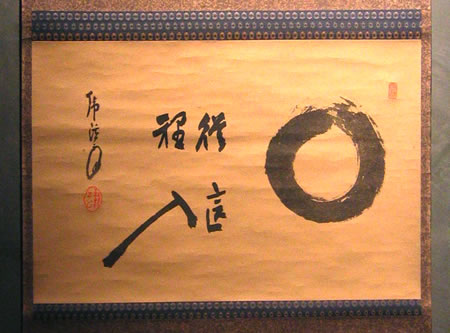
This one, from the Girvin Zenga collection, came out of hiding, in a book by Audrey Yoshiko Seo: Enso, Zen Circles of Enlightenment.
Weatherhill, London.
The painting is here:

GIRVIN ZENGA COLLECTION:
Hoshino Taigen (Saishokan) • 1865 – 1945
“Enter from here.”
Photograph by Deanna Carroll
__
Speaking to practice, meditation, mind fullness…it’s interesting that
the etymological reference of concentration is “with circle.”
It is the center point of contemplation, the center of the circle.
Finally, what this all comes to meaning for me, to brand, design, strategy, is the transformative power of the mark — a stroke of meaning.
For designers, the script of statement, the inscribing of meaning lies in the stroke — what is the mark that you make, in telling a story?
In the brand visualizations that you create, a mark has meaning.
It’s a reflection of content. The circle, the square, the line — each a vocabulary of statement, a lexicon of scribed perspective — a seeing through, from one realm to another, a carrier of message.
To the seer and experiencer, that could be an unforgettable encounter, and surely that is what we’re all seeking:
unforgettable moments in memory.
To those that are open.
Tim | West Queen Anne Elementary Studios
…..
G I R V I N | SOCIALITY + MEDIATION
DESIGNING BRAND STORYTELLING IN HYBRID MEDIA | http://goo.gl/GEiGKN