Brand, story, environments — what story told?
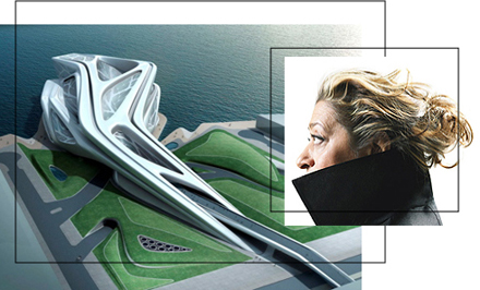
I’ve not met Zaha Hadid, but I’ve had an early connection with her, decades back — and followed her work closely since that time.
My first connection with her was working with Jim Olson and his team on a pitch design program for a project in Kowloon, Hong Kong, China. As a designer, my role was packaging. Designing the character of the look of the presentation, Working with the team then — Olson Walker (Jim and Gordon) was an early foray in the 80s to create an award-winning solution for a complex siting above the Hong Kong harbor — one which had to bear in mind underpinnings of the principles of fengshui, dragon energy forces and other geomantic challenges. While we made it to the end — among the bronze winners, to spin an Olympic allegory — the award recipient was Zaha Hadid.
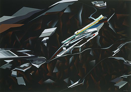
And typically, to Zaha’s extraordinary imaginings, it’s her illustration that is perhaps the most compelling. All of her drawings, for projects built or unbuilt, are imaginatively visioned — and detailed in airbrushed dimensionality. The project has been described by MOMA, that owns this drawing:
Hadid, whose work has been called “deconstructivist,” was the winning design in a competition for a private club to be located in the hills of Kowloon, overlooking Hong Kong. Hadid proposed a transformation of the site itself by excavating the hills and using the excavated rock to build artificial cliffs. Into this new topography, she interjected cantilevered beams, shardlike fragments, and other elements that seemed to splinter the structure into its myriad constituent parts, as if it had been subjected to some powerful de–stabilizing force.
Hadid’s history is outlined by Walter Smith, Grove Art Online — edited:
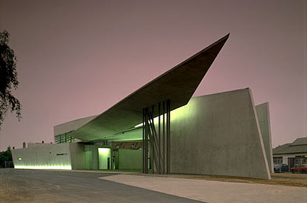
“British architect, designer and teacher, of Iraqi birth studied at the Architectural Association, London, from 1972 to 1977 and then joined the Office for Metropolitan Architecture founded by Rem Koolhaas, one of her teachers; there she worked on the Dutch Parliament Building extension (1978), The Hague. In 1979 she opened her own practice in London, designing a flat in Eaton Place that won a gold medal from Architectural Design in 1982, also teaching at the Architectural Association (1980–87). During the 1980s she entered several architectural competitions, winning those for the Hong Kong Peak (1983), the Kurfürstendamm (1986), Berlin, and for an art and media centre in Düsseldorf (1989). Hadid designed furniture and interiors (1985) for Bitar, London, and interiors (1990) for the Monsoon Restaurant, Sapporo, Japan. Her work evolves the traditions of Modernism, inspired by Cubism, Futurism and Constructivism, and most profoundly by the Suprematism of Kazimir Malevich. Hadid explores possibilities inherent in the work of such figures as Malevich that had only begun to be realized. Sometimes described as ‘Neo-Suprematist’ and as resembling spaceships, her designs are typified by fragmented convex geometrical forms that engage and define the space around them, incorporating a Futurist sense of dynamic movement. Her works often contain an element of fantasy, Hadid insisted on the buildability of her projects, an assessment confirmed by her engineering consultants. Nevertheless few of her major designs of the 1980s were built. Her first significant constructed work was the Vitra fire station (1989–93) at Weil am Rhein, Germany, which has been described as having the appearance of ‘an exploding set of parallelograms’ (Winter, 1993), containing the sharp angles of her previous designs and including large expanses of glass. From a distance its roof line resembles the wings of a bird; the interior reflects the tension between space and form familiar in her unexecuted designs. Hadid continued to teach in universities around the world, including Harvard University, Cambridge, MA, where she held the Kenzō Tange Chair at the Graduate School of Design. In 1994 she won the important Cardiff Bay Opera House competition.
And that closing piece, now is rather outdated — many of her more recent, abstracted design treatments have been built. The first is her Vitra project as a solo practioner; and the effect of it is profound, even shocking.
What I find most compelling about her, aside from her luminous résumé, is her persistent dreaming. And — adding to the extraordinary melange of Dubai‘s unfolding visioning of luxurious architectural statements — she’s been creating new evocations of her distinctly Hadidian design brilliance and character.
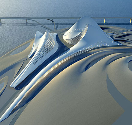
The Dubai Art Center
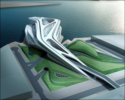
The Dubai Opera House
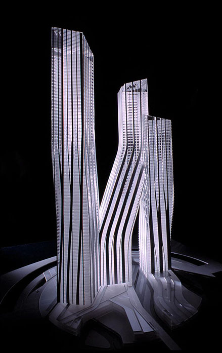
The Dancing Towers
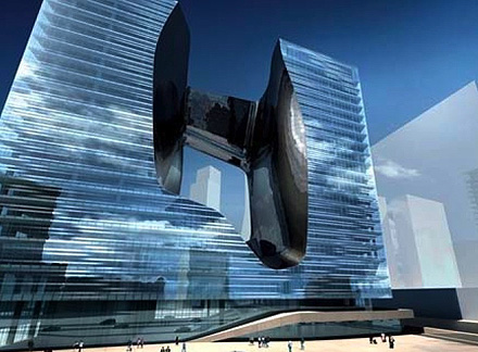
The Opus Dubai
One might presume that the idea of branding space, in creating place, could be exemplified in her first built work — the Vitra Firehouse. But there’s more. For her creative efforts on Mobile Design Space — for Chanel — first unveiled at the Venice Biennale — she created a form that one might suggest a conceptual alignment with the classic Chanel quilted bag.
She describes it this way:
“The form of the Chanel Pavilion is a celebration of the iconic work of Chanel, unmistakeable for its smooth layering of exquisite details that together create an elegant, cohesive whole. The resulting structure is very much tied to that original inspiration—elegant, functional, and versatile both in its overall structure and detail. *
The form of the Chanel Pavilion is a celebration of the iconic work of Chanel, unmistakeable, for its smooth layering of exquisite details that together create an elegant, cohesive whole. The resulting structure is very much tied to that original inspiration—elegant, functional, and versatile both in its overall structure and detail.
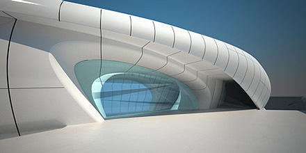
The architectural structure of the Pavilion is a series of continuous arch-shaped elements, with a courtyard in its central space. The glazed ceiling adjusts to allow for control of the interior temperature in response to the particular climate conditions of each venue city.
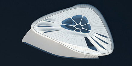
Natural light descending from seven elements on the ceiling, meets artificial light pushed up from gap between the walls and raised floor to emphasize the “arched” structure, and assists in the creation of a new artificial landscape for art installations. Six of these elements are roof lights for artworks; another large opening dramatically floods the entrance in daylight to blur the relationship between interior and exterior. In addition to the lighting and colour effects, the spatial rhythm created by the seams of each segment gives strong perspective views throughout the interior.
The size of the Pavilion will be 29m x 45m, a total of 700sqm. The overall height is 6m, with the floor raised 1.00m above the existing ground surface. In light of the extensive shipping between cities, each structural segment will be a maximum of 2,25m wide.
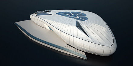
The 65sqm central courtyard has large transparent openings to the sky above and is designed to host events as well as provide an area for reflection after visiting the exhibition. The courtyard serves as an intermediate space between the exhibition and a public area of the Pavilion. A 25sqm cloakroom is also provided.
With a direct visual connection to the courtyard, the 128sqm terrace continues this dialogue between the Pavilion’s exterior and interior. During an event, the two spaces could be linked to become one large event zone.
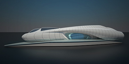
Reflective materials allow the exterior skin to be illuminated with varying colours which can be tailored to the differing programmes of special events in each city.
The dichotomy between the powerful sculptural mass of the Chanel Pavilion’s structure and the lightness of its envelope create a bold and enigmatic element. The Pavilion’s exterior develops into a rich variety of interior spaces that maximize the potential to reuse and rethink space due to the innate flexibility of its plan.
The total fluidity of the Chanel Pavilion’s curvilinear geometries is an obvious continuation of Hadid’s 30-years of exploration and research into systems of continuous transformations and smooth transitions. With this repertoire of morphology, Zaha Hadid is able to translate the ephemeral typology of a pavilion into the sensual forms required for this celebration of Chanel’s cultural importance.
Nice descriptions. But what about the real: http://www.chanel-mobileart.com/
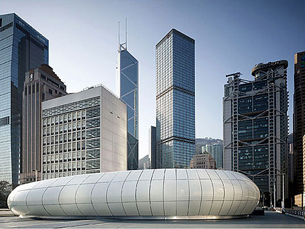
Personally, I might suggest that there is a unique “lightness” to the character of this work — and it’s been extensively discussed, noted elsewhere. The team at Inhabitat [http://www.inhabitat.com/], ever astute, offers these assessments — with the appropriate querying stance:
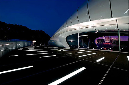
It used to be that Manhattan’s Central Park was reserved for leisurely Sunday strolls, ultimate Frisbee on the Great Lawn, and narrated carriage rides for out-of-towners. There was a policy to keep public art works out of the park proper leaving public spectacles to be reserved for ‘New Yorkers just being New Yorkers’ and the odd impromptu performance. Ever since Christo and Jeanne-Claude’s saffron-bedecked The Gates and now Olafur Eliasson’s Waterfalls, it seems as if the city is looking for creative ways to build up its financial reserves. We are not sure if Zaha Hadid’s latest Mobile Art Pavilion (created as an homage to Chanel’s classic handbag) is the best way for the Central Park Conservancy to boost its programs and plantings, but in this new era of ‘bread and circus’ art and life on the verge of recession, who is really going to fight a posh take on an old classic?
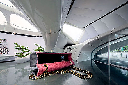
I might expand on that front — brand and circus.
And NYC spectacle: https://www.girvin.com/blog/olafur-eliasson-weather-waterways-spectacle/.
And what is the brand but the story and its visualizations, and the circus is merely a roundabout. So, perhaps the fluidity of the structuring is about that — the story, the circus, the round, the brand. What I’m sensing is potentially a new direction for luxury in design; design in luxury. But the idea is the story — the legacy of Chanel, her story, Karl Lagerfeld‘s evocations of Chanel legacy and how that is arranged in the context of mobile space + brand = place.
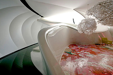
http://www.eikongraphia.com/?p=1318/
http://video.on.nytimes.com/
http://www.zaha-hadid.com/
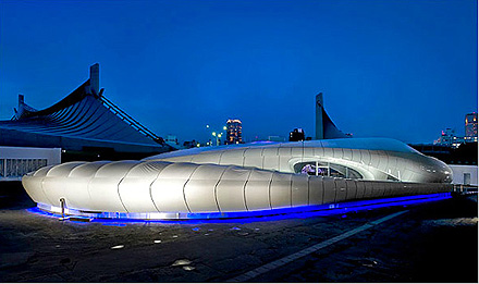
What I’m wondering about is — did you go there?
tsg – seattle, washington