I was favored with the opportunity to partner with the leadership of Yves Saint Laurent | North America in the development of a brand retail strategy for their flagship store, to be rolled out nationally. How done? We used Girvin’s proprietary BrandQuest® methodology to explore the heart and spirit of the YSL legacy. That spiritual string is founded on the premise, and the promise of — a relationship to the genius of Monsieur Yves Saint Laurent. But what, then, of Tom Ford? And then, the character of Stefano Pilati.

The working sessions framed the character of Valérie Hermann’s driving global strategy, then applied, in design theory and brand spirit, to the store conceptions.
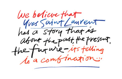
And these values, in interpretation, reflect the original guiding presence of that founding neighborhood — and the couture foundation at St. Sulpice, Yves Saint Laurent’s layered visioning.
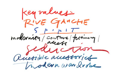
But it was about the beginning — and that translation to a new — a renewed, sense of warmth. Tom Ford explored a darker, harder burnish — stainless steel, black lacquer, rough chipped woods, dark stone: cold, cooly sexual and empowered with the energy and design embrace of Tom Ford’s sleek vision and William Soffield’s architecture. Our recommendation — a turning to curve, a retaining of warmth, a recollection of the beginning, in the new story that is held in the power of Stefano Pilati’s visioning.
We carried our explorations from 57th & 5th, NYC, to the hands of North American retail leadership, Claudia Cividino and Laura Lendrum — then presented in a series of charrettes of brand development in Paris. What outcome? That reference won out — the workshops, the team engagements in Paris, lightened the spirit of the space and the collective strategies explored in the states then captured the emerging spirit of a new retail appearance for YSL. The mastermind, in this evolution: Stefano Pilati.
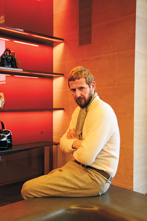
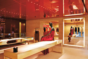
Our visualizations of BrandQuest® outcomes — to a new warmth, a new sensation of pale vibrance:

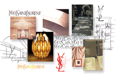
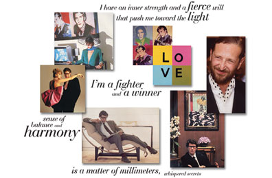
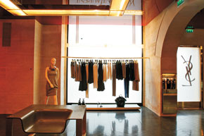
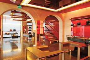
The official word: The historic Saint Sulpice store, on the Left Bank, inspiration for Saint Laurent’s original Rive Gauche line of luxury ready-to-wear, which first opened its doors in 1979, has been remodeled with a new interpretation by Pilati, in consultation with the architects Moatti + Rivière.

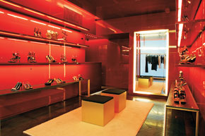
The concept is taken from the YSL perfume, Opium, and includes shiny lacquered surfaces, polished brass and stone and parquet flooring.
—–
Published: Monday, February 25, 2008
By Miles Socha
PARIS — “I call it the opium experience,” Stefano Pilati said of Yves Saint Laurent’s striking new-look boutique here at St. Sulpice, with ceilings and wall panels in glossy lacquer the color of the French brand’s legendary perfume bottle and packaging.
A custom scent wafting from candles aside, Pilati’s hope is that the store design — to be unveiled to the industry tonight at the start of Paris Fashion Week — is iconic enough to be recognizable without any logo.
“I wanted to do something that was timeless,” Pilati said during an exclusive walk-through of the 3,200-square-foot, two-level boutique on Friday. “It has to go beyond my era at Saint Laurent: contemporary, but effective, and with a strong identity.”
Airy and bright because of pale stone walls, the liquid-look lacquer and accents of polished brass, the boutique is worlds apart from the mostly black, rough-hewn interiors that were in place in 2004 when Pilati took over the design helm from Tom Ford.
“[This] fits more with my designing,” said Pilati, dressed in shades of cream and light gray. “In general, I’m more bright and open in terms of mood.” He described the environment as luxurious and modern, but also “familiar, warm and personal.”
The dramatic concept will eventually arrive at the other 61 stores in YSL’s global network as the brand capitalizes on strong sales momentum. Fourth-quarter revenues gained 20 percent at constant exchange rates. (YSL parent PPR reports 2007 earnings on Wednesday.)
In separate interviews, Pilati and YSL chief executive officer Valérie Hermann allowed that the dark stores have shortcomings. For example, in some locations, it is difficult to distinguish a garment that is dark brown, say, from one that is black.
They said the new design should bring fresh energy to the brand, and fuel double-digit sales at St. Sulpice thanks to more legible merchandising and a more suitable backdrop for Pilati’s ready-to-wear and accessories.
Hermann said a larger store in Cannes, and a shop-in-shop in Printemps in Paris, would be among the first this year to reflect the new design concept. But the plan is to “have it quite visible quickly,” she said. “The majority of [the stores] should be done over four to five years.”
St. Sulpice has been home to a YSL boutique since 1979, and Pilati stripped out the warren of rooms and internal walls to expose stone arches and give the store an open feel. Customers alight upon a large selling area showcasing rtw, handbags and accessories, with a shoe salon and cash wrap in a second room off to the left. A glass and stone staircase leads to the second level, a larger showcase for rtw. Upstairs, Pilati had interior walls removed to give views of the square.
“I love to see the clothes against the city,” he said. “I don’t want the store to be the star. I want the clothing to be the star, but I want [the store] to be identifiable.”
And adaptable, given that no other YSL locations are housed in a landmark 17th-century building in one of the most picturesque squares in Paris.
“Every shop is going to have its own identity, but quite linked to what we have done here,” he said.
Pilati said he would likely keep the stone walls — “it’s a very French identity,” he noted — but the scale of lacquer panels, for example, would be adapted to each unit. The material, he said, “gives a liquid effect to the store.” And, placed behind racks, they resemble minimalist canvases.
Working with architectural firm Moatti & Rivière, Pilati opted for a mix of industrial and luxurious materials, from Baccarat crystal light fixtures to synthetic concrete floors in a typical French parquet pattern. The store also has an environmentally friendly bent in the use of ductal concrete (which uses less water and energy to produce) and efficient lighting.
The store also comes with new staff uniforms, opium-colored shopping bags and boxes and spacious, spa-like fitting rooms. It will be used for special events as well, including re-see appointments for the press right after Pilati’s fall show on Thursday.
——-
See these added blog references:
https://www.girvin.com/blog/gucci-the-movie-yves-saint-laurent-the-collection/
https://www.girvin.com/blog/yves-saint-laurent-the-personal-the-person/
tsg | NYC