
Brand identity, integration, story and truth.
I’ve spoken about the reach to true brands. What are they, what resonation have they with audiences and who cares about the story that they promulgate? I’m looking for true brands; and, in my own work, I’m looking for truth.
There’s a bigger challenge, during the obfuscation of these times, seeing the fog of brands that are misting strangely diffused messages and imagery that might be truth, might be transition, might be mere coverings.
People take a new vantage – and others, including myself, seek that advantage. The point is, if there’s a change in heart, literally, then there needs to be an interpretation — a refreshed lustration of the heart full change; the story needs a new spin, a renewed telling. That’s the point of the truth — especially now. People are looking for it. And in seeking brand relationships, it’s about two things — what brand is worth recalling, remembering, linking to, as a relationship of consistent embrace. The other link, or point of disconnection is simply price. While in the past, one might presume that pricing to the compelled was never an obstacle, in the present scene, pricing is everything. Certainly there is the character of the brand, its value, but these are troubling moments for many, when it comes to money — careful planning, conservation seems to be the word — the working world — of the consumer. That telling is consistent from a multiplicity of channels.
To my sense, the realm of brand management is that, the mission of finding the heart, the truth of culture, community, enterprise and spirit — preserving the assets and pushing them out to the audience surrounding the center-point of the story.
Louise Story, offers that in this time of travail — to the financial sector — it’s all about repositioning, shuttling new images, messages and trying to wash away, quickly, the past.
There’s the new Ally Bank: ”A better kind of bank.” Ally is the lender formerly known as GMAC Bank, once part of now bankrupt General Motors.

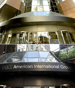
And A.I.G. transferred to become: A.I.U.: ”A unique franchise.”

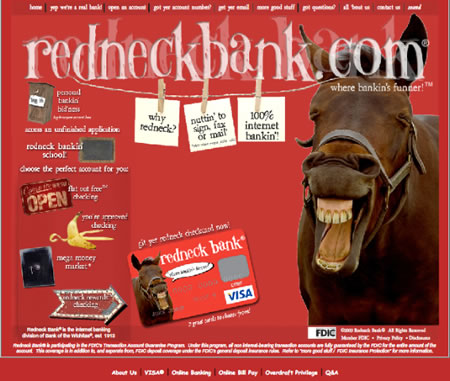
Redneck Bank: ”Where bankin’s funner!”
New names, new positioning, old companies that are trying to remake themselves. But the challenge lies in the idea of concept, context and truth. As my friend Patrick Byers references, is this socially responsible? What I ponder is the idea that the truth — in change — is more sustainable. And the history calls an agreement to this proposition — honesty prevails.
Change that ”U” to a ”G” in A.I.U. and you get A.I.G., the American International Group, which owns A.I.U. The recently founded Redneck is the new name for the online arm of plain old (foundering) Bank of the Wichitas.
There was the bailout, then the blowout — and the transitioning polish of a blowtorch to marketing evolutions. “Not since the Great Depression has the nation’s financial industry confronted so much bad P.R. So with cheery, the-future-is-bright advertising and, in some cases, revisionist branding, companies are trying to put their troubled pasts behind them, or at least out of the public’s mind”, according to Story’s overview.
The basic positioning is that — “well, we’ve changed; let’s forget about it and move along, shall we?” Most of us, of course, will never.
Anne Finucane, Chief Marketing Officer at Bank of America offers this counsel: ”The fundamental value of financial institutions is clouded by the anger and the confusion people feel. We are an optimistic society. Individuals and companies want to move ahead. They want to get on with their lives. They want the banking industry to help them.”
These strategies of brand identity transition are the lifeblood of our work — considering the shift in trend, market, leadership ethos, cultural change and, in some instances, a more authentic return to the heart of the brand. From brands that are hundreds of years old, in legacy, to newly emerging freshly created ideations, everything changes — we all (now) hold that truth to be self evident. Many brands, then, are considering transition. To the nature of our consulting, brand truth is a focused definition. Using team-worked charrettes, called BrandQuest® — a cumularity of minds, we work inside out to newly define brand strategy and build renewed identity. The point is that the spirit of authenticity and truthfulness build the inherent quality of brands that people can relate to. Relationships are everything in brand — without friends, advocates, lovers, stewards, storytellers — relationally dead brands are nothing. Brands are made by humans, for humans.
Brand identity in transition has been recently examined by CNN Money; and this overview is a good gathering of successes — and failed strategy in relationship resonance. I’ve made some added notes and links, below:
What’s in a New Logo?
by Blake Ellis and Josh Glasser
Wednesday, August 12, 2009 provided by ![]()
It can invigorate a company’s image or squander its brand equity. To see which gambles paid off, Fortune turned to a few experts to judge some of the most dramatic transformations.
Apple – A Chic Redesign
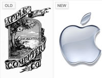 Talk about a makeover.
Just imagine what an iBook or iPhone would look like with this image on it: definitely not as chic.
Ronald Wayne designed Apple’s original logo in 1976 when the company was still operating out of a garage.
It shows Isaac Newton sitting beneath a tree with an apple dangling precariously above his head.
Rob Janoff used the same apple in his redesign a year later.
“You can almost feel the ’70s and ’80s taking place when you take a look at that rainbow apple,” says Bill Gardner, principal of Gardner Design.
Apple dropped the multi-colored logo in 1998 for a monochromatic version, produced in every color imaginable, until transitioning it to today’s popular shade of chrome.
(The Apple strategy is a thorough integration of brand culture, the leadership of Steve Jobs, the highest empowerment of industrial product design — and retail implementation — as a kind of overarching brand steward and art director; it might be the best in the series.)
BP – Re-Branding Faces Reality
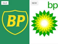 After British Petroleum merged with Amoco, the oil giant commissioned branding firm Landor & Associates and advertising agency Oglivy & Mather to fashion a corporate identity that would convey the image of a forward-thinking, socially conscious company.
BP had already begun building that persona: After all, former CEO Lord John Browne was the first oil executive to acknowledge the threat of global warming.
The bursting green, yellow, and white Greek mythology-inspired “Helios” symbol that replaced BP’s shield is meant to imply a shift toward alternative, environmentally-friendly sources of energy like solar and biofuels, and relentless advertising has made the company’s initials synonymous with “beyond petroleum.”
But a series of oil spills and accidents suggested that BP wasn’t walking the walk, leading some to consider its wildly successful mark more a mask than its true face.
“If the story doesn’t hold up, the mark and the brand start to lose their luster,” says Brendán Murphy, senior partner at Lippinott, a brand management firm.
(The truth is in the telling — authentic brand storytelling and implemented action will continue to sustain the power of the brand.)
IBM – Simply Classic
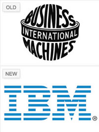 In 1972, IBM ditched its original logo in favor of the symbol it has used ever since.
In an attempt to update its antiquated look — the old logo wrapped the words “International Business Machines” around an image of the globe — IBM tried two different block-letter logos before legendary branding designer Paul Rand created the current version.
In this modern design, the lines that make up the letters represent “speed and dynamism,” according to the company.
They owned the lines going through it before everyone started using lines,” Gardner says. And because of its simplicity and originality, “you have a hard time desiring to mess with it.”
(What can you say? Designed by Paul Rand, the elemental designer of some of the best and most powerful corporate expressions there have been.)
Kraft Foods – Mismanaged and Indistinct
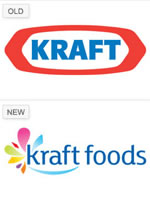 The association with fattening products like Kraft Macaroni & Cheese — and negative connotations stemming from its connection to tobacco conglomerate Philip Morris — tainted both Kraft’s corporate history and its logo. So it made sense that just under two years after Altria (formerly Philip Morris) spun off shares of Kraft to form a distinct company called Kraft Foods, the food giant would want to revamp its image.
But it wasn’t necessarily a success: While the slimmer styling suggests healthier products, many analysts consider the new logo, by Nitro design agency, a disaster. Introduced in February, it’s already been altered, with changes to both the location and shape of the ambiguous “flavor burst,” which evokes both butterflies and flowers.
“I don’t get a story from it,” Belk says. “The fact that they changed it twice in such a short period of time says that they’re not managing it very well. They’re not taking a strategic approach to it.” What’s more, the new logo bears an uncanny resemblance to Yoplait’s, which isn’t even a Kraft brand.
(Being a designer and strategist for Kraft, for a number of years, I can comment that there is an internal drive, most evinced in the efforts of the new overarching Creative Director, Jon Denham, to reboot the innovation and brand design strategies of the organization. I believe this shift — Kraft’s brand identity might precede him. To it, there’s a complexity that will be hard to effectively manage, over time; packaging — compressed real estate that it owns on shelf — is already complex; the challenge will be how this is managed — on package. And, from there, what is the consumer’s take on the outcomes. What is the story, who’s telling it, and who cares?)
Procter & Gamble – No Devil Inside
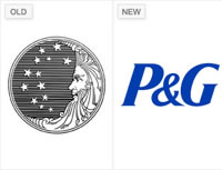 The logo P&G used when it launched in 1851 pictured a man in the moon with 13 stars, representing the original American colonies — à la the original U.S. flag. But critics later claimed the stars connected to form “666” and that the curls were in the shape of devilish sixes as well.
P&G chopped off the old man’s bearded curls in 1991, and then two years later, the company trashed the pictorial logo altogether for the simple initials it uses today. “While it’s unfortunate that they had to change for the reasons they did,” Murphy says, “I think the ‘P&G’ logo is a strong mark.”
(P&G, another client, is compelled by powerful design strategy — in fact, among the best on the planet, lead by former powerhouse Claudia Kotchka [retired], Elizabeth Olson and others, like Global brand design leader Art Herstol — all fueled by the innovation tactics of CEO A.G. Lafley — this mark is clean, sure, typographically well-crafted and simple enough to grace a building — and their design center — as well as hundreds of products in signature worldwide.)
Starbucks – Song of the Siren
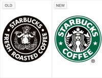 Here’s one Starbucks concoction many hoped had disappeared a long time ago. The brown logo featuring a nude siren had been the company’s icon since 1971, when it was developed by Starbucks co-founder Terry Heckler.
In 1992, it was updated to the green logo used today, picturing a less exposed siren. But in May of last year, the brown logo — with the breasts covered — made a comeback for several months during a promotion. Even with the minor touch-up, the flashback was not met with much enthusiasm.The retro logo “goes from nostalgic to crude,” says Belk, whose opinion was shared by many.
(Being a friend to Howard Schultz and Terry Heckler, I can get the strategy in the development of the initial mark, expertly crafted by another friend, Doug Fast; they, together, did the first mark, its secondary iteration, and its return to the founding. I believe that the heart of the character — the siren itself — is the call to story. Going back to the heart, that’s the story that they are attempting to accomplish. )
UPS – Modern and Traditional
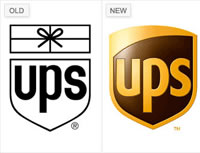 In 2003, as UPS moved into the digital age — from packaging and shipping to managing logistics, too — the company outgrew its 42-year-old iconic logo. Celebrated in the design community for its connection to legendary designer Rand, the original logo and its old-fashioned bow gestured to the company’s roots in neighborhood package delivery. “It had a humor and a humanity to it,” Murphy says.
But the new logo represents a strategic decision to emphasize UPS’s expanded business operations, and analysts also praised the company’s FutureBrand designers for nodding to UPS’s heritage by preserving the shield, keeping it lighthearted, and leveraging the color brown. “You would never think [brown] would be an asset,” Belk says, “but in their case, it is.”
Wal-Mart – Softening Its Image
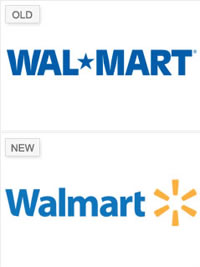 Wal-Mart didn’t always make its employees as smiley as the happy face that rolled back prices on its commercials. “They were known as a heartless, soulless company that didn’t care about people — even their own people,” Belk says.
But Wal-Mart’s 2008 branding makeover by Lippicott produced a logo that now conjures up the image of an “inviting and accessible” store, explains Belk, rather than the “daunting and monolithic” one the old logo (in use since 1992) projected.
The redesign transformed the big-box store’s name to one word, used standard capitalization and a softer shade of blue, and added a yellow spark symbol. The new logo, like the company’s updated tagline — “Save Money. Live Better.” — invigorates the company with an “altruistic mission,” says Belk, as it expands its reach from rural America to an urban consumer.
Xerox – X Misses the Spot
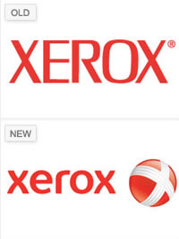 ;It’s so painful for me to even look at that thing,” says Gardner about Xerox’s new logo, which the company unveiled last year. Xerox decided to lose its signature ‘X’ logo in hopes of changing its reputation for being just a copier and printing company as it increases its focus on software and services.
But analysts and customers have been critical of the redesign — Xerox’s biggest makeover in forty years. “The new logo is first and foremost a sphere…and the less obvious ‘X’ is almost an afterthought,” says Gardner. “Xerox owns the letter ‘X’ in the corporate world. Why would they want to bury the ‘X’ instead of making the most of it?”
The company stands behind its decision, however, saying in a press release that the new look is “more lively” and the ‘X’ in the ball represents the company’s connections to customers, partners, industry and innovation.
(The first designed by Lippincott, 1961. Simple, elegant, timeless, clean. I still like it.)
Copyrighted, CNNMoney. All Rights Reserved.
What I might offer is that brand, story, truth, identity are all wrapped up in each other — they are interwoven, genetically. If an organization is changing its visual rank, then it’s important to assure that the overarching strategy starts at the heart of the enterprise — the team’s leadership is locked in, there is defined resonance in the market, the strategic outplay of tactics are planned and the story’s messaging will be appropriately placed.
It’s never about the media alone; it’s always about the message first.
Here’s to exploring more of what lies within, and what visuals express with out.
Tim Girvin | GIRVIN
Humans | Brands | Love
http://blog.girvin.com/?p=2886
c. 206.890.0621
New York City + Seattle | Tokyo
Twitter: http://twitter.com/tgirvin