There are bad signs, and then there are worse signs.
In the journey of a designer of signing and related environmental graphics — the core point of the design strategy is storytelling — the story might be: this is the place; go here, do not go here, you are here, finally; this place is beautiful — here’s more about it. Each, in a manner, a story, told.
Get lost.
Be found.
Sometimes, when I see a sign,
I think — what is that sign really saying?
Drain — that could mean more than just an opening for storm effluent.
Exit — what’s that really mean: leave here?
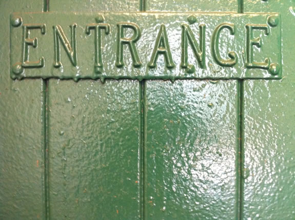
Entrance — come in here? Or be entranced?

Sometimes signs are about rules.
And any rule, as well you know, needs to be broken.
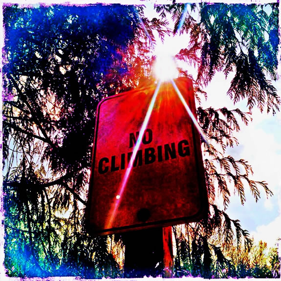
I was thinking about climbing and what happens when you climb?
A simple enough proposition.
Climb, and you get higher.
Climb higher and you can see differently.
And likely, you can see farther.
As a designer, and a soul-finder, treasure hunter,
you’re looking for gems; when you climb that
landscape can be better seen.
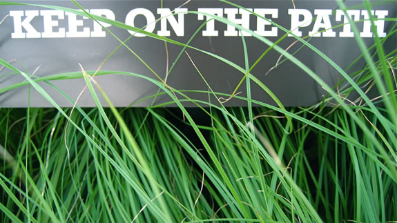
And you’ll see more if you stay off the path.
If you stay on the path, you’ll see the same as anyone else.

Climb higher.
Path find.
Look for signs.
Even the most obvious ones usually have an added meaning.
If you know how to read into them.
TIM | GIRVIN NYC
…..
G I R V I N | SOCIALITY + MEDIATION
DESIGNING BRAND STORYTELLING IN HYBRID MEDIA
http://bit.ly/sJ4IjO