Exploring design, art and imagination: motion picture branding, Tim Burton, and the legacy of Girvin identity and cinematic brand design.
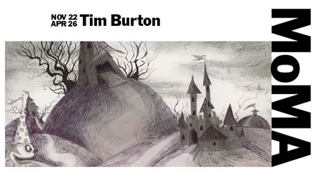
Tim Burton, MoMa, what a nice idea.
As a designer for Tim Burton, I will offer that I never had the chance to meet him, work with him, live — side by side. But, sometimes, proximity is a challenge — so, in working with various directors — at various tiers of celebrity power, you can work, but perhaps not “closely”. Sometimes being relatively quiet, in a room with that person, might be all that is offered. I’ve not given up.
But I did have the chance to collaborate, over time, with his creative teams — and him — on the process of moving from storied ideation to production design and finally, to motion picture identity development.
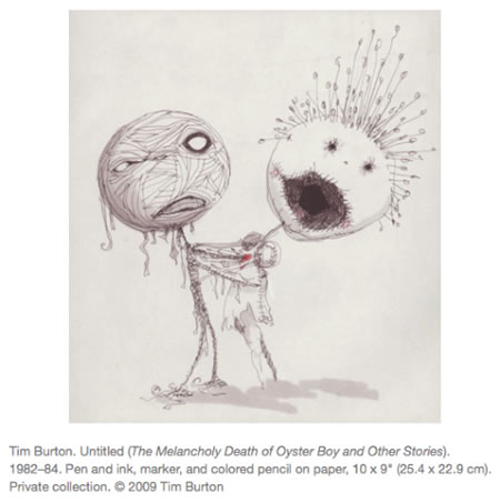
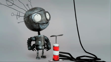
In any film, the idea is the heart of the imagination – and Burton’s beauty is very much at the soul of his storytelling. He is a spectacular visionary — but, perhaps unlike other directors — he can draw. Working with Zemeckis, Cameron, Cruise, Abrams, DePalma, Wachowski, Eastwood, Scott, and others, the ability to truly generate visualizations that are sharp details of an imagined world is very unusual. Some can sketch — or gesture to the visualizations of ideas — and show a general verisimilitude; but detailed drawings of sets, even making them by hand, as Burton can and does, is a rarity.
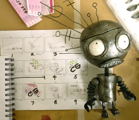
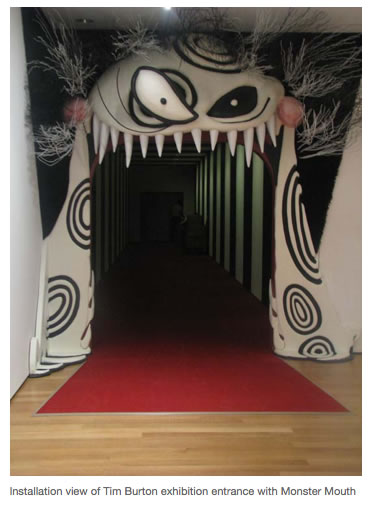
I was happy when I heard about this exhibition — importantly — it’s far more than being merely a show of work, it’s a convocation of celebrating his legacy. Rich, indeed. And I’m also happy to be heading there after a long break (from NYC). I’ve not been to Manhattan for most of the year — which has been hard.
The idea of creating design solutions for a talent that is already a quintessential designer of designers — that is something of a challenge. Kind of scary, actually. The real sense of imagination that is so marvelously alive in the spirit of his work is the willingness to progressively — continuously — risk everything, in exploring creative dimension. From Planet of the Apes to Frankenweenie, from Sweeney Todd (as a musical) to Corpse Bride.
How that process works, for example, is an alignment of principle. If there’s a drawing, in the spirit of the work — the creation of the set designs, the characters, the fundamentals of the modeling. Interestingly enough — that would be using tools and techniques that match up to the spirit of the strategy of design and creative expression.
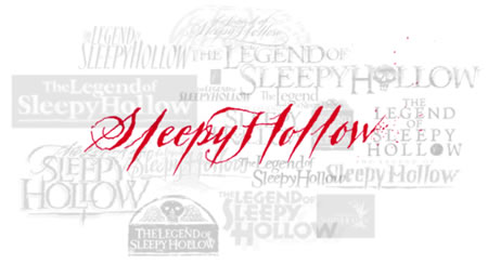
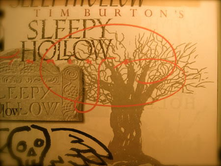
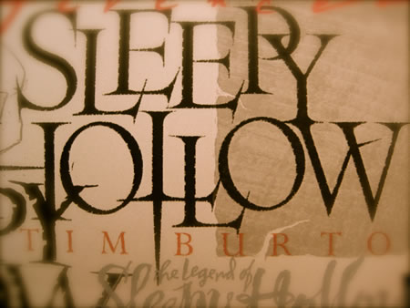
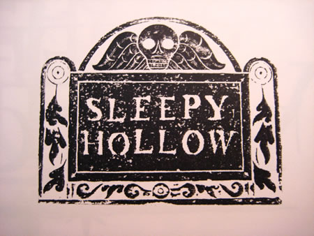
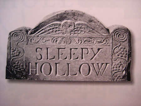
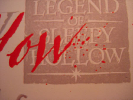
A reference — that would be an exemplar to that process, that exploration — would be Sleepy Hollow. Working on this production with Burton’s team, as well as the creative leadership team at Paramount Studios — everything, creatively, is a follow from Burton. But the concept is more about the idea of reaching into the heart of the telling that specifically Burton is bringing out in his interpretation. That positioning, literally, comes from production design, strategy in storytelling — the Burtonesque stylings — and of course, how that link to storytelling in brand identity attaches to narrative visioning.
The right tool, the right time period, the right (palaeographically correct) rendering — herewith, scratched below:
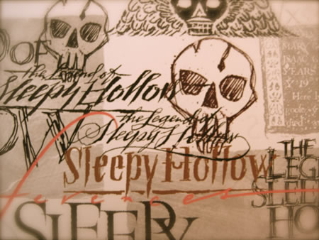

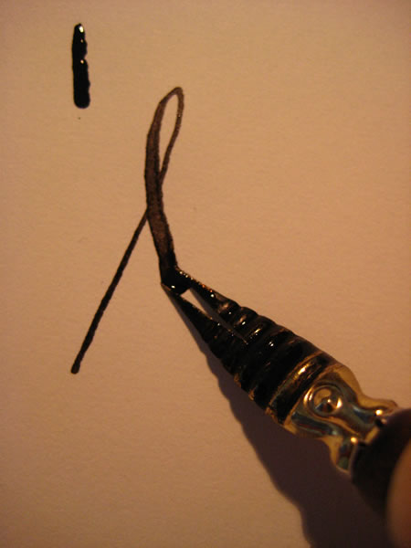
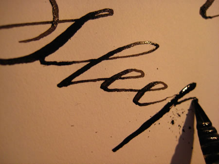

Draw what might, that
wetted split tool doth
make, tines spread, the
line grown hard in
the pressured telling,
that story comes forth —
like blood — more like
dreams, in the gesture
scrib’d — one moment,
that story told.
Congrats to Tim Burton. We’re lucky to know him.
tsg
….
GIRVIN | STORYTELLING & IDENTITY
MOTION PICTURE BRANDING DESIGN
https://www.girvin.com/blog/?cat=301
motion picture: https://www.girvin.com/new/movie.php
the reels: http://www.youtube.com/user/GIRVIN888
girvin blogs:
http://blog.girvin.com/
https://tim.girvin.com/index.php
girvin profiles and communities:
TED: http://www.ted.com/index.php/profiles/view/id/825
Behance: http://www.behance.net/GIRVIN-Branding
Flickr: http://www.flickr.com/photos/tgirvin/
Google: http://www.google.com/profiles/timgirvin
LinkedIn: http://www.linkedin.com/in/timgirvin
Facebook: http://www.facebook.com/people/Tim-Girvin/644114347