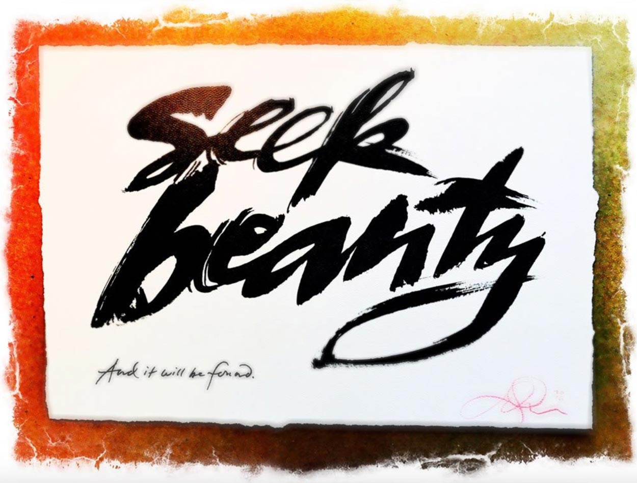
In our own history, we have been honored to cross from core motion picture identity to its applicable resonance in production design.
Working on the Lots at Paramount, Warner Brothers and Universal, and meeting with the production crews for various film properties and projects, I’ve had the chance to lean-into the set design principles and their presentations to look at the integration of motion picture scripts and set design overviews—to consider the framing of identity into the very fabric of the film’s look and feel.
GIRVIN’s typographical references | Benjamin Button
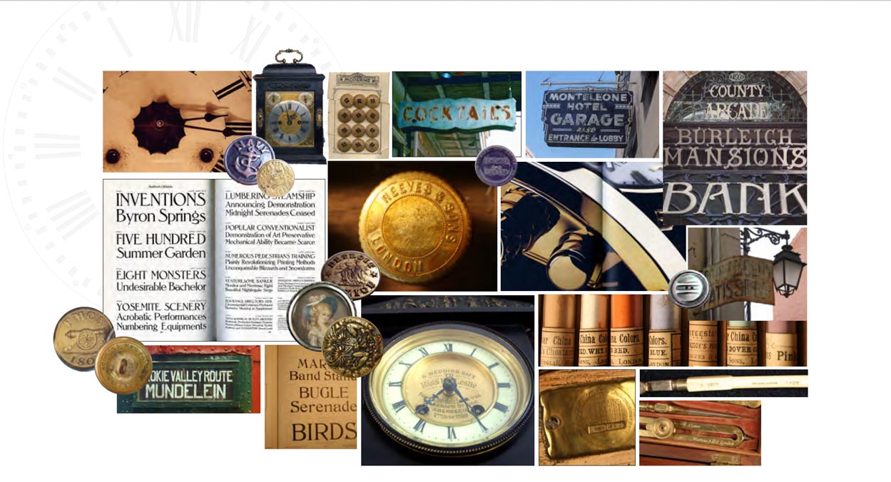
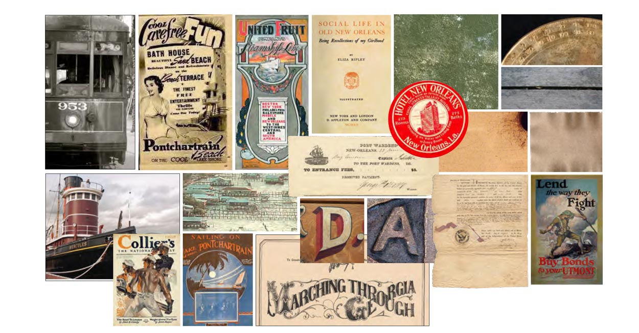
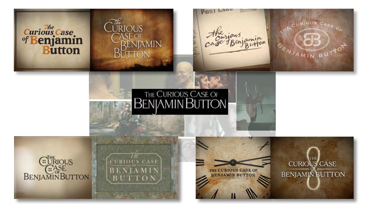
We see logo-typography as a kind of sensate typology, that is: there’s a distinct alignment between set experience design and filmic expression and how that might interpret the interplay between graphical expression and narrative *experientiality.
That would reflect back to our writings on
theatrical production design.
And the synchrony between logo art and theatrical production design. That is, how does the set and interior design get—potentially—intertwined as a motion picture advertising mission? Obviously, there is a sequence, oftentimes a long-running the movement between the development of the core story, the narrative development teams, the pitch, the budgeting and planning, the production alignment, set design build-out, production planning and shooting regimens.
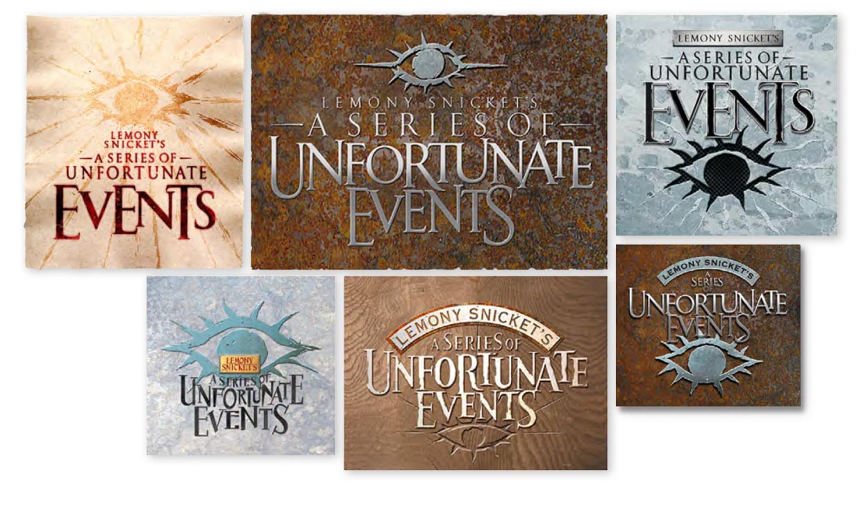
What if one designed the eye for the set, then integrated that into the logo for the film itself?
Or could a film star, Tom Cruise in this instance, espouse a particular materiality and monogrammatic influence?
Yes. And that would be an alignment—production design, materiality, and luminosity that finds its way
into the shooting regimen.
That would be yes.
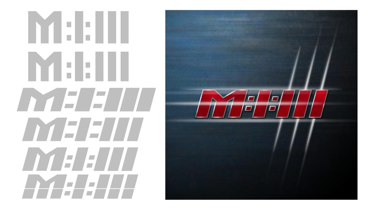
The idea of this type of material synchrony—materials and time—is an ongoing thematic influence for all of our design projects.
Soul. Story. Time. Material. Expression.
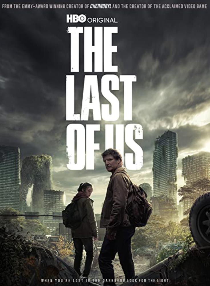
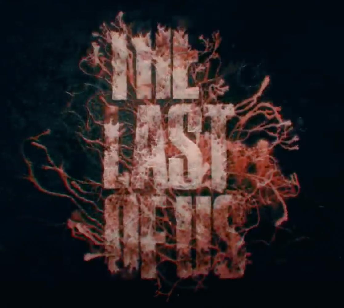
But enough of the dithering around our work—this is more of a complimentary observation on “The Last of Us,” which employs a particularly detailed approach to the link between identity and production design. As we’ve discussed in GIRVIN observations previous links between apocalyptic design and filmic depiction—for example, The Book of Eli and Terminator Salvation, the notion of a distressed character would be an obvious presumption. With all the people gone, or changed, everything would be, as it were, dissolute. It’s the wabi sabi æsthetic of the end of the world.
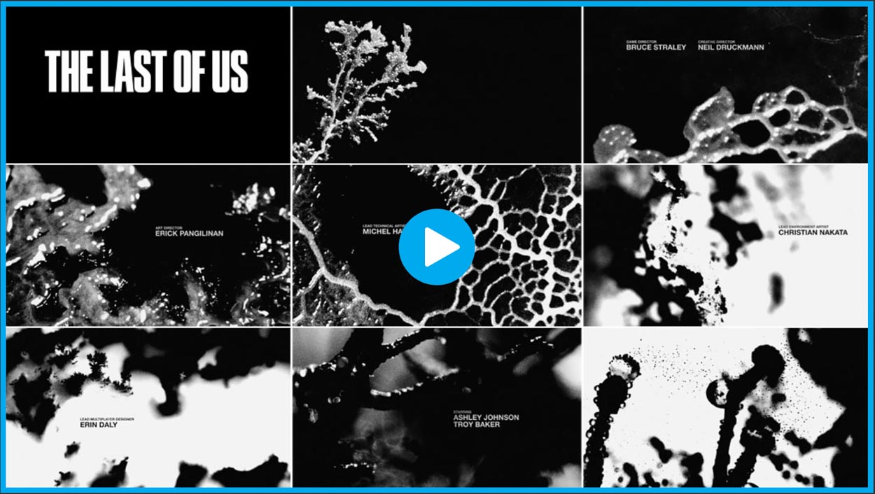
The alignment is particularly evident in the titling in the manner of the mycelial insinuations into the revelation of the logo-typography.
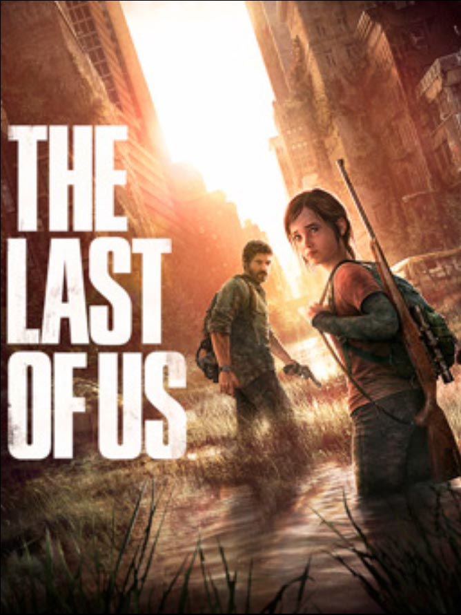
To anyone that knows the game, or the film series on HBO, the premise is one of an endgame—survival in a world besieged by a global “infection” of fungus—a spore-based dispersal of a deadly strain that turns the recipients into humanized, eukaryotic creatures, all collectively connected by the wide distribution of a mycelial network that keeps all infected in their connected, cannibalistic “community.”

Of course, as friends and consultants to mycologist Paul Stamets, [even discovering just one of these Cordyceps parasites in the forest on a shared jaunt, worth a watch—his sharp-eyed gathering!] the mycelial network is a powerful proposition—and true in our world.
Check out the link from titling design, identity and production—and mycelial—integration.
2013 Game titling
And production visualizations?
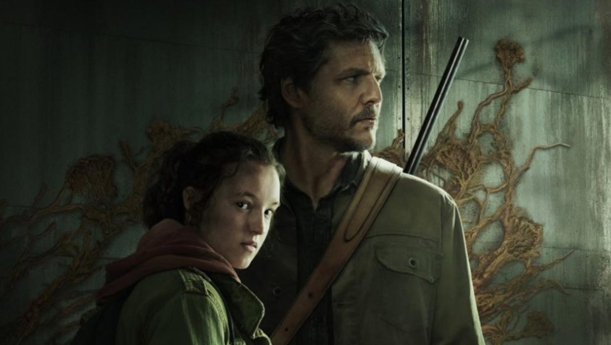
©HBO
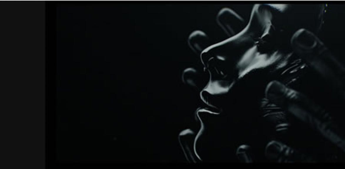
We’ve talked about other similar titling references—linking production design values to titling, as in:
What we do is to look towards integrative solutions—
intertwining sensations of *experientiality, even to
the notion of a synæsthetic postulate:
the intermingling of senses as one holistic storytelling.
More, rarely enough.
*Experientiality—design thinking founded on
a multi-sensory strategy of experience
development: integrated holism.
Onwards, in the quest for beauty
Tim Girvin | Principal, Founder and Chief Creative Officer
GIRVIN | Strategic Branding & Design
GIRVIN + OSEAN
Follow Us:
Facebook LinkedIn Instagram Behance
