For motion picture studio teams, agencies and theatrical producers,
I’ve been giving these workshop presentations as a proposition
to linking marketing strategy, brand storytelling and narrative illustration.
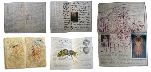
In a manner, thinking of movie logos, the identity offers a compression of the entire storytelling, it’s a key mnemonic for the community of movie logos. In our experience, movie goers often times recall the logo as a core remembrance, when asked to describe motion picture promotion—and, towards the notion of specificity and tuning—it’s GIRVIN’s experience to build logo treatments entirely by hand first, we draw them out, and settle on content direction by team notes and pages, sometimes in a journal. I tend to gather these up in a collected manner, in digitally collected summations that walk the process—which, in the end, shall be presented to studio clients as a working solution pathway.
That journal work is an experiment in layout, messaging, content tiering, palimpsest—and it’s precisely this kind of thinking that lends itself to linking storytelling, messaging, design thinking and visualization strategies.
Research.
Write.
Do.
Create.
In any project, my movement walks towards research—in the case of motion pictures, might be reading the script on set, meeting with the production team, the director, the actors. But more so, a further walk into history, other productions, literature, and paleography.
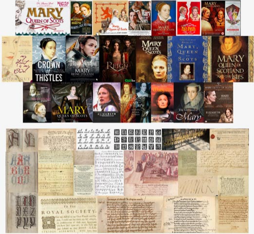
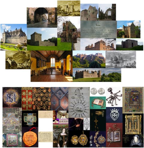
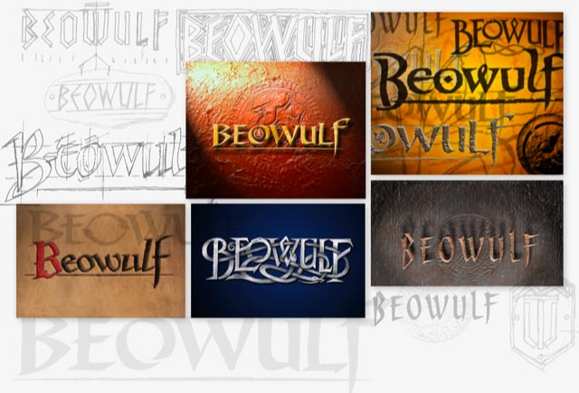
I walk these materials, start building art, configurational studies—all circumambulating the potential scenario; it’s never the repetition of a theme, but rather studying and building solutions that look at design thinking that examines distinctive and unique logotypographies.
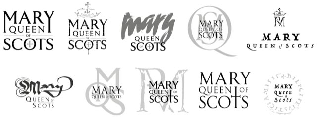
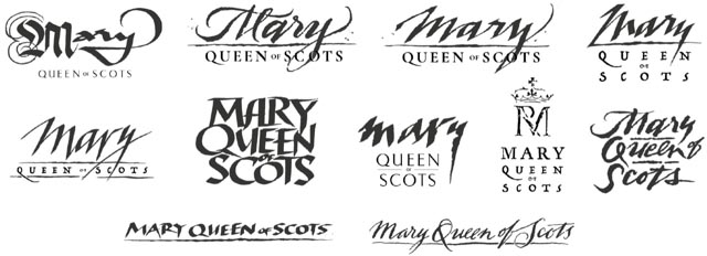
How do you illustrate the characteristics of

?
Read the script in a
locked room, on Lot, to start.
Could be that it comes out to the sublimity of classical restraint—
in this finalized pathway, a customized, proprietary font—we call it Girvalia.
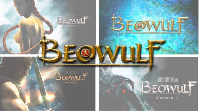
There are several marketing interpretations of this launch.
Including font treatments that bear no resemblance to this 1st century visual perspective.
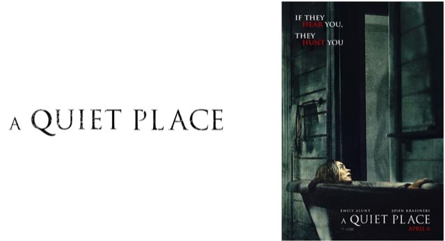
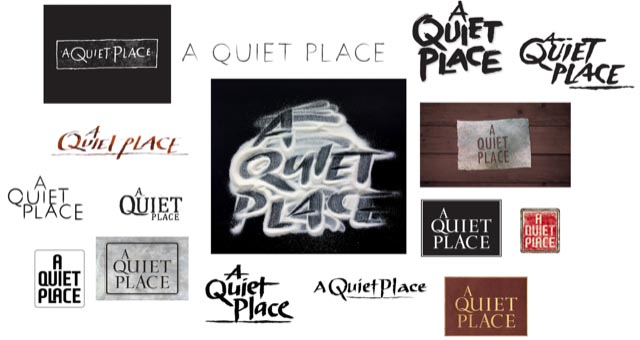
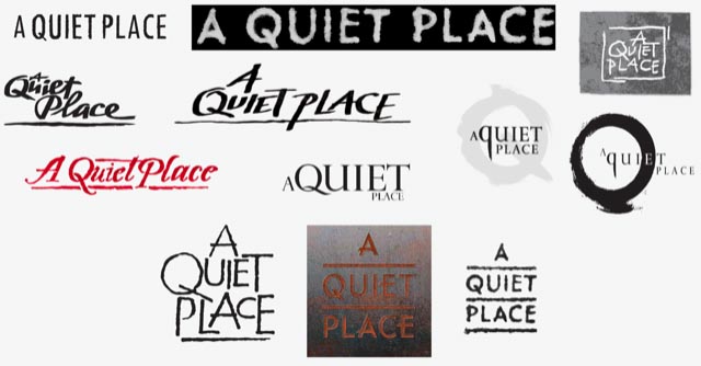
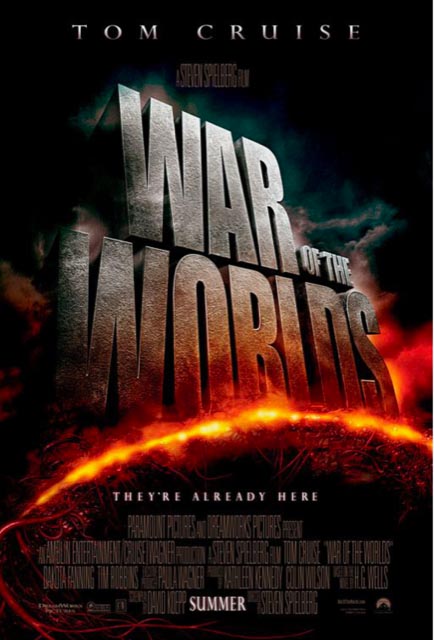
And what of an alien war, how could that be developed?
The journal renderings for Steven Spielberg and Tom Cruise,
delivered for discussion with the Paramount Studios production team
and studio theatrical marketing executives—walking palette and materiality.
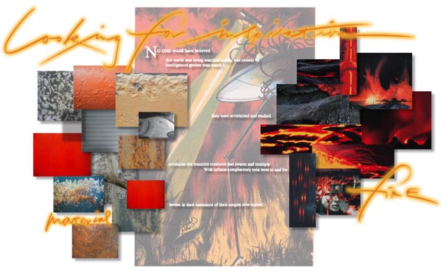
Preliminary look and feel renderings, gathered for discussion—a journal.
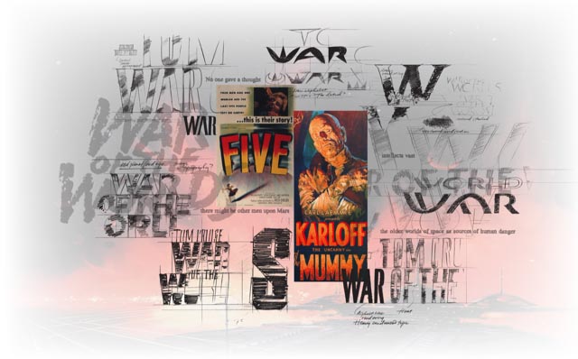
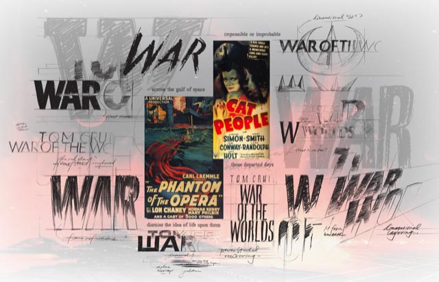
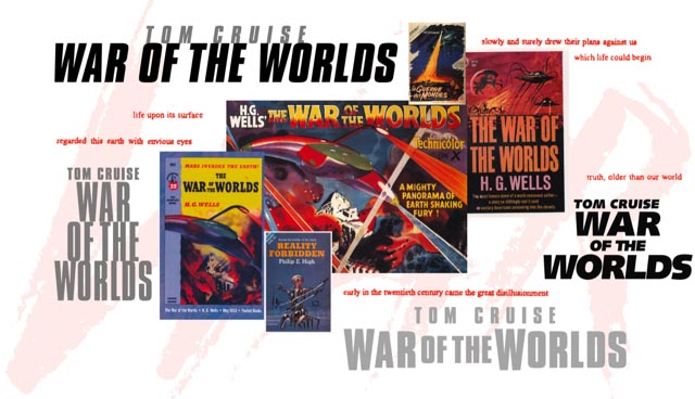
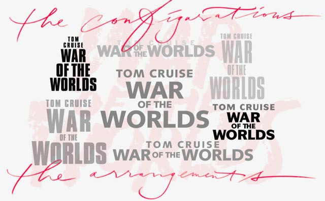
And materiality and dimensionalized renderings—still, the journal.
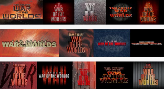
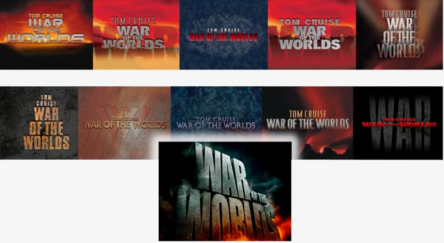
And, in all that journey,
what’s been,
evolves to the
what is.
What if one were to take that challenge and run back 200 years?
And in an entirely different aesthetic amalgam.

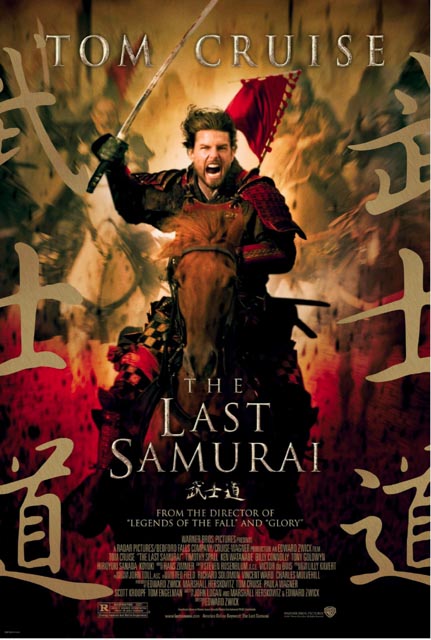
Working for Warner Brothers, aided by dozens of years of working in Asia, we were synced-up to work on this property with WB Studio theatrical marketing executives, again for Tom Cruise—who, too, we have history in supporting
the marketing of his efforts.
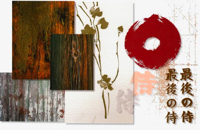
And with those characterizations in play—texturality, material intimations,
paper stock and traditional Japanese tools, coupled with
Western expressions in typographic history—the latter 19th century.
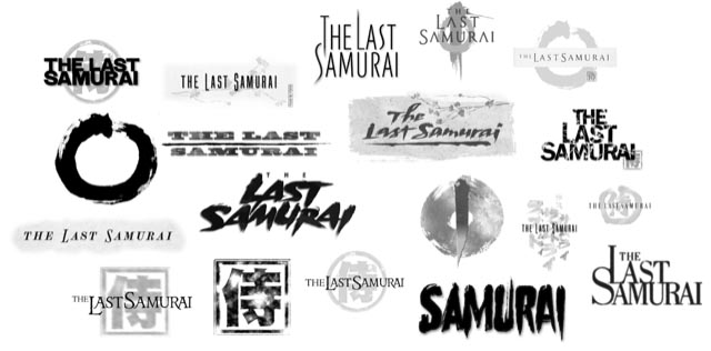
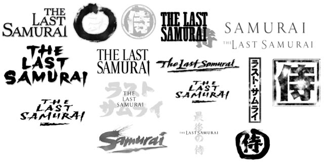
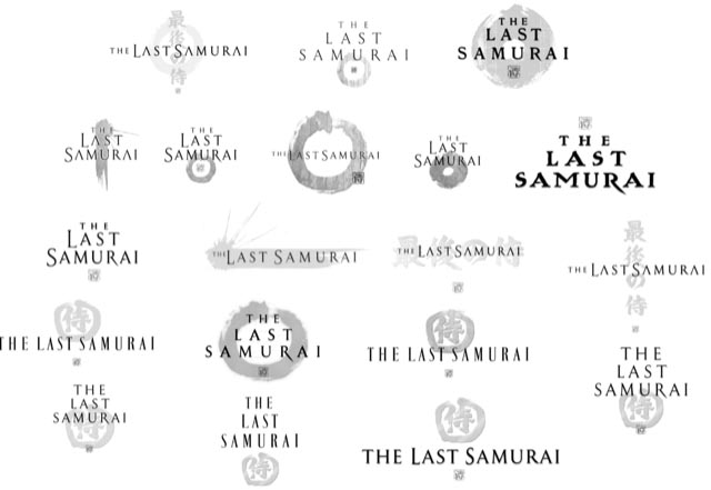
Coincidentally, for the director of the film, for Edward Zwick,
we designed his earlier efforts on “Legends of the Fall,” and “Glory.”
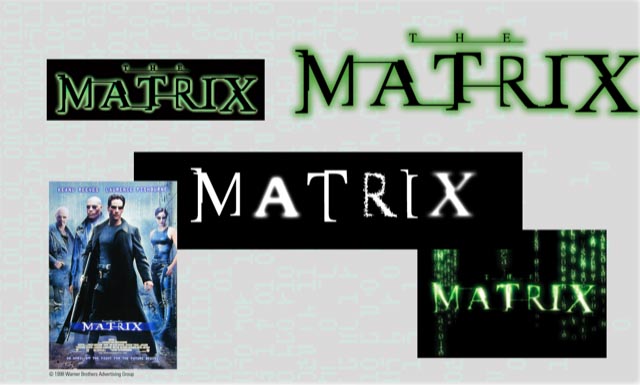
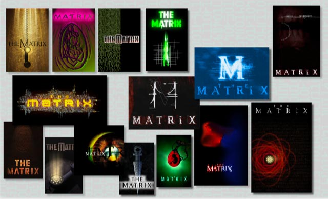
And speaking with the Wachowski siblings, working in Joel Silver’s office, just down the street from ,
so too—research, reading scripts, studying storyboards, studying production drawings
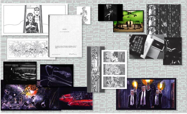
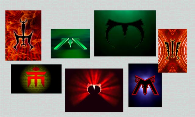
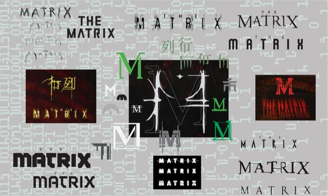
working with them onsite, on Lot, we walked around strings of ideas in live sessions—
as well as working remotely in Seattle, Burbank and LA, and too, Sydney, AU.
Typologies, monograms, devices and coded alphabetics—the rain of the Matrix code.
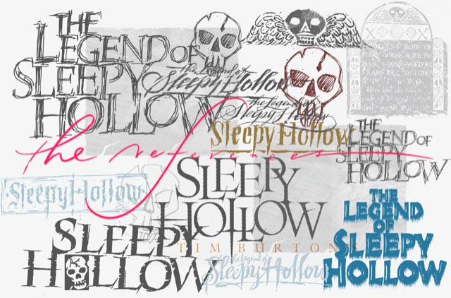
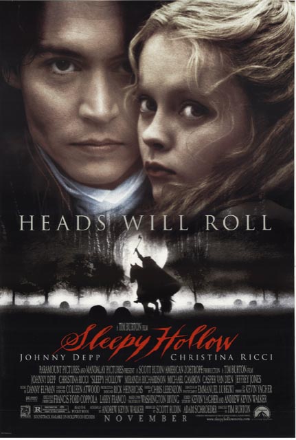
And more journaling, for Tim Burton. Period gravestones—
and the scripts of the period, production drawings from Tim,
and a scrawled emotional matchup—the 18th century.
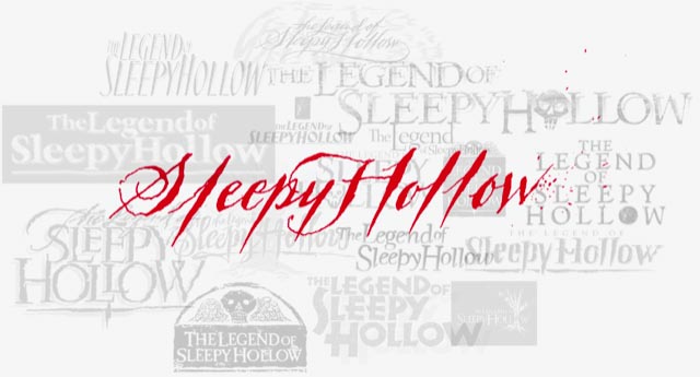
Time does tell.
And, to production planning, set design, digital environments—
working under the direct supervision of Robert Zemeckis,
walking around the perimeters of the film, and the presumptions
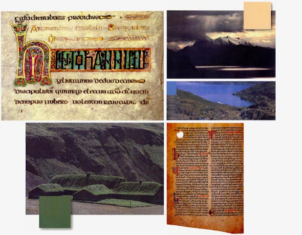
of 6th century paleography we gather palette, manuscripts and environmental constructs,
to draw a precisely-tuned, millimeter-by-millimeter rendering, with a symbolic, bejeweled sigil.
 ng
ng
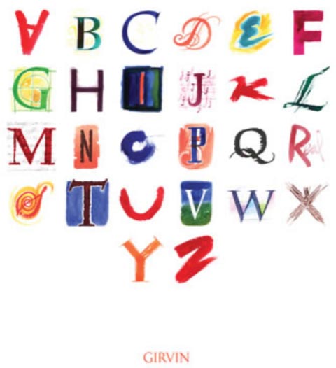
And in the spirit of lesson-giving, walking the notation of font work—what art drives the detailing of the alphabet?
There is something, of course, to geometrical thinking—but, as Paul Standard, a calligraphy aficionado from NYC, noted, “geometry can produce legible letters, but art alone makes them beautiful.
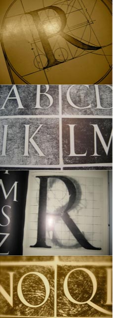
A base foundational commentary.
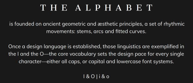
Notes on font detailing, vocabulary and structural notes
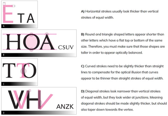
And taking those principles to font-related brand development—how could that be played out?
CBS under the direction of Susan Zirinsky.
Again, sketch conceptions working with Susan and her team.
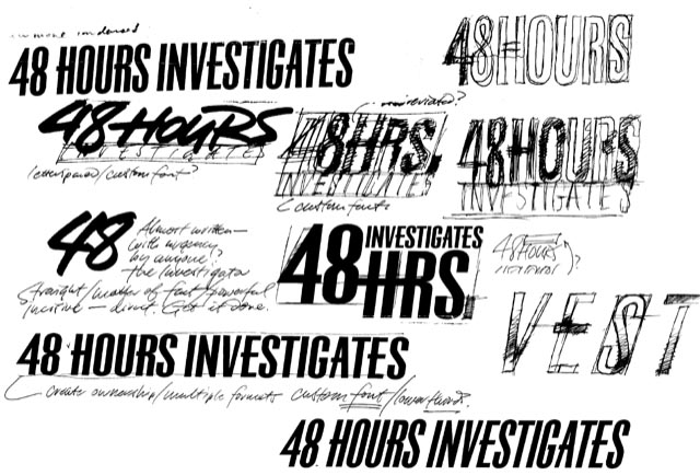
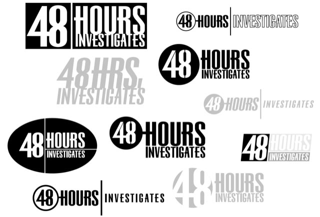
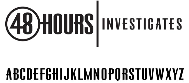
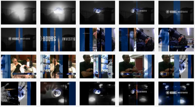
And the broadcast design for main title, lower thirds and interstitials.
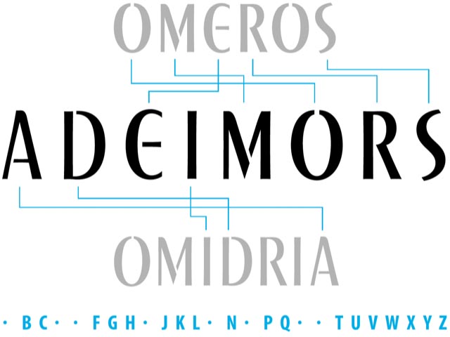
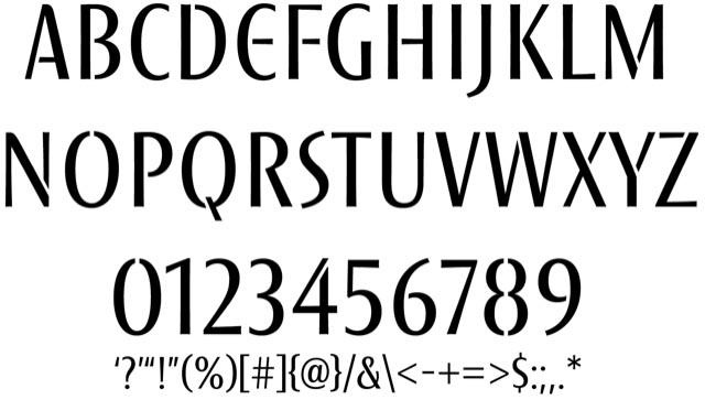
A custom font for a Seattle-based, international pharmaceutical group.
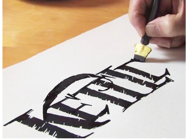
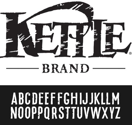
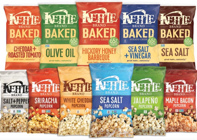
A handbuilt font for the Kettle Brand
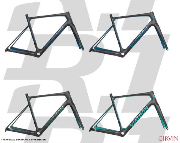
And a premium bicycle brand that we named and created for Walmart.com, the studies:

The master art.
The font system for bicycle labeling.
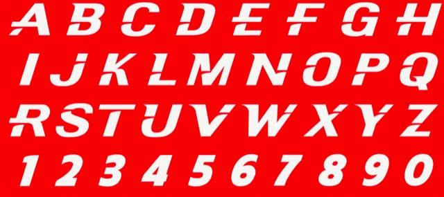


The core principle of alphabetic design lies in the characteristics of two core letters—the I,i and the O,o—
define those four and the discipline of the expressions continue to mobilize in
the genetic qualities of the rest of the letterforms, including numerals.
You might be wondering, what about more recent film logos?
I’ve referenced our dragon-related work, Godzilla, and Kong—and, too, Amazon Studios.
Looking forward to hear about your thoughts on font design.
Onwards with the journey
Tim Girvin | Principal, Founder and Chief Creative Officer
GIRVIN | Strategic Branding & Design
Facebook LinkedIn Instagram Behance
