Sky Captain, Hugh Ferriss, Raymond Loewy, Norman Bel Geddes and the implications of design in entertainment
Over time, I’ve had the chance to link with, and work for, extraordinary talent. It’s a blessing. And it’s a gift of the work — as a designer, working as a translator of intention, mystery, ideation and story. And it is all about the story — simple as a foundational medium of exchange. One story reaches to another; but really, the basic layering of how we connect with each other, on one level or another is about the story. I look for stories in influence — the inward flow of ideas, the fluency outwards of inspiration.
Hugh Ferriss
Raymond Loewy
Norman Bel Geddes

The Metropolis of Hugh Ferriss
I walk back.
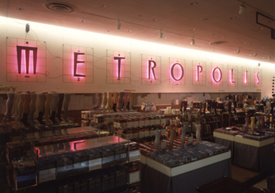
Doing retail drawings for Nordstrom, earlier in my career, I worked on creating hybrid campaign solutions. That might’ve been a name, an illustration, a piece of typography — always created by hand — it would be a bag, a sign, a holistic expression. I’d designed a long string of shopping bags. But, it was never merely that, alone — but bags that exemplified a thematic intention. for one: logo, bag, signing, merchandising, displays, ads, catalog; it was a thread of ideas, manifest in the place of marketing. That string of ideals during the 80s and 90s, newly aligned the concept of identity in place-making for Nordstrom retail; really, never before was there the cogent stringing of campaign theming that suggested comprehensive integration. But there were inspirations that tilted to the positioning of whole brand experiences.
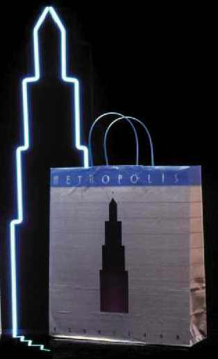
Symbolically, the building became part of the emblem that built that campaign — above, to the structuring of the campaign imagery throughout; and further below, the renderings of Mr. Ferriss, atelier.
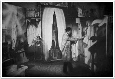
Ferriss in the studio
One of those campaigns was called Metropolis — and aside from the logo, the signing, the special alphabet, store interior design, packaging and installations, there was a grouping of drawings that I’d done as part of the packaging. Tiny little drawings. Dramatically lit, showing the place of the future.
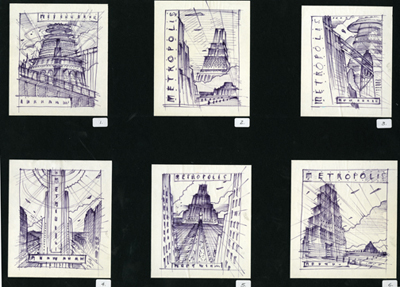
These tiny drawings became emblematic in my mind, since they represented the beginnings of a connection to Hugh Ferriss. That legacy lead me to an entire string of explorations of type, design and the heritage of that time period. The timing — from the beginnings of the 20th century, was aligned with other figures in the realm of design and visualization. Raymond Loewy the man who many called the designer of America — theatrical, industrial and production designer Norman Bel Geddes it was the combination of these talents — Loewy and Ferriss that created a kind of amalgam that lead to the raw inspiration of building the Metropolis campaign and merchandising program for Nordstrom. I needed no reference, I knew it.
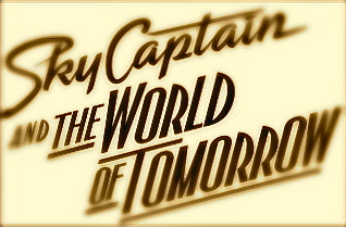
Later in my life, I got another call from Paramount Studios, and a friend, Kirsten Conran, to work on a project for her…brothers. Kirsten, a designer working in the theatrical advertising business at Paramount Studios, was working on a project for Kerry and Kevin Conran — one, Kerry, as the director; and Kevin as the designer. So in partnering with the family, so to speak, we worked together on the advancement of the brand for Sky Captain and the World of Tomorrow. Surely, during that time, several years back, the idea of a digital/live action composite mix to play on the stylistic expressions of the 30s was perceived as a kind of “wait and see” outcome. Avatar, of course, is now the state of the art in digital mixture of live and pixelated content. Reviews were mixed — still, there were some intriguing visualizations that literally spoke, stylistically, to both talents. And awards were had.
According to the detailed analysis of the film by the blog Radiator Heaven, linked below, “The film was surprisingly well-received by most major critics. Roger Ebert gave it a four star rating and praised it for “its heedless energy and joy, it reminded me of how I felt the first time I saw Raiders of the Lost Ark. It’s like a film that escaped from the imagination directly onto the screen, without having to pass through reality along the way.” Entertainment Weekly gave the film an “A-” rating, saying, “The investment is optimistic and wise; Sky Captain is a gorgeous, funny, and welcome novelty.” The New York Times observer, Stephen Holden, admired its visuals and its evocation of a bygone era but felt that “the monochromatic variations on sepia keep the actors and their adventures at a refined aesthetic distance… At times the film is hard to see. And as the action accelerates, the wonder of its visual concept starts giving way to sci-fi clichés.”
There’s a great deal more to the explication of the story, that’s been gathered in detail on other blogs, and I’ll offer the referential link here.
In terms of design ethos, to the linking of styling and production design, the intentions are clear. And in working with Kirsten Conran, as the project leader — as well as the team at Paramount Studios, Executive Creative Director, Lucia Ludovico and EVP Nancy Goliger, the goal was to push the edge of the marketing bridge as well as the production design and stylistic frames of Kerry Conran’s visioning.
To the background, studying the films visuals, as well as Kevin Conran’s careful time references, looking to nearly embrace the designing ethos of the Ferriss visioning, combined with the smoothed aerodynamics of Loewy and Bel Geddes.
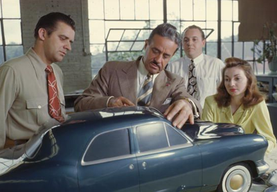
Raymond Loewy in his studio
The staggering of visualizations might be something along the string of these sensations, to offer a visual backup in construct. Of course the proposition — the promise — is the nature syncing messaging and imagery in a manner that not only links to the nature of the story being told, or rather the threading of context (what is the story and who cares about it?) Caring — they might remember — otherwise it’s smoke in the factoring of relevance. The nature of embracement is at the heart of the marketing work: does the song sing?
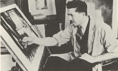
Ferriss drafting, Ferriss studio, Chicago
During the 30s, Ferriss’s architecture (and interestingly enough, while an architect himself, he really never had any of his work built) became a kind of standee to the imagery of the most impactful and powerful intimations of architectural form — and space, in the making of place. Numerous architects claimed that he was nearly the most influential of all architects — mostly in his ability to visualize the power of building.
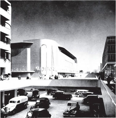
Bel Geddes streetscape
Bel Geddes and Loewy, as similar designers of industry (and industrial design) reached not only to the concept of production and cinematic design, but as well, influencing a kind of vocabulary of form language that found its way into the construct of the film visioning.
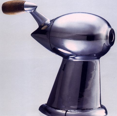
Loewy pencil sharpener
One might suggest — as part of the production values for the film — that the leading influencers rest in this trio; and our role was how to flip that positioning visualization back into the marketing. Being in the detective mode, in virtually every that we design — or market — looking for roots and inflection will lead itself to deeper, richer storytelling. But it might be even more specific, even more strategic, to detailing — studying the font language of a time, rebuilding it, for a new telling.
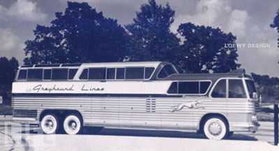
Loewy’s Scenicruiser for Greyhound Lines
To the nature of these interpretations, a graphic exploration, running from the production stills to the building of a grouping of marketing visualizations and identity development, intermixed in the construct of motion picture marketing, lead by a member of the family, Kirsten Conran herself.
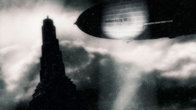
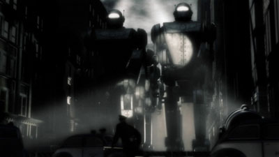
The grainy mists of compositing frame the sepia character of the film, allowing for color-sparked impact highlighted details.
Like: lips.
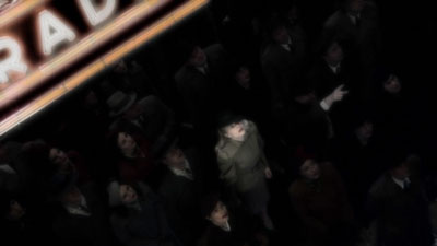
And spotlit robots.
For us, the development of identity reaches back into the place of authentic interpretation, as much as might be allowed, or is relevant to audience narrative. Anything, to Girvin identity, is based on the handmade. Tagged, ruled, rendered:
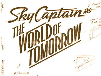
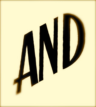
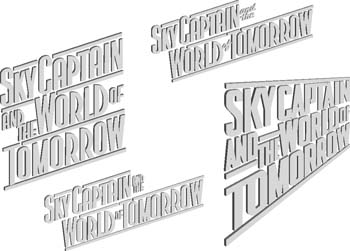
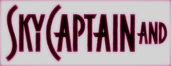
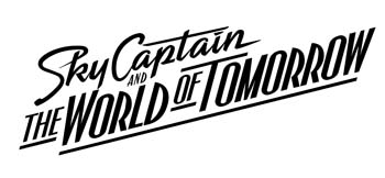
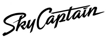
Composites and details emerge, as well as the concepts of material and dimensionality.
Like steel and shadow — building basic font languages, then extending them to other structures.
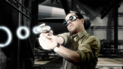
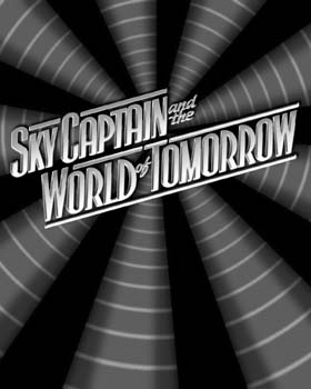
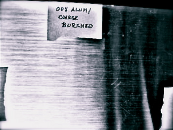
Materials are shot, built, sampled — then integrated and applied to art elements in exploration and development.
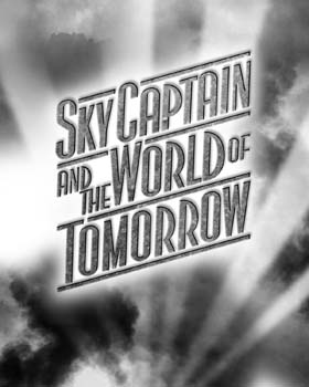
These alignments, explorations, continue, along with writing, to build on the construct of story told and audience engagement. And the culminating alliance between the spirit of the period, the digital interpretations, the building of those worlds, and finally the integrated thematics that link campaign to cinematic lineage.
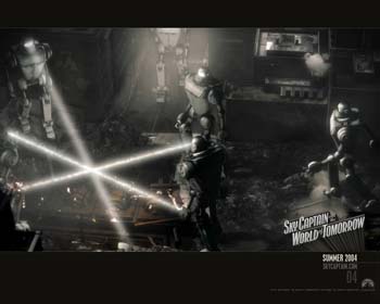
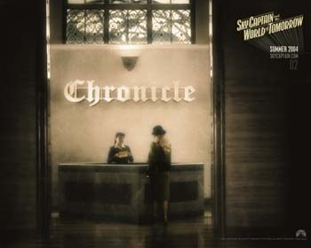
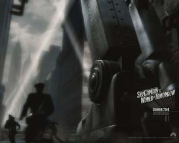
Teaser marketing sets move to one sheets and the campaign is built.
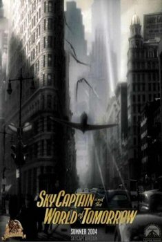
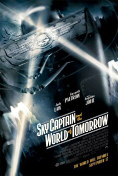
To the mists of time, going back, that’s the point of my fascination — aligning timing, context, storytelling, visualizations and strategy in marketing proposition. Gathering some stories on a positioning of the new Metropolis, caused me to reach back to the heart of an earlier inspiration, for Nordstrom (and even later, Bloomingdale’s) in finding the dream of another time, another vision that could newly found the evolution of the world as a bright, well-organized and beautiful place. Doing that — recalling Ferriss, Loewy, Bel Geddes and others, I recollected, too, the inspirations of the Conrans, and the story of brand development, intertwined in history, with them — their family enclave — and Paramount studios.
onward and upwards — tsg
….
Exploring the human brand — in cinema and entertainment:
Eastwood, the Conrans, Stone and the Wachowski Brothers
https://www.girvin.com/subsites/humanbrands/
the reels: http://www.youtube.com/user/GIRVIN888
girvin blogs:
http://blog.girvin.com/
https://tim.girvin.com/index.php
girvin profiles and communities:
TED: http://www.ted.com/index.php/profiles/view/id/825
Behance: http://www.behance.net/GIRVIN-Branding
Flickr: http://www.flickr.com/photos/tgirvin/
Google: http://www.google.com/profiles/timgirvin
LinkedIn: http://www.linkedin.com/in/timgirvin
Facebook: http://www.facebook.com/people/Tim-Girvin/644114347
Twitter: http://twitter.com/tgirvin