How to plan and design a menu?
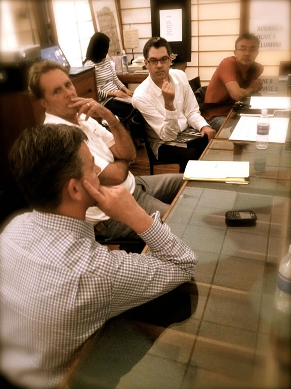
Key is close collaboration — and knowing the diner, the experience strategy, the character of illumination, stylistic consciousness, and the budgeting of items in relation to the financial strategy of the brand.
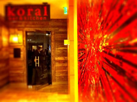
A menu, like the procession experience — the guiding route into a restaurant — it tells a story.
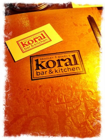
Designed to be holistically synced to the system — Koral experience design.
In our experience, working directly with chefs, like Bradley Dickinson and operational strategist Mikel Rogers [shown above,] co-founders of Pearl and Koral, as well as our earlier work with Kerry Sear, Four Seasons — Terry Heffernan in NYC, partnering with team leaders at Schwartz Brothers [on a string of their restaurants]– even talking menu concepting with legend Sirio Maccioni, during our times working with him in NYC — the messages and languages of the meal offerings are a tightly studied affair, coupled with thoughtful detailing on how the meal should be organized and described. The menu should be an attribute of a holistic expression — disciplined to align to the language of the brand.
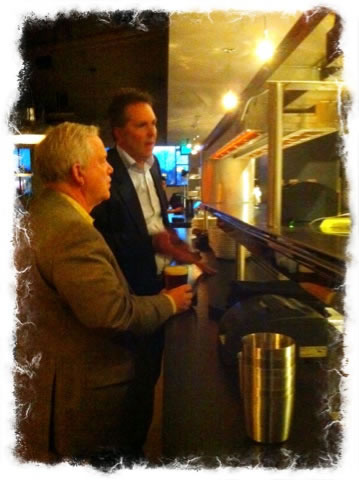
Any good restauranteur knows how to talk up
the story of his brand, his experience offerings —
and will be the key architect of the menu
What is the scale of the menu means not only how big is it, but how does it fit on the table? To size and placement, would it be contained in the examined and planned perimeter of the diner’s experience circle? Or is it large enough to stand outside that ring of connectedness that a diner feels in their place at the table, with co-guests and in the larger intimacy of their sensation in place?
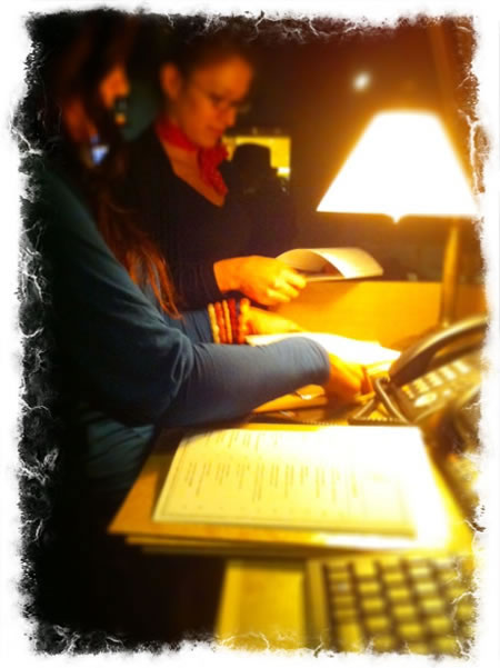
Team preparing the beginnings of the experience,
daily-built, customized menus and messages to guests.
A big menu is hard to deal with — and can become a kind of guest barricade — let alone staff management of big bulky folios. If the menu is exquisitely small and precious, too tiny, and people will literally bring out magnifying glasses, lighters and penlights [or tipped table candle lights] to simply see what’s been offered.
Printing ease, and paper template formatting, is another critical concern — to the nature of daily offering changes — in our experience, we often will spend time working closely with restauranteurs on their IT / print system to assure that our planning and designs are easier to manage — hands on, they can be rebuilt easily, every day.
Below, see another published overview, some added comments to explore —
ranging from structure, language and design,
gathered from perspectives all over the US,
restaurant-side, consulting-side.
Tim | Decatur Island Studios
The Strategy of Holism | Restaurant Experience Design
TouchPoints, Storytelling and Guest Engagement
Restaurants’ menus are more than just lists of dishes
Words that make mouths water are vital to an eatery’s success.
BY MARY BLOCH
Special to The Star
| Sometimes it’s hard to put a finger on exactly what makes a restaurant stand out from the pack.Great food is the obvious answer, but there are other subtle factors at work that are most easily summed up in the menu. Since diners don’t parade through the kitchen for a look-see before ordering, the words used to convey how a dish is prepared and how it will taste are at least as important as the food that appears on the plate.
American food culture has come a long way from the simple menu that lists food items and prices. Today’s menus serve as a connector between the diner, the food and the dining experience, and creating menus with the right look and feel for a particular restaurant is more complicated than reciting a list of ingredients. “A good menu should make you hungry,” says graphic designer Armin Vit, a co-founder of Under Consideration, based in Austin, Texas. “It should get your mouth watering. Hopefully it does it in a cool-looking way.” Although Vit does not specialize in restaurant menu design, he is a fan and devotes a portion of the company’s website to menus gathered from restaurants from around the world that he thinks offer best-in-class examples of typography, illustration and graphics. The art and science of menu development has become big business. When Matteo Bologna, a New York City graphic designer who develops menus for some of the country’s top restaurants, brainstorms with members of his firm, Mucca Design, he throws out words like “strategy,” “identity,” “goals” and “solutions.” “Menu creation doesn’t happen in a vacuum,” Bologna says. “We’re all about the branding — a complete 360 degree experience. It’s our job to express the soul of the place and to make the customer feel comfortable the minute he or she sits down. The menu should be perfectly incorporated with all of the other elements of the restaurant to project the space.” That’s why Bologna, who worked on Keith McNally’s French bistro Balthazar, insists on having a chef on board before he dives into a menu project. It’s hard to design a menu without knowing, for example, the number of appetizers, salads and entree offerings and any specialties that the kitchen plans to highlight. And there are also more subtle and sometimes less obvious elements of menu design, which Bologna refers to as the “message” that the restaurant must convey. Inspiration for those subtle design elements can come from unlikely places. Menu guru Douglas Riccardi of the New York design firm Memo, who has worked with such high-profile chefs as Mario Batttali, sometimes finds his inspiration while walking the streets of New York. Other times something in an art book triggers an idea that puts a different spin on the message that the chef or restaurateur envisions. |
 Photo illustration “A good menu should make you hungry,”says graphic designer Armin Vit, a co-founder of Under Consideration, based in Austin, Texas. “It should get your mouth watering. Hopefully it does it in a cool-looking way.”Common Menu Mistakes • Trying to save money by creating the menu in-house: “If you hire a chef to cook the food, why wouldn’t you hire a graphic designer to design the menu?” asks Matteo Bologna of Mucca Designs in New York City. • Not giving the staff adequate tools to sell the menu: At Lidia’s, executive chef Dan Swinney leads tastings for the staff, and a menu guide is available online. The guide is a running catalog of all the dishes the restaurant serves regularly and supplements the menu tests that servers must pass before they go on the floor. Similarly, Story’s general manager writes up a verbal description of each dish, detailing cooking techniques and ingredients that the servers can refer to as needed. • Opting for a verbal rather than a printed menu: Washington Post restaurant critic Tom Sietsema finds the practice of a server offering 15 daily specials (and not printing them up on a menu) “obnoxious,” especially if more than three dishes are being offered. A long recitation is not gracious or hospitable, and it forces the diner to work too hard at what should be a relaxing experience. • Trying to execute a menu that’s too big: Rambling menus show a lack of focus by the chef, Sietsema says. Practically speaking, he doesn’t want to have to study the menu for so long that he ignores his dinner companions. • Offering too many disclaimers: Some are advisable, but Bologna, who is Italian, thinks the American way of adding disclaimers at the bottom of the menu is ridiculous. “Who doesn’t know the coffee you order is going to be hot?” he retorts. • Forgetting to proofread: According to Sietsema, grammatical or typographical errors signal carelessness. “If there are that many typos, can the chef cook? Such lack of attention to detail shows a carelessness that could spill over into the kitchen,” he says. • Forgetting to test-drive the menu: Sietsema finds that a number of factors determine whether you want to sit down and order with abandon. Comfortable chairs are a must, but if the lighting is too dim to read the menu, the menu’s paper stock is too dark or feels cheap, or the font used is too thin or difficult to decipher, sales will suffer. |
Along with satisfying food, these distinguishing elements might subconsciously draw patrons back to a restaurant.
Of course, menu design experts know that restaurateurs and chefs aren’t always as caught up with the menu’s look as they are, and it’s easy to understand why people running restaurants are more focused on the tangibles, like the preparation of dishes and the selection of ingredients. Yet the feeling that a menu or a memorable logo can generate is often just as important in determining a restaurant’s ultimate success.
• • •
In a society approaching information overload, deciding what to edit from a menu can be tricky.
“I want people to have what some would consider too much information,” says Ted Habiger, co-owner and chef of Room 39. “Sometimes when I’m dining out, the meal is nothing like how the menu reads. And sometimes it reads better than it actually tastes. That’s a pet peeve of mine. I try to write the menu so you can practically taste the way it’s written, and you’re not going to be surprised by it.”
At the other end of the word spectrum is Carl Thorne-Thomson, of Story in Prairie Village, who labels himself a minimalist. “I just put key words down and let the diner begin to imagine what the dish will look like,” he says.
His approach works as long as the servers are well-versed in the menu. “If you leave a bit off, it serves as a conversation starter at the table with the restaurant representative, allowing the server to interact with the diner,” he says.
As a general rule, the design experts suggest that if a restaurant’s fare is simple or casual, the menu description should be as well. They also advise that a menu not be cumbersome. Some upscale restaurants use too many words and more flowery language than a diner cares to digest.
Tom Sietsema, the longtime restaurant critic for The Washington Post, has read his share of restaurant menus. After all, he eats out 12 to 13 times a week. “There are so many ways to pull readers into a menu or turn them off,” he says.
Sietsema is not a fan of surprise ingredients that people tend to love or hate and that are in a dish but not listed on the menu. Cilantro, for instance, repels some diners, while chocolate usually excites them. His point is that patrons should be made aware of these types of ingredients before placing their orders.
Nor should the importance of adjectives be underestimated. Sietsema recalls Danny Meyer of New York’s Union Square Hospitality Group using the term “torpedoes” and “rockets” to illustrate how menu descriptions can sway restaurant patrons.
Rockets are adjectives that attract diners. Examples are “grilled,” “homemade,” “organic” or wood-roasted.”
Torpedoes, on the other hand, are descriptors that keep people from ordering a particular dish. “Crispy” might indicate that the item is “fried,” while “poached” or “steamed” might lead diners to think the dish is boring or tasteless.
Increasingly, seasonally driven menus tout locally sourced ingredients that are available for a month, a week or a day, depending on supply. Room 39 highlights the purveyors of its produce, meats and cheeses. And just how these locally sourced foods are positioned on the menu is carefully considered.
“We don’t put it all over the menu,” Habiger says. “The top part is dedicated to one farmer every five or six weeks, and there’s an ever-changing list of our daily sources on the side.”
• • •
When executive chef Dan Swinney arrived at Lidia’s, it was during the pre-computer revolution, an era when it took two months to get a new menu typeset, proofed and printed.
“Technology gives us the flexibility to print our menus in-house,” he says.
Lidia’s produces special menus in-house all week. Monday night is Meatless Monday, Tuesday is Tuscan Grill, and both of those are produced that day based on what the chefs decide to cook. The restaurant also produces private party menus, customized for each event.
“It’s amazing to me that more people don’t update their menus daily now that it’s not a big deal to do it,” Room 39’s Habiger says. “We can just take a dish off the menu if we run out of certain ingredients, and if there’s a typo, it’s gone in 24 hours.”
Menu designers Riccardi and Bologna strive to give their clients similar flexibility by providing a menu template that the restaurants can update themselves as often as it suits their needs. But chain restaurants are typically not as nimble as independently owned restaurants.
National brands are increasingly turning to Kansas City’s own Trabon, a 60-year-old family business. Though it started as a small printing company, Trish Balmos, vice president of marketing, says 70 percent of Trabon’s business now involves working with national restaurant chains, including Applebee’s, California Pizza Kitchen, Red Robin and Capital Grille.
In the early 1990s, Trabon developed a centralized menu data management system that allows clients to go online and manage each version. Since Trabon has both print and technology divisions, it can match its clients’ menu information with an interface to increase accuracy and consistency for all locations, an especially critical feature now that more states require nutritional information printed on the menu.
Ultimately, menus can be an important real-time tool for a restaurant’s bottom line, which is why Robert Sobieraj, instructor at Johnson County Community College’s Culinary Arts program, teaches his students how to cost out a menu. “It’s your profit plan,” he says. “You have to be sure that what is being ordered will make you money, or you have to make some adjustments.”
Sobieraj drills into his students the necessity of changing the menu daily as a way to control costs and react to market factors like inflation, a drought or what’s in season. “The smaller the menu the more control you have over expenses and inventory, and the better your ability to prepare the actual items on the menu,” he says.
Story’s Thorne-Thomson knows he’s making his bottom line when the entire menu line-up sells well. “Not all of our dishes will be best-sellers,” he says, “but we sell enough of those to keep them on the menu for diners. … And if our patrons like what we’re doing for the most part, they’ll keep coming back.”
But perhaps the best barometer of whether a menu is doing its job is when patrons sneak them into their purses. “I knew I had succeeded when customers started stealing the menus,” Bologna says.
Mary Bloch is a freelance writer who lives in Kansas City. Her blog is AroundTheBlockKC.com.