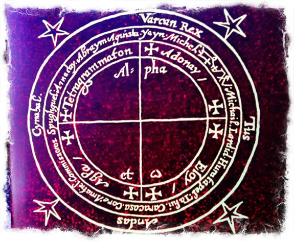
Strategic Magic, Designed Mysticism, Metamagical Thematics.
It’s been said that illustration,
the real meaning of the word is a shining —
to illustrate is “making bright.”
But also — to purify.
The image above, a sigil of the Heptameron Arbatel,
Peter de Abano, 1575.
In a manner, thinking about illustration as a craft of communication suggests change, a new, evolved formation, a transformation. The idea, by process, becomes purified.
Extending that thinking, alchemy comes to mind —
a metaphor of bringing various baser elements to make something far more valuable. It is also about transitioning, portal-making and portal opening — designing doors, designing planes, transiting to others. Doors open, new planes appear — you’ve gone from one place to another — you were there, and now you are here. Something has changed. Your perception, your psychic state, your physical condition — you’re different. You’re seeing new things.
Everything has changed. And that change, that magical transitioning, that alchemy of the caldron of the new — the trans-formation, the crossing of form — one plane, to another.
Therein, the sigil and the signature
of design, an alchemical signal.
Have you ever heard — “wow, I just love that,
it’s magic.”
That could be a place,
a visit, an experience,
an object, a product, a person.
Not so unusual, that word, when you consider that
Apple positioned the iPad as a “magical” device.
Like lustre and lustrous, to illustrate an idea is to make it brighter, to make it shine.
Shining, like epiphany, is a slip to another world,
it’s the other side of “not-shining” — it’s darkness.
See more, it’s “light.”
A transformation is the
movement from one form to another —
it was something,
now it’s something else.
It’s a change.
One “thing” becomes something different and distinguished in a new way.
I think about my work, as a designer, a draughtsman, calligrapher — a brand scribe of strategy,
and I look in,
look deep to the meaning told there.
What is a sign?
A logo, from logos, is what?
It’s a bridge from voice and message to
a graphical meaning.
Logos, of course, bolsters name and word —
which is a voice, called.
Evocation.
Vocation.
Evoke.
Call
forth.
I’m not asking you along, but perhaps you’ll come.
Think of sign, signal, sigil, signature – what, to your take, ties them together?
I’ve been thinking about the craft of the work, designing as something more. A CEO of a client brand offered — “if you’re talking about magic, there are theories of view. She notes, “Modern perspectives on the theory of magic broadly follow two major views. The first sees magic as a result of a universal sympathy within the universe, where if something is done here a result happens somewhere else. The other view sees magic as a collaboration with spirits who cause the effect.”
She voices, too, the power of networking communications and the spirit of culture. Great brand culture is cult-like.
It becomes a code that binds, perhaps like a spell — a binding of talk, a telling — that reaches back to voice.
What is the telling of the story — what voicing, told?
Why would the listener be bound?
Like a chant, that draws one in —
deeper; it’s enchanting.
Charm-ing.
For me, there is huge influence in the mystery of the work, the ancient legacies of the meaning of design — that tradition of study for me started in my childhood.
But
I’ve talked about that
already.
A mark is a mark — but the meaning of a mark is more — a stroke drawn is something more than a line. A circle is more than a curve. A box, a star, a crescent — a circle in a circle, a circle on square, a star on a star, a star in a star — these aren’t just marks, unless you’re asleep.
My journey to the study of symbols began in
a darker magic,
when I was very young, 10 years old, actually — \
then went deeper to the roots and the why,
if there is dark, why?
And what to the Light,
that emerges from the dark?
The leylines of symbols, struck in line and ancient psychic cartographics, become a kind of mapping, one place to another – a signal, a sign, is pointing the viewer somewhere, but where?
It’s been said that drawing a line is
a break in reality,
that such a stroke transects planes, and worlds,
and consciousness.
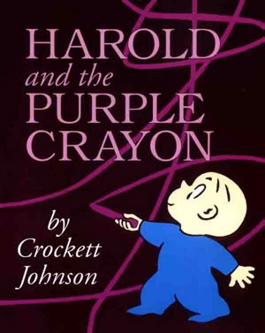
As Harold and the Purple Crayon might attest.
The first stroke of many alphabets
has been thought of as
a earth | light splitter —
the the Hebrew aleph, the Arabic alif, the Greek alpha.
As any lover of The Matrix
might attest, the concept of a layering fabric
of an alphabet, coding the reality of
the other side is
a legendary proposition.
We worked on
creating that alphabet for
the Wachowski siblings.
As a young creative, a big influence for me was Harold Balasz.
If there ever was a “maker,” he is it.
I was struck by a kind of organic symbology,
and wondered after its provenance.
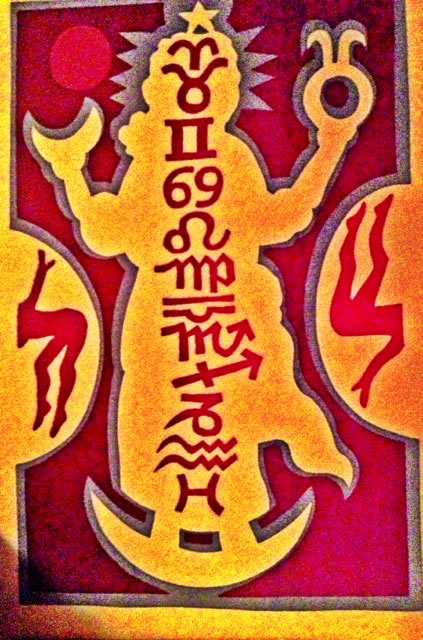
This goddess, a gift to a friend,
shows the graphical curling and “paper-cutting” of his work, in print form.
He uses this same handmade character in
enamels, sculpture, anything he can lay
his mind, inspirations and hands on.
Print by
Harold Balasz
Exploring further, during teen-aged wondering,
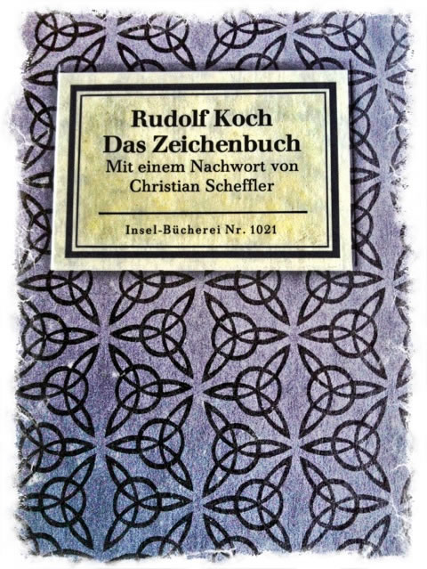
I found Rudolf Koch.
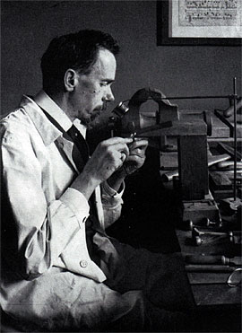
Koch was a German designer, craftsman, font maker, and publisher.
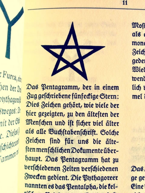
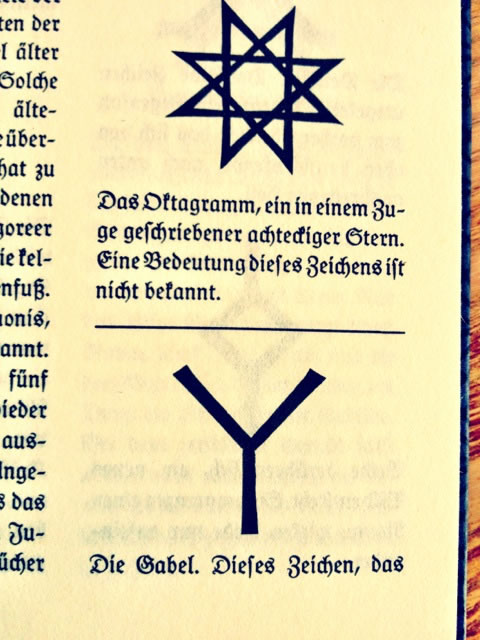
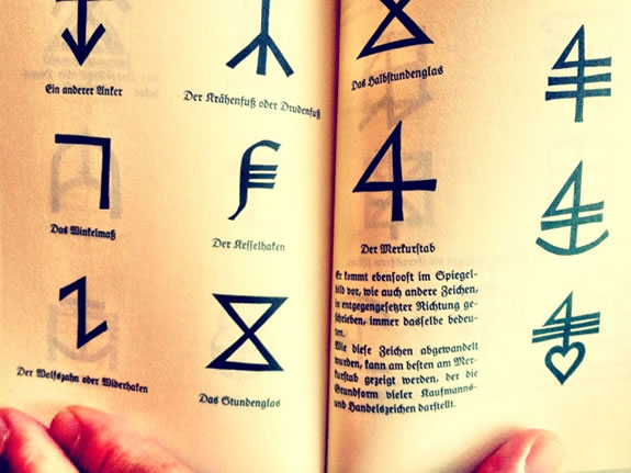
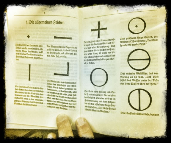
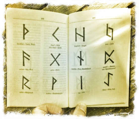
His Zeichenbuch — “Symbol Book” shows through that
character of a graphical treatment of symbolic forms.
I found a copy of the original, published as a kind of tractate of symbolic forms,
graphically interpreted as woodcuts. Fritz Kredel was part of the Koch workshop during this time,
a master of such skill he was tied to the reclamation of Dürer works.
These graphical treatments influenced my explorations, and below, a gathering of images from
the Girvin Rare Book Library on design.
The notion of a mark — a signing as a signal, what are called “sigils”
are markings that act as portals:
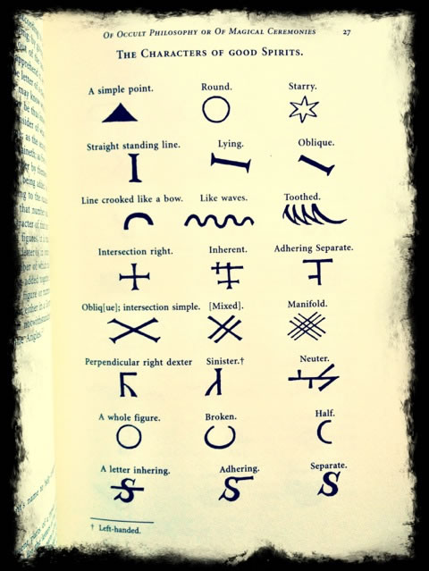
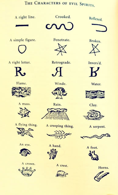
While this might be seen as a far-fetched leap — to the spirit and nature of design,
the point comes to an apex of belief.
When you design, what — really — are you doing?
More so, what do you
believe
that you are
doing?
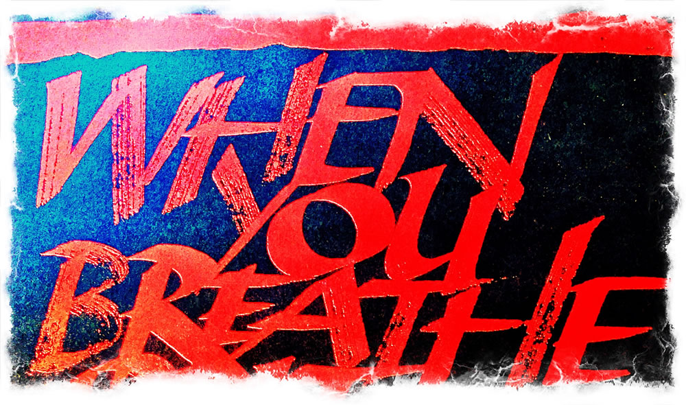
Conveying an idea that is a “conveyance,” it’s a rendering that takes the viewer somewhere, into the culture, the inner vibe of a collective mindset of people, what they make, what they offer, what story they tell, what it feels like, what actions are continuously framing that story in the authenticity of process and works in motion.
Design is a translation, from one language to another — it’s a conjuration; it calls something forth,
it brings a new seeing of spirit out.
Magic, a new beauty, perceived.
A scribble, a geometry
can mean.
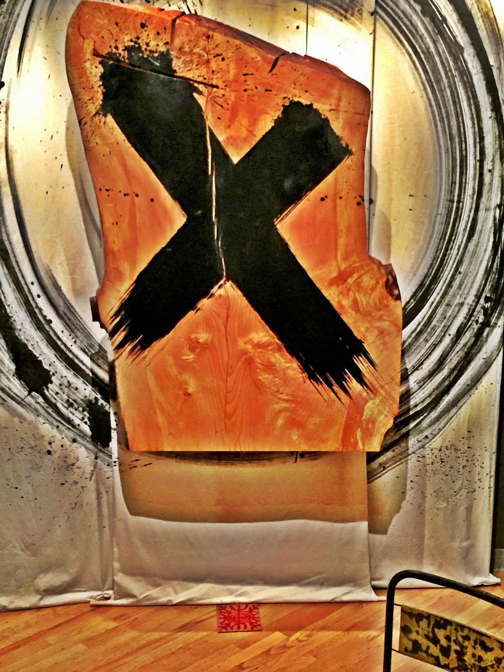
And in the arc of mean,
the meant of mind,
conjures
memory.
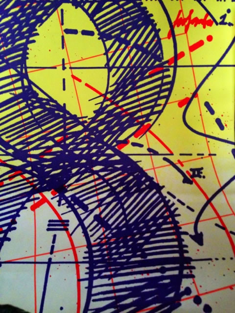
Girvin | Bloomingdale’s
Without memory and re-collection,
what’s the point of the work?
Without memory, and emotional reaction,
nothing will be held.
And if your work is forgettable,
then you can forget about it.
The mission,
the promise of the work,
is lost.
Tim
F i r e s t a r t e r & S h e p h e r d
B R A N D M Y S T I C I S M | Deep Journeys to Team & Enterprise
D i s c o v e r y: http://goo.gl/DNfwS9
HUMANS, BRANDING + H E A R T
GIRVIN BrandJourneys
http://goo.gl/iyQIzK