Palaeography, design, historical context and the imagination
Theatrical identity design
We didn’t work on the movie Thor. In about twenty years of working for Paramount Studios and Warner Brothers, in particular, we’ve worked on literally hundreds of identity design programs — and perhaps, in some instances, our role has been to link to the creative leadership on the film — theatrical advertising and studio executives (from the CEO down to production managers), directors, producers, production designers to build a powerful link between identity and motion picture entertainment management and promotion. This process can involve months of work, film site, studio, edit suite visits, secrecy and shifts between marketing strategy and raw instinct — we’ve been there, done that.
The key to aligning visuals with storytelling, especially in the emotive power of motion picture telling, might be the notation of authenticity in building brands that speak — in the realm of imagination — to depiction. What is the story, how is it being told, what is the voice, and who would care?
The point to style would lie in the sense of production design — and in identity — the intimation of holistic “style” for the film, the production and set design can influence everything, along with the cinematographic strategy. Who’s shooting it — how will they be filming this production? Story, actors, production values and design, cinematic voice and pacing, and finally the approach to marketing.
Marketing films can be an object lesson in listening — considering the nature of the storytelling in the character of the receiving audience. That can be focus studies, consumer analysis, testing and screening, building communities socially in advance to feel out the premise.
Being a student of evolving motion picture practices in marketing, I was watching the evolution of the marketing pitch for Thor, particularly given Kenneth Branagh’s involvement — a director and actor that is profoundly skilled. There is always a challenging bridge between graphic novels, comics and theatrical interpretation — that could be the string of comic book heroic efforts of recent years (and even going decades back) to even the alliance between storybook comics, heroics and conventional live theater — (from Lion King to Spiderman).
Thor might be the crossing guard between ancient mythologies, comic books and the presenting technology of today. I enjoyed the film — in fact, I took the whole office to see it in 3D. I found the story to be intriguing, and I admired Mr. Branagh’s solution in thinking through the story, as simplistic as it was, to the heights of adventuring that he’d orchestrated.
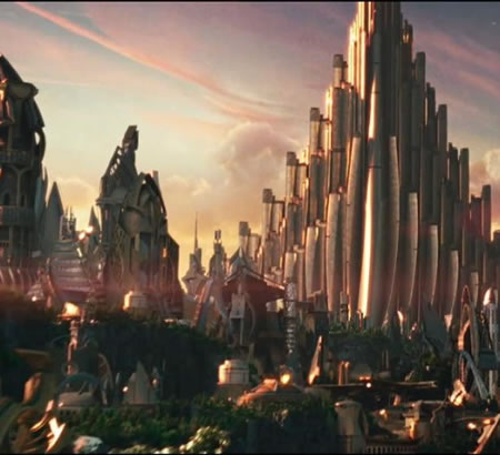
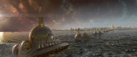
I did have a couple of questions about the strategy for the production design — the sleek, rather OZian kingdom of metallically clad buildings, war-rooms and promenades. While there might’ve been some theory about the styling of the film in terms of Norse love of high sheen, perfected and polished gold, it’s not something that I’ve observed — pardon — historically: in art history or palaeographically.
That doesn’t mean anything — I don’t know Valhalla — expecting historical alignment. This is the land of the Gods, so it’s got to be shiny and beautiful. To Branagh’s imagination — yes; his founding pitch — story treatment, personal reading to stylistic architectures was a run between Frank Lloyd Wright and Santiago Calatrava.
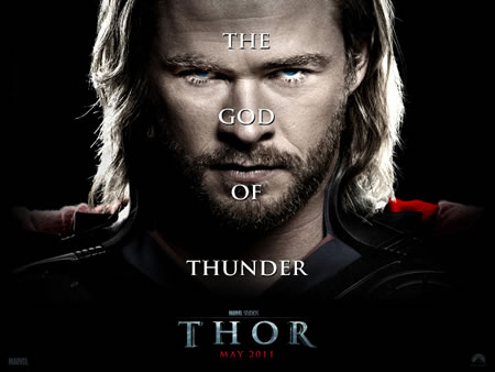
That strategy might be another aspect of the approach to marketing — which is relatively slick, blockbusting. After raking $585,000,000 in on Iron Man‘s recent Paramount / Marvel treatment (we did have some involvement there,) the idea of a similarly defined approach might seem apropos — knowing the dozens of one sheet studies that goes into building the tactics of an advertising campaign, as holistically integrated as they are — the baseline of any theatrical promotion.
What I ponder is the logo. What about about something different than a lettering treatment that’s based — rather precisely stylised — on the chiseled epigraphy of the Roman Empire (113CE, to be exact). These days, the idea of using the font Trajan seems like such a laissez faire tactic — rarely customized, redrawn or rethought — it’s usually just straight out of the font book. And Trajan, the man — he was big, larger than life, in the histories of ancient Rome.
Here, silvered:
Pondering the idea of historical authenticity — could there be a merge between classical, palaeographical precision and the telling of the visual identity? In the past, I’d written to Ridley Scott about Gladiator — and sent him a treatment of that title using a hand drawn roman lettering sequence — letter-spaced out, but roughened with the quality of a graffiti of ancient Rome. Didn’t hear from him — nor from James Cameron on my idea of creating a customized design language for Avatar; but actually writing ideas, suggesting ideas for linking brand, story, motion picture design and identity, to directors, has paid off.
There is value to the sense of appropriateness of production design to intention — so too, to the nature of identity and placement in the chronological string of ideas in theatrical entertainment. Wiki offers some sense of the foundations of runic alphabets, and we could presume that the character of the mythic heaven of the Norse gods would be scripted by them.
Abbreviated, these notations suggest that runic alphabets are a set of related alphabets using letterforms known as runes for various Germanic languages — pre Latin alphabetic adoption. They are the Scandinavian variants known as futhark (or fuþark, derived from their first six letters (like alpha + beta = alphabet): F, U, Þ, A, R, and K). “The Anglo-Saxon variant is futhorc (due to sound changes undergone in Old English by the same six letters). Runology is the study of the runic alphabets, runic inscriptions, runestones, and their history. Runology forms a specialized branch of Germanic linguistics.”
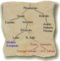
At around CE 150, the earliest runic epigraphy has been uncovered. “The characters were generally replaced by the Latin alphabet as the cultures that had used runes underwent Christianization by around CE 700 in central Europe and by around CE 1100 in Northern Europe. However, the use of runes persisted for specialized purposes in Northern Europe. Until the early 20th century runes were used in rural Sweden for decoration purposes in Dalarna and on Runic calendars.”
The Elder Futhark
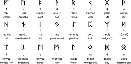
There are three foundational runic alphabets: the Elder Futhark (around 150 to 800 AD), the Anglo-Saxon Futhorc (400 to 1100 AD), and the Younger Futhark (800–1100). “The Younger Futhark is further divided into the long-branch runes (also called Danish, although they were also used in Norway and Sweden), short-branch or Rök runes (also called Swedish-Norwegian, although they were also used in Denmark), and the stavesyle or Hälsinge runes (staveless runes).”
The Anglo-Saxon Futhorc
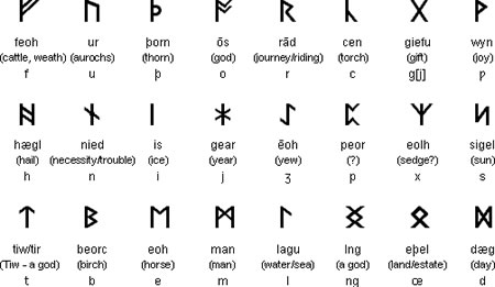
The Younger Futhark evolved into the Marcomannic runes, the Medieval runes (1100CE to 1500 CE), and the Dalecarlian runes (around 1500 to 1800 CE). The question might be: “could this system be part of that representation for the identity for this film?”
Three slightly different versions of the alphabet developed in Denmark, Sweden and Norway:
Danish Futhark

Swedish-Norwegian / Short-twig / Rök Runes

Norwegian Futhark

Gothenburg / Bohuslän Runes

Medieval (Latinised) Futhark

After the arrival of Christianity in Scandinaiva, the Runic alphabet was Latinised and was used occasionlly, mainly for decoration until 1850.
The origins of the runic alphabet are shrouded in uncertainty. “There are characters of the Elder Futhark that bear a close resemblance to characters from the Latin alphabet. Other candidates are the 5th to 1st century BCE Northern Italic alphabets: Lepontic, Rhaetic and Venetic, all of which are closely related to each other and descend from the Old Italic alphabet.” Obviously, there is a comprehensive study in runology — more details can be found in the “runemeister” Tara Hill. As well, the working studies of Omniglot, from whom these added studies and visuals are derived.

The Old Norse Poetic Edda — an ancient collection of lays and ballads.
A manuscript, Middle High German “Nibelungenlied.” 1230 CE.
From Author Adventures. Manuscript C.
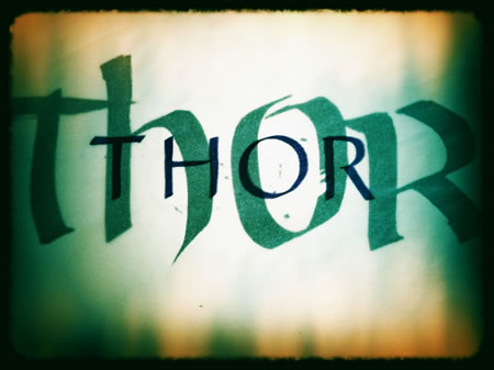
That brings us to some scratching of possible logomarks — the treatments of an identity that might be more emblematic of the spirit of the film. As previously noted, the idea of the production styling is fabulously “slick” — polished metals and lustrous applications of light and glowing lens flares. It might be seen, then — as a contrast — these conceptual renderings. Interestingly, these studies are brush drawn, which is not likely the technology for writing runes; it might be something more to a cut reed, or cutting iron to chiseled stone. A quill, potentially?
Runic interpretations: Thor
A 12th century brush drawn rendering
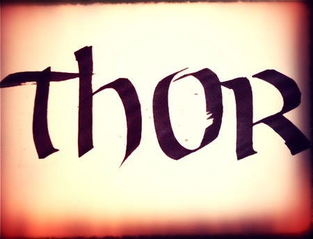
A bamboo reed cut epigraph style draft
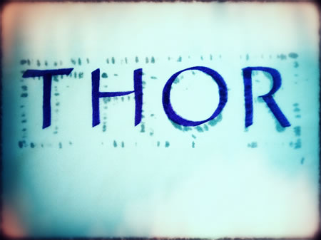
A steel blade rendering, Younger Futhorc
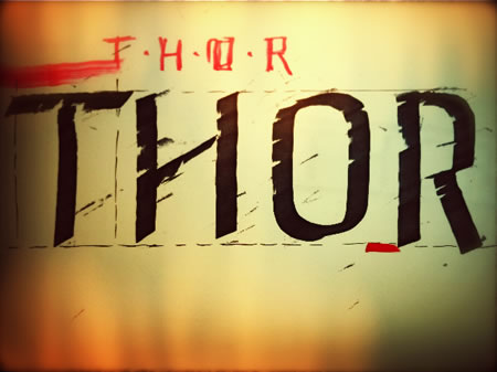
The Elder Futhark treatment, metal drawn
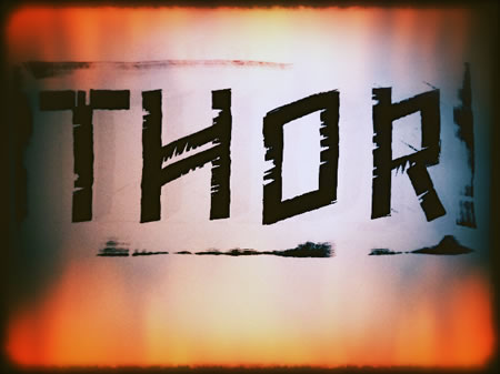
Brush drawn rendering, Capitalis Quadrata, the 1st century, BCE
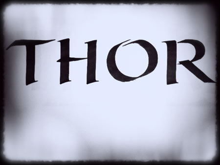
The gesture is to acknowledgement, not slavish copy — I rendered these treatments from my head, and imagination, not manuscript or stone scanning. What a designer might suggest is that the idea of doing something that gestures to the past is irrelevant — still, is the answer a generic, all-capitalized, digital treatment that hales from the Roman Imperial lexicon of accepted cut stone scripts?
I’d look to a visual link that bridges from the ideal, to the presentation — perhaps in the same context as Branagh’s ideation of the Asgardian realm as a stylistic mix between Santiago Calatrava and Frank Lloyd Wright. It is all about the imagining.
A step beyond, to a step back; a sense of time, reclaimed in the present — the shine of illustration.
TIM | New York City
…..
GIRVIN | IMAGINATION + PLACE
DESIGNING ENVIRONMENTS | RETAIL | RESTAURANTS
http://bit.ly/i7b7EN
the reels:http://www.youtube.com/user/GIRVIN888
girvin blogs:
http://blog.girvin.com/
https://tim.girvin.com/index.php
girvin profiles and communities:
TED: http://www.ted.com/index.php/profiles/view/id/825
Behance: http://www.behance.net/GIRVIN-Branding
Flickr: http://www.flickr.com/photos/tgirvin/
Alltop network: http://my.alltop.com/TGirvin
Google: http://www.google.com/profiles/timgirvin
LinkedIn: http://www.linkedin.com/in/timgirvin
Facebook: http://www.facebook.com/tim.girvin
Facebook Page: http://www.facebook.com/girvindesign