
SYNAESTHETIC EXPERIENTIALITY AND DESIGN LEADERSHIP
As a journeyer of decades of design, all over the world, and in partnering with many adepts in that journey, it’s interesting to study different models of design leadership.
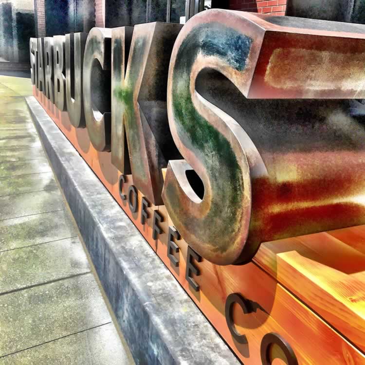
There are collaborators and team-builders, there are legions of implementors and executioners and there are the leaders and visionaries that drive design as a journey—they step out there first.
Fortunately for me, over time, I’ve had the chance to step-in early and listen-to, work-with, explore and collaborate with some of the most amazing designers in the world: listen to them, watch them, participate in a project or two, walk further out, learn and gain more, get more from this designed life.
That story brings me to Liz Muller.
Several years back, I was studying, for Dannon, an initiative with a couple of client colleagues and friends—years in collaborations, Eric O’Toole and Miguel Leal, the notion of a strategic revenue booster in a string of actions that ranged from innovations in rethinking packaging, product innovations—ingredients, cultures and flavoring—to partnering with a national supplier of frozen yogurt ingredients, to the build-out a Dannon stores, and finally—an alignment with Starbucks in the alliance of in-store Dannon product.
We worked on all of them—even designing powerpoint strategies, presentation icons and merchandising tactics for team sessions.
To the last notion, the Starbucks alliance, we worked in a set of team-round discussions on the proposition of a “farm to table” celebration of yogurt—
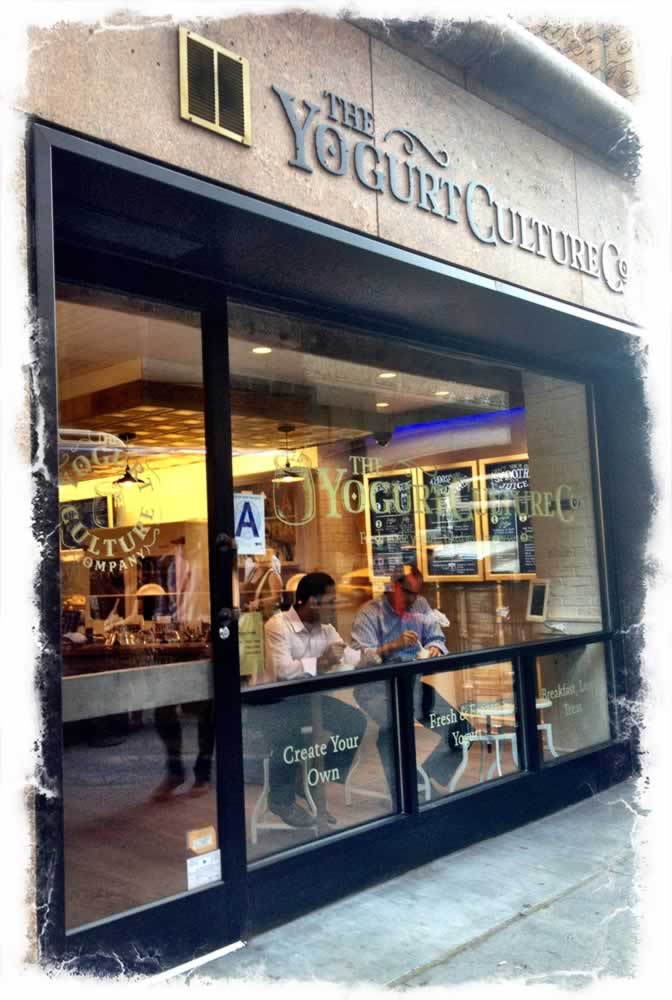
Dannon farms to yogurt shops, leading to the buy-in of YoCream.
Those workshops at GIRVIN
led to YCC|NYC.
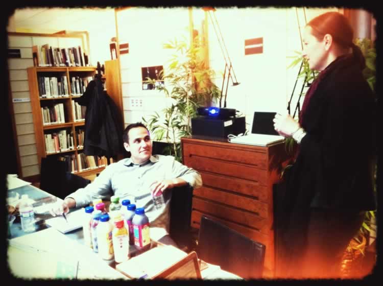
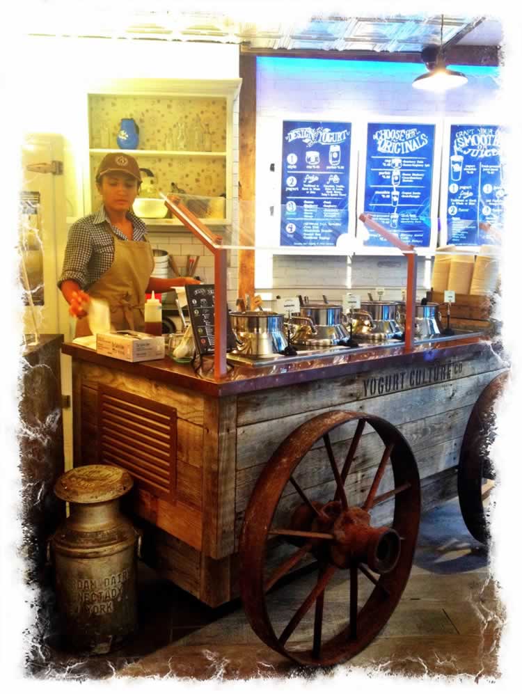
We named, branded and designed a telling exemplar to the street-wise impression of a new modeling. Park Avenue, south of Grand Central, NYC, thrived and starred for awhile.
YCC | YOGURT CULTURE COMPANY
What could be more necessary than a perpetual collaboration?
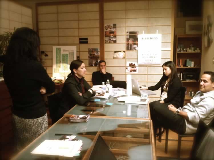
We pushed, we wandered, we explored and made the shop of highly customized yogurt makings. A special menu was built, a processional sequence designed, a serving strategy was born and the tactics to make it happen—by the thousands of visitors.
Popular and packed during its spree.
And it was this string of studies, and co-corporate discussions that led me to Liz Muller — working near her; driving, almost by herself, a sequence of retail concepts that were operating, as far as I could tell, outside of any standard for retail design for Starbucks that anyone else was abiding by.
Who is this person?
The not-Howard person?
That’s Liz.
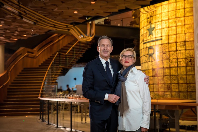
Starbucks executive chair Howard Schultz and SVP Creative, Global Design, and Innovation Liz Muller in the new Starbucks Roastery in Shanghai on Sunday, December 3, 2017. (Joshua Trujillo, Starbucks)
Joshua Trujillo
What started this wild initiative of innovation was our work on Dannon, then seeing her work, being curious—talking to her about what she was doing—just what was her work on creating the concept for Heritage Starbucks?
This is where I first connected with her work [1st & Pike,] then 15th Street Roy Street, then the split-open University Village Store—followed by the Paris Opéra, again orchestrated by the imaginative fires of Muller’s visioning.
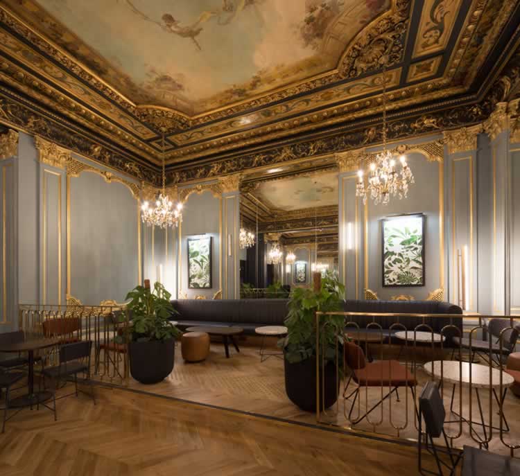
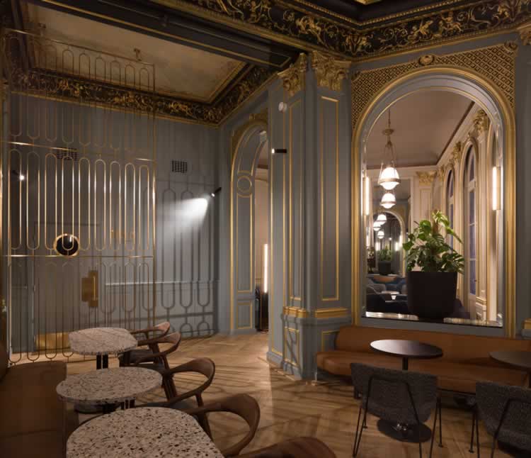
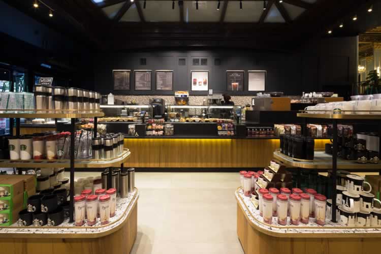
What, India? Next: the flagship Mumbai Bank innovation—a Tata alliance with Starbucks.
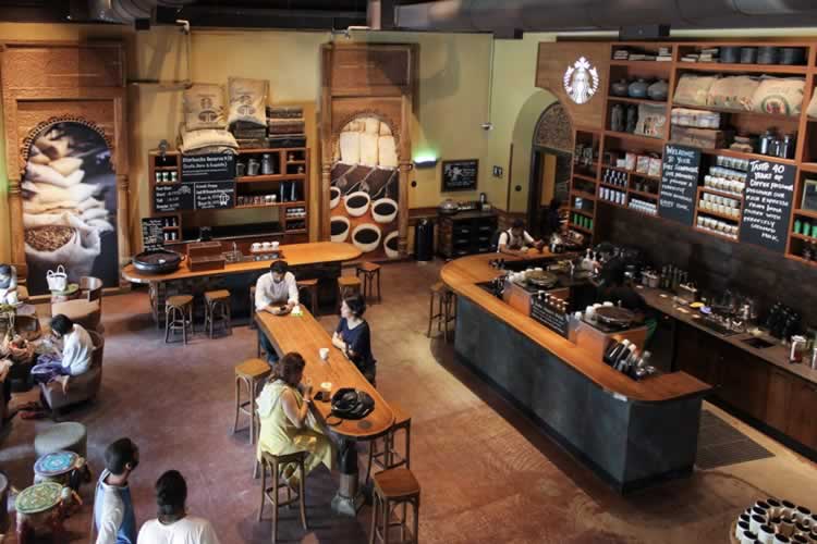
Image: TataStarbucks
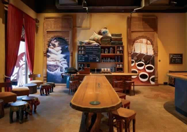
Image: TataStarbucks
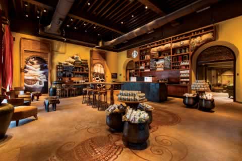
Image: TataStarbucks
Dezeen comments on her work in Amsterdam.
The Starbucks Press release?
Starbucks Coffee Experience ‘Laboratory’ to open at New Concept Store in Amsterdam
In a few weeks, Starbucks will open a new concept store in Amsterdam, but with its ‘Slow’Coffee Theatre, hyper local design, floating community gathering spaces and on-site baking, Starbucks – ‘The Bank’ is a glimpse into Starbuck’s vision to the future.
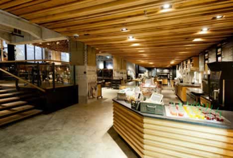
While over the last few years Starbucks has gone to great lengths to reinforce the superlative quality of its coffee and products, under the radar they’ve been re-defining the atmosphere in which we drink it. In Seattle, New York, London, Paris and now Amsterdam, Starbucks has been stealthily unveiling unique and highly individualized concept stores across America and Europe.
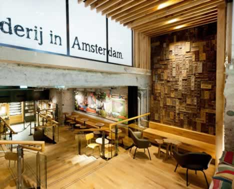
Starbucks – The Bank
Situated in a 430 square meter subterranean space in the vault of a historic bank on the popular Rembrandtplein, the new shop is the 9th Starbucks concept store to open in the last three years across the globe, but the first shop they are openly referring to as a ‘laboratory’. A large beautiful store inspired by Dutch culture and tradition, ‘The Bank’ will raise the bar on how Starbucks openly innovates.
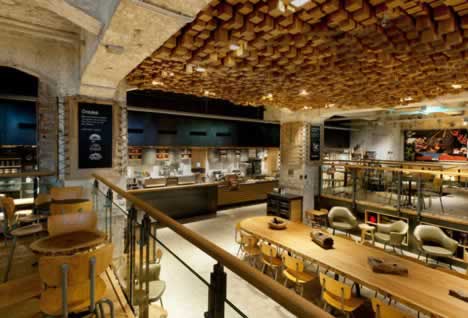
The laboratory
Considering its well-earned progressive reputation, Amsterdam might be the perfect spot for trying out new things. Starbucks ‘The Bank’ will function as a testing centre for innovative coffee brewing methods in its ‘Slow’ Coffee Theatre and offer small batch reserve coffees available no where else on the continent. It will also premiere Starbucks first ever Clover® brewing system in Europe. The Clover® is one of the most significant innovations in coffee brewing since the introduction of the espresso machine. Starbucks – The Bank will also feature new food concepts including in-store baking. What works at ‘The Bank’ will make its way to the rest of Europe.
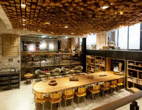
Repurposed hyper-local design
As with all Starbucks concept stores, the Amsterdam shop will be a radical aesthetic departure. Under the direction of Dutch-born Liz Muller, Starbucks Concept Design director, more than 35 artists and craftsmen have kitted the subterranean space with quirky local design touches and sustainable materials. Local design details include antique Delft tiles, walls clad in bicycle inner tubes, wooden gingerbread biscuit moulds and coffee bag burlap, and a ‘tattooed’ ‘Delftware’ mural highlighting the important role 17th century Dutch traders played in exporting coffee around the world.
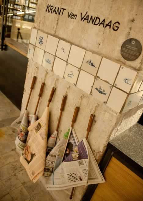
And while all the design and constructions adheres to strict Leed® sustainable building guidelines to reduce the impact on the environment, the designers have gone out of their way to integrate repurposed design. In addition to reclaiming the vault’s exposed concrete and 1920s marble floor, the entire shop is kitted out in repurposed Dutch oak – the benches, the tables and the undulating ceiling relief made from 1,876 pieces of individually-cut blocks. Also a radical departure from Starbucks house style are the various types of chairs and stools, reclaimed from local schools and spruced up.
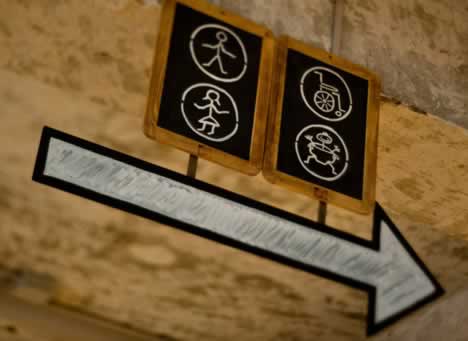
Neighbourhood hotspot
With window seat cushions, a centrally-situated oak table and multi-level spaces that cameo as stages for local bands, poetry readings and other cultural activities, ‘The Bank’ is positioning itself as a cultural gathering spot in the middle of Amsterdam. With literally thousands of people living within a minute’s walk, the shop will also playfully use social media to communicate relevant moments. For example, the bakery will send out a tweet announcing ‘warm cookies’ the minute a batch rolls out of the oven.
Then the Roastery in Seattle’s Capitol Hill, which, in a PR move of some unusual character in the Starbucks roster of sharing talent, spotlighting key leadership in brand design, the message was quite specific to Liz Muller’s characteristic holistic and sensationally dense contributions.
As a designer, I tend to look for the lead, the big grab to the brand, and its story— what’s the major reach-out, first up? What am I seeing first? Then, how do I get into, grasp more of the details, the smaller touches?
For as we’ve talked about in the past, is that it is the smaller details that seem to stick in people’s minds. “What I remember is that patterning in the floor, the little pebbles, or that tiny symbol on the door, the creak of the floors…”
And, to Liz Muller’s thinking, the daughter of a culture of highly-crafted design thinking and implementation in a family that, to her Father, was led by architecture and furniture design and cabinet-making, and to her Mother—a seamstress and operator of a sewing / design school. And from a foundational press release on Liz in 2014, precision and detail are top of reference:
“No detail inside the new Starbucks Reserve® Roastery and Tasting Room in Seattle escapes Liz Muller’s attention.
From the stitching on leather handrail covers and hand-stained wood finishes throughout the 15,000 square-foot building to the precise location of two industrial roasting machines capable of handling over a half ton of coffee per hour, every component of the first-of-its-kind retail space has the discerning touch of Muller, Starbucks vice president of Creative and Global Design.
Just as each cup of coffee Starbucks served in its 43-year history has led the company to create an unprecedented coffee theater for its customers, all that Muller has learned since childhood prepared her to lead the team tasked with bringing Howard Schultz’s vision to life.
As a little girl in Amsterdam, Muller discovered the value of precision craftsmanship from her parents. Her father was a fine cabinet maker and architect; her mother ran her own design and sewing school.
‘Perfection,‘ Muller said with a satisfied smile. ‘I understood perfection from an early age and I’m still driven by it.‘
What this journey in conversations and sharing has left for me, in studying the empowered evolution of Liz’s envisioning dreams and team leadership—practicing passion to commit to dreams, regardless of how outrageous they might appear to make them happen: ‘Passion has to overtake common sense, because otherwise people would have said it couldn’t be done,‘ said Muller.
‘Everything is possible; it’s just a matter of figuring out how to do it.‘
Schultz elaborated on how he wanted coffee beans to travel through the café to and from the roasters. The challenge was to seamlessly integrate coffee roasting, coffee education, retail areas, a spacious café and a restaurant all in one location – a building constructed more than 100 years ago. It had never been done before. How much time did Muller have to do complete the project? One year.
A small Starbucks design team traveled through Europe for a week looking at coffee houses with small roasters. But ‘Howard’s vision was much larger’ than anything they saw, Muller said.
In a hotel in Amsterdam, the team started sketching the unrivaled design that would become Starbucks Reserve® Roastery and Tasting Room. The finished immersive coffee experience is almost exactly as Muller imagined it.”
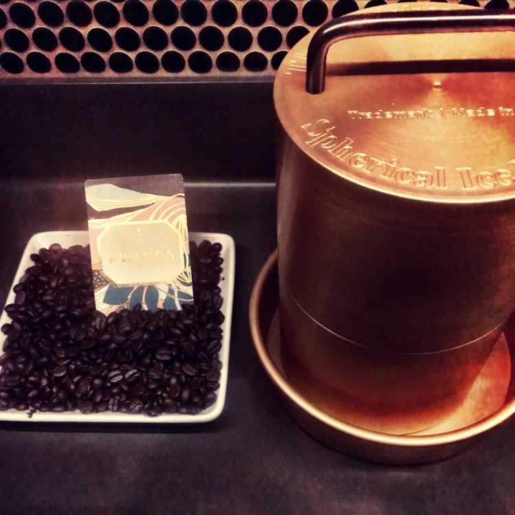
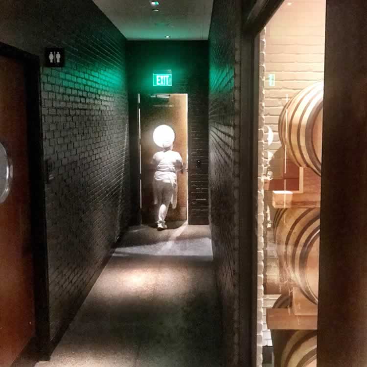
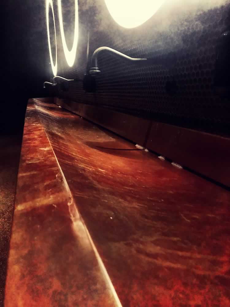
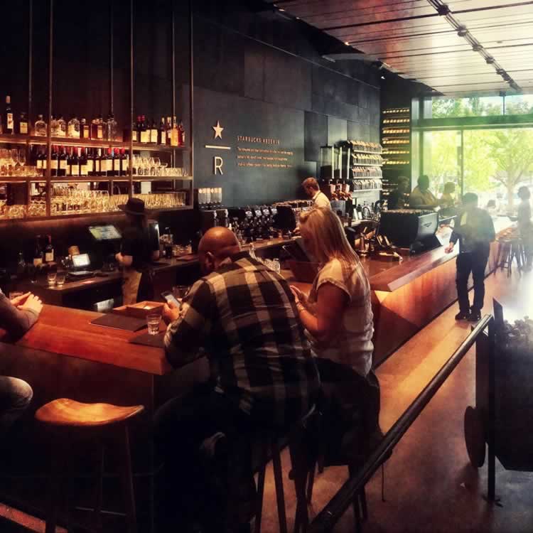
That principle led to a core effort in the challenge of offering a reach-out to the Roastery ideology—as a Reserve bar storytelling at an enlarged scale at the corporate offices. Once again, to my walk-through of the Mullerisms of the space, there is a gravitational radiance to the roaster central, there’s a pivoting outwards from the kitchen, there are vast doorways to transit, that are touched with tiny details. It’s that balance between the gigantic swooping gesture and the micro-details that I find as a constant den röda tråden—the red threading of carefully considered design and place-making experientiality.
There’s a thread, from the large sweep of ideas, to the stitching of the leather details.
As in Milan, only days old, the newest installation:
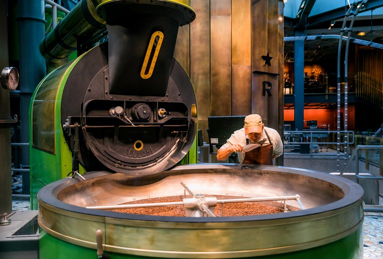
The roaster was made just a few miles from the center of Milan by Scolari, a family-owned historic coffee manufacturing company that has a decades-long relationship with Starbucks.
Joshua Trujillo/Courtesy of Starbucks
Someone, that would be Liz, is watching.
Explore this journey in detailing— from the front to the back, back out again:

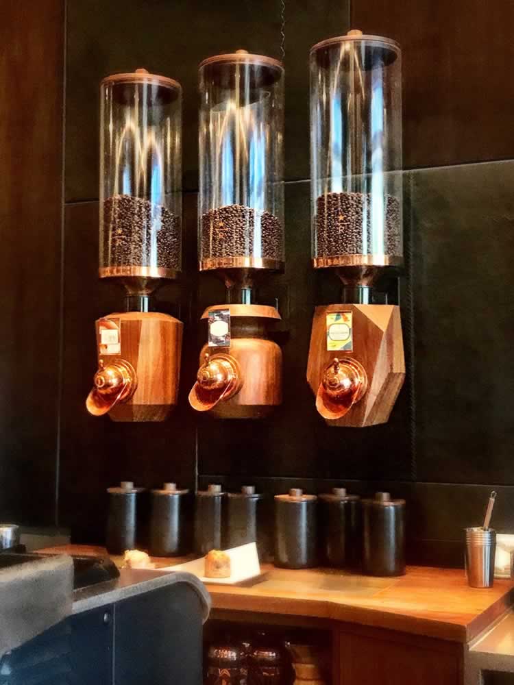
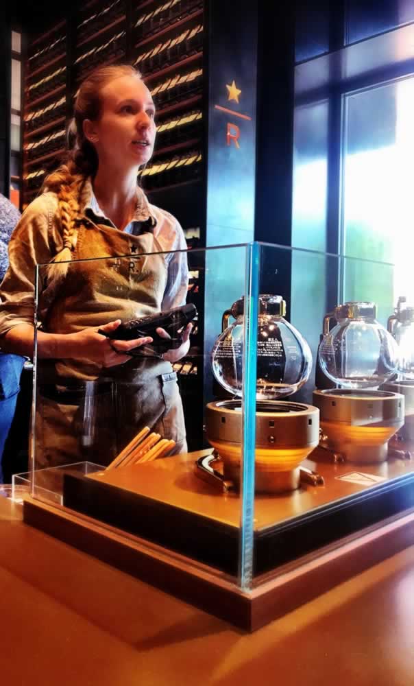
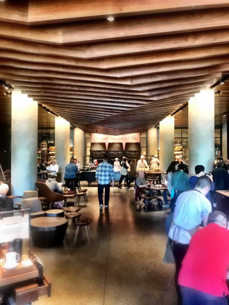
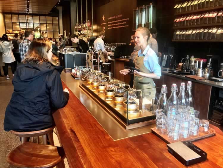
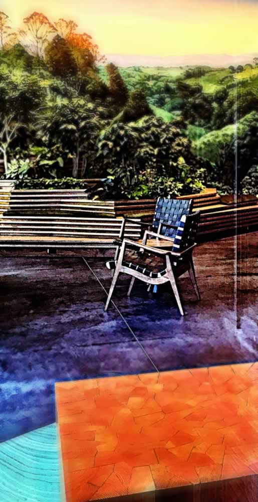
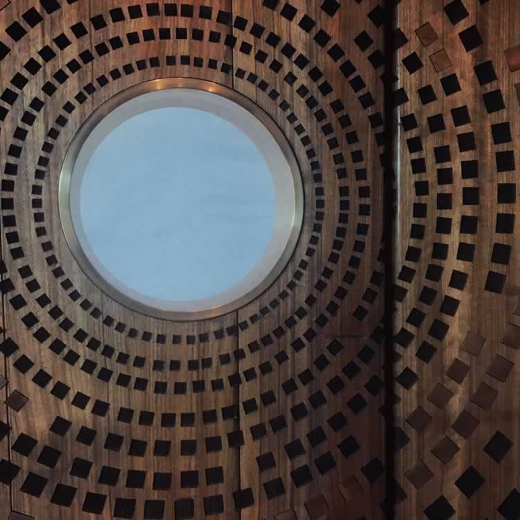
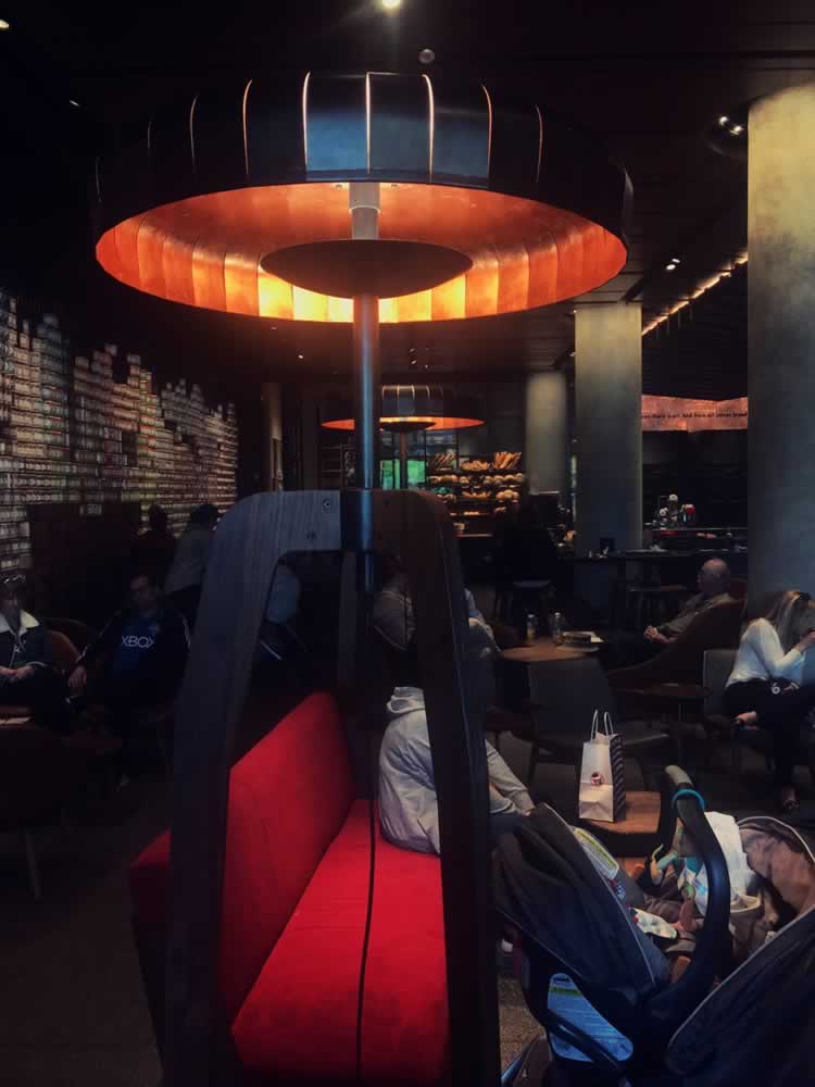
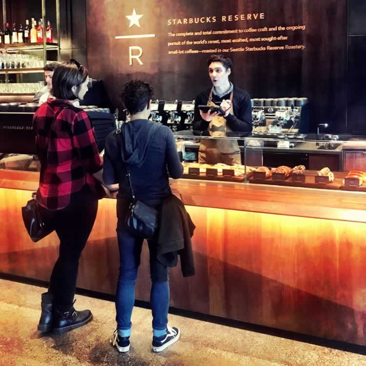

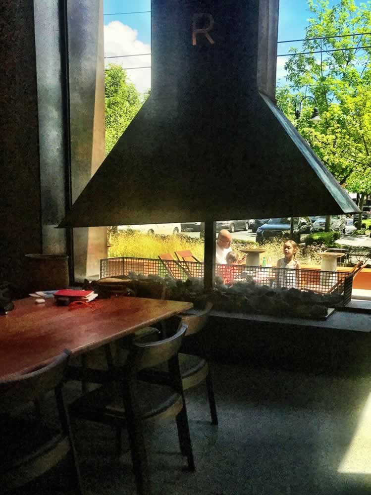
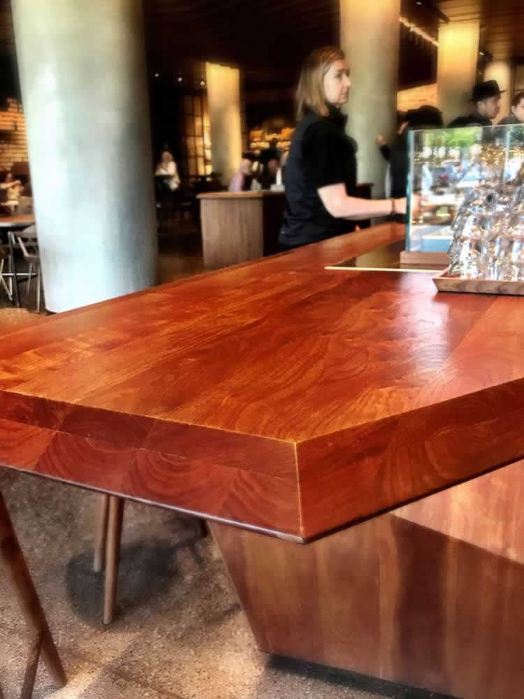
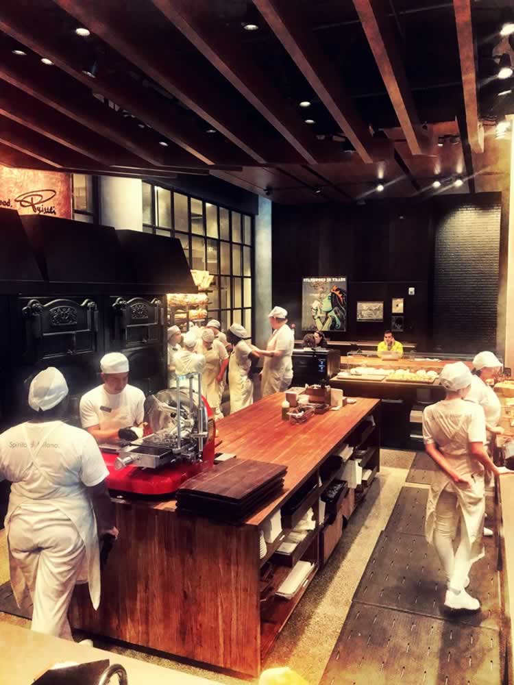
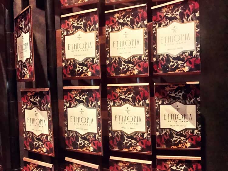
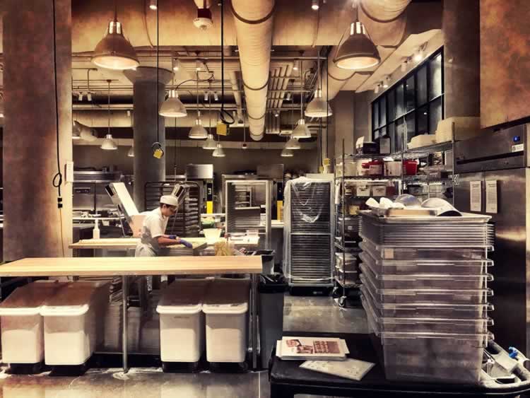

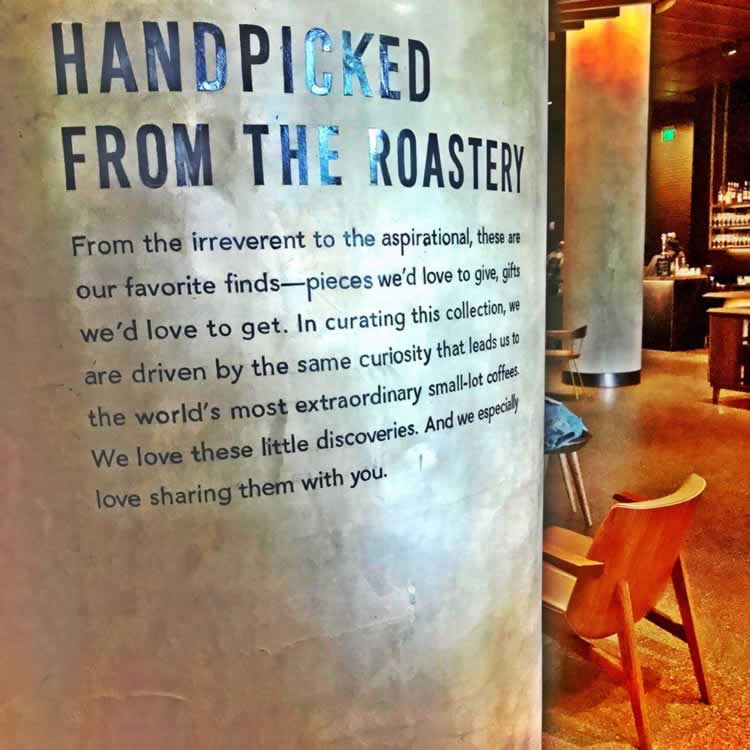
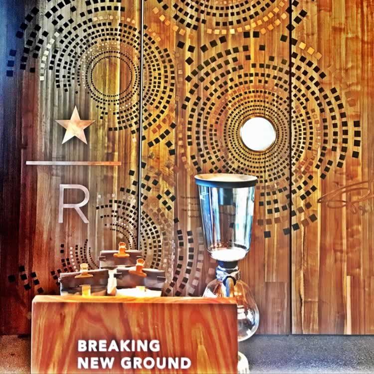
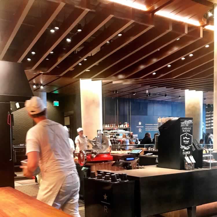
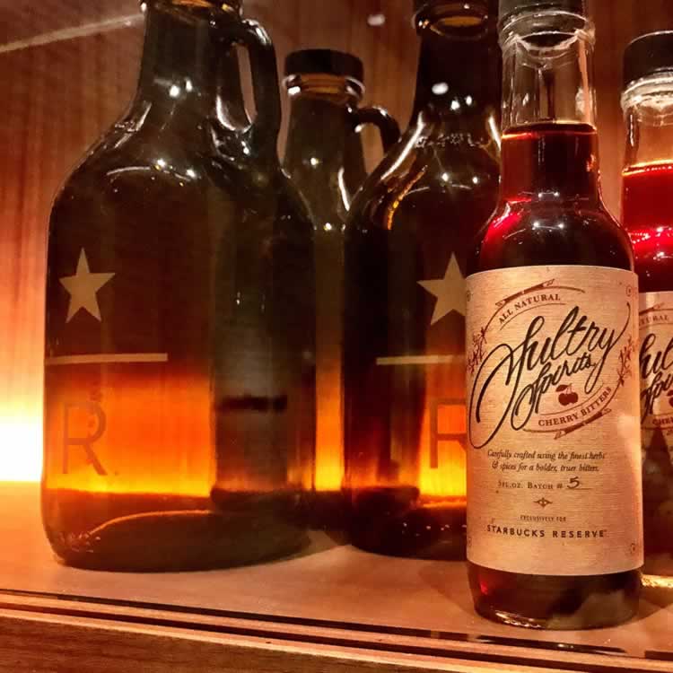
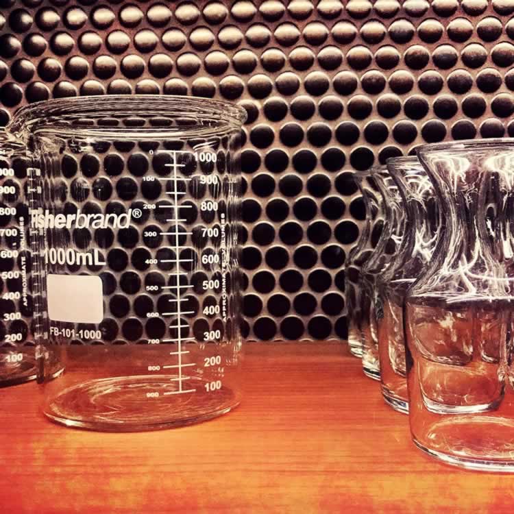
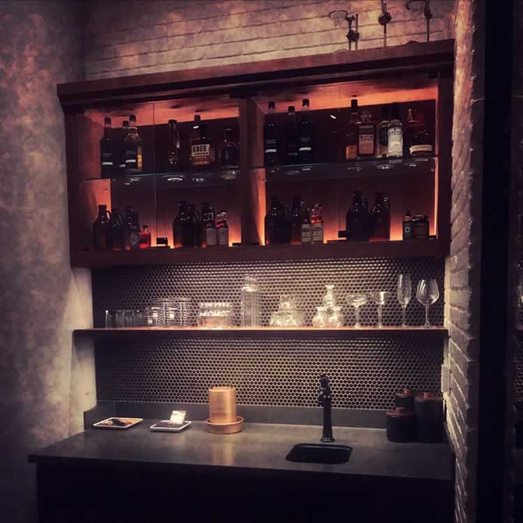
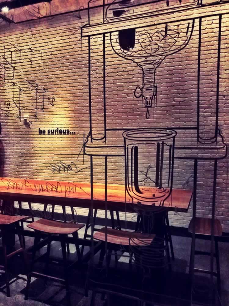
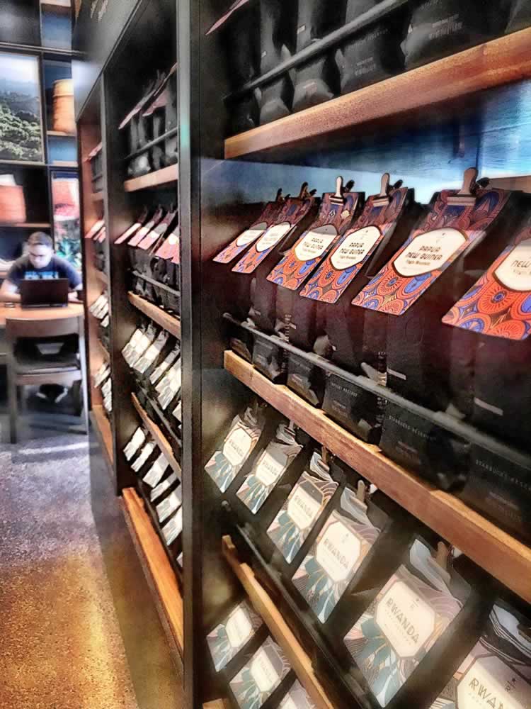

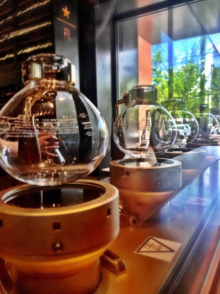
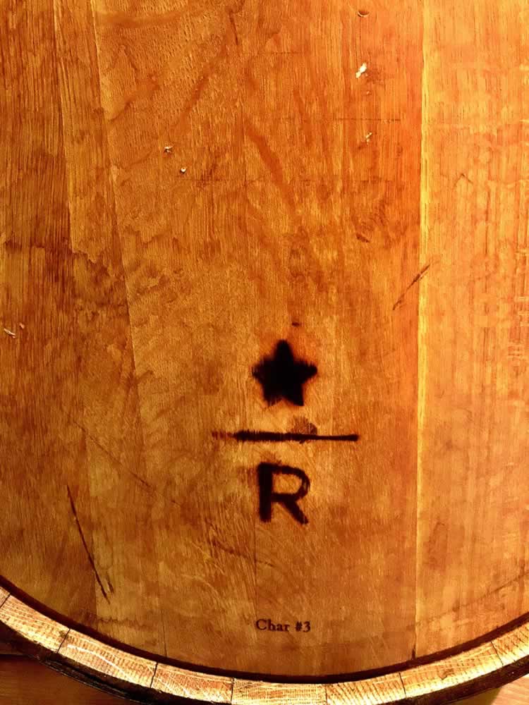
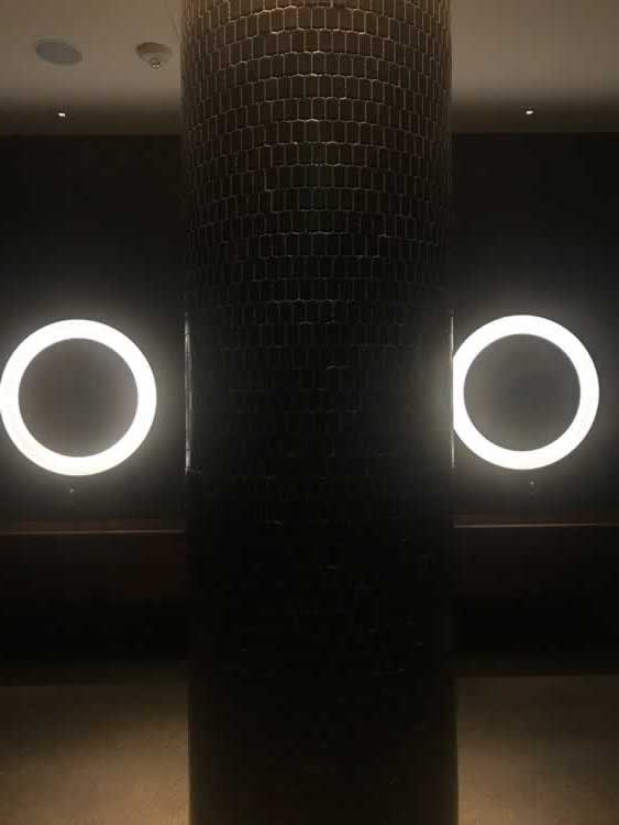
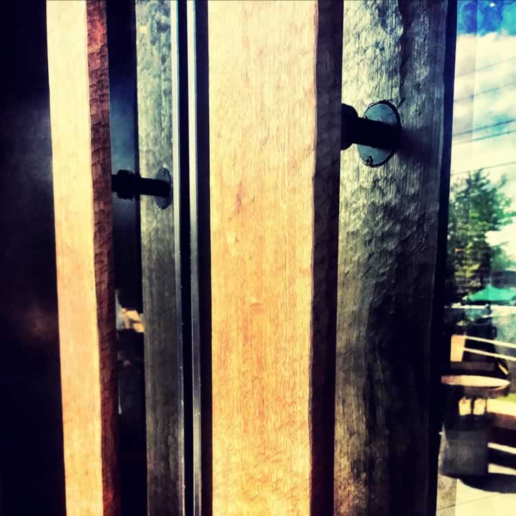
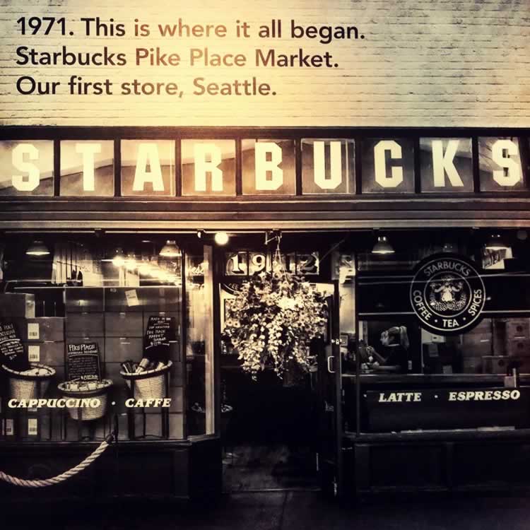


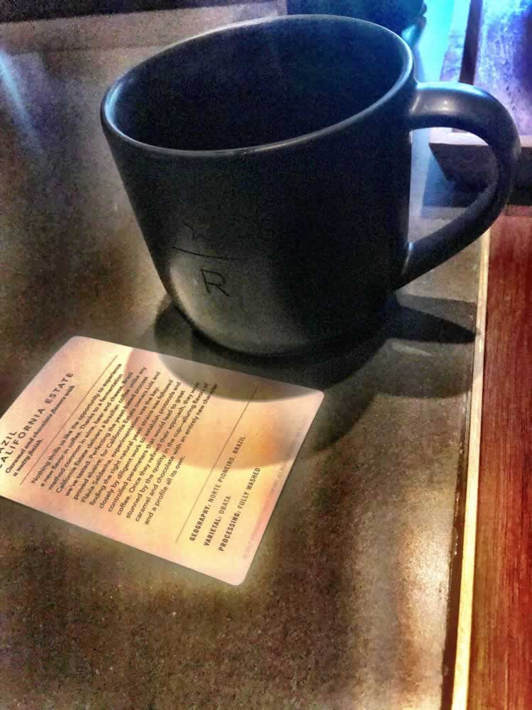

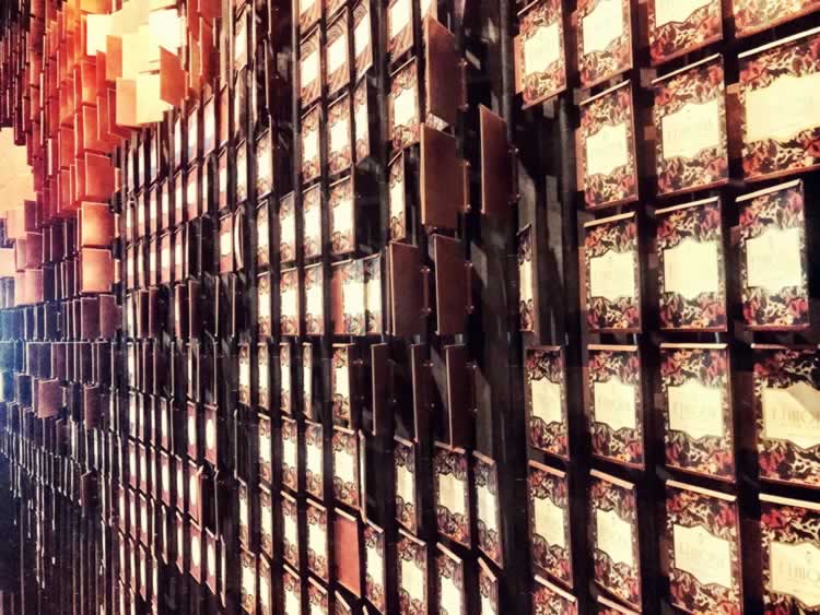
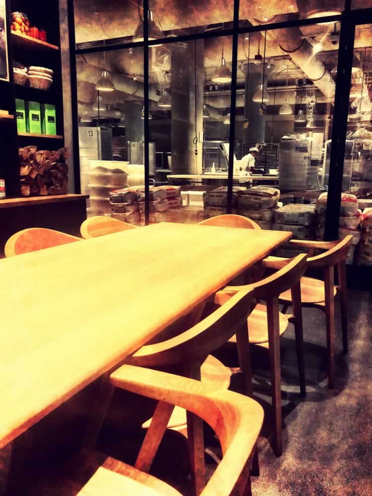
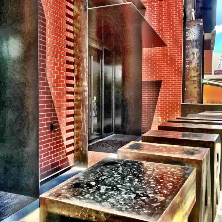
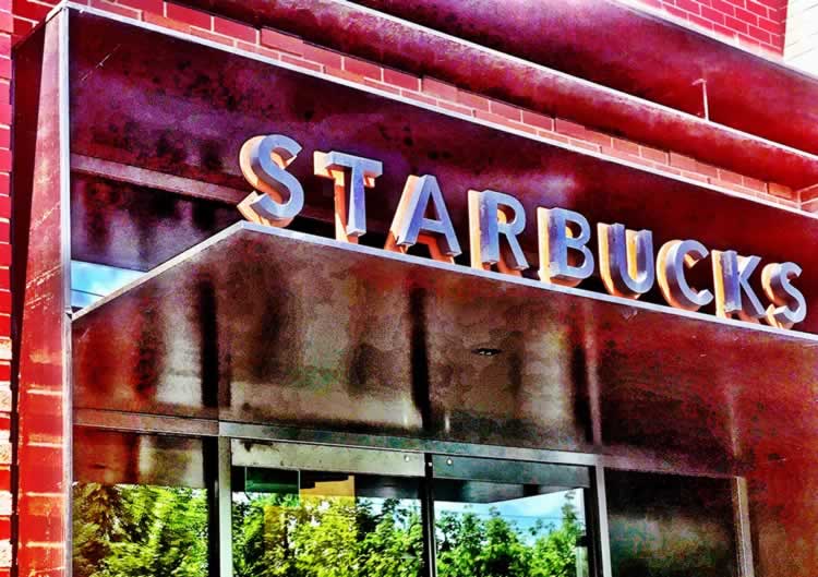
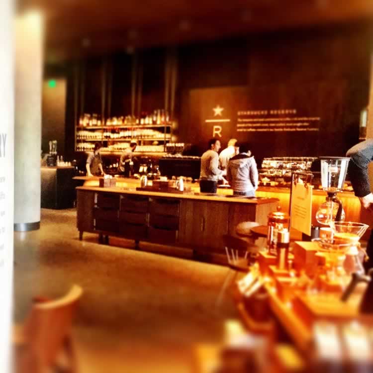
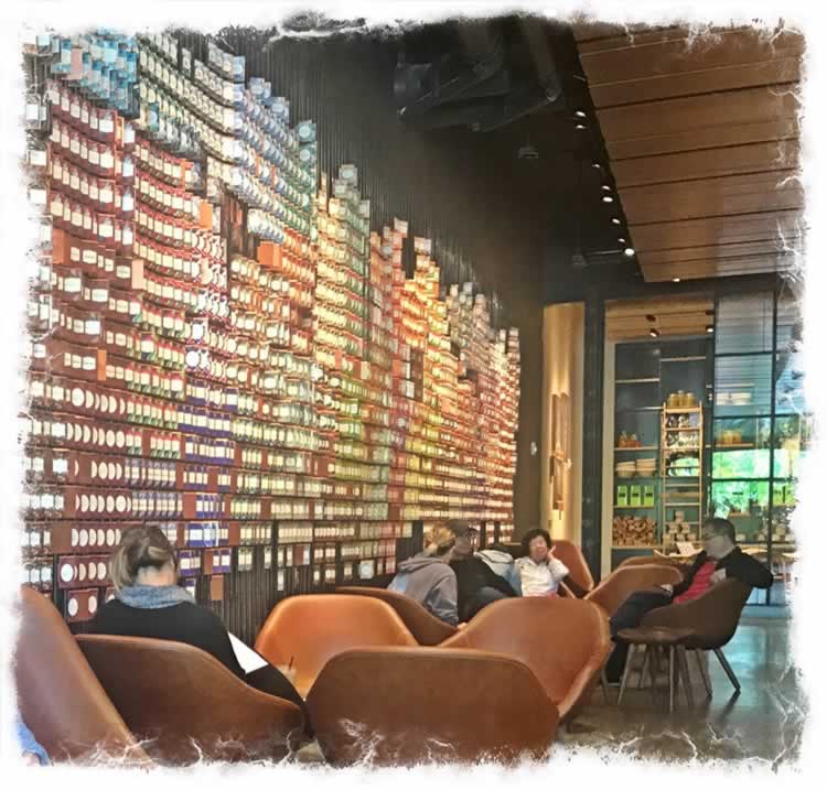
Design is that: making a sign—the mark of a map, the symbol of deeper and mysterious values, the crisp of a letter well-drawn, that makes a word. And that skeletized string of letters, that forms words, meanings, stories and sentences to the now of yes, the wonder of yesterday’s dawn, to the wisdom of tomorrow, reborn yesterday, today—then to:morrow.
As a designer.
Keep on,
the making.
T. Shaw Girvin | OSEANSTUDIOS
…..
GIRVIN | DESIGN MEDITATIONS ON
APPLE INNOVATION: THE LEGACY OF STEVE JOBS
& APPLE BRANDING [+GIRVIN]
DESIGNING IMAGINATION : AND THE TOOLS TO MAKE IT HAPPEN
goo.gl/akGWR2