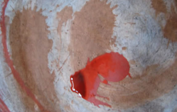
Designing Identities for Scary Storytelling | Gruesome Design for Films
I was talking to a young aficionado of typography and the lettering arts, as well as a connoisseur of scary movies, and we talked about logos for horror movies. And, to quote, “why is that lettering so spoooky?”
It made me think — in designing a logo for a scary film — what would the construct entail? How would you write a creative brief for that?
It might be said that horror lives in the dark side — the gnarled, the crab-clawed, the spattered and splattered, the scream of the unnatural — indeed, the supernatural.
That calls to mind, etymology and the etymon of, the word:
horror.
From whence does it come? Horror — the origin is literally horror, from the Latin, which intones “dread, veneration, or a religious awe” — the Latin verb horrore which calls to mind — the physical manifestations of fear:
“bristling with fright,
shuddering from the fear-filled.”
What that offers is, perhaps,
the foundation for
a creative brief:
“gnarly,
thorned,
prickly,
scarred,
scratched
and roughened.”
For the most part, the horror movie logos I’ve done have something of that spirit,
as in another etymological bridge: the Sanskrit harsate, “bristles” — as in “hedgehog” and the most ancient roots, of the linguistic nexus of the Proto Indo European languages, the so-called P.I.E formations —
“a ruffling of feathers”
as in the hackles of fear.
Literally:
hair raising.
All of these speak to what might be the adjectival build of a creative executional strategy.
So in drafting fear, it couldn’t likely be something that is “shuddering, bristling, scarred and racked with fearful demeanor.”
So too, the results of that creative impetus.
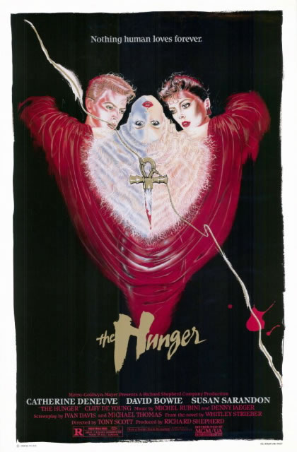
For Tony Scott:
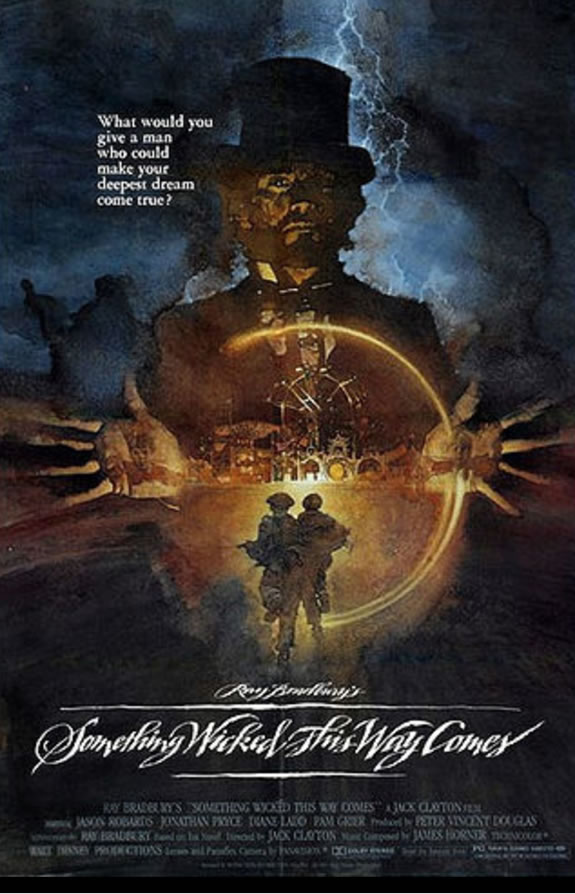
For the Disney brood,
something wicked in 1983:
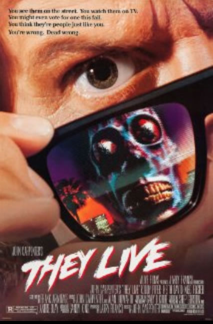
For John Carpenter and Universal [1988]
Drawn with a toothbrush:
 g
g
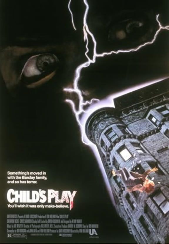
Mancini’s first “Chucky” installment
for United Artists [1988]
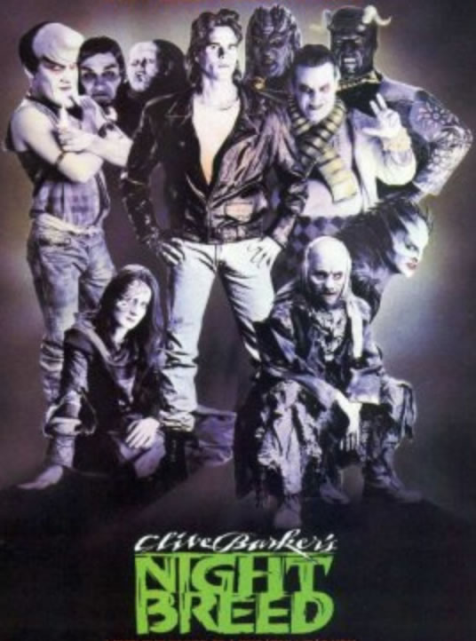
And after a breakfast meeting with Clive Barker:
 g
g
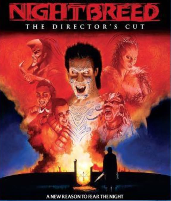
And Clive’s newly tuned
rendering, 2014:
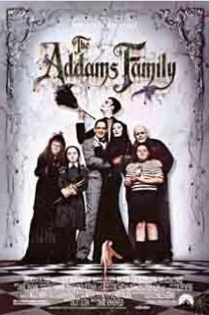
For Barry Sonnenfeld and Paramount, 1991:
For Tim Burton, 1999, Paramount Studios.
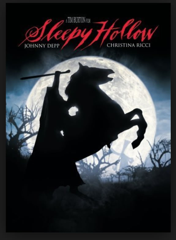
There is something to that scarier telling. Of ghosts and mists, skulls, memories of the dead and those that linger.
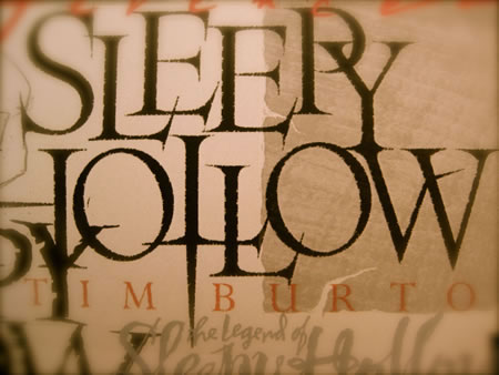
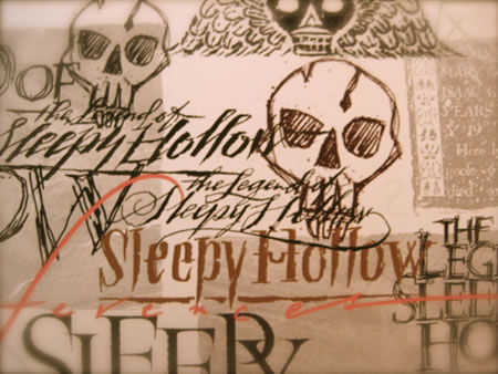
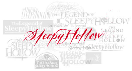
And the draft of the creepy,
black-blooded, spattered
strokes of fear.
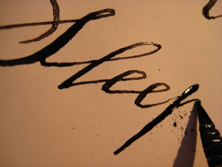
Some GIRVIN storytelling and
gatherings on the frightening:
Added references:
Vampire glamour A History of Vampire Style
BBC’s “Being Human” and Undead Fashion
How to: Runway Road Test | Prada’s Vampire Look
A History of Dracula
Tim Burton, Johnny Depp and Dark Shadows
GIRVIN’s COLLECTION ON BALCOMB’S SCREAM:
http://thescreamonline.com/tim-girvin/
Tim | Southwest Queen Anne Hill Studios
The New GIRVIN
@ 3131 Western Avenue
…..
G I R V I N | DESIGNING MOVIES
THEATRICAL BRANDING + ENTERTAINMENT
IMAGINATION: AND THE TOOLS TO MAKE IT HAPPEN
http://bit.ly/seAMZf