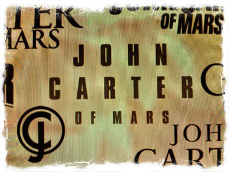
Designing a brand around a legendary legacy
John Carter’s legend story, at Disney, is relatively recent — but the Edgar Rice Burroughs’s saga spans back decades [1911] to its origination — for a relatively short-lived comics series [72 weeks ], to the founding storytelling;
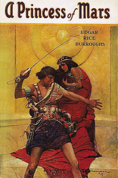
John Carter and Princess Dejah Thoris [of Mars,] 1917.
There’s not scene spoiler here, nor a complete recanting of the tale, nor extensive details and documentation on the current production. Our work goes back, further to the heart of the legend. In any storytelling, the idea syncs to what lies beneath — which could be history, which could be soul, is a more captivating excavation. Our efforts start with a direct connection to the Conran brothers, after our work on SkyCaptain and our executive relationships at Paramount Studios. We’d supported them [indeed all the Conran family — who I had the pleasure to meet, all of them, at the screening of “Sky Captain.”] Kerry Conran gave up the project for John Carter to work on another personal assignment. The movie jumped to Jon Favreau [Iron Man — we worked on that too,] then Robert Rodriguez [not yet — hoping!] and on to Disney.
To the Conrans, and our efforts, there was an alignment, to the idea of digging back, looking into the history of the story — but more so, the placement to time: “the Civil War”. In fact, Conran’s strategy was previously evidenced in his careful “digging in, excavation” of history in look and feel. Our examination goes to not only the nature of the history of the time, but — too, the history of earlier marketing. We dug into time for Benjamin Button — synchronism and brand design / theatrical marketing for David Fincher — as well as the archaeology of brand story for Robert Zemekis and Beowulf. That positioning is a core chromosome for Girvin — dig into what lies beneath. It’s need what’s on the surface, the glimmering of powerful ideas requires some digging in — going into the story, the imagery, the history — and the attributions of history — artifacts, signs, graphics and elements of time.
To the telling — what are the layers of the story?
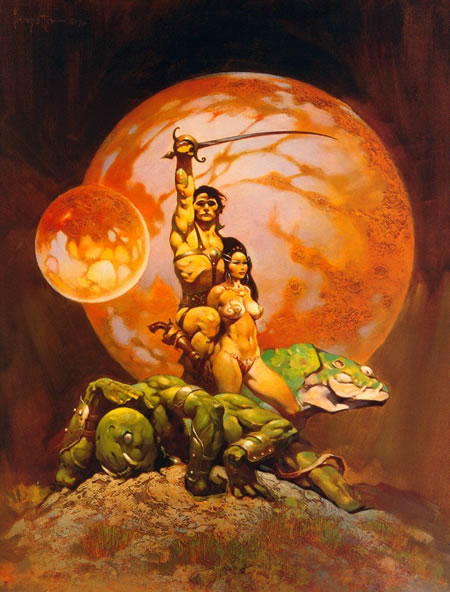
Frank Frazetta’s Princess of Mars classic book cover art
Girvin’s archaeology of John Carter of Mars:
Graphical storytelling from the period —
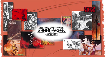
Civil war detailing | typographic considerations:
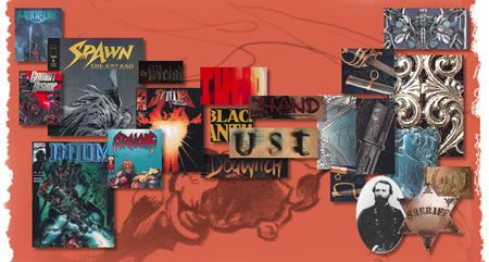
Opening studies and sketchbook foundations
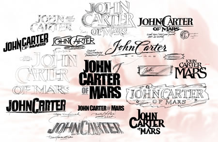
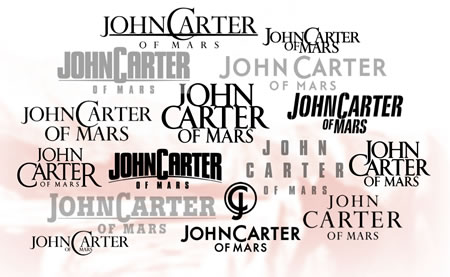
Typographic studies
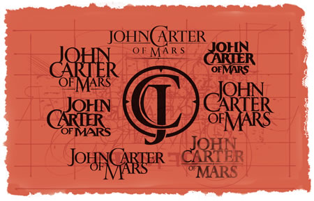
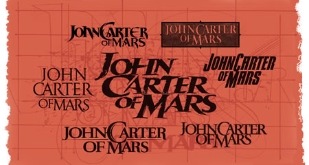
The image to the center [above] was the Conran’s defined, selected direction — to Kerry’s take, there was something rough-hewn, hand-drawn about this selection –it had something of the period, yet attributes and qualities that celebrate the raw otherworldly nature of John Carter’s movements between Mars and Earth — and back again.
…..
tim girvin | queen anne hill, sea-town, WA
–––
G I R V I N | DESIGNING FOR MOVIES
THEATRICAL BRANDING + ENTERTAINMENT
IMAGINATION: AND THE TOOLS TO MAKE IT HAPPEN
http://bit.ly/seAMZf
Tim Girvin | founder + principal
mobile direct. 206.890.0621
teams: New York City + Seattle | Tokyo
work: https://www.girvin.com
truth: https://tim.girvin.com/
reels: http://www.youtube.com/user/GIRVIN888
girvincontent:
http://blog.girvin.com/https://tim.girvin.com/index.php“>
https://tim.girvin.com/index.php