THE BASTARD LETTER | LITTERA BASTARDA, JON SNOW & THE CALLIGRAPHY OF THE GAME OF THRONES
GIRVIN CALLIGRAPHY CLASSES WALK OUR TEAMS BACK IN TIME — THE CRAFT AND HISTORY OF THE LETTER, A JOURNEY IN PALAEOGRAPHY AND CULTURAL HISTORY.
What was drawn then, what was scribed when, how did it originate? What was happening that created that script? Why?
Some know that every week, for months on end, we repeat the lessons learned in my beginnings — the alphabetic craft. I’ve been teaching the lettering arts since my start as one of the creative ones. And in fact, we’re still using an exemplar I designed by hand in 1975.
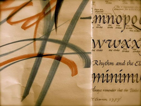
A calligraphic knot, along with the original worksheet, from the Girvin / Evergreen State College workshops, 1975.
These alphabet studies start in the 19th century, the scripty flourishment of the Victorian Age [early 1800s,] the so-called Spencerian which, in our class,
goes back in a century-by-century string
of weekly studies of alphabets —
and the cultural storytelling around them,
as time flies by.
I’d promised to my students, my teams, and those that visit, as the premise of the work holds, to build-out an increasingly complicated study of alphabetic history —
go deeper, find more, build more exemplars:
more experiments
and deeper, more obscure alphabets.
So I look and learn.
And when I look,
I look far and wide.
And I look for popular resonance:
teaching strange alphabets from centuries past, time passed isn’t for the all, but the many that seek to know the why of how a letterform might’ve come to be.
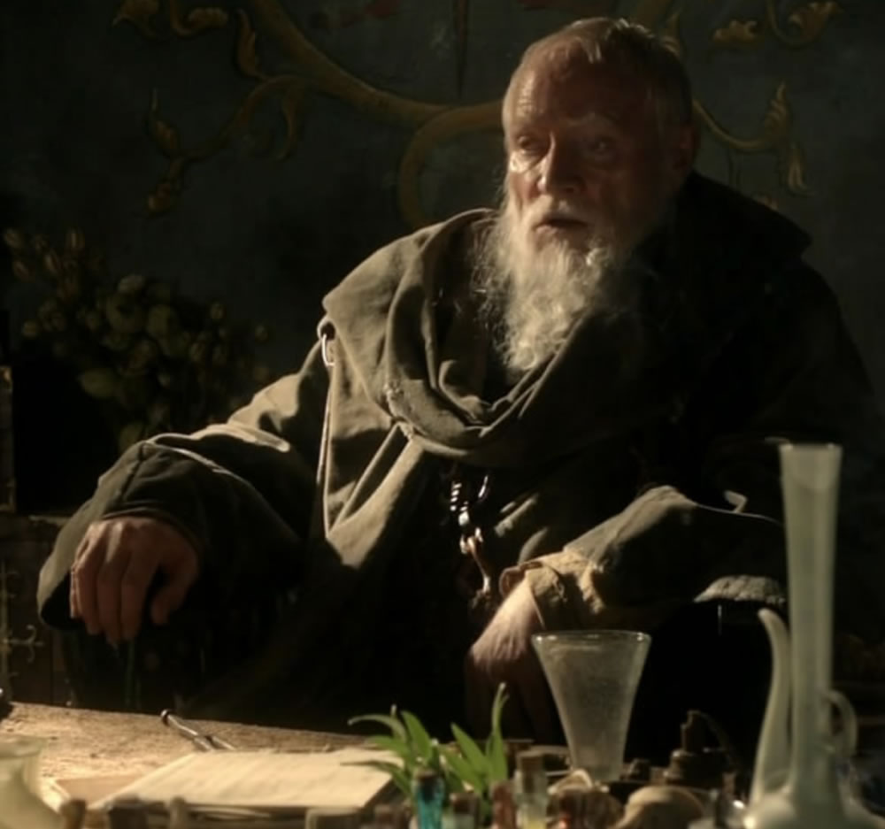
Mæster Pycelle
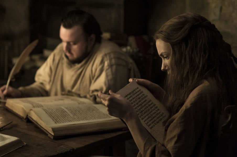
So to that — popular resonance, I’d watched the Mæsters of the Game of Thrones in their crabbed notes to the Raven carriers of potent missives to other castles and strongholds in Westeros. To, for example, Jon Snow, Lord Commander of the Night’s Watch and Winterfell Lord, bastard of Eddard, populates those GoT dreams.

And,
as I looked,
I thought –
“what is that script?”
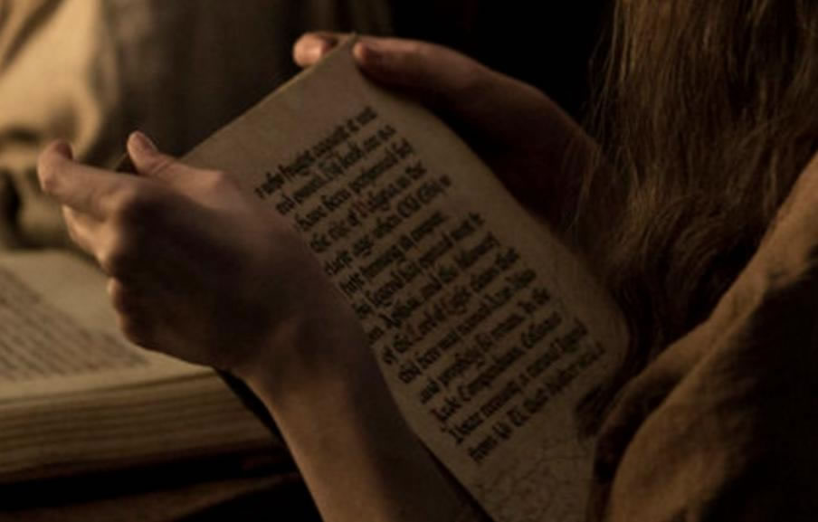
I would ascertain, in a distant viewing — something latter Gothic, late BlackLetter.
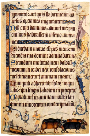
The nomenclature of this name Gothic came to describe a darkly tangled thicket of letterforms, a forested scratching of compressed letter-weavings that aligns to the name of “texturalis,” the Latin paleographic spinning for its type of “textured” text. Something along the lines of this fourteenth century Vulgate Psalter, illuminated with peculiar monsters and farm scenes.
But Gothic?
That naming was cursed
as the “time of barbarians.”
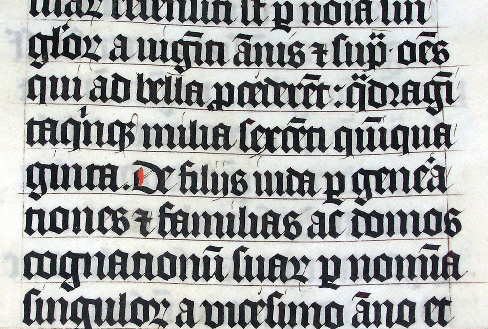
And the spiked and thorned styling was a prick in the side of the 15th-century Italians, for in the self-absorbed celebration of a so-called perfected antiquity and anachronism of earlier, heralded ages, the Humanists decried the letterform as barbaric.
I wondered then if the calligraphy of this age — the legend-crushing of Jon Snow and his travails in the GoT might speak to this age of barbarism, even though the world time of Westeros operates on a different imagining than our Christo-Roman timeframe.
But I’m looking for a bridge, from that darker age to the theories of an enlightened era — even though we all know that “Winter is Coming.” And surely, “the North Remembers.”
That palaeographical bridge is “The Bastard Letter,” a so-called transitional script for the exemplars of speedier rendering [it might be said that the entire evolution of handwriting is a progressive attempt to copy faster the manuscripts of earlier ages]. And, perhaps in our present age, the extinction of the hand-written document as an assessment of our history.
I would remit that the script of the Game of Thrones could be, literally and figuratively, this Bastard Letter — paleographers call it “littera bastarda,” or “lettre bâtarde.
For the journey of the letter students of GIRVIN calligraphy, it looks like this — I build an exemplar that is founded, as much as possible, on what I find to be the best foundational manuscript of the time, and then rework the letters to support a workable alphabet that manifests utility in letterform study and: that you could use it somehow.
Herewith, some imagery from our sessions.
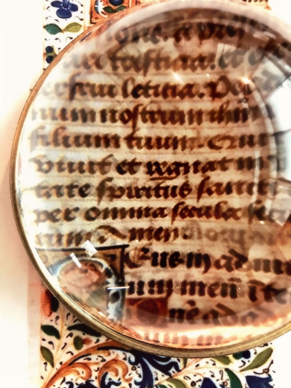
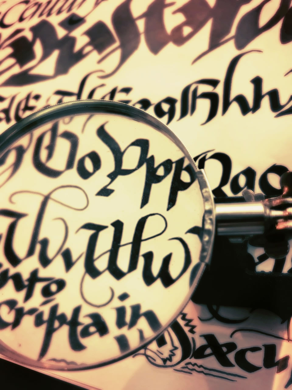
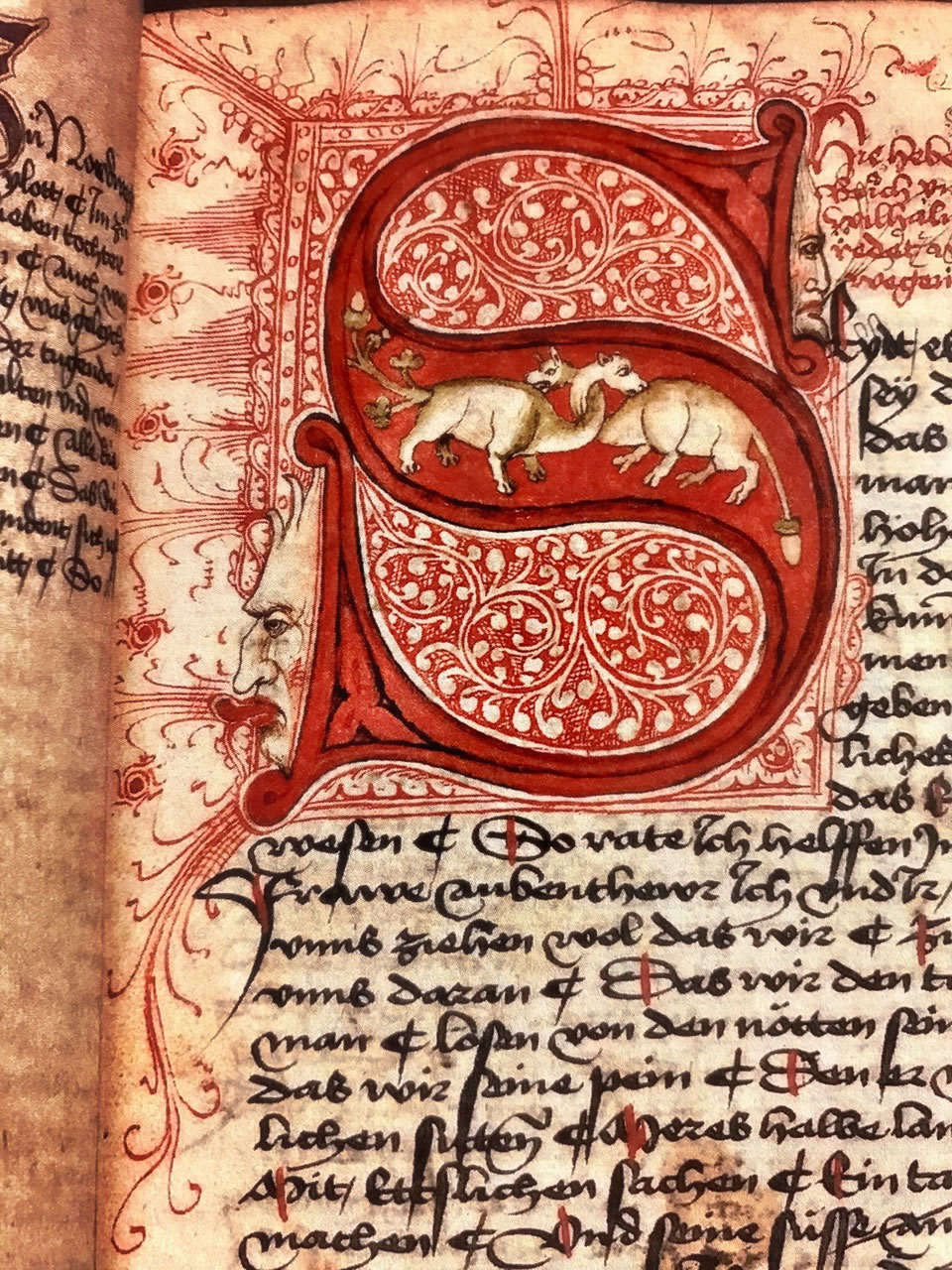
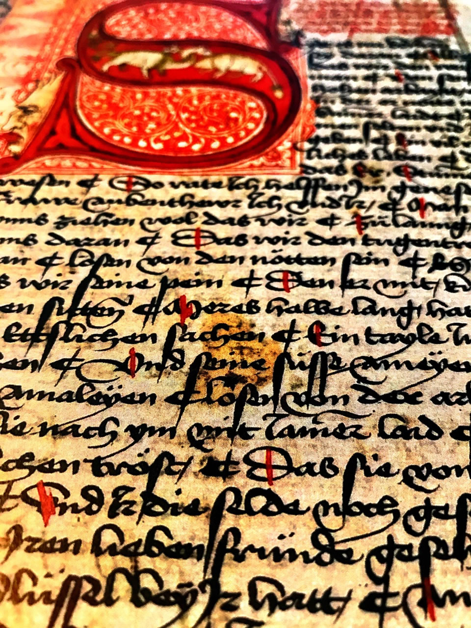
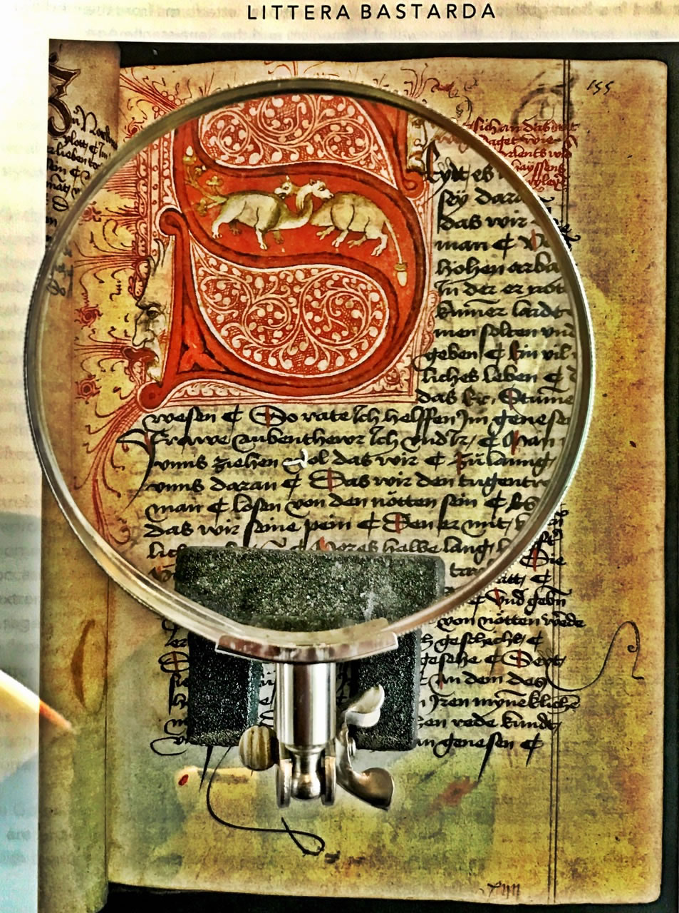
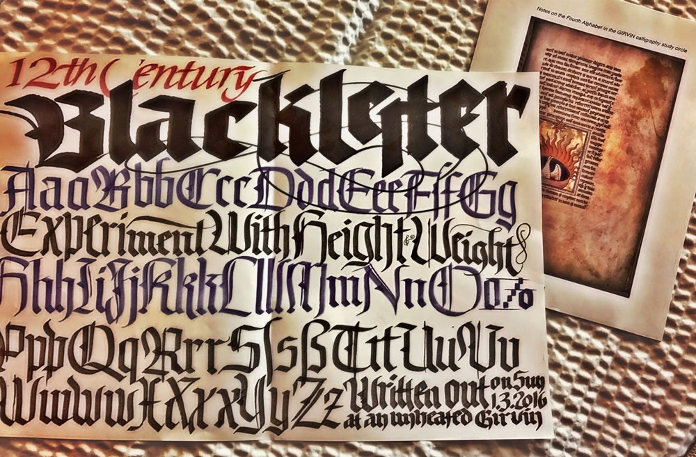
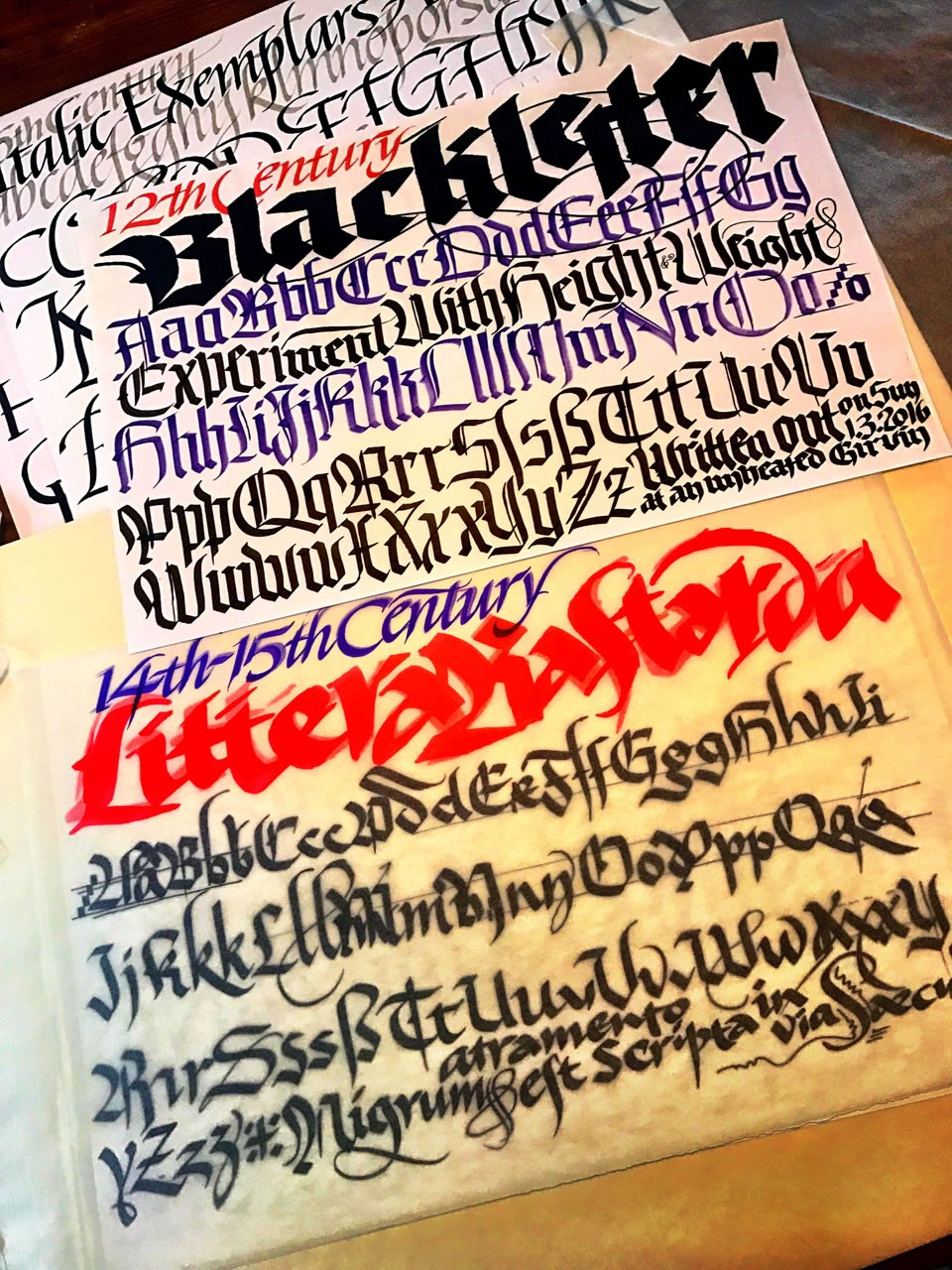
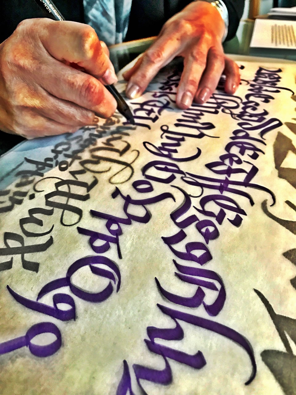
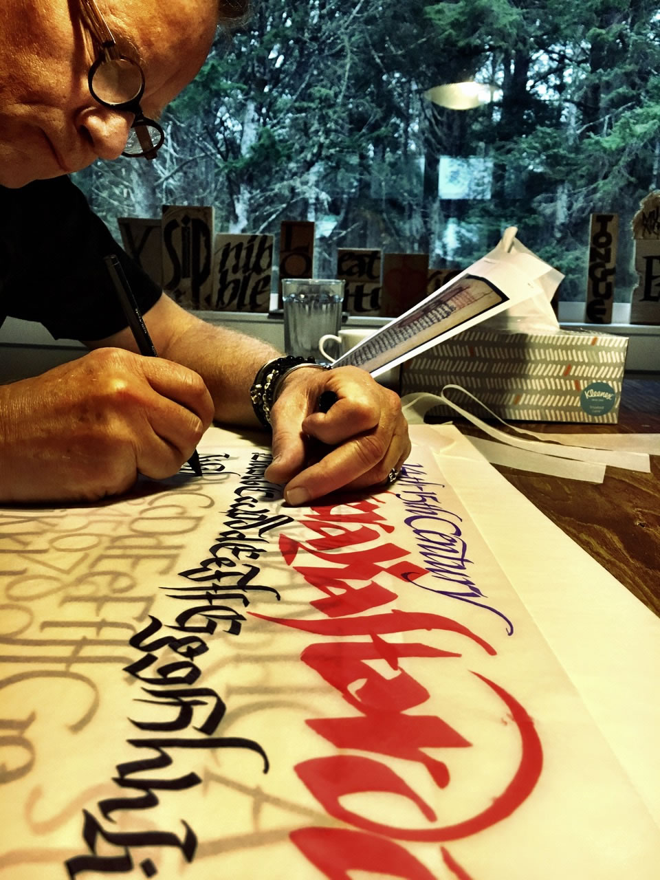
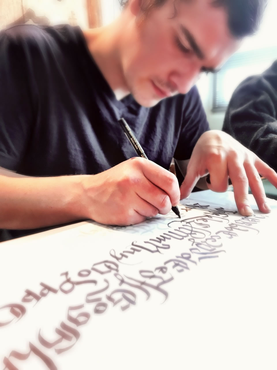
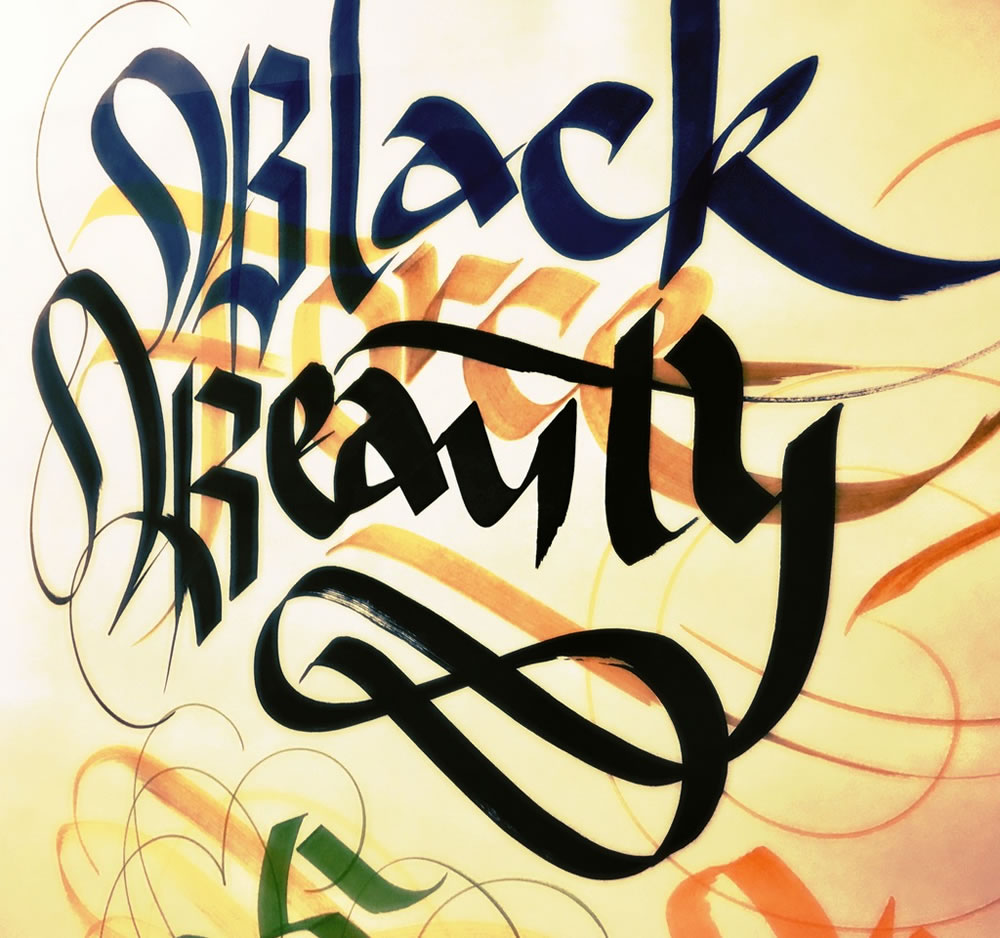
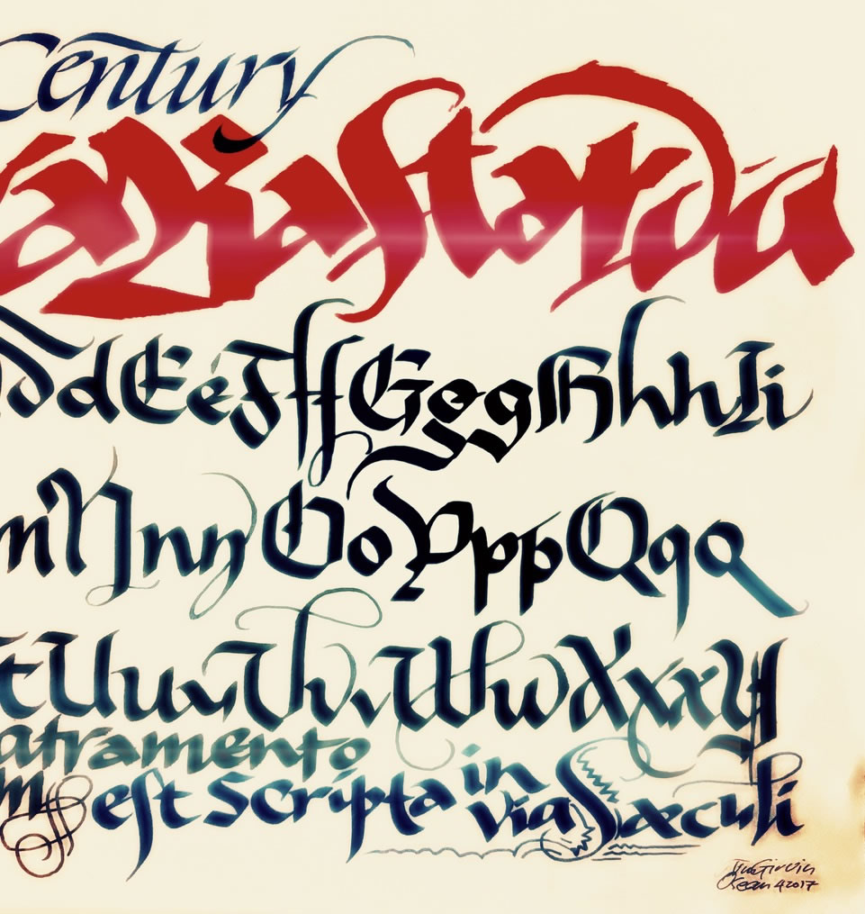
The core conclusions of learning how to extemporaneously draft any alphabet from 800BCE to the 19th century [my collegiate goal in the 70s] is that, as a designer, you have built-in the construct of meaning to type design. Deep[er] work always gravitates to a quest for meaning.
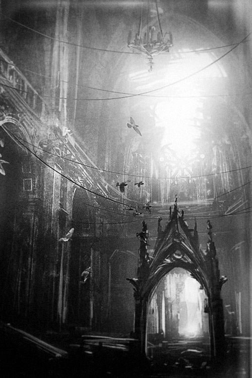
You know what an alphabet looks like because you know where it came from, how it was made, and why the forms of that age were drafted. Could it be that the architecture of the Italian renaissance aligns with the soaring gracefulness of its humanist underpinnings, which too — in the imagination of the Italian Humanist, reached back to Imperial Roman design strategies of an airier sensitivity. While the age of the Goths and the thicketed arrays of black letter might, too, align with the dark and forested impressions of an ancient grove; the Sun, a rose window at the end of a “nave” of long, intertwined tree trunks?
You go somewhere.
Where you wander is what you make of that journey.
Find something.
Tim | GIRVIN | NYC @ 57TH
––––
Crowdweaving innovation >
ideation, charrettes + brand events
Girvin BrandQuest® | goo.gl/yAquKQ
