DESIGNING FURNITURE THAT PROTECTS THE USER.
As a designer, I’m frequently talking about the core power of markings. In fact, at Mark Anderson’s futurist, high tech conference—this year in ParkCity, Utah, I was doing just that—talking about the symbolism of the mark and the patterning of markings as a larger sequence of storytelling symbolisms.
So if there is belief:
practice what you preach.
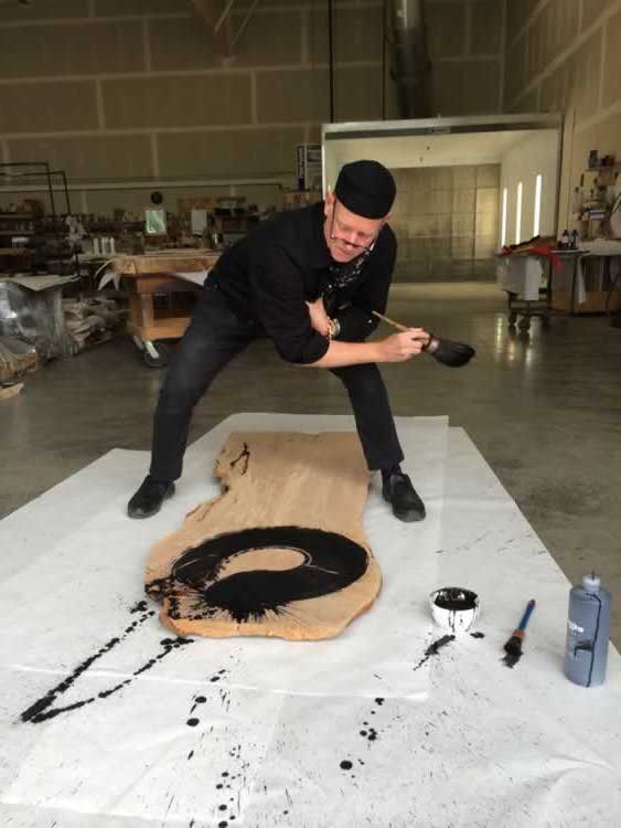
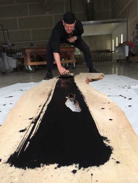
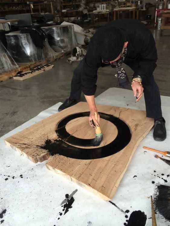
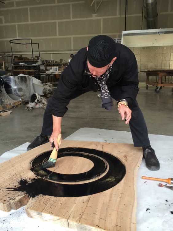
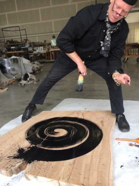
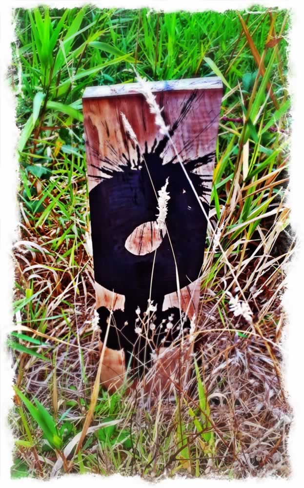
Working with a set of fallen, street-harvested urban trunk sections, band-saw cut, I drew ancient symbols of protective power. They are about containment, encirclement, flow and the manifestation of energy—a kind of amuletic fluency, brush-drawn with focused force and ch’i.
Imagery by Dawn A. Clark.
So what of a mark, well-laid, as a statement to place?
In the context of branding and place-making strategy, a brand management and processional experience tool would be the patterning of a place, the brand storytelling drawn in, and through, that visitor walk-through.
Some notes on that thinking.
A mark tells a story—as you see into it, wander into it, know it.
In fact, earlier times, the mark was a form of evocative power—one mark can speak volumes, of myths, of journeys and adventures—of personal travail and triumph, of memories and meaning—what could be, rightly disposed, is an open to the leaning-in, the listening, can speak to the opening of eyes, hearts and minds.
A mark opens the nothing.
It splits the dark.
It divides an open space into quarters—as the + is drawn. And the circle stroke contains.
As in, those meditations speak to:
There is nothing: the space of unrecognized void.
Then:
there is a point.
Then there is a line.
There is a +
And there is
the circle.
And there is the whorl-winding, the labyrinthine spiral of
the no-thing to the some-thing.
Most design, including the design of alphabets, comes down to this symbolic language.
The point:
boom,
there is a mark in place.
And it sets a mark in time.
Measured, it is plane-revealing.
What was no-thing now has a perspective,
a seeing-through to the other side.
The mark sets a beat to the articulation of space, into the perspective rendering of place.
The line, the splitting of the void to halves—the equinox,
or the staff of light.
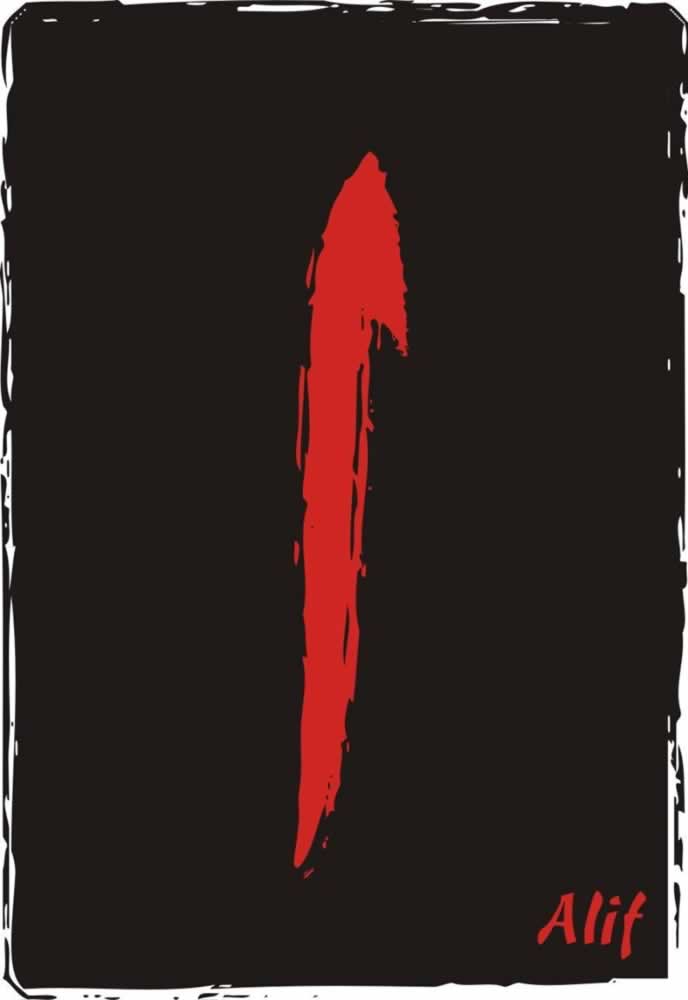
For example, the Arabic alif—
light-splitter, the first stroke of creation.
The cross-stroke—
an exemplar in our work for Tableau.

And finally, the next most powerful symbol—the circle.
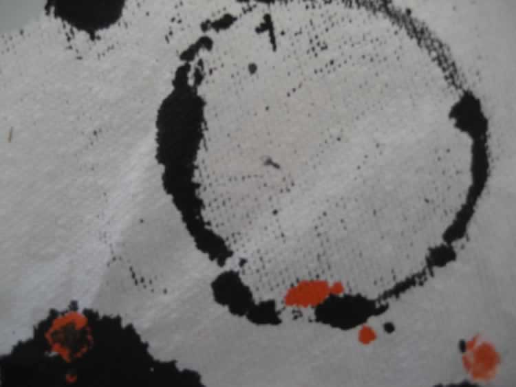
All together,
this the core of the symbolic language—the most powerful foundations for all of
the most graphically simple,
designed marks.
Even the most common containment—the square—is but a straightening of the boundlessness of circularity.
I was thinking, what of taking fallen, cleaved and polished timber, drawing marks as a talismanic form? Then furniture?
The talisman is emblematic of protection, and mostly consisted of markings, symbolic scratching, alphabetic spells and sigils.
That is, talismans are mostly graphical. So I thought to manage the notion of a protective procession with the furniture of cleaved street-fell timber, from our partners at MeyerWells.
This maps out as:
—the dot, marking space:
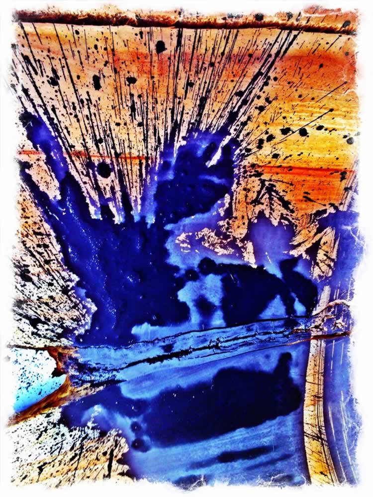
—the rule-demarcation of light and dark,
—the stroke of the transecting planes.
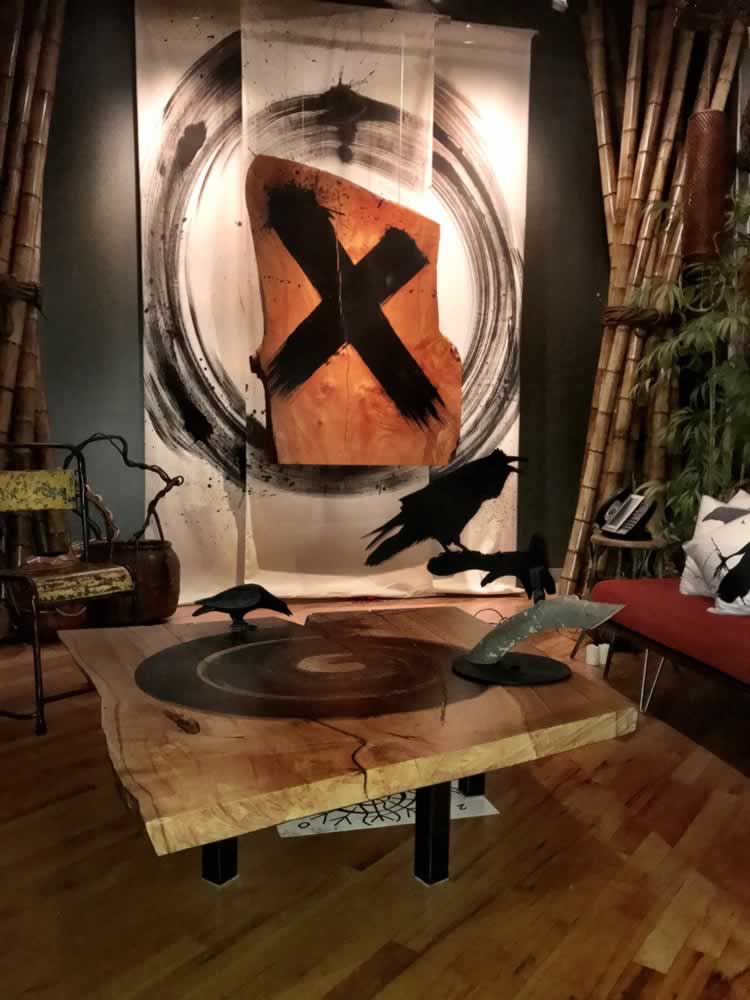
And that table, standing in the office, with a series of alphabet blocks looks like this.
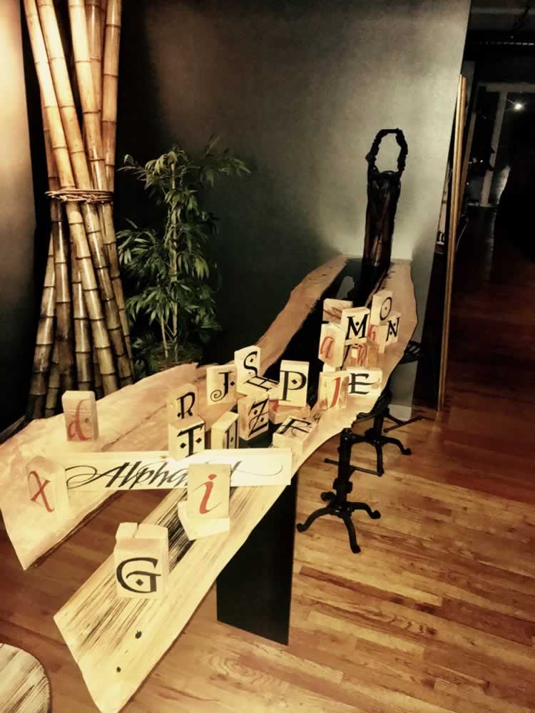
Any drawing requires a meditation, a moment before momentum: a pause in study of the wooden slab:
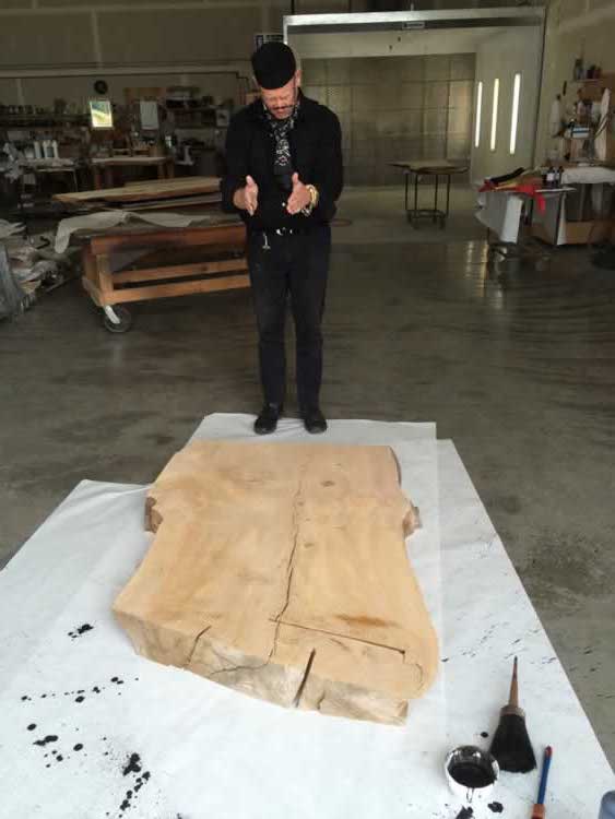
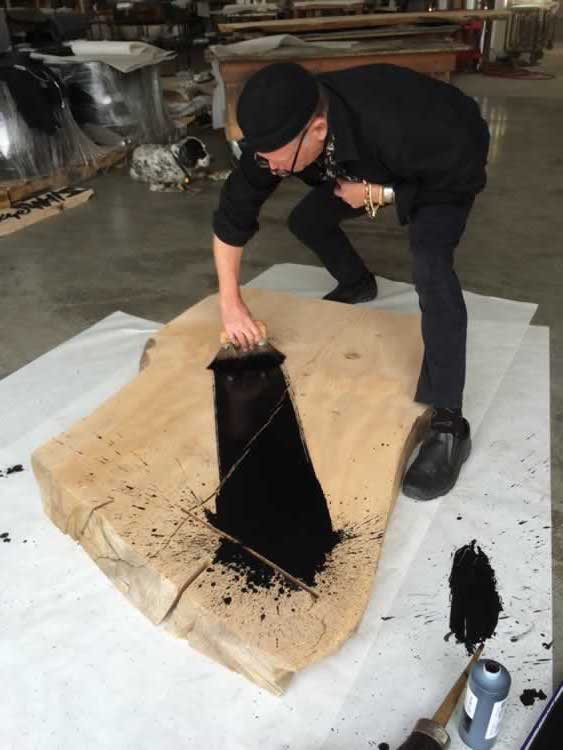
of the crossroads:
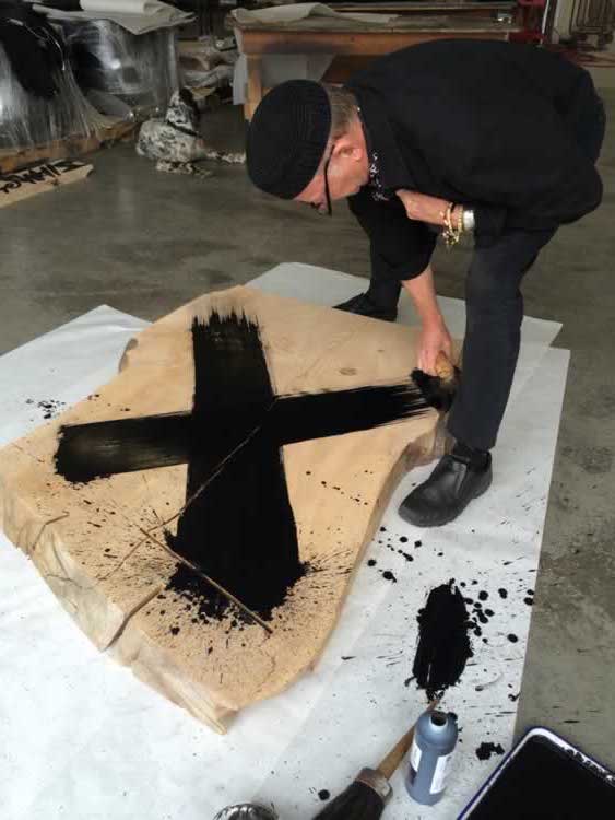
The X,
the +,
the crossing guard,
these are among the most powerful symbols—they are definers of plane, of axial points, of intersections and interplay between realms. And in global cultures, the crossroads are places of magic. One plane meets another, and at that crossing point, the neXus, that is where the portal lies, between planes, between realms, the heart of the doorway.
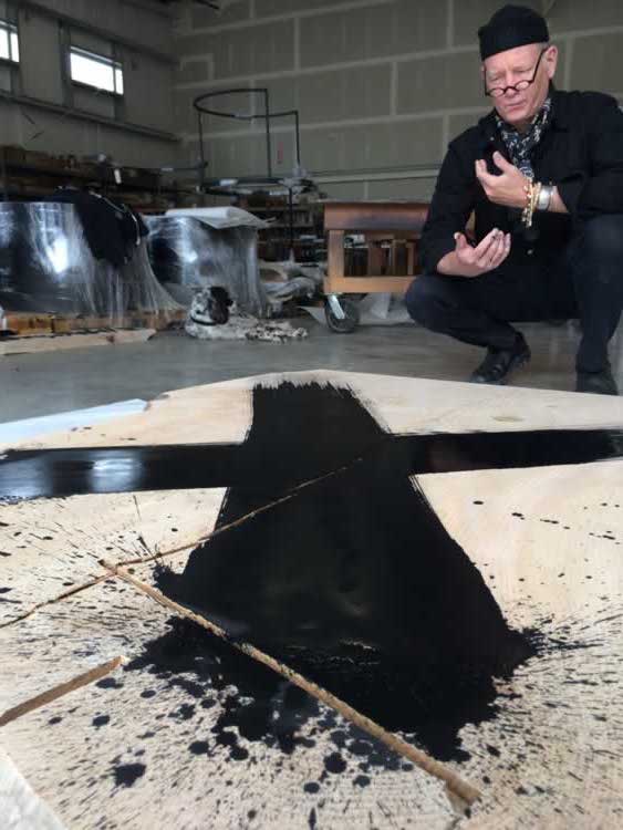
has been widely noted and studied in earlier examinations.
O N W A R D S :
—The circle, it is our return, our containing, our protection.
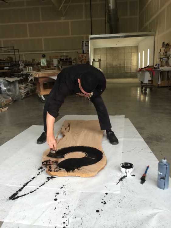
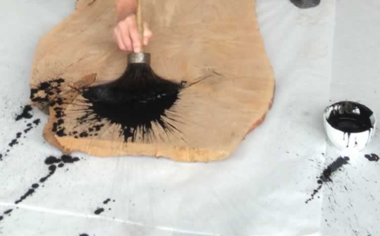
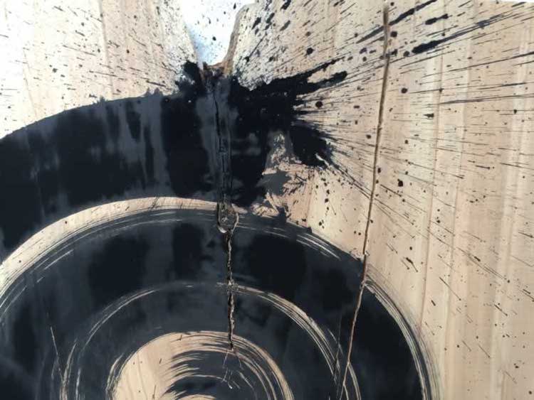
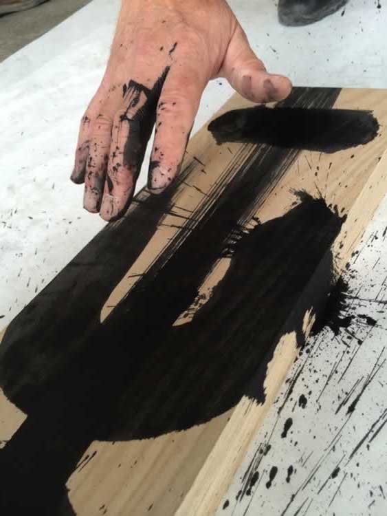
As a draftsman, stroke-maker, calligrapher, I’m curious about the meditation on the power of the stroke, the force of focus and engagement, so when I draw these furnitures, I pull force and explosive energization forwards—the sheer charge of the ink on fields of paper, metal—and, in this instance:
the fallen and sheared slabs of aged timber.
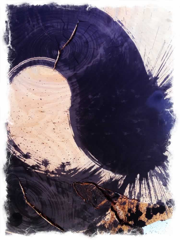
And its place as a talismanic piece of furniture?
A stanchion in the library passage point at GIRVIN | Seattle.
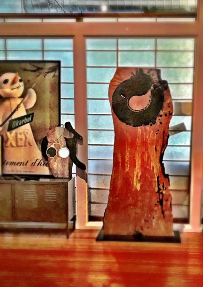
And others?
From the circle, the spiraling form marks the journey of us all: labyrinthos—coming out, onwards, inwards;
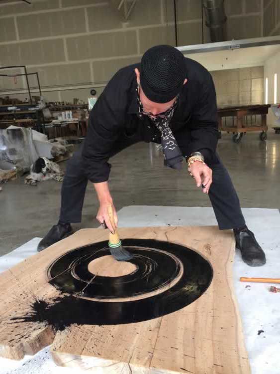
The timber is cut with a massive bandsaw, sectioned from large scale, downed timber as I’ve selected from a standing stock:
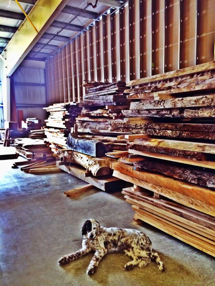
trees that have died, rotted-out or storm-cast; they are crane-lifted
and hauled to a mill, sectioned and polished.
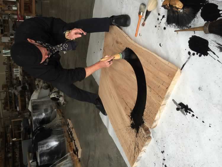
I size up the timber and look
at the character of the slab,
then draw to it,
into it,
on it.
And the furniture becomes something else, a protective object.

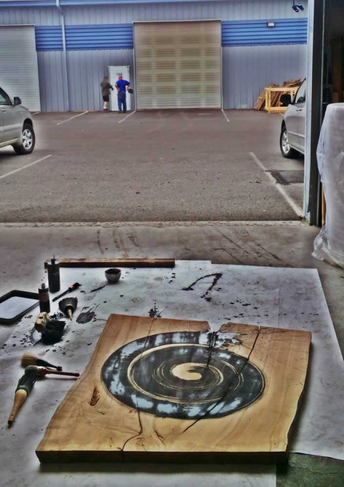
Which then becomes this tableau:
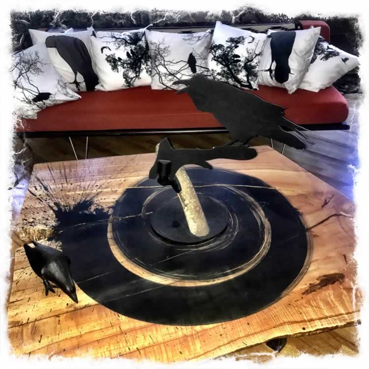
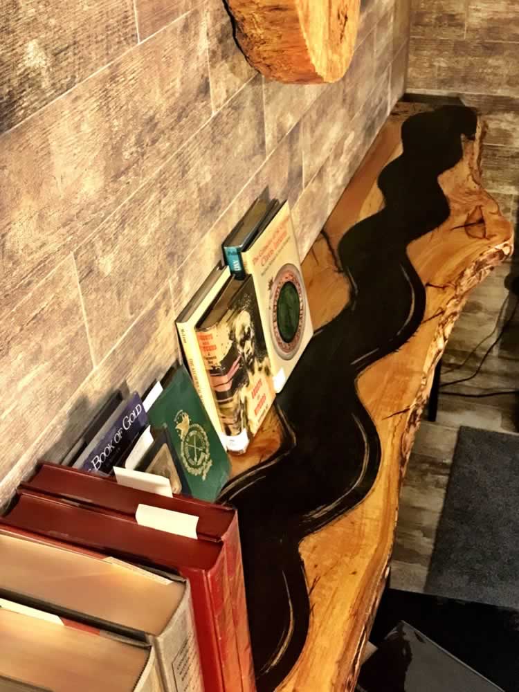
—Another timber: the serpentine: flow.
Life is a meander, like a river, it keeps moving, there is flow unceasing and the force of the river keeps its pace,
ever forward to the Sea.
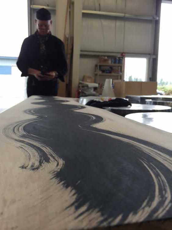
A bookshelf, wall-mounted, the serpentine pathway:
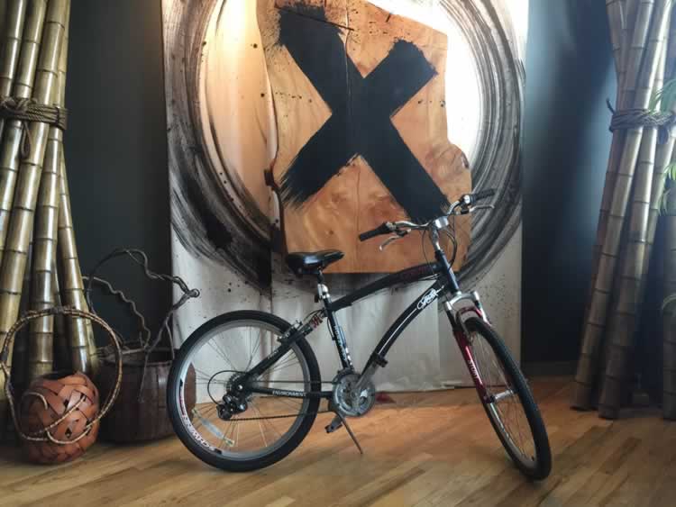
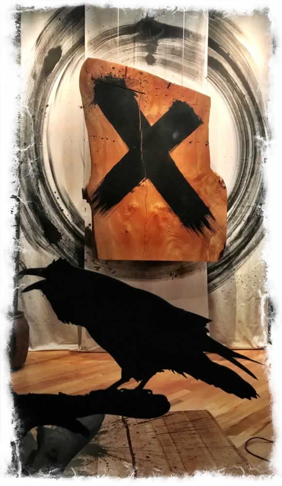
The X-file, as an entry talisman to the office.
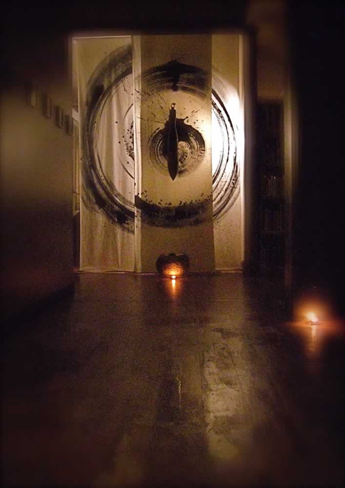
Hung with guy-wires on a three-panel canvas circle stroke—the ensō.
The slab weighs several hundred pounds, and
the canvas enso is 10’ high.
The raven on the spiral table is cut from cold-rolled, then ebonized steel on a toggle, fabricated by John Bandringa, a Girvinist from the 1990s.
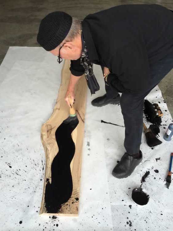
It’s a messy business,
but I like it.
These are signs, sigils and signals of messages, from this side, to the other side.
Those who know how to read, shall know—
human or spirit.
TIM | GREENSBORO, NC
….
THE STRATEGY OF RE-IMAGINING
HOSPITALITY & GUEST ENGAGEMENT
DESIGNING ENVIRONMENTS FOR UNFORGETTABLE PLACES:
HOTELS |RESORTS | SPAS | RETAIL | RESTAURANTS |
SPAS + WELL CENTERS
Happiness experience design, storytelling + brand = goo.gl/WCHxLM