THE STROKES, THE GRID AND THE CURVES OF MAGIC
Mark off the grid of proportion,
reach for meaning,
touch the reed,
learn the language,
lean in and listen
to the ancient tales.
That is where the alphabet comes from:
the mists of time
and mythic meaning,
the archetypes of the stroke.
I was a wanderer —
and part of that wandering
took me to Harvard [to see my brother Robert,]
and the Houghton.
And part of the journeying took me to Dr. Annamarie Schimmel —
then an Orientalist and Scholar at the Fogg.
I talked to her about meaning, layer in layer, stroke on stroke,
mystery in mystery.
I was talking to our clients about
the alphabet and the mysticism of
the build
of their logo.
Everything has a meaning.
Point is — what do you know about it, where to look,
what lies beneath and within?
Most think of lettering as a kind of crafty thing.
But it’s too old for that. As old as time, told.
The stroke of the I, and the strokes of the O
in the mystery of these —
everything is built on the intertwining
of these two movements.
Drawing letterforms is a mystical journey — it’s a place-making; there is the ink, the white sheet, the drawing tool, the wrist, the fingers, what is there, the black of the stroke and what is not: the paper. the mapping of the letterform, the stringing of the alphabet as a tapestry of storytelling.
The letters have meaning and ancient content — they are sounds of voiced reading, but they are founded on symbolic values, that leads back and back into the kernels of mind, memory and magic.
A mark means something more than —
a mark.
That’s where I live and work.
When I build an alphabet, I’m looking at the soul of the storytelling, turning in hand the nuance of tool, muscular memory and the paleography of 3000 years of proto-sinaitic scratching, ancient semitic markers, the tale-spinning of the journeys of Egyptians, Mesopotamian, Macedonians and the empire builders of the Etruscan clans, the Greeks, the Romans and all the journey going forward to the now.
I look back on it all.
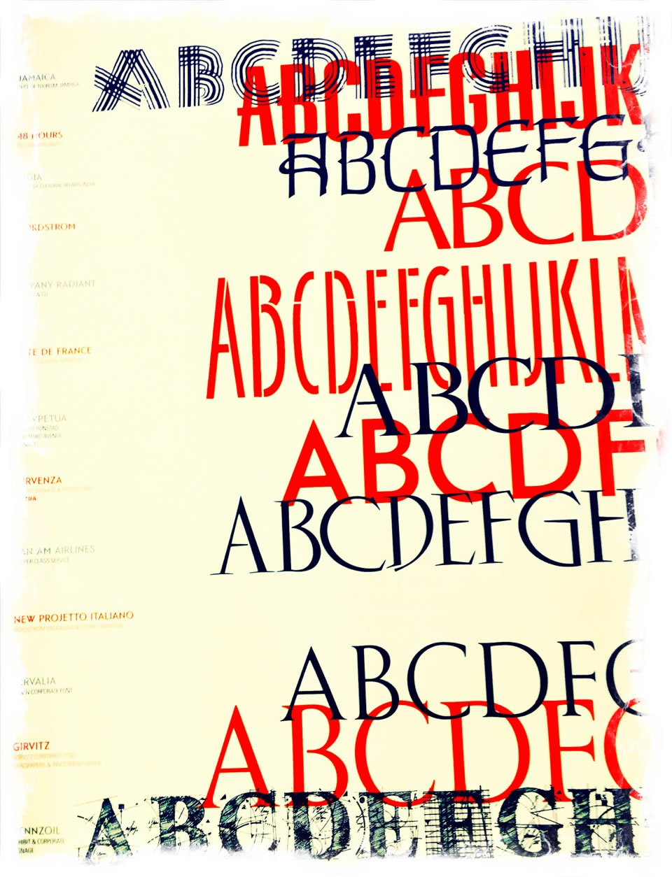
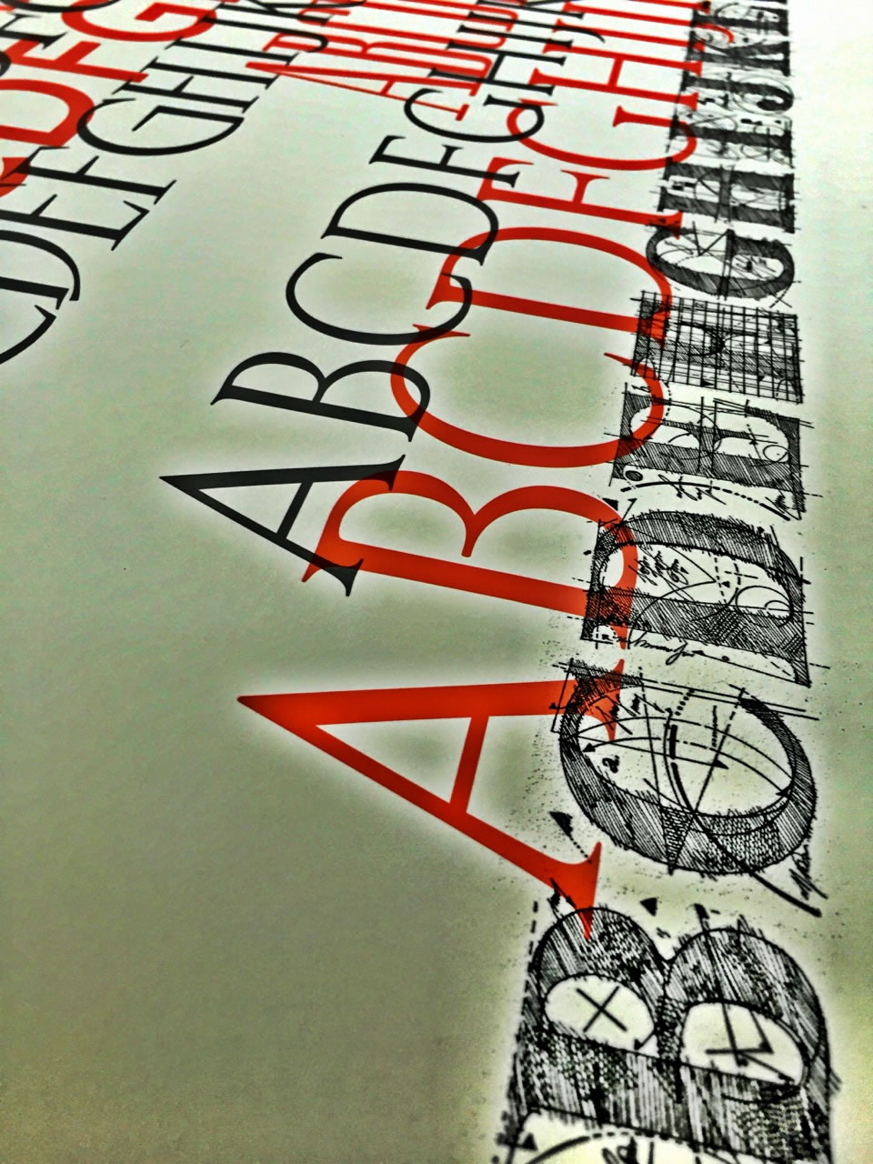
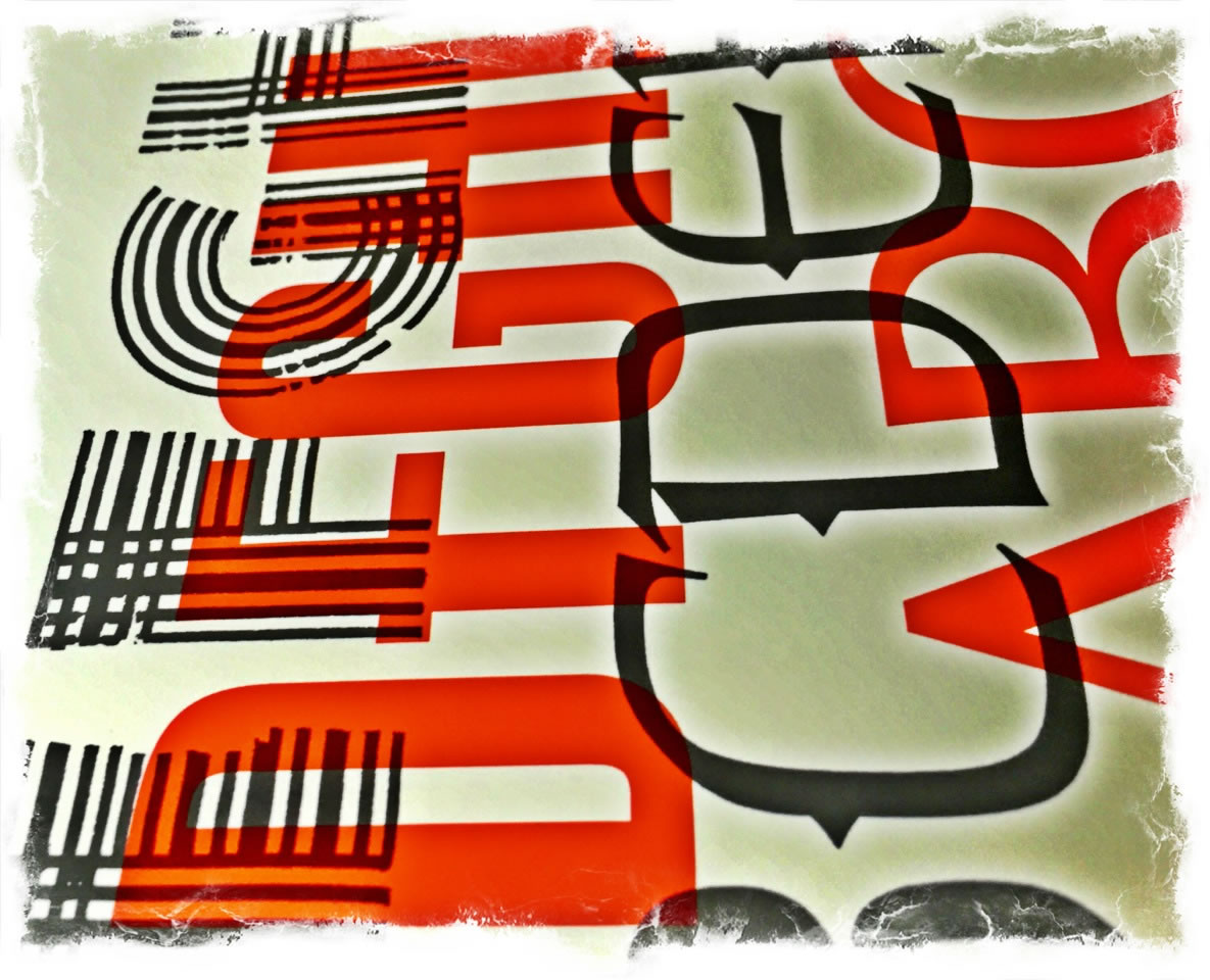
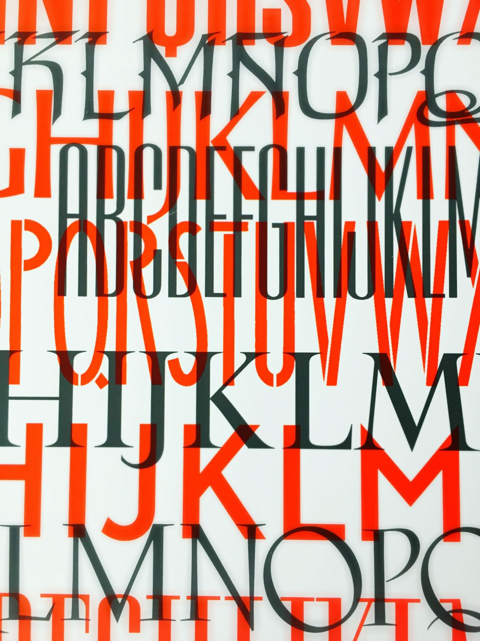
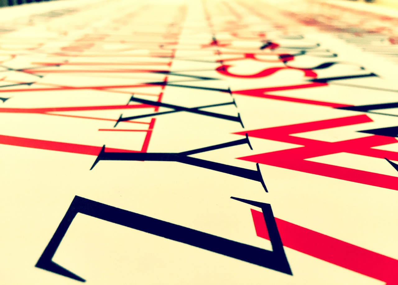
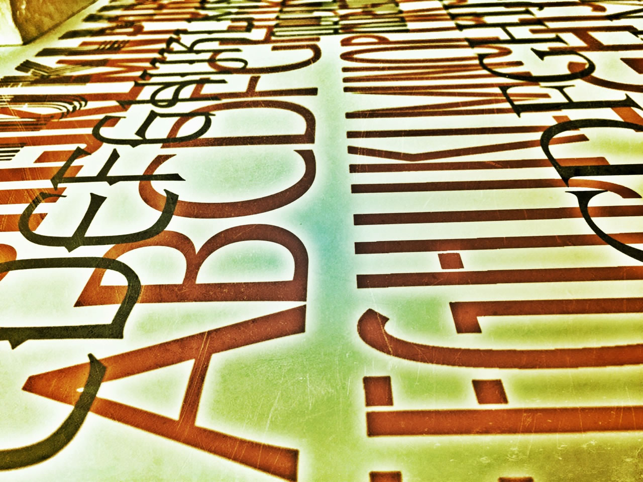
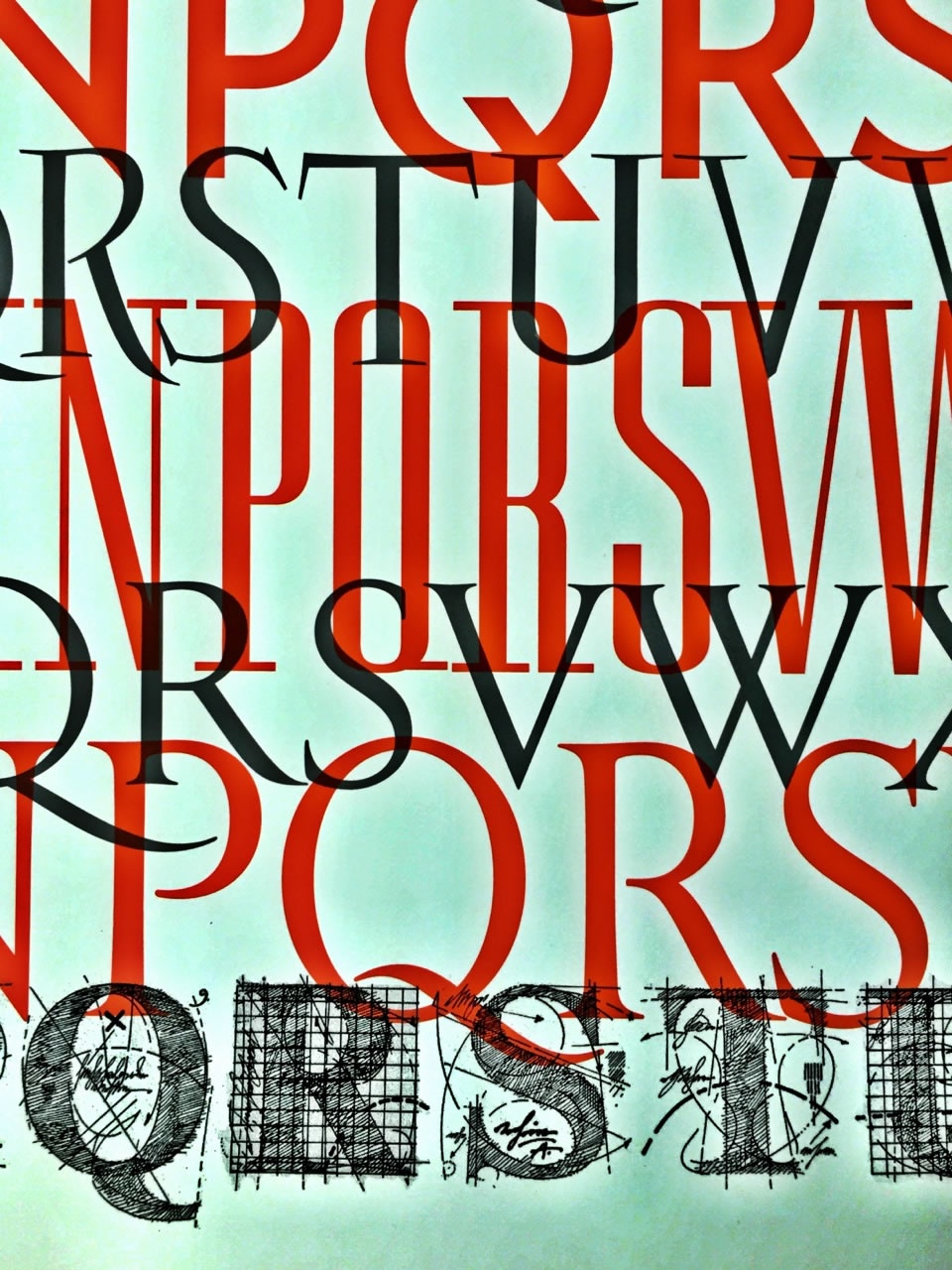
Some of that patterning, here above —
a string of Girvin fonts.
Designed for Bloomingdale’s, Tiffany&Co., Michael Bierut and Massimo Vignelli, Tiffany&Co., Nordstrom, PanAmerican Airlines, Pennzoil, The Horvitz Trust, FiFA and others,
we keep designing them — the gestural twining of idea and ideal, because: why?
Sometimes, most times, I think that the journey to
a hand-built interpretation of a dream
is more in keeping with the patterning of ideas
closely tuned to the nature of the telling.
A kind of editorial culling of light and dark — sculpting forms that, by nuance — suggest age, newness, commonality, luxury, boldness or delicacy.
Sometimes is you need it — just so.
That’s how you get there — make it by hand.
Measure
meaning
in
memory.
Tim | GIRVINWATERFRONT
F i r e s t a r t e r & A c c e l e r a n t
B R A N D M Y S T I C I S M | Deep Journeys to Team & Enterprise
D i s c o v e r y: http://goo.gl/DNfwS9
HUMANS, BRANDING + H E A R T
GIRVIN BrandJourneys®
http://goo.gl/iyQIzK