
The Context of Message, Framing of Context and Visualization
I look for signs that aren’t signs —
in a conventional sense —
they tell
another deeper story,
but sigils that signal a message
that stand for the nature of a place.
Cairns, ovoo, iwakura no mononoke, menhir, dolmen.
Traveling in the Himalaya, the trekker will see piles of stones that reference prayers and mantra, carved on the skin of the stones — these stones are messages, way-findings — way-placements, but they don’t point to a village on the path, but a higher state of being.
A sign and a symbol — something that throws beyond.
That is one
way to be thinking about
signs,
and the sigils
of their story.
To take them away
to steal mani stones —
sends a thunderbolt after the thief.
There are signs that are signals
of another tiers of mention, meaning and mind.
Sometimes that are other variations of urgency.
A sign that speaks to its own physical design characteristics.
Like: “ you can read this, but you can’t touch it.”
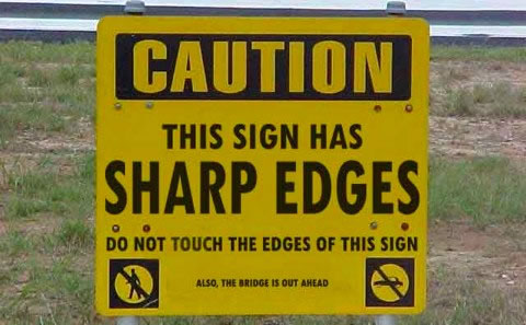
While I reference the care of handling signs — only a sensualist would be thinking about “touching” a sign out in the middle of nowhere.
I like that notion of offering a sign —
that speaks to the character of being more focused.
Be aware, there is danger in the air.
That has a nice rhythm to it.
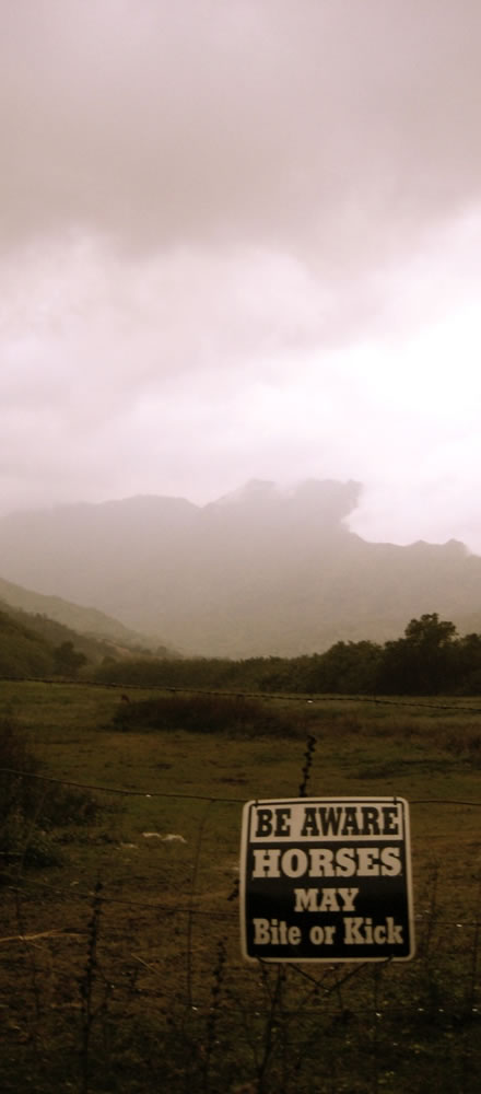
And on that theme of signs that
signal more — a danger-based signing treatment that is, in fact, in a state of dissolution is symbolic unto its own positioning.
Things are dangerous ahead, and falling apart.
Yes, makes sense.
Keep away — things are dissolving here.
This is a place that things are falling apart, disappearing into the jungle again.
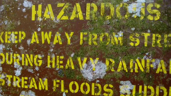
This, on the other hand, as
a signing treatment uses a
disciplined typographic rendering that is modernist, urgent and
fast. There is no abstraction, no distraction — but a hinting of moss and a misting of fungi. So you know you’re out in a real place where danger flows through the veins of the wet ecosystem.
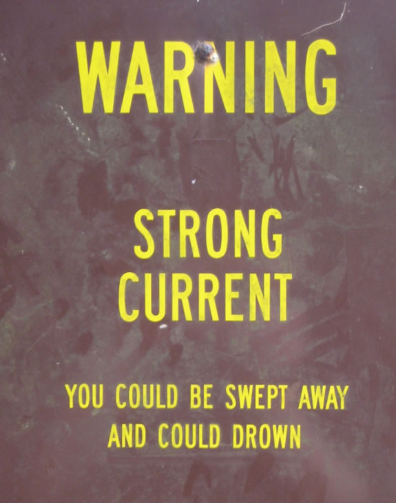
As a contrast to design and layering, signing and statement —
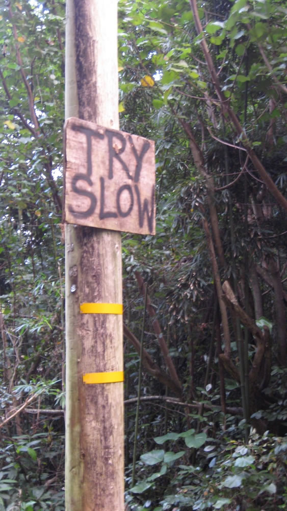
this hand-crafted statement —
you could, like the former, be more aware, and
“ T R Y
S L O W. ”
As a surfer, I watch the waves off shore.
Signs are natural, to curl and drag, force and parabola —
you can see the rhythmic reveal.
Signs on the beach are less than meaningful.
But they speak a language.
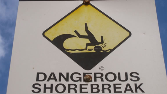
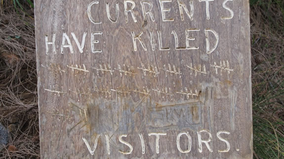
Some warners offer a tally in discussion.
Pay attention, as these haven’t.
A compelling layering of messaging in intention.
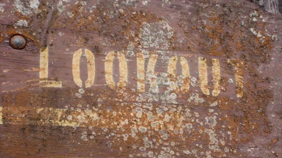
In most places, journeys to another vista, there is a presumption of a look out.
Which is just that, a place
of
looking
out.
If you’re expecting
to see more,
in the duality of study and spectacle —
you can be a look out —
a sentinel in your view
be the watch in
your
look
out.
Here, wildly distressed and battered by decades of sun and ruinous decay,
the sign — looking out — is a matrix of its own visioning — it’s seen the passage of time in weather, storms, wet and sun — and the deep forest, moss and fungi flourish — adding their own detailing to the signing and its message.
The signing that has no signing might be just
that, a sign that is a message —
but it has no obvious alphabetic message other than the statement of
its blank conditioning.
Blank, it says everything.
It is up to you to read it.
There is nothing.
There is
a way to
go, if
you
know
how to
read the sign
that is
faceless.
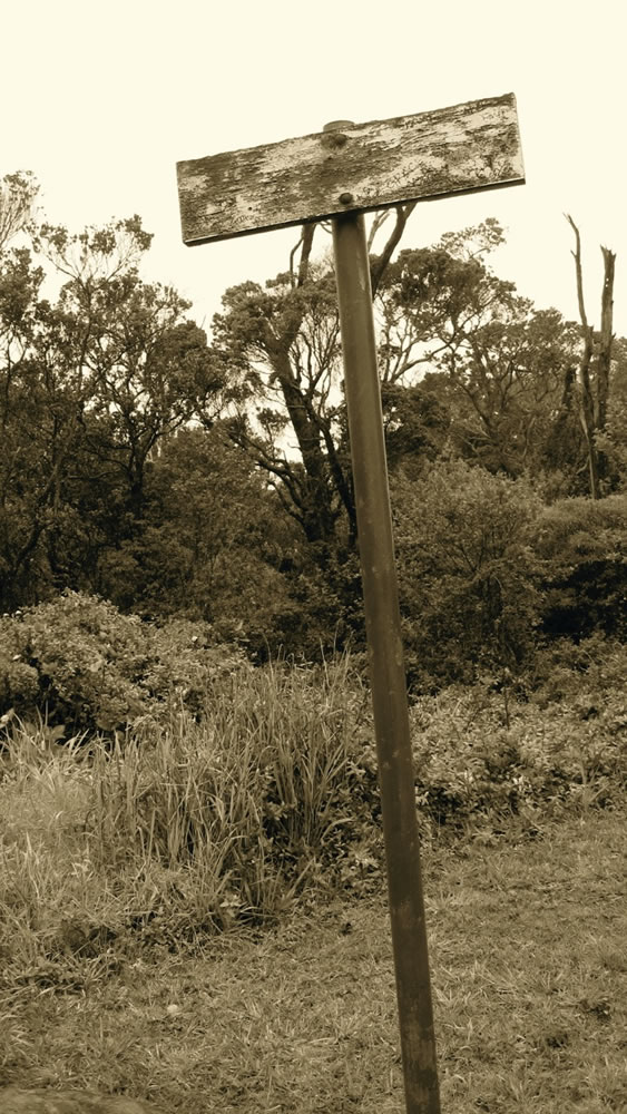
Or a call to evocation
— there is no
message other than:
H O N K .
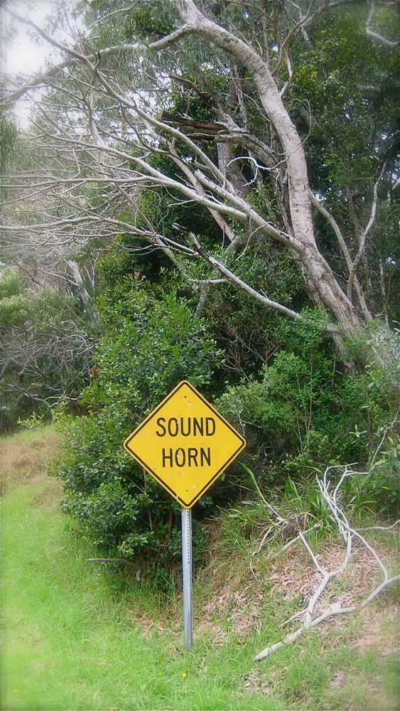
Kind of a classic American statement.
BLOW
YOUR
HORN.
And that too, an allegory.
You know your way.
Shout it out.
Or you are silent.
TIM | GIRVINNEW YORK CITY
….
MAKE
SOME
THING
–––––
THE STRATEGY OF RE-IMAGINING
HOSPITALITY & GUEST ENGAGEMENT
DESIGNING ENVIRONMENTS FOR UNFORGETTABLE PLACES:
HOTELS |RESORTS | SPAS | RETAIL | RESTAURANTS |
SPAS + WELL CENTERS
Happiness experience design, storytelling + brand =
http://bit.ly/1nrwiA7