Washington Capital
The Challenge
SHOW THE GROW(th)
Washington Capital approached GIRVIN for a brand refreshment that reflected both their company’s reputation and their growth as well as their commitment to the communities they serve.
The Solution
Distinction and Differentiation
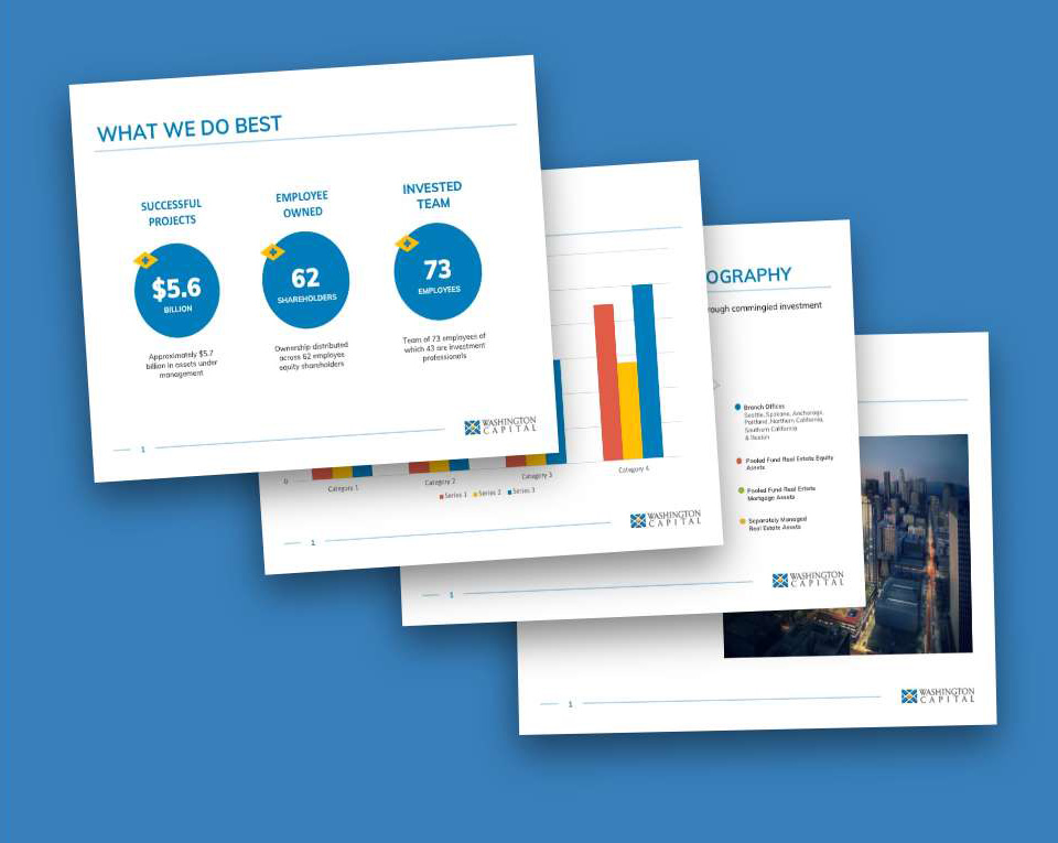
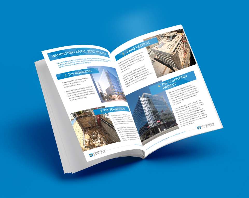
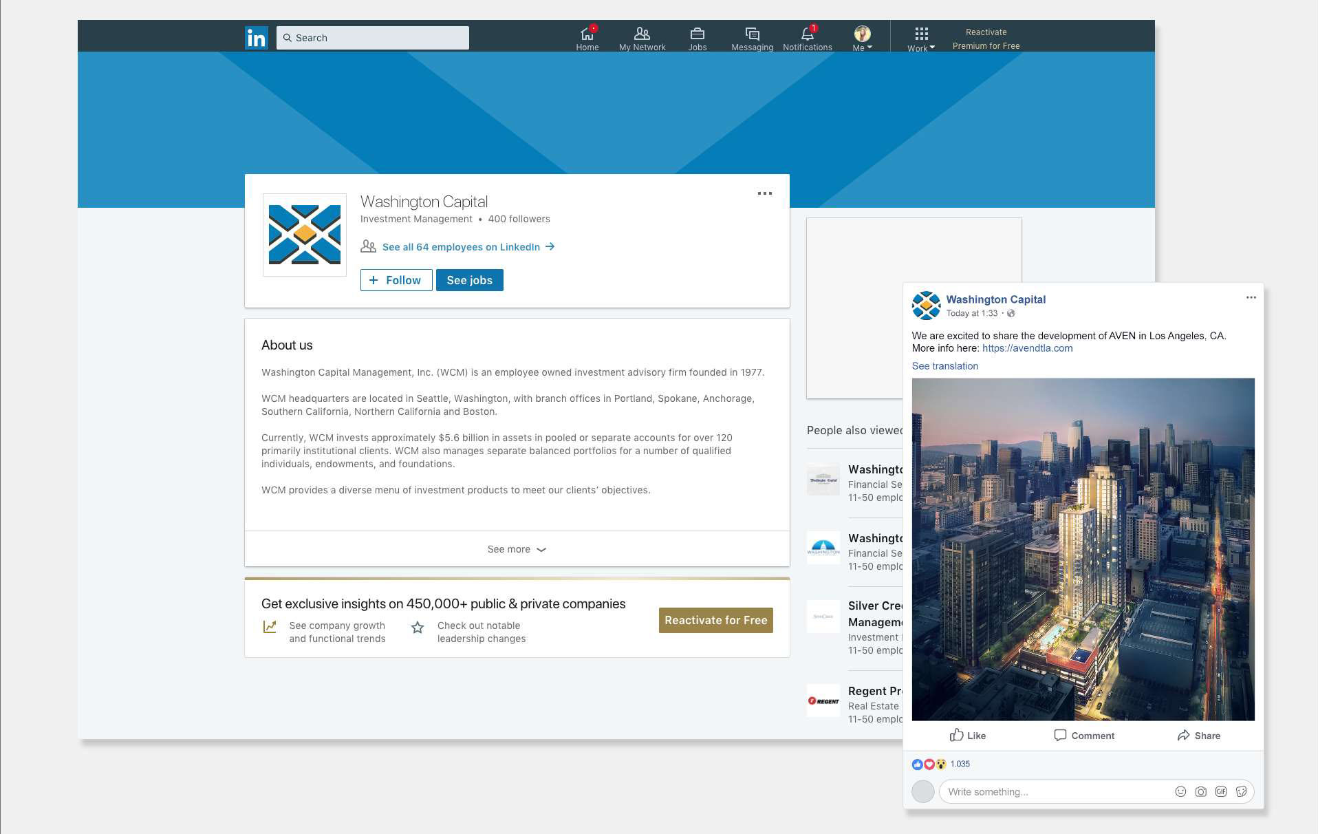
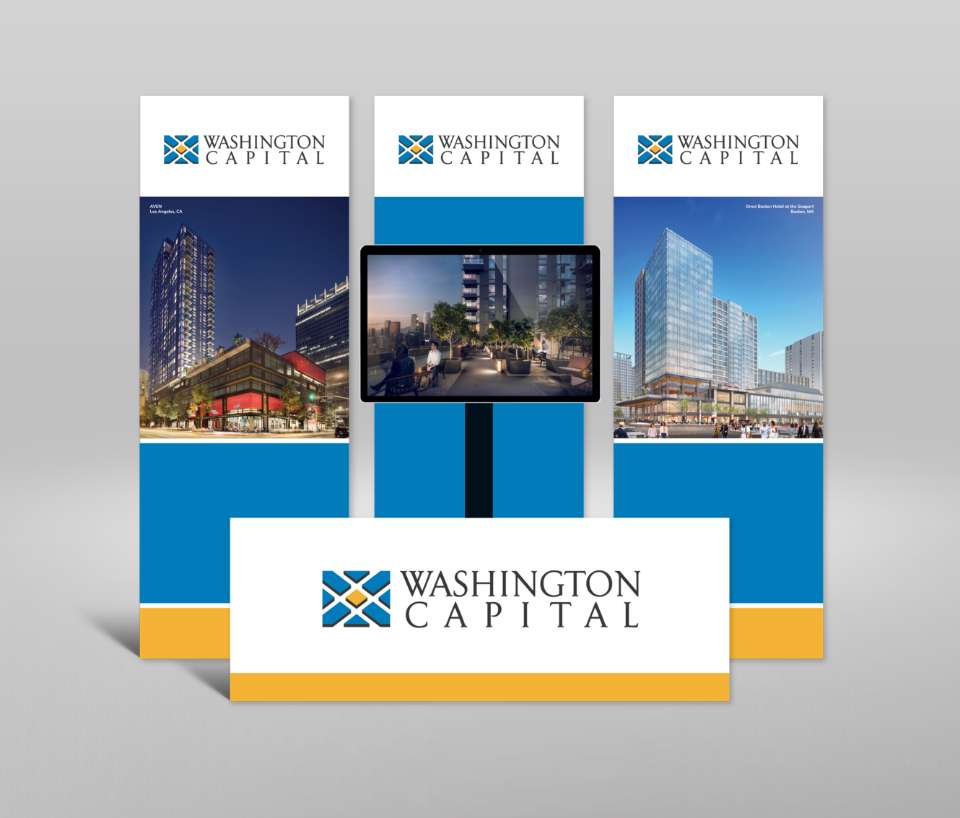
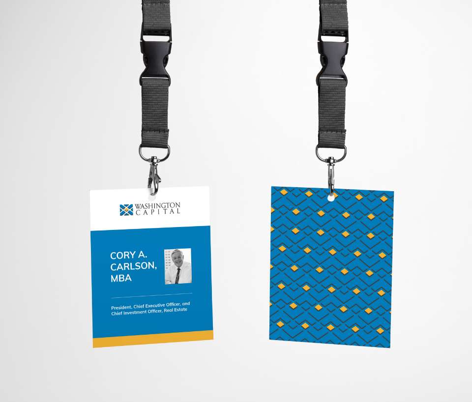
In our design of the new logo icon, two metaphorical symbols emerged from the resulting shapes of the reflecting “W” in Washington: first, a top view of a community with the buildings fitting together like a puzzle, emphasizing organized teamwork; Second, the shapes lend themselves to stepping stones, creating a pathway to success. From there, we extended the new identity into brand patterning, refreshed their marketing materials and digital presentations, and created a new brand guide that easily communicates the visual transition for their team members.


BRAND STYLE GUIDELINES
Washington Capital’s uplifting brand refresh resonates with new leaders while maintaining the history and reputation with current clients. With the new branding, consistency is essential to deepen Washington Capital’s national footprint, grow projects, and grow the teams to support them. This revamped brand look, language, and attitude provide both hard rules and general guidelines to communicate their growth clearly to all their clients.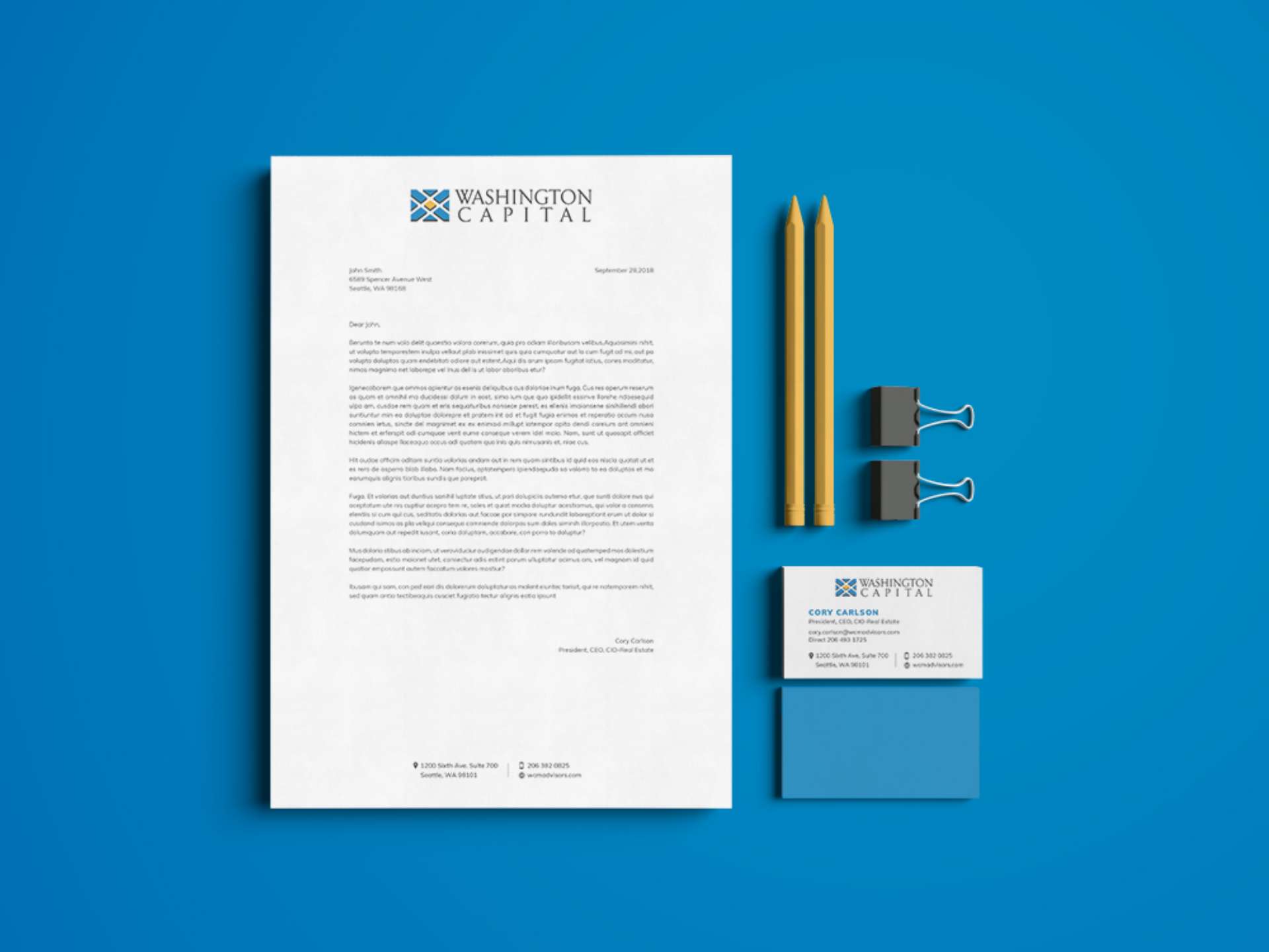
“
We are really happy with our new brand identity and have received a lot of positive feedback.”