
CLIMBING TO THE TOP IN ASIA
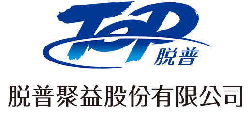
TOP is a Taiwanese “daily household and personal necessities” sales enterprise founded in 1957, which sought to expand its business with a Chinese partner in 1991. Today, 90% of its sales are in China. With a goal of further expanding their market to encompass more of southeast Asia, a change in corporate image from that of a local company to one worthy of a global corporation became necessary. This meant rethinking their corporate logo.


ALIGNED BY DESIGN
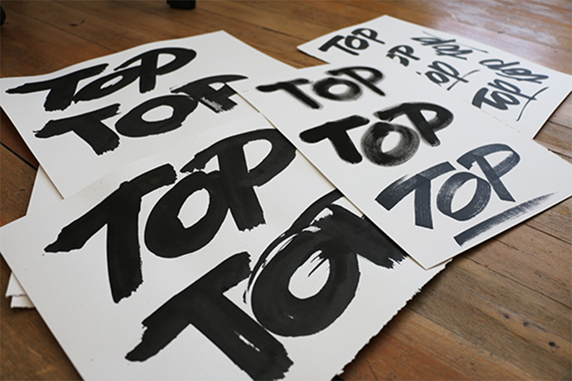
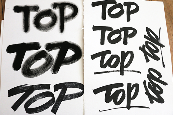
Our design partner in Japan, Tadaoishi Sato of The Design Associates Co., Ltd. (TDA) requested that Tim Girvin contribute to this project by wielding his expertise as type designer and calligrapher to provide a singular, collaborative typographic energy that supports TOP’s new branding and messages.
CROSS CURRENTS
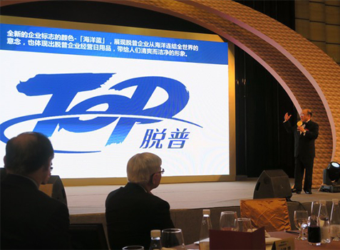
The dynamic brush strokes express the energy and forward thinking spirit of the company, while the arcing loop signifies globalism and bold vision. The corporate color is named Ocean Blue, and represents the connecting seas that extend outward to the world. GIRVIN has been collaborating with TDA over two decades now, combining our expertise and bridging diverse cultures.
