MTI
The Challenge
MTI Matters
MTI was in the midst of transition and needed support in envisioning a refreshed tier of intuitive messaging that aligned to their larger positioning. Their site needed a new coding solution that supported quick responsiveness for their marketing team as well as a visually cohesive and human-centric design.
The Solution
Blue Sky
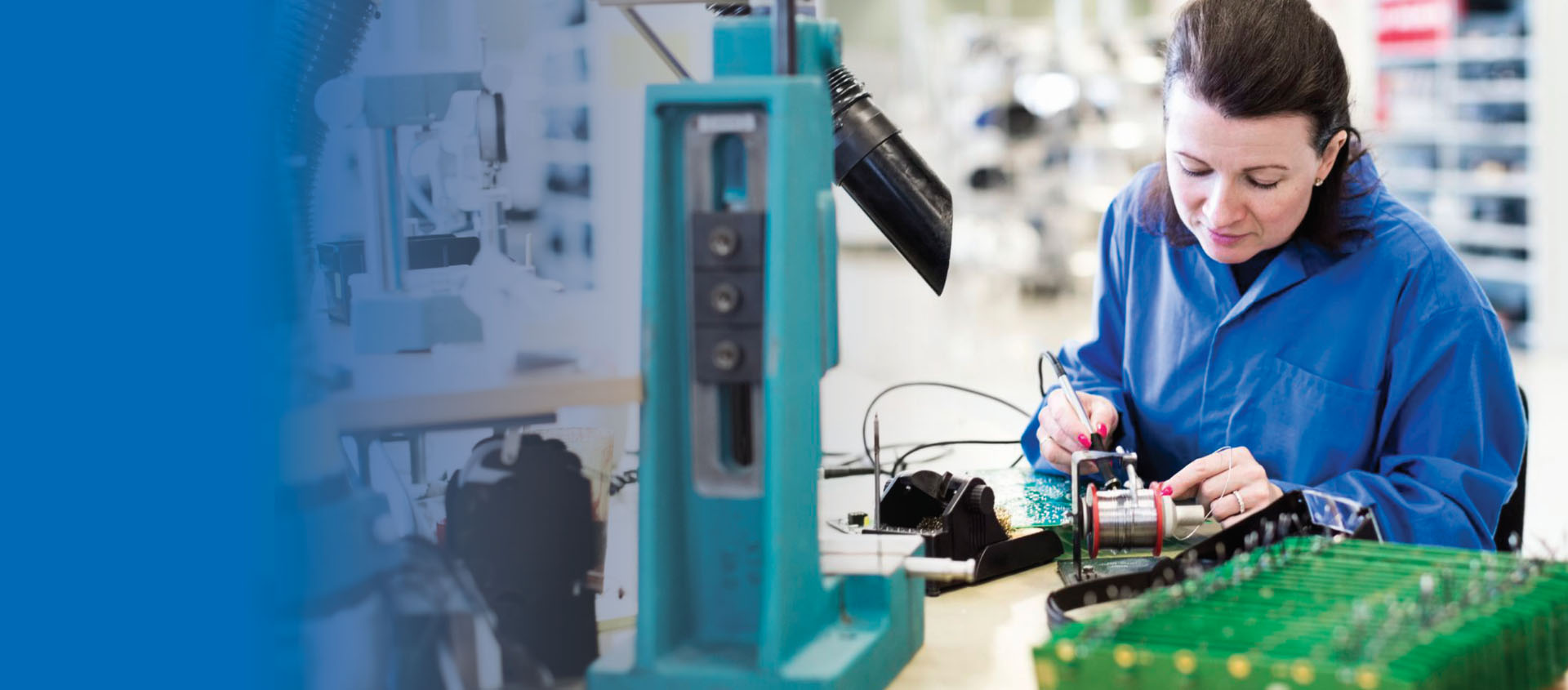
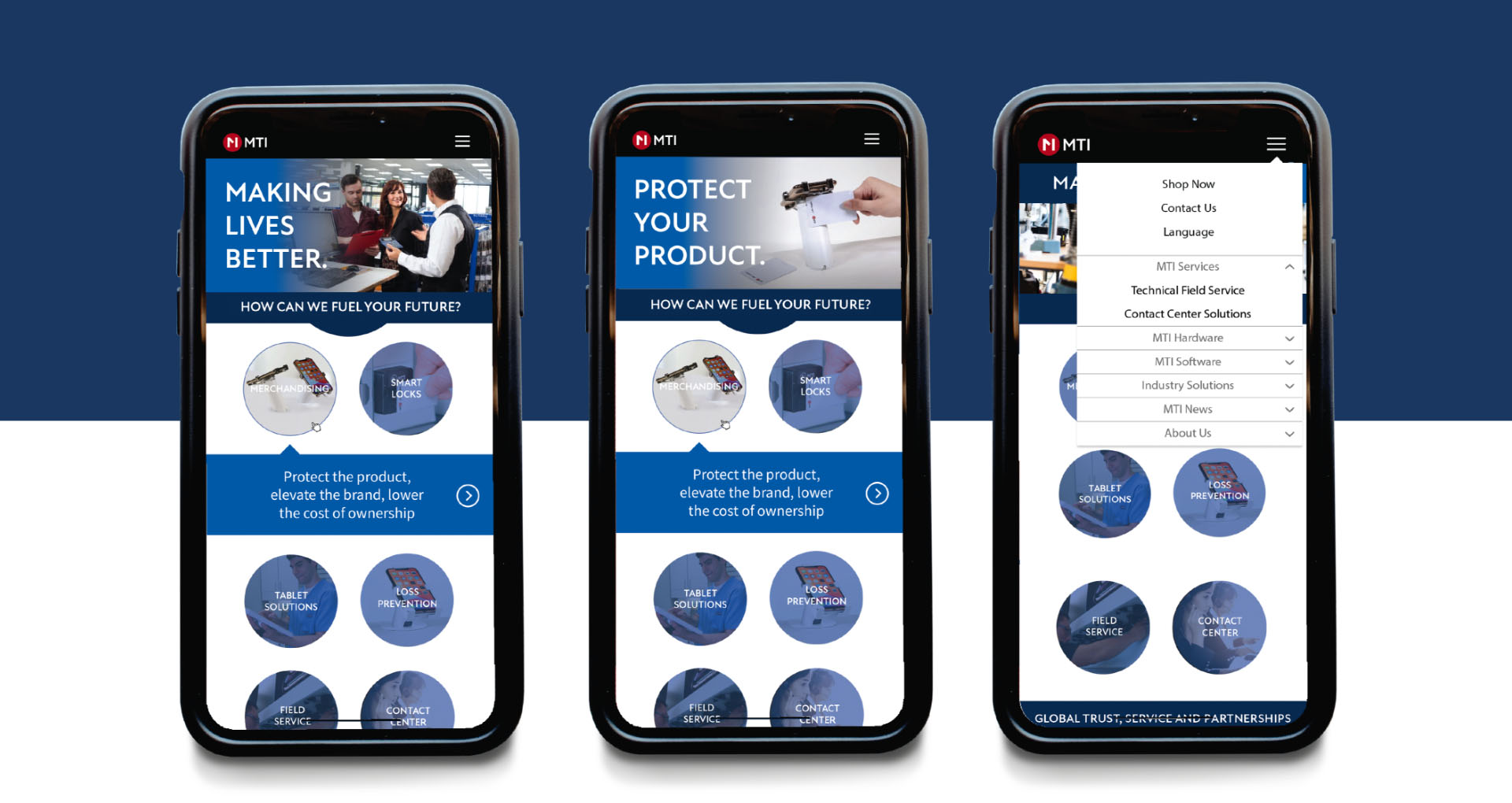
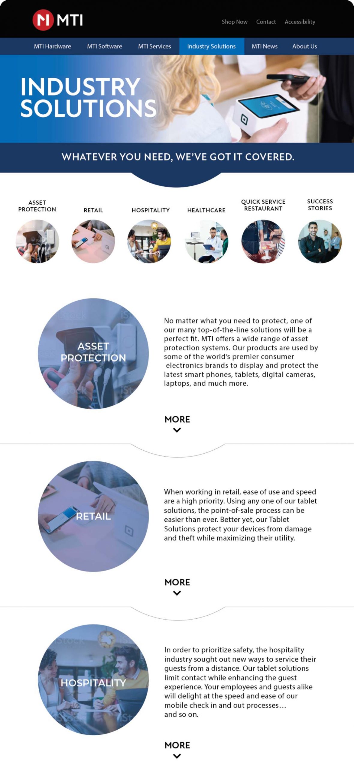
GIRVIN’s team worked in close collaboration with MTI’s CEO and a team of marketing executives to support the new positioning of MTI as a human-relevant brand—making lives better for their community of technicians, sales members and retail constituents. Our solution was a cohesive branded site that more clearly communicated MTI’s key positioning through the use of people-forward imagery and incorporating the color “true blue”—an important color to the MTI team as a metaphor for their “blue sky thinking.”
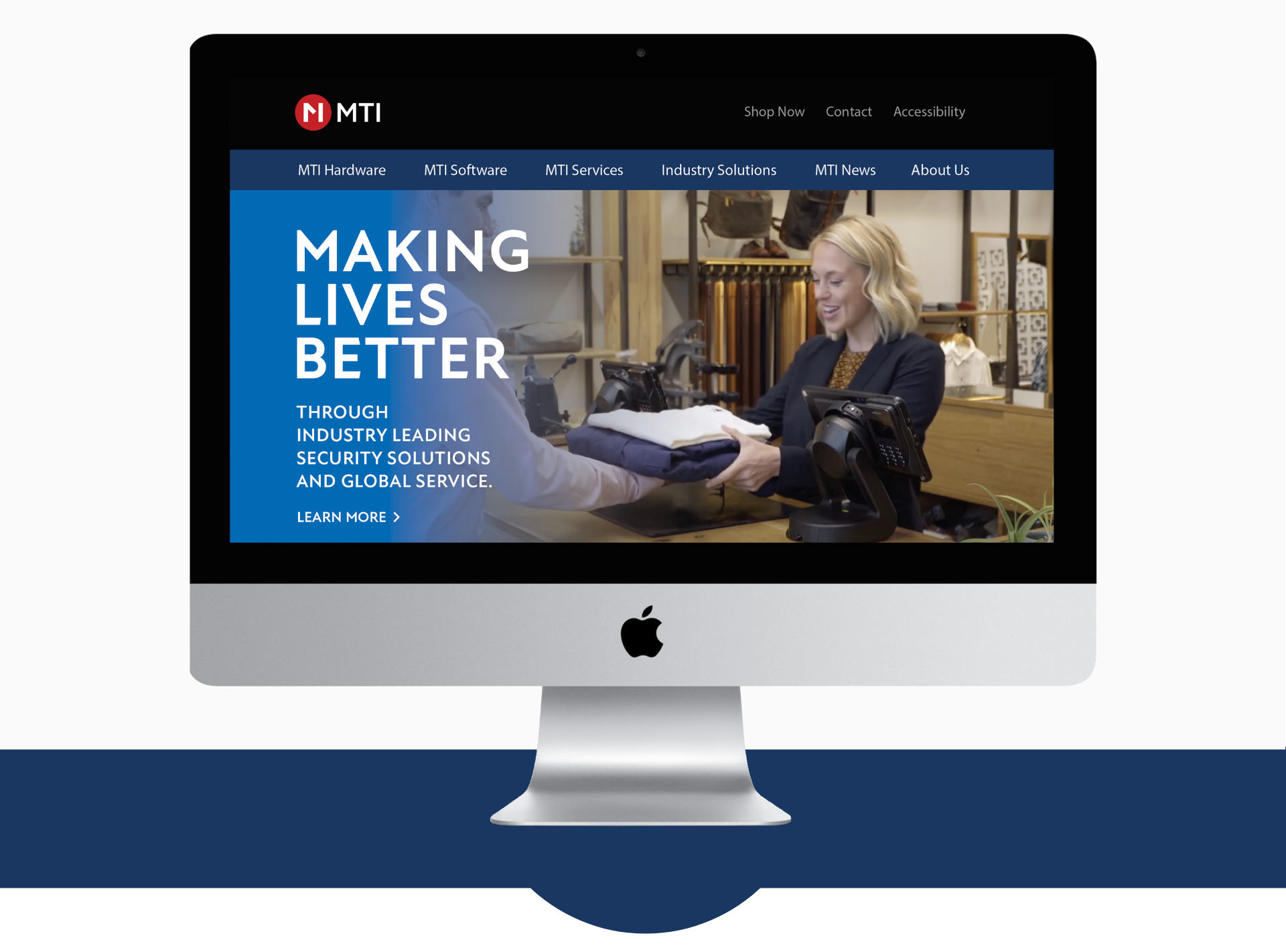
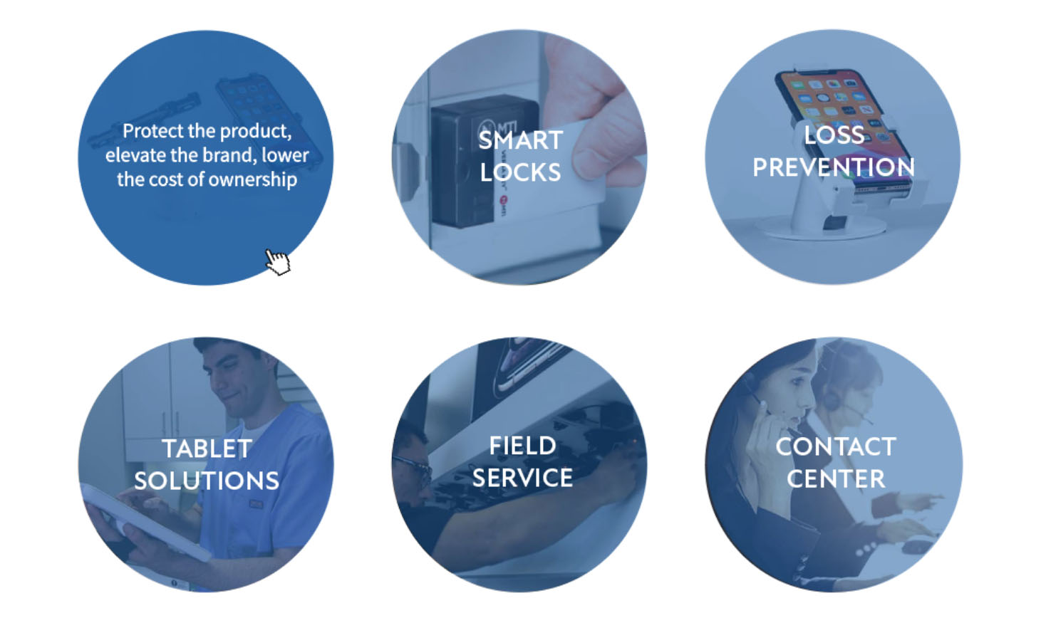
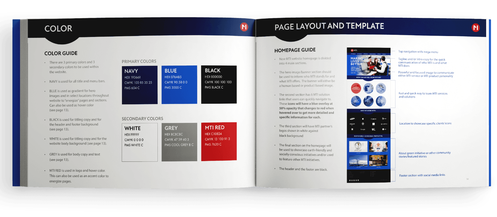
GIRVIN’s team supported new messaging and visual strategy that was metaphorically aligned: the “true blue” color emulates the spirit of incessant innovations, accelerated product and technology integrations—what MTI calls “blue sky thinking.” GIRVIN offered newly purposed imagery of people interlacing in the spirit of ever-improving product offerings, technology, and bespoke industrial solutions in new hardware and integrated systems, as well as supported website coding evolutions and platform transitioning.

“
We were looking for a malleable web solution that would allow easy implementation of new content. Tim and his team helped us with our message integration and a metaphorical styling with a more directly human-relevant expression, as well as his “blue sky” imagery that eloquently reflects MTI’s innovation and imaginative solutions for our customers.”