Mary’s Gone Crackers
The Challenge
Getting up to seed
Mary’s Gone Crackers felt that it was time for a change, so they reached out to GIRVIN to refresh their image and reengage their audience. They wanted to update their logo and bring color and simplicity to their packaging while remaining authentic and true to their natural roots.
The Solution
Baking new ground
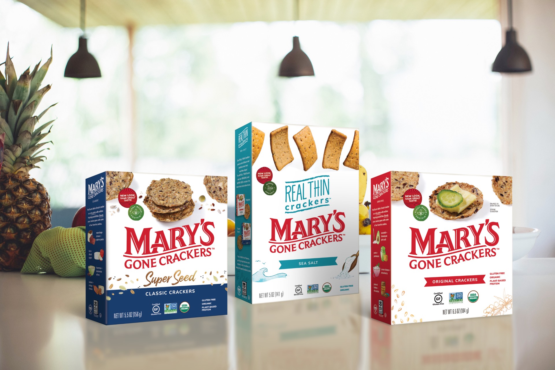
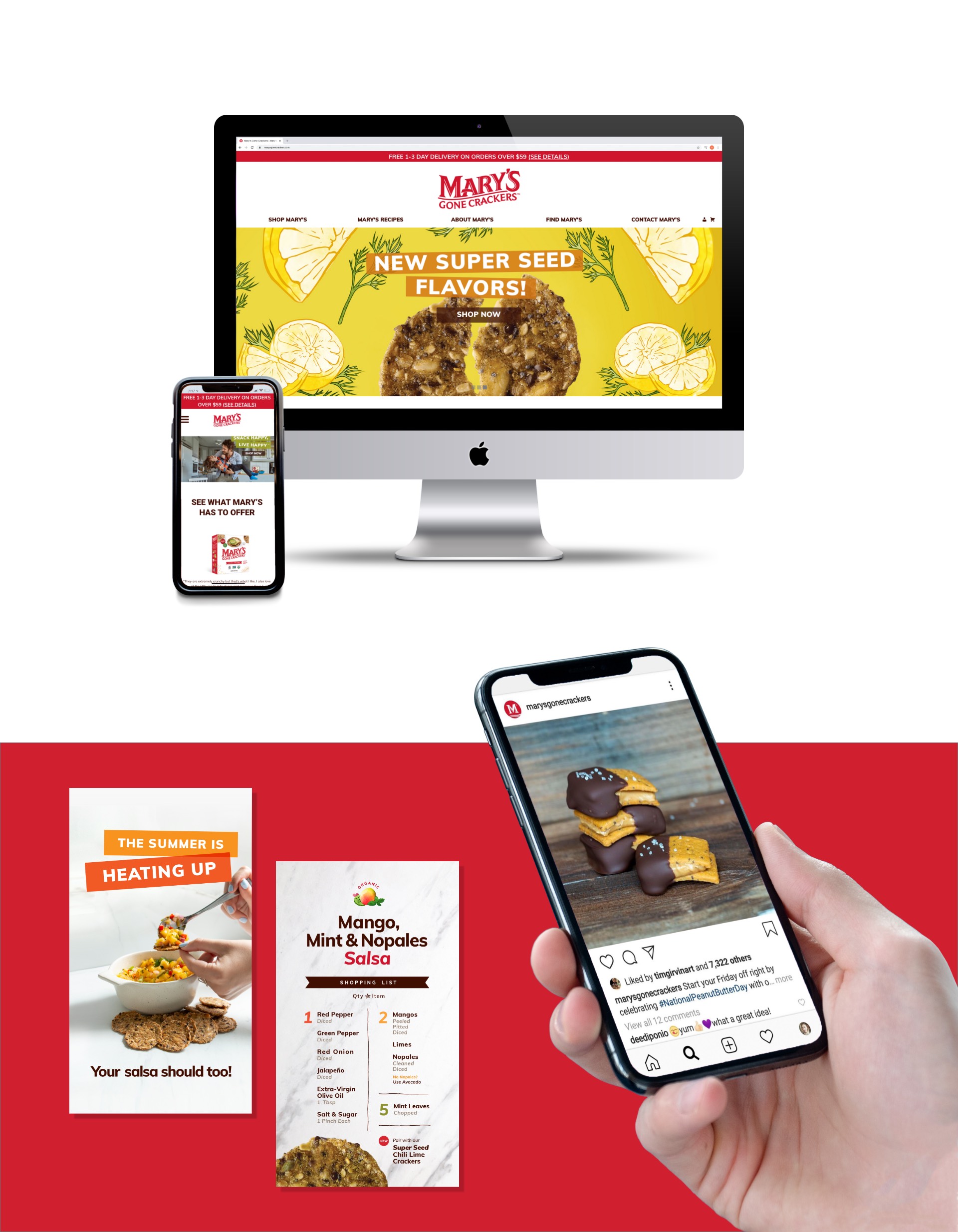
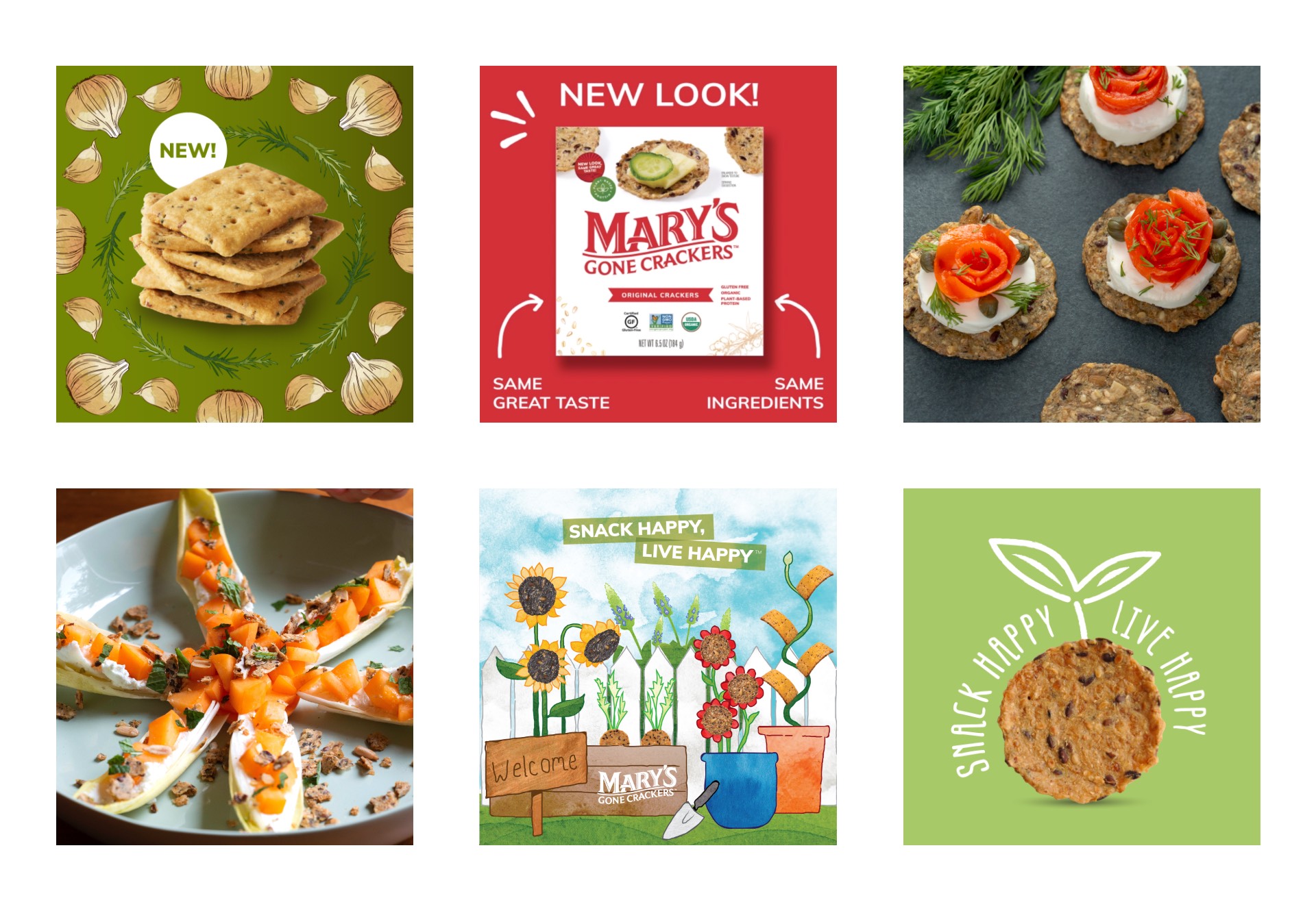
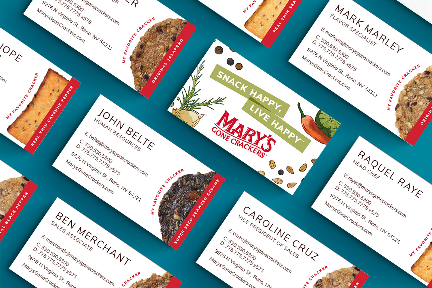
Starting with the logo, we sifted through all of the extraneous details and dug down deep to rediscover and refine the heart of the Mary’s mark—retaining the whimsy while simplifying to increase legibility and to reflect the minimally processed products they create. We revitalized the packaging to focus on the brand and the quality of the cracker—from using bold flavor colors and illustrations to the unorthodox placement of the cracker on the top of the box, Mary’s now stands out on the shelf. Expanding their visual language to digital platforms, we revamped their website and breathed life into their social media, making it easier and more fun for their audience to purchase and engage.

And Beyond
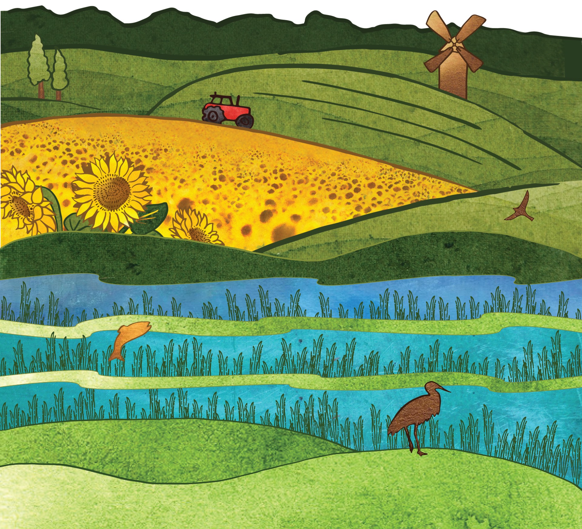
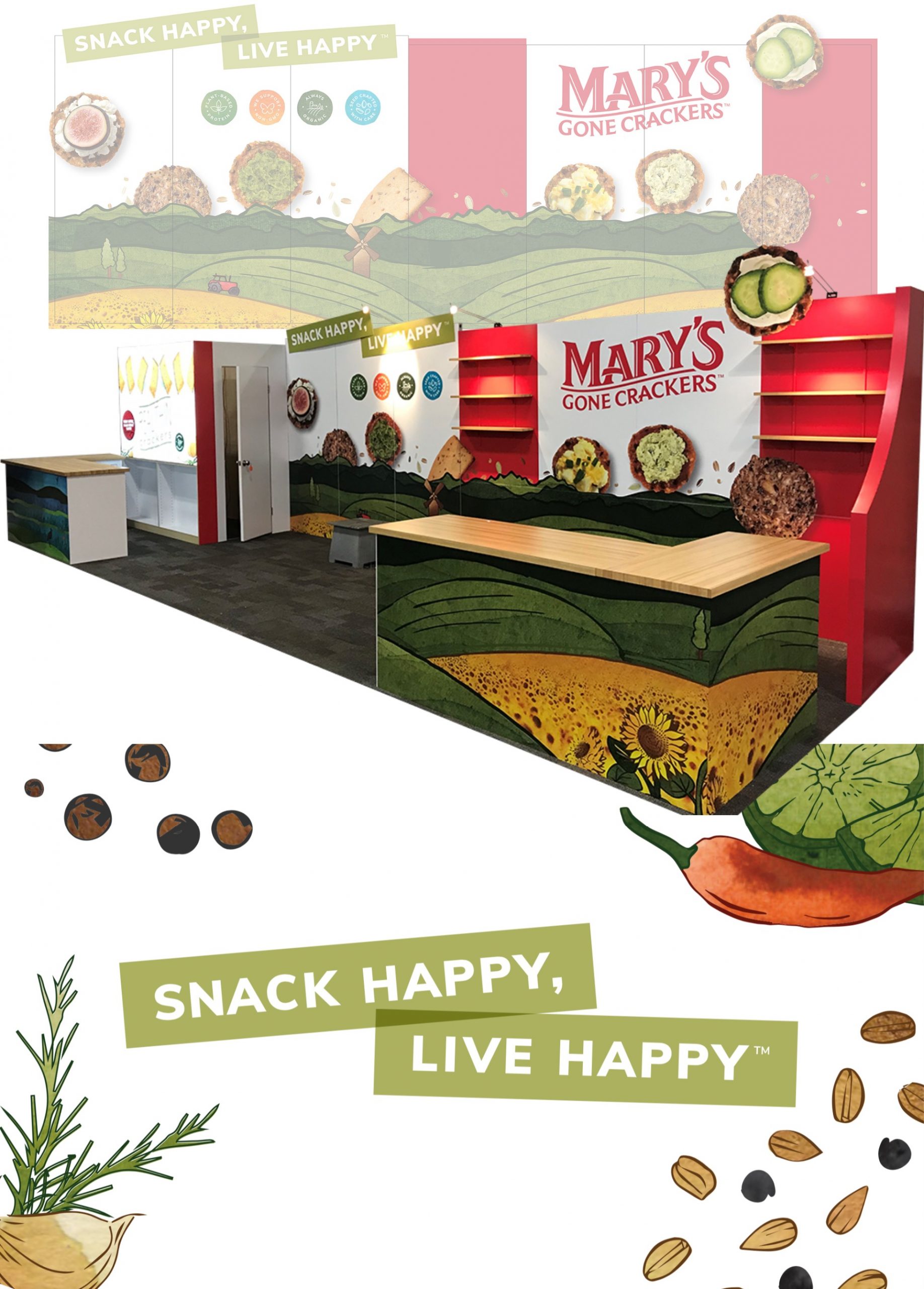
The art style, a combination of hand-drawn lines and watercolor textures, reflects the natural and organic nature of the brand while the bright colors and organic shapes engage people of all ages. Each landscape is representative of real places where Mary’s sources ingredients. Because Mary’s takes pride in their sustainability practices and wanted to give them a larger spotlight, these illustrations became an important part of the new brand DNA and are now featured on their packaging.

“
I am thankful for the super partnership we have and the outstanding work you have done and are doing on the brand relaunch.
Jason Galante | Chief Marketing Officer | Mary’s Gone Crackers, Inc.

