Kavella
The Challenge
A fresh perspective
Ashley Feinberg, cosmetologist and animal rights enthusiast, created Kavella as an earth-friendly, cruelty-free, and all natural alternative to the chemical-laden “luxury” hair care products she’d been using for years. After gaining traction in the hair care industry, and in anticipation of creating new products, she realized her packaging needed better visual consistency. She reached out to GIRVIN to update her logo and simplify the labels to better reflect her vision for the brand.
The Solution
It’s black and white
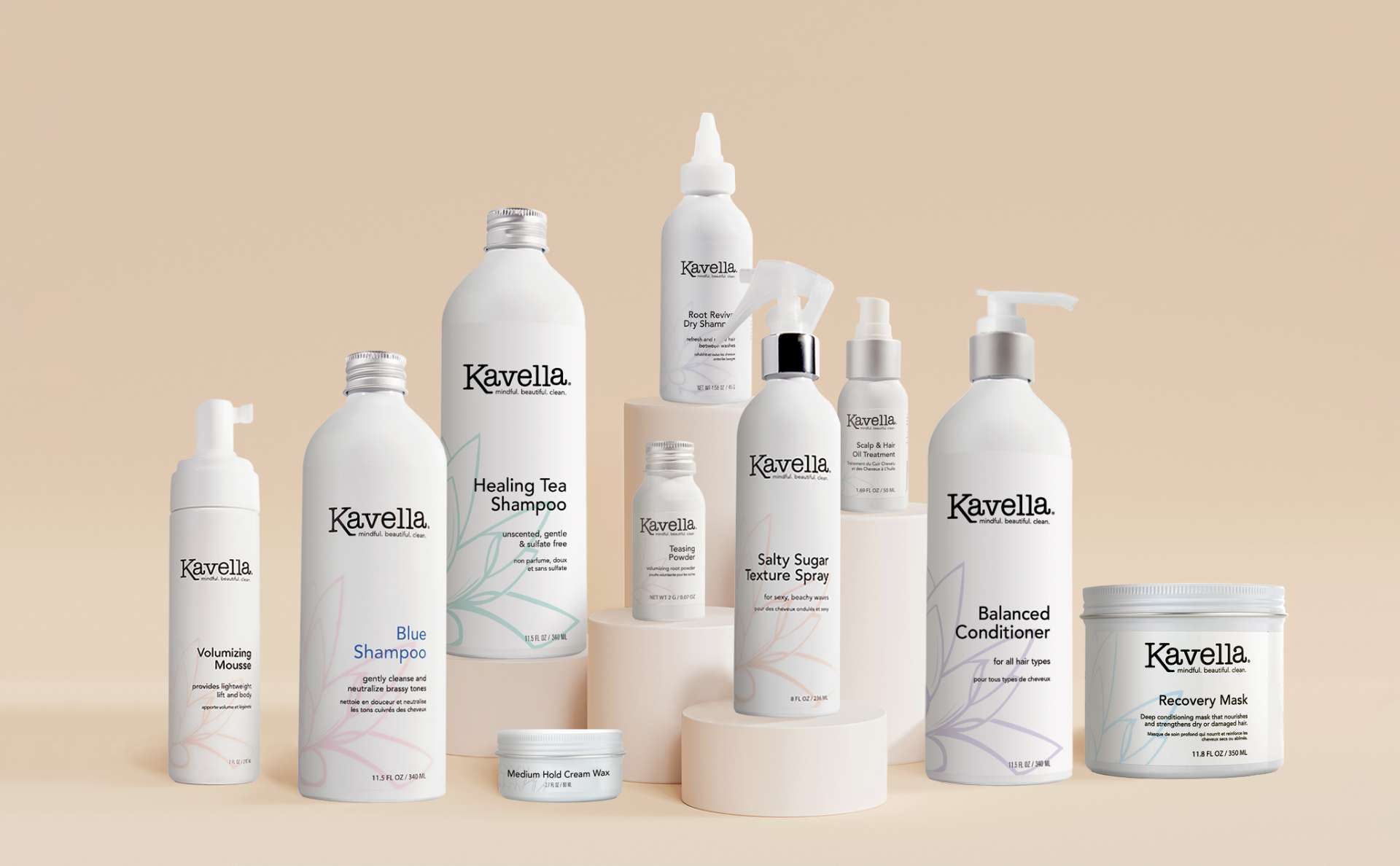
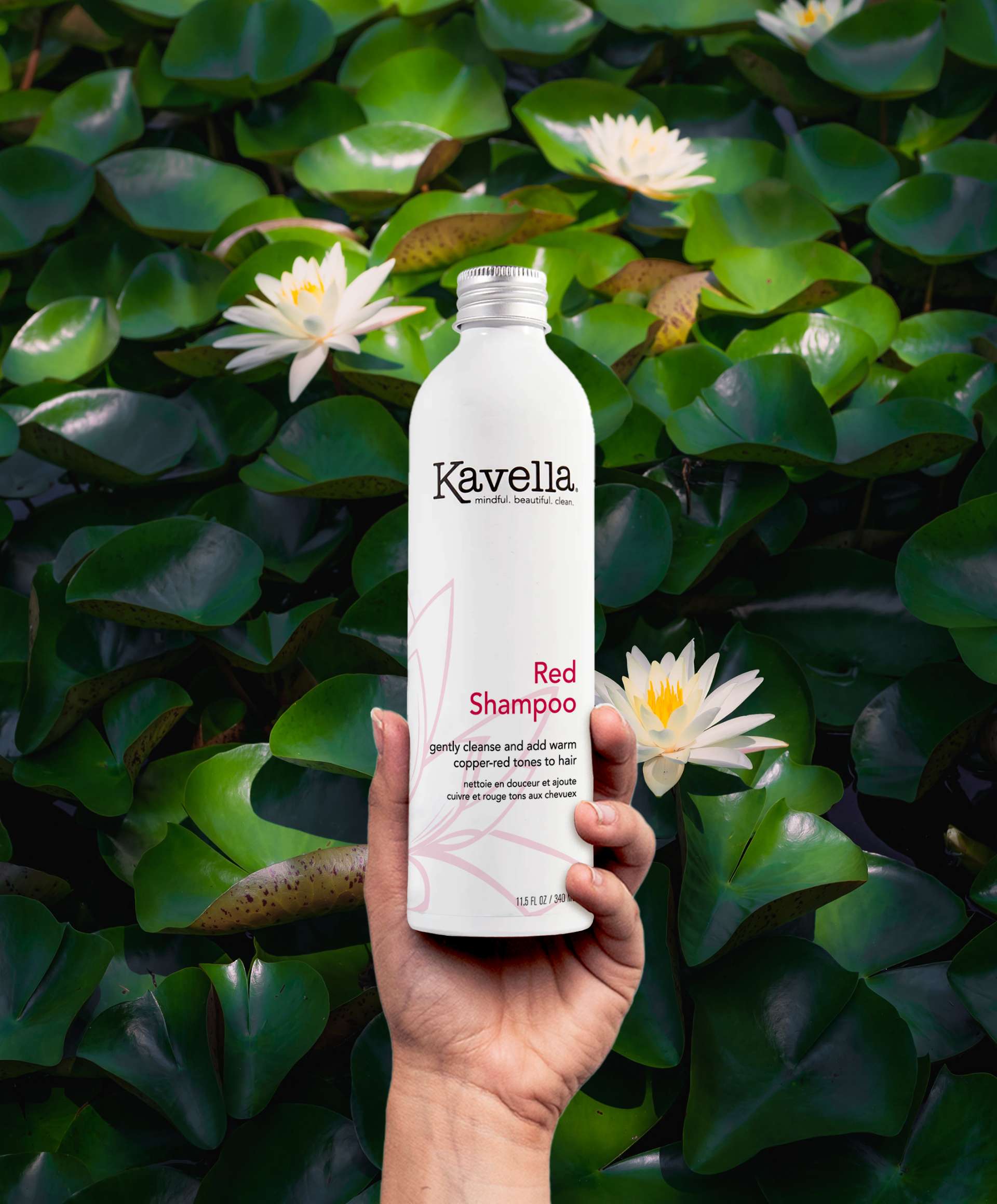
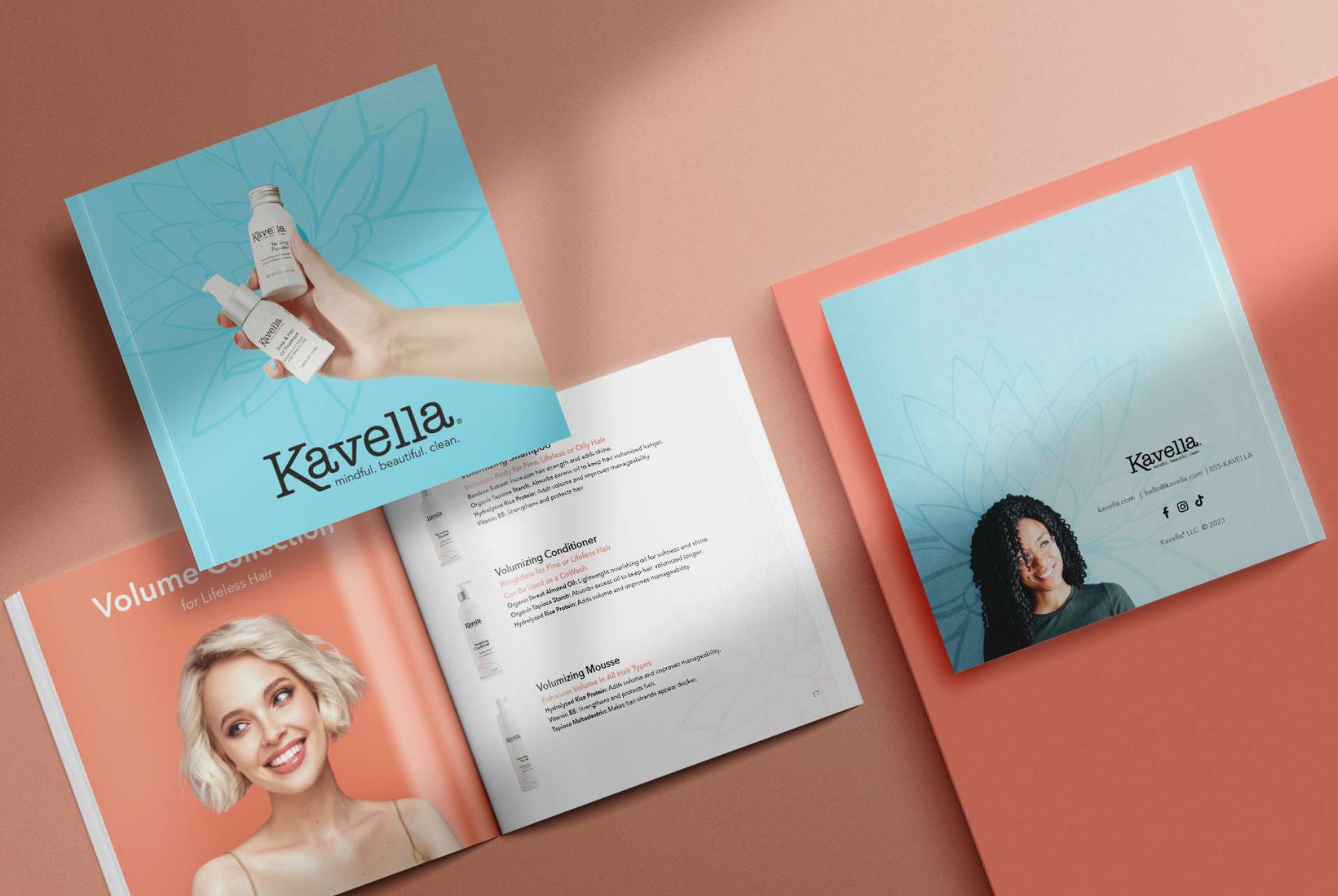
GIRVIN started by refining the brand mark—keeping brand equity in mind, we created a cleaner and more modern rendition of the logo and updated the support typography. As Ashley sourced new white aluminum bottles for better sustainability, we developed a crisp and clean label system paired with a color palette with a pop to help the brand stand out and drive home the simple ingredients and clean beauty premise. Finally, we developed a pitch deck that showcased the new brand look and products for a cohesive and compelling presentation.

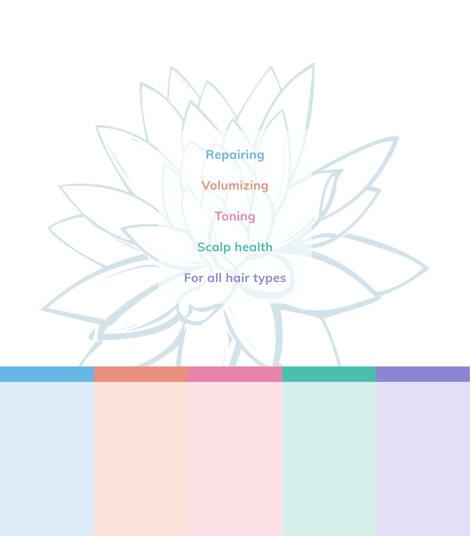

Natural Roots
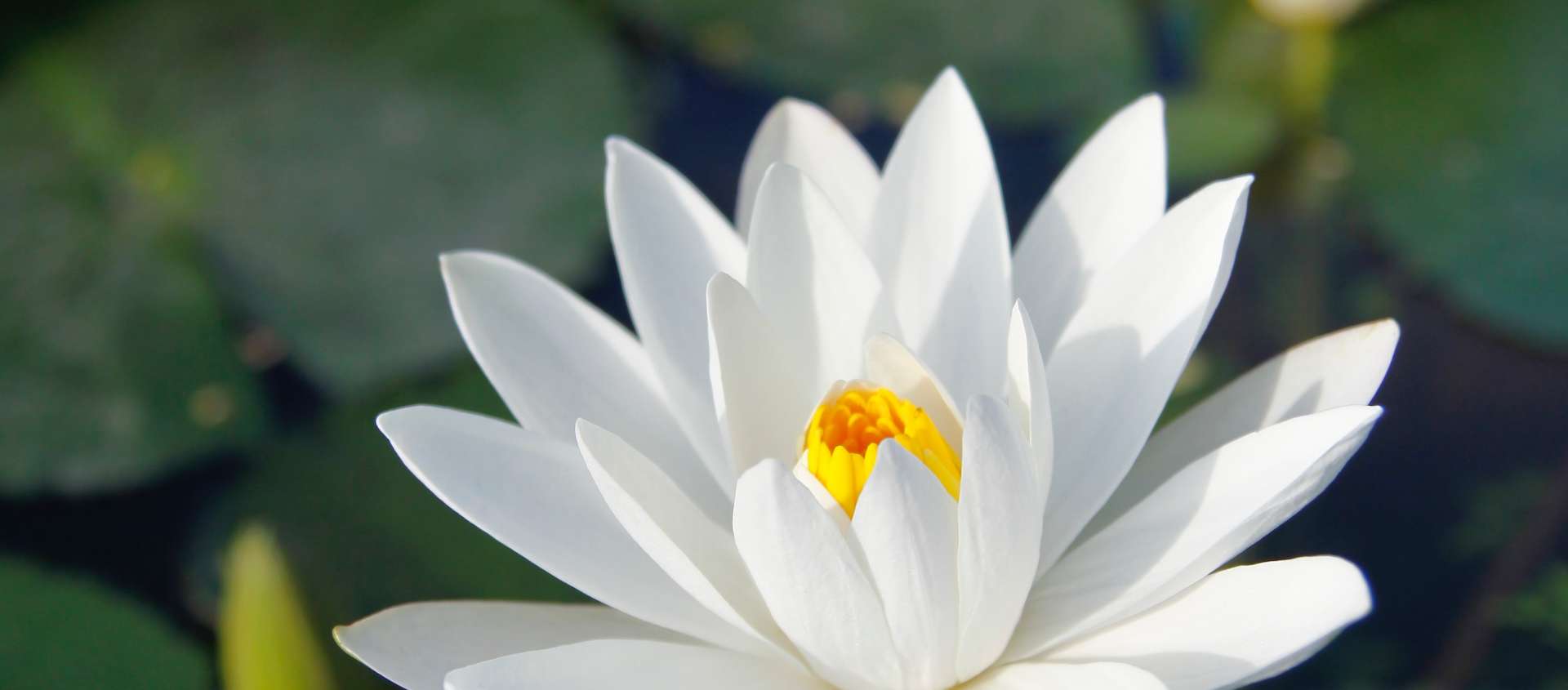
Kavella means “lotus flower” and “beautiful”—and this earth-conscious hair brand firmly roots its purpose in creating clean, natural-ingredient products for beautiful, healthy hair (for people and their pets!). We updated the existing lotus artwork with cleaner, simpler lines to reflect that, and created a vibrant, minimally used color palette to breathe vitality and distinction into the predominantly white packaging. The black logo and typography create a stark contrast against the white background that reflects the simplicity of the ingredients and the clarity of the brand promise.
“
Having GIRVIN help me redesign my logo and product packaging was such a great decision! They are so knowledgeable. They take into account every aspect of your story and business model when redesigning your brand. I highly recommend partnering with GIRVIN. My only regret honestly is that I didn’t find them sooner.”