Emerald
The Challenge
Breaking Emerald Out of its Shell
Emerald came to GIRVIN with one goal in mind; create a brand strategy that’s nuts and disruptive.
The Solution
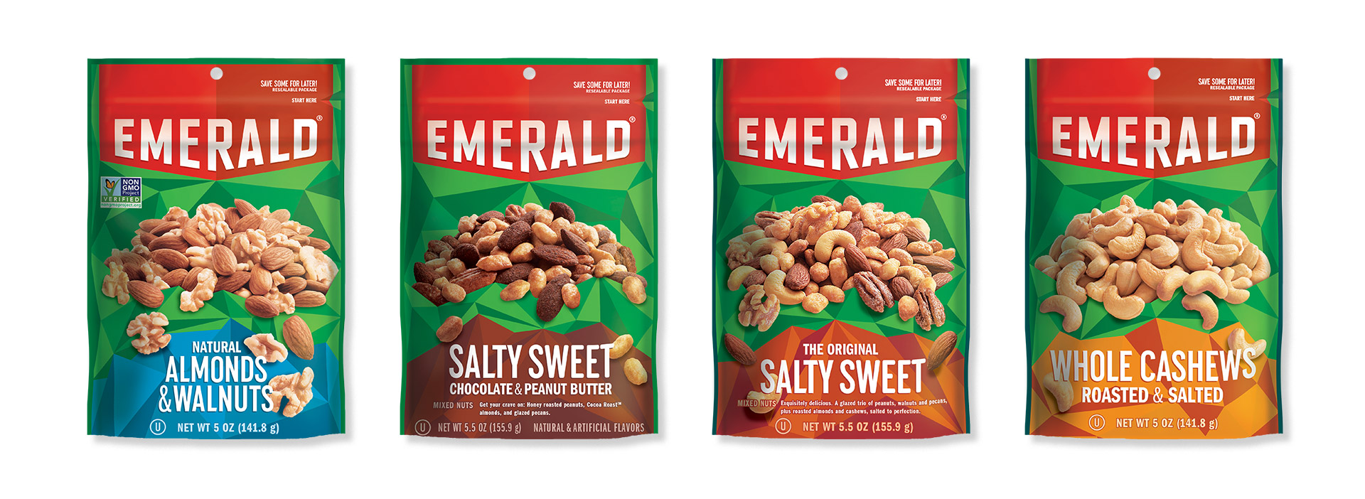
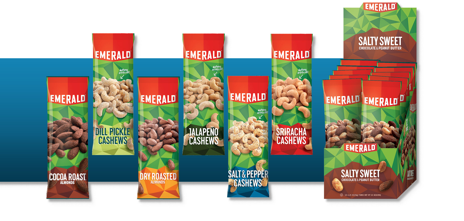
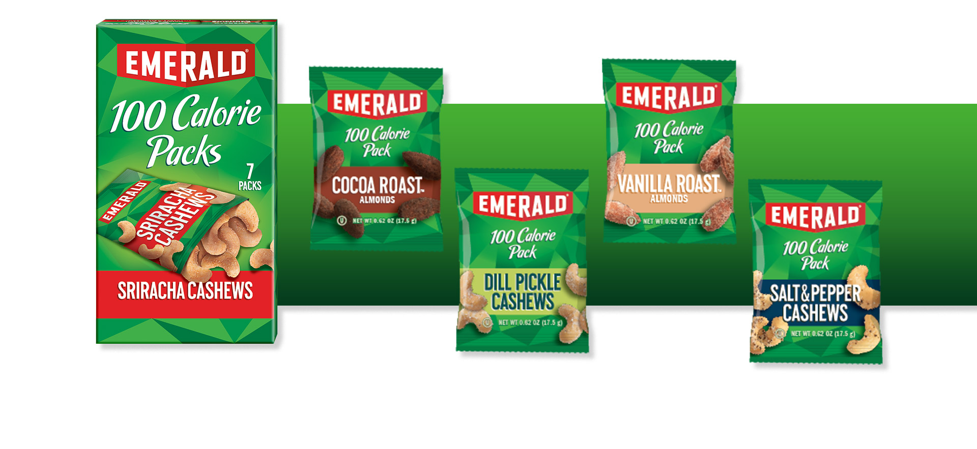
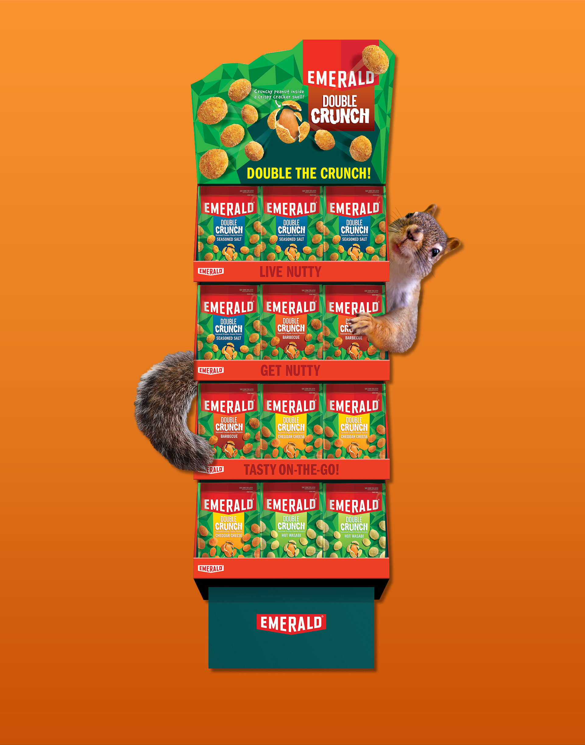
Cashew believe it?
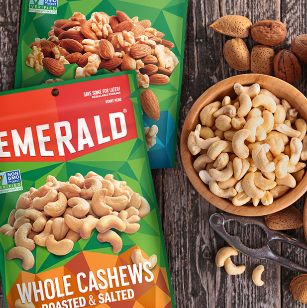
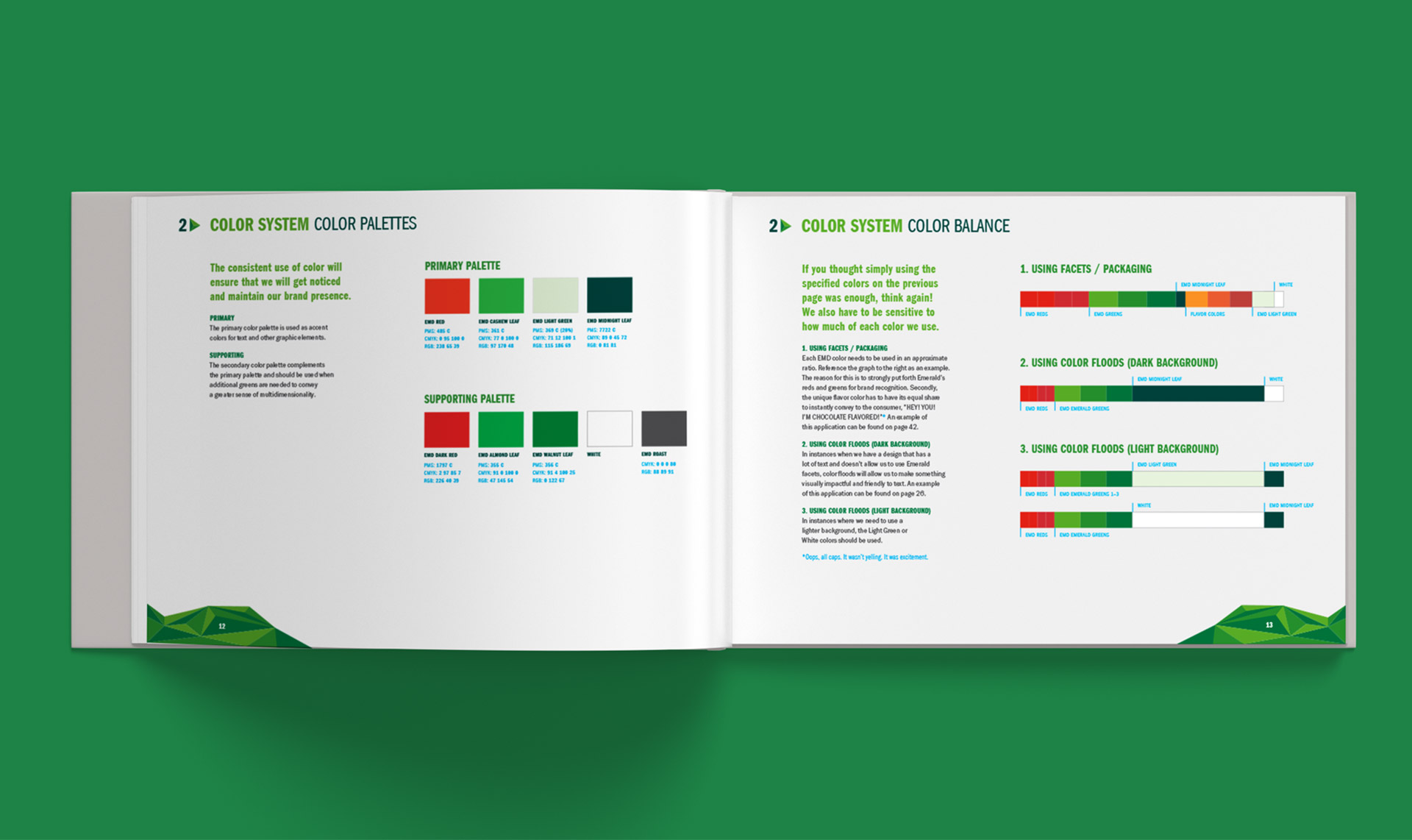
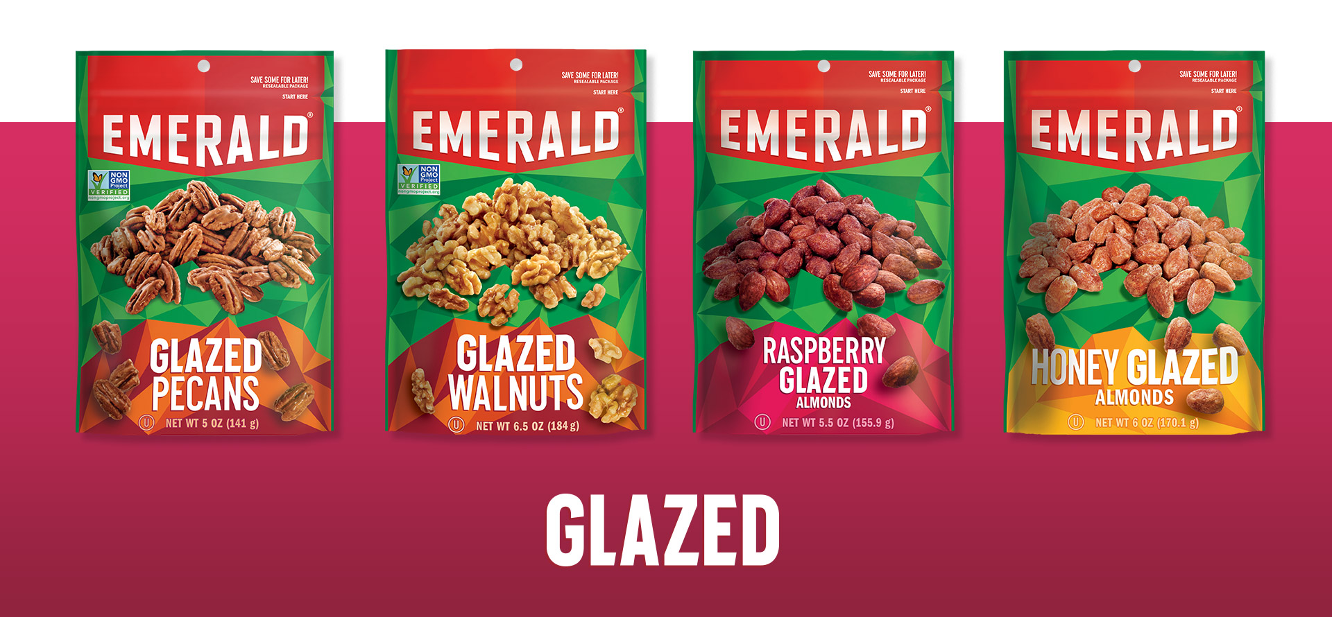
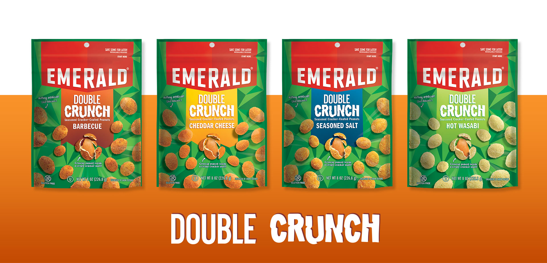
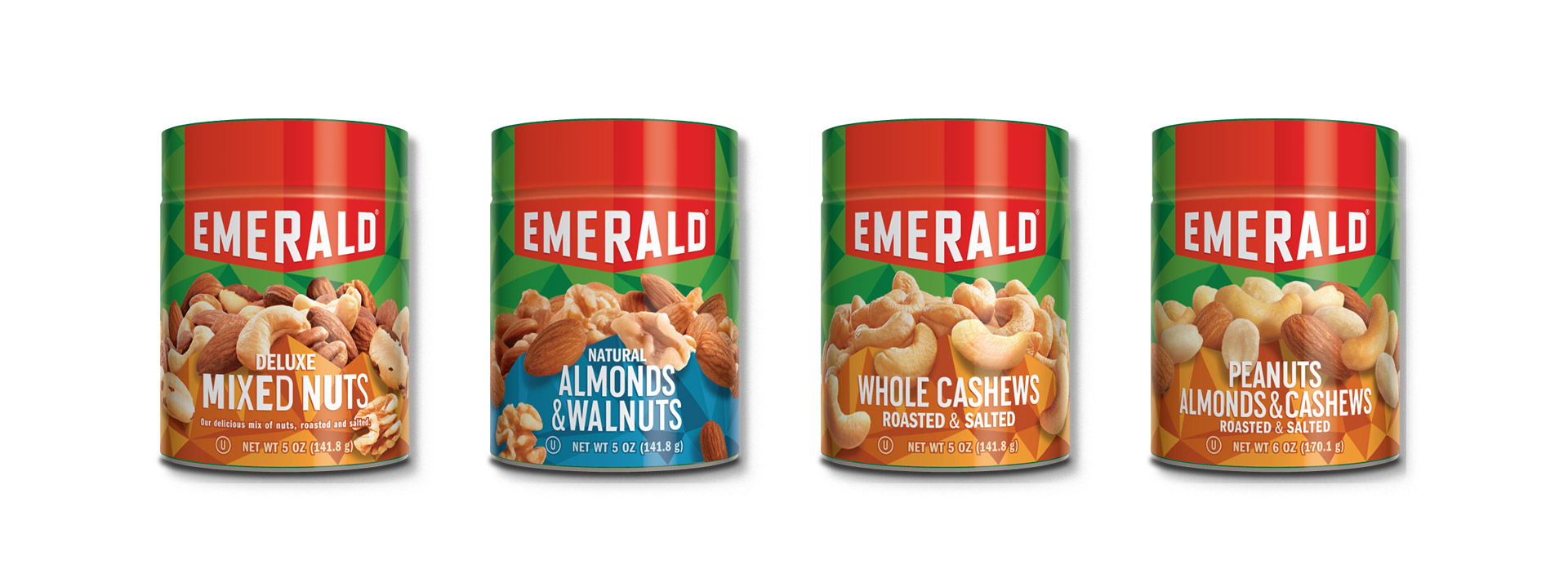
The old Emerald logo looked like a vintage automotive emblem. We changed that by stripping away the metallic gradients and swapping out the dark reds with bright and energetic reds. We also created a custom alphabet that would serve as a foundation for product names. Franklin Gothic was used to support Emerald Gothic.
 Strategy
 Story
Story Identity
 Environmental
 Messaging
 Packaging
 Print
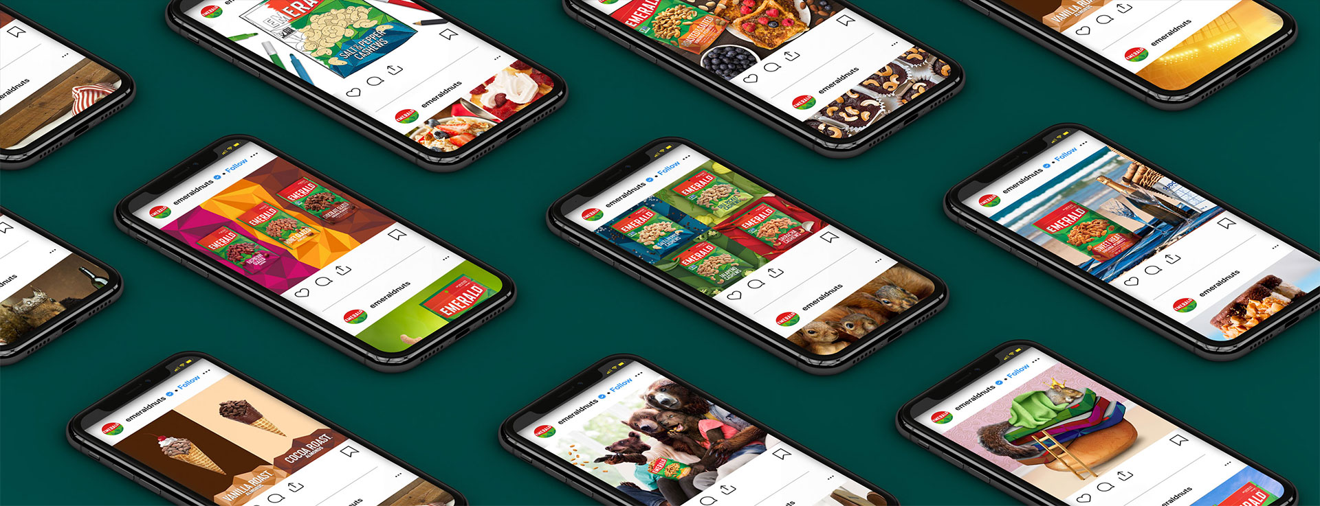
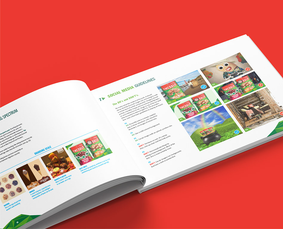
Print Social
 Type Design
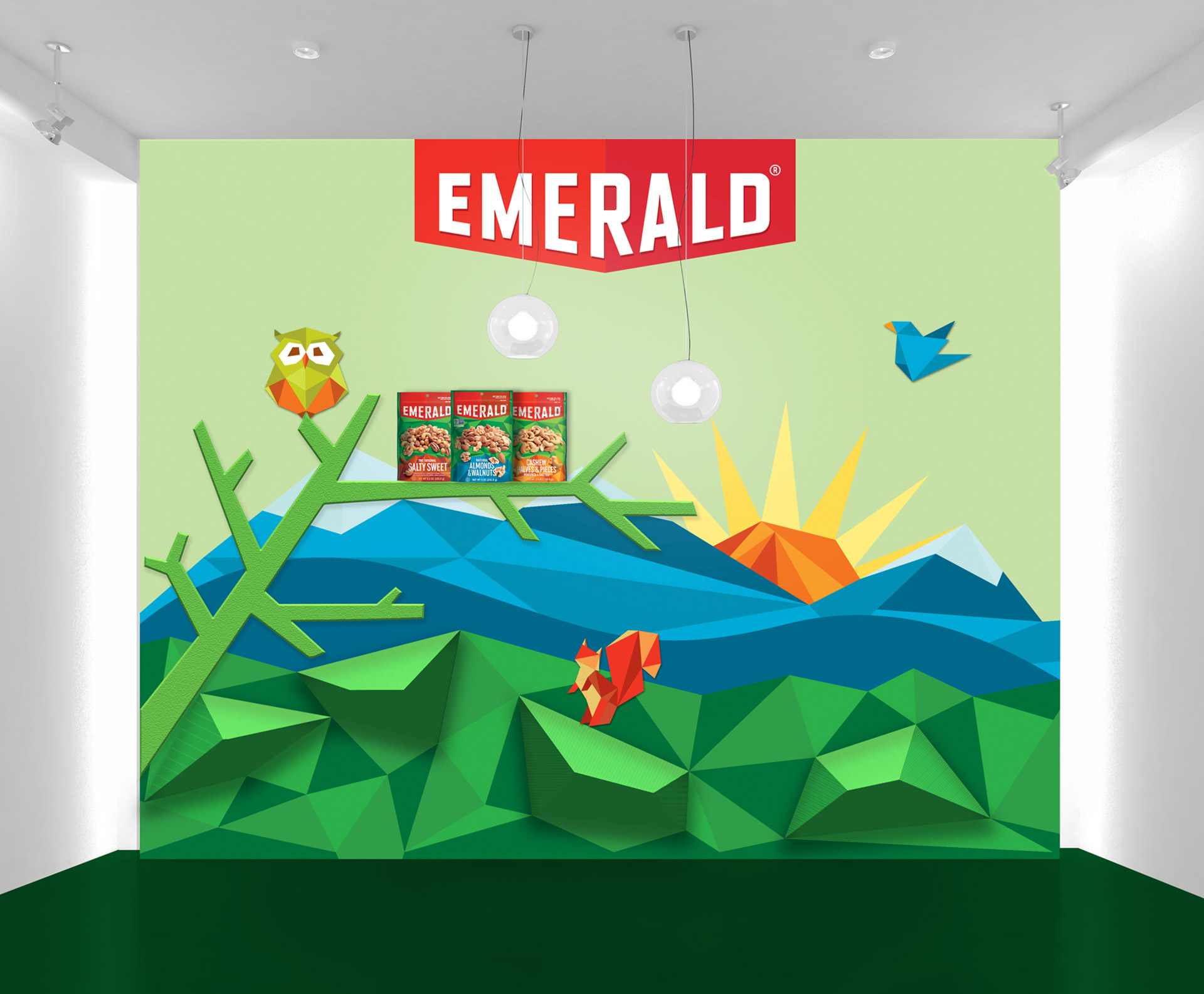
And Beyond
GIRVIN brought Emerald to the forefront of branded social media with content that reflects the new brand identity and an energetic voice used to proactively engage existing, and potential community members. As a result the community size doubled and engagement tripled within a year.