Dermasof
The Challenge
Facing the future
Dermasof, well known in the medical and cosmetic industries for over thirty years, wanted to relaunch their brand and introduce new products. Their goal was to expand to new and younger audiences as well as professionals.
The Solution
Palette cleanser
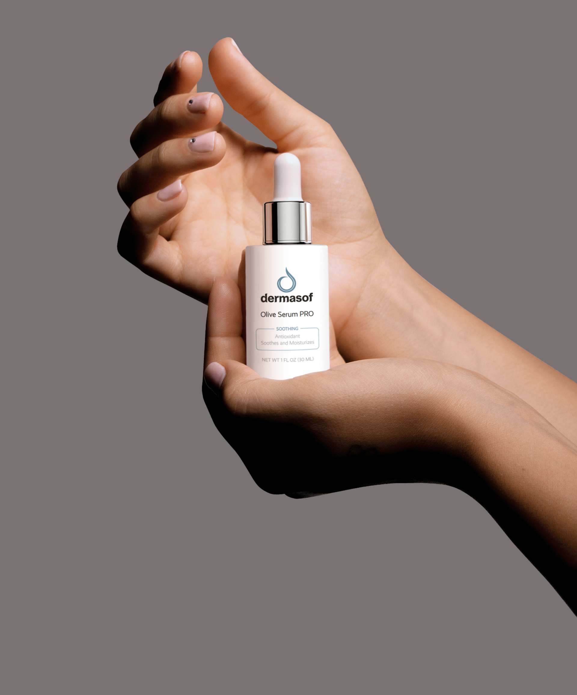
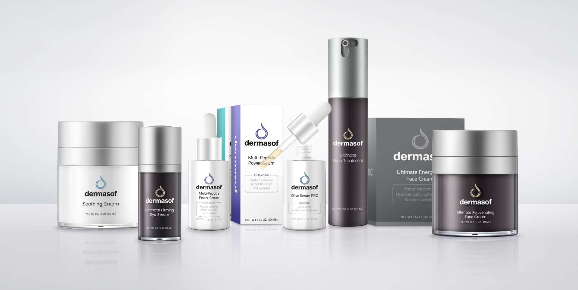
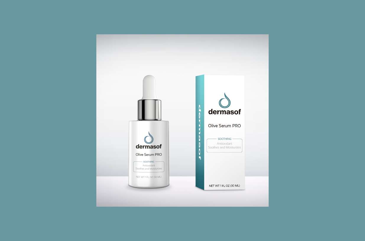
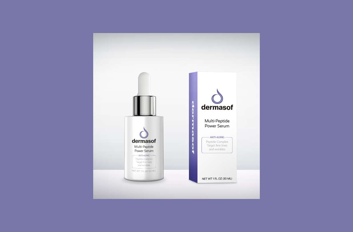
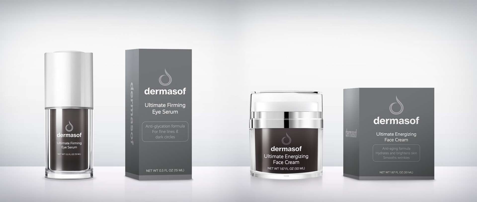
GIRVIN created a fresh new brand mark that combined the luxury, accessibility, and science of the products and brand legacy. As we designed the labels and packaging system for the Luxury and Premium lines, we also came up with a color palette for the Premium line to quickly communicate the two main functions so the customer could easily distinguish them online and on shelf: cool green for products that soothe the skin, and a harmonious purple for anti-aging.
And Beyond
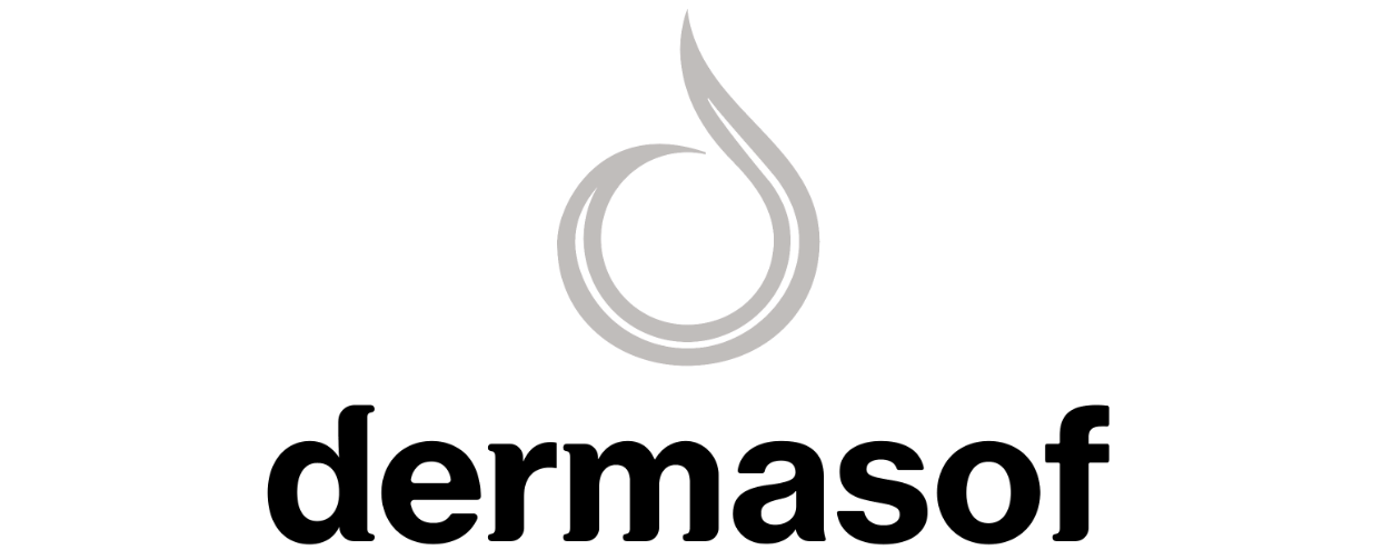
We developed the new logotype to communicate the high-quality ingredients as well as the softness and accessibility of the product while also referencing the scientific and compassionate legacy of the brand.
The open-circled drop icon is a lowercase “d” for Dermasof and expresses both the products’ moisturizing qualities as well as the brand’s inclusivity (Dermasof is for all skin types); the lighter line inside the thicker stroke symbolizes the brand’s medical foundation with a human element—science with soul, beauty inside and out.
Together, the icon and logotype convey a high-end yet accessible skincare brand that combines science, luxury, and humanity—distinguishing them in both the medical and luxury beauty markets.