
Butter London
The Challenge
Turning chaos into a choir
ButterLondon was an expressive, personality-driven brand with founding leadership in NY, London and Seattle. With the integration of new leadership and brand talent, there was a diversity of viewpoints, brand attitudes and visualizations—and it was GIRVIN’s task was to bring these together, synchronizing into one integrated whole.
The Solution
Back to bread and butter
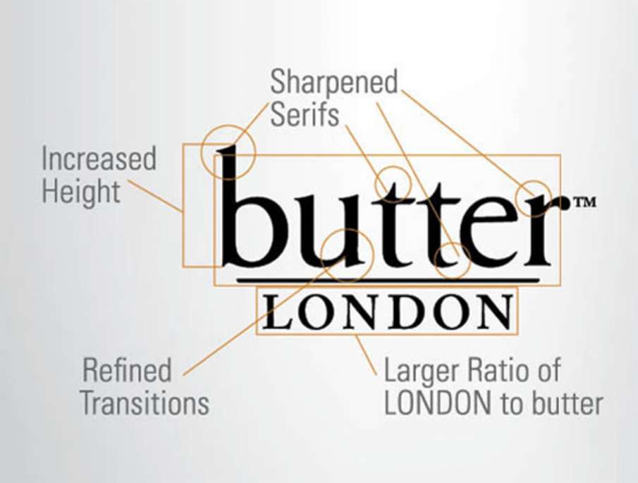
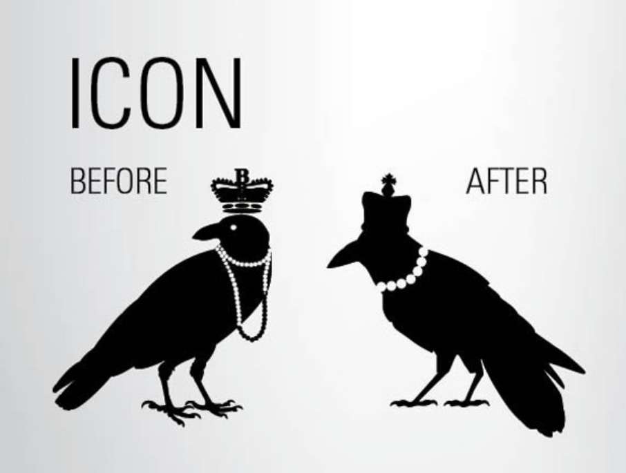
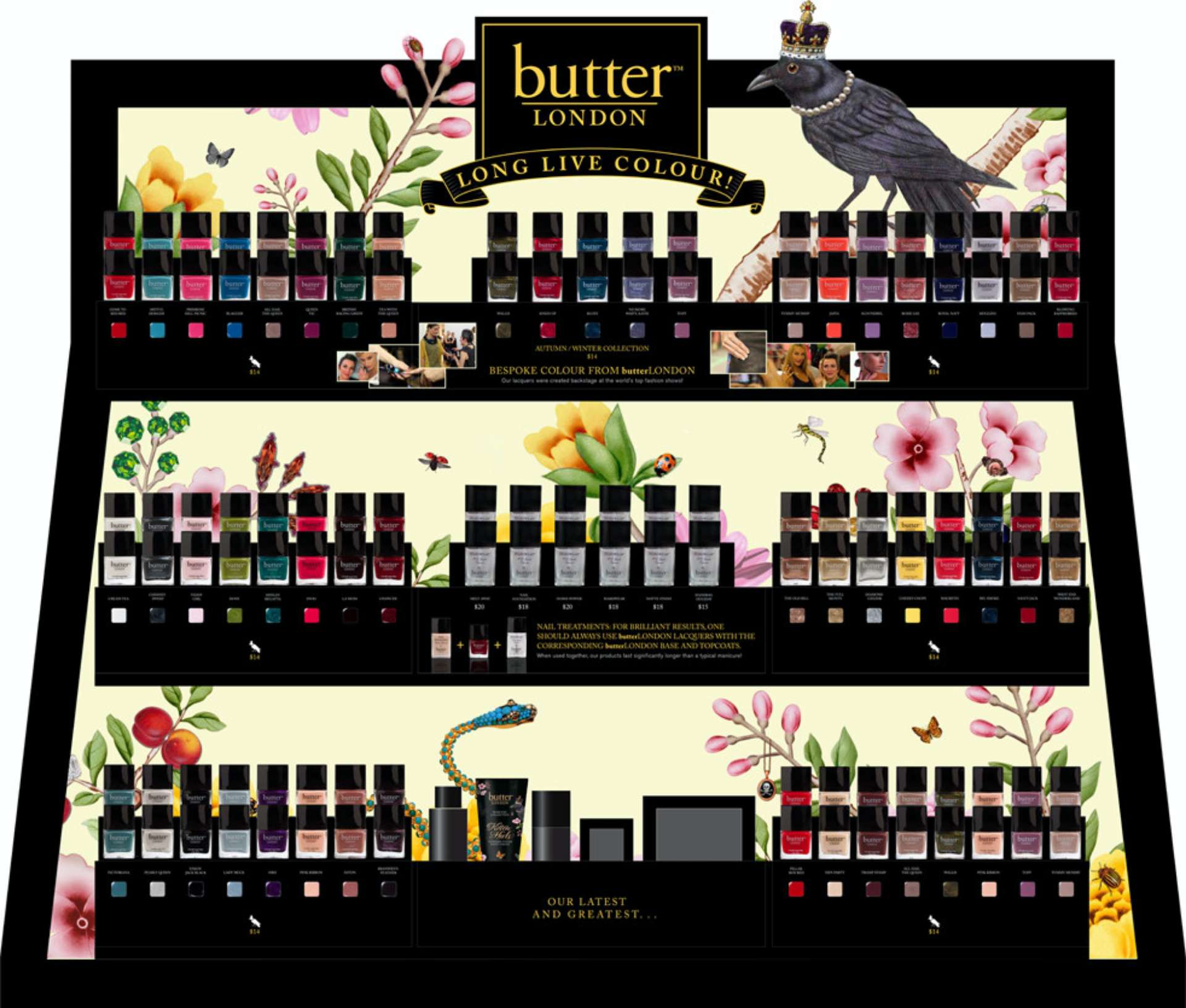
We started with a BrandQuest® leadership summit, working with their new CEO, founders and brand marketers, to establish a foundational vision for the brand, and then move on to organize and refine all assets—including icons and art derived from the founders’ inspirations. This included a detailed examination and retuning of the logotype and redrawing all art for a more integrated and disciplined system that strategically positioned the brand for growth yet still had the brand team’s artistic visioning. Our team also developed a customized calligraphic script, founded on Victorian Spencerian penmanship, to support the visual legacy of the brand experience.
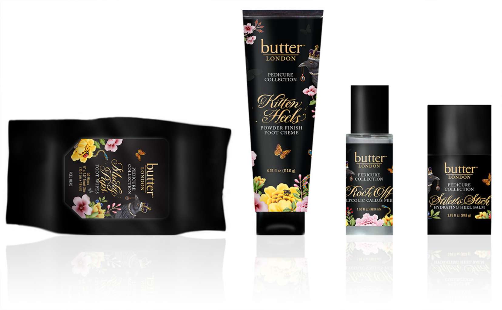
Packaging
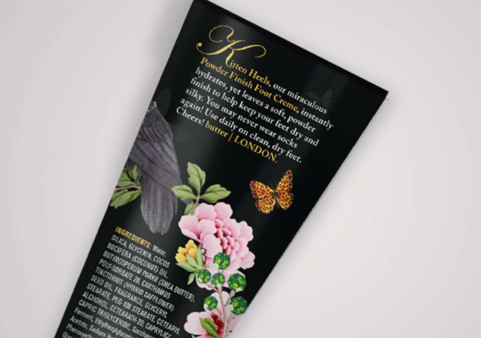
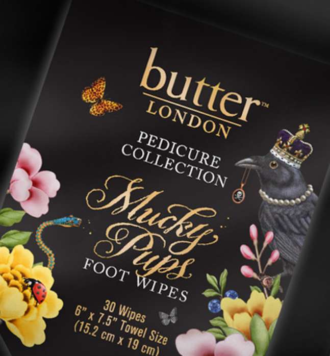
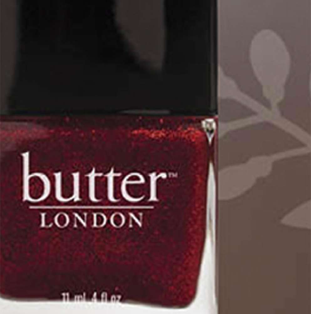
Tim Girvin, working with the butter London team and Nonie Creme, created a new line of packaging design language, including a customized font drawn with a steel pen on Italian handmade paper, a font styling that Tim created for Tim Burton. GIRVIN’s team also refined all of the Victorian design elements and layered them for the packaging and paper treatments as well as online and digital applications — culled from a London wallpaper.



“
“Thank you! I am so happy to have you as part of the team – your deep understanding of the needs of our brand going forward is evident and much appreciated”.