The sensuality of the book
I was working in a remote, private room, the so-called rare book library at Girvin | Seattle. It’s a small space, and in this book room, the volumes start at about a yard from the floor, then rise up to somewhere around 10 feet.
People have asked — “can I come and visit and work in this room?” Such, the ambience.

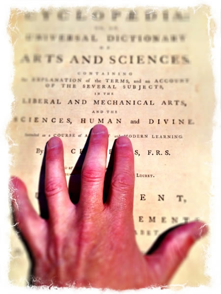
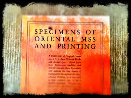
It’s a collection of books on design, architecture, fine printing, fashion, retail design and the design of typography — 40 years of collecting, with valuable books from this year, to 400 years back; there are even objects from are protochristian objects, cut stones from 2000 years back, and a Sumerian talismanic script cone. I cracked open one book — probably 400 years old, and the sensuality emerged. First, the scent of handmade paper laid in forms, water washed, the pulpy mass of fibers and botanical materials, gesturally swathed on the frame of the paper making screens — then of wire and wood that demarcate the known water-making patterning of light, material and strands that support the laid nature of the story.
Digging into a book like this, sentience — the feelingnessness — pours forth. The deep scent rises, and then the touch.
Touching paper like this is wholly different than the character of our modern stocks — it’s heavier, the feeling in the fingertips is marvelously textured, the illustrations, engraved, reversed and incised in metal plates, or drawn on hard woods, is printed moist, the pigments and pressed into the stock as a bite mark. You can, running your fingers over the surface, feel them — the messages are imported in the mind, the fingertips in a wholly different manner. I’d written in the past about the power of the book [even though I own both iPad and Kindle] as a sensualist experience.
It’s print. It’s different than a screen. Bill Hill, a Microsoft UI / typographic strategist, talks about his design of screen import and visual character. The running of this blog comes from another insight, gathered from the meditation — insightful and thoughtful — of AdAge blogger, the proverbial media guy, Simon Dumenco; his notes, I transcribe here:
The Joy of Offline Discovery
Or How I Learned to Stop Clicking (Once a Week) and Love Print Again
“If you’re reading this column in print, you’ve already noticed that Advertising Age has undergone a major redesign. I’m not talking about a few nips and tucks, but a top-to-bottom renovation with new departments, reconfigured layouts and flow, handsome new typefaces, an increased emphasis on infographics and lots more — right down to a change in the physical dimensions of the thing.If you’re reading this online, you probably either feel a little left out (and hopefully eager to track down a print edition of the new Ad Age)
or you just let out a big yawn.
I confess that I understand both reactions.
I’ve felt my allegiance shift back and forth between print and digital media over most of my career — over most of life, in fact. In my childhood, I was a media junkie with my own subscriptions to Time and Newsweek starting in the seventh grade (and a nightly habit of watching my journalistic hero, Ted Koppel, slow-jam the news on “Nightline”), but I was also a seriously nerdy tech-fetishist. The first computer I ever personally bought, I built from a kit when I was 14, and I jumped headlong into the BBS (bulletin board system) world well before Marc Andreessen’s Netscape ushered in the age of the graphical web in 1994. So when I started working for big media companies, by default I became “the interactive guy,” charged with dragging legacy brands (sometimes kicking and screaming) into the digital age.
The web, of course, is irresistibly seductive. And the instant gratification it delivers is all the more heady if you get to work as one of the wizards behind the curtain — a web publisher/editor/writer. I still remember the first time I pored over rudimentary traffic reports for a site I launched in 1997 (before Google Analytics, or even Google itself, existed) and felt my mind getting highly blown by seeing a huge surge of visits to a post I’d published.
(Of course, today anybody who blogs or tweets or uploads videos to YouTube can experience that uncanny sensation of instant popularity, too — that uniquely modern thrill of seeing something you’ve just unleashed on the world gain traction, or even go viral.)But the constant adrenaline rush of producing and consuming web content also leaves me feeling a little … lost sometimes. When you spend your days floating on a cloud of internet ephemera — breaking news, status updates, smart and dumb blog posts alike, tweets, animated GIFs, etc. — you can’t help but feel a little light-headed. And unmoored. Don’t get me wrong: What we call “web discovery” — that erratic, undisciplined, social-media-driven, down-the-rabbit-hole process by which millions of us shovel information into our brains these days — is one of the great joys of my life. There pretty much isn’t a day that goes by that I’m not delighted or heartbroken or astonished or enlightened — or some combination thereof — by something I randomly come across on the internet.
I had an a-ha moment about all this thanks to, ironically, a digital-subscription initiative. I had long ago let my print subscription to The New York Times lapse when the paper introduced a new paywall last year. I decided to resubscribe to the Sunday print edition, because it came with “All Access Digital” (everything the Times publishes online every day, hour, minute — accessible across all my devices). In doing so I rediscovered the joy of, well, print discovery.
Every Sunday, diving into the inky broadsheet, I’m reminded of the enduring value of a tightly edited, coherent, cohesive, thoughtful package. And I’m reminded that print can still be an important part of a balanced media diet.
It’s all about focusing not on whatever I happen to click on next, but on what an international team of editors, graphic artists, journalists, photographers and illustrators have assembled with great care and intention. In surrendering my attention to what they’ve created, I’m reminded how siloed my web-based media consumption actually is. For instance, I get way more schooled about international news by reading the printed Times on the weekend. There’s just so much I devour in the Sunday paper that I know I’d never stumble across on the web — like a recent fascinating report on the effects of a year-old French law banning the wearing of niqabs (face coverings worn by some Muslim women) in public and an eye-opening dispatch from Hanoi about grassroots protests over economic inequality in Vietnam, both of which I was moved to read because they sucked me in, against all odds, with striking photography.
The lesson I relearn every Sunday is that the discipline of print — the discipline it takes to assemble a compelling, finite package, and the discipline it takes to devote a chunk of your attention to it — still matters.
When it comes to the international team of editors, graphic artists, journalists, photographers and illustrators who have assembled the new Advertising Age, I’m obviously not impartial. And the truth is, putting it all together — getting the mix right, knowing exactly what to include and exclude — ain’t easy. But I’m convinced that if you emerge from your webby rabbit hole long enough to spend a little time with the newfangled, old-fashioned Ad Age each week, you’ll be amply rewarded.
Simon Dumenco is the “Media Guy” media columnist for Advertising Age. You can follow him on Twitter @simondumenco.
To each our own, the sharing and discovery of print —
in contrast to the digital, his telling of resubscribing to the New York Times — I get the print delivered to my door, every morning at 4.00am. And yes, I’m rolling then. But, above, he talks about the crossover discovery, from digital [whole world, hybrid media] to print world [close at hand].
An epiphany emerges.
TSG | decatur island studios
[and today, only the NYTimes on iPad]
…..
G I R V I N | SOCIALITY + MEDIATION
DESIGNING BRAND STORYTELLING IN HYBRID MEDIA
http://bit.ly/sJ4IjO