THE SIGILLIC SOLUTION
In the journey of brand design and identity, there is the high road, the first summit, the easier vista—the outreach of an accessible view and foundational story:
“it’s beautiful, so this must be a beautiful brand.”
And then there are the deeper intentions, and robust layerings of story, which speak to the meaning of the curves, the symbolism of their movements—the characterizations of their crossing gestures and interlacements.
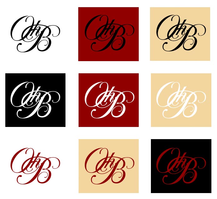
Which, in this instance, speak to a brand—only of luxury lingerie—where interlacement, precisely delicate garment construction, the celebration of curvaceous physicality and luxurious allure, both for the wearer and the other participants.
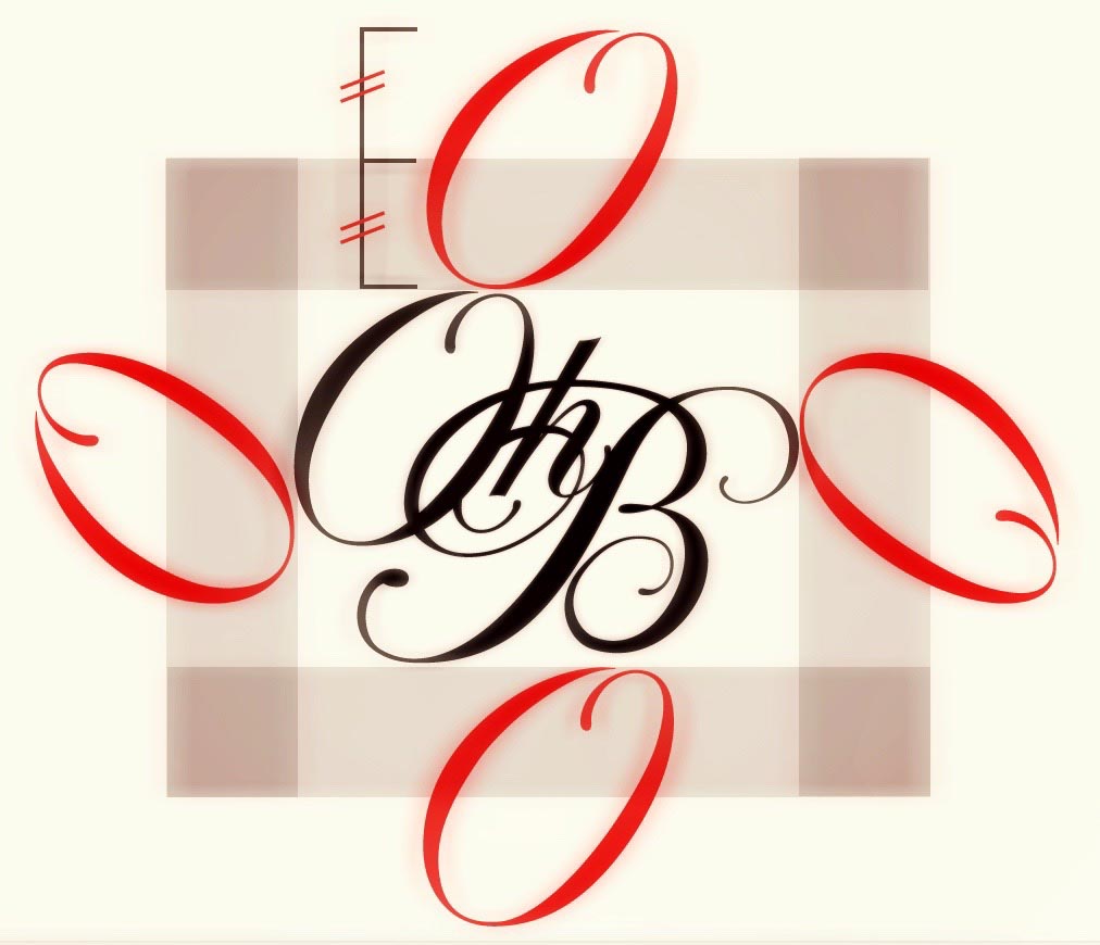
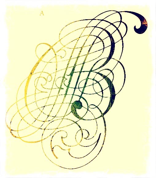
You could consider that the nature of a compression of the identity into the form of a monogrammed device, it becomes an illustration of the principles of the brand, interlacement, beauty, delicacy—which, too, could have added details and layering in other contexts—so, for this brand, we chose an added customized illustrative detail, to be used in a layered construct, a single letter from the folio of Georg Schwandner,
a mid century 18th century calligrapher
as in this distressed rendering:
In the history of design, and mark-making, there is a legacy of magic. Most alphabets come from mysterious origins—sure, they might be early representations of understood objects, as they were prefigurative intimations of a house, an ox, an arrow, or…
But, too, they were marks of meaning, and in that, marks are transformative. As alphabets evolved, they came to represent coded elements that is: a collective evolution of inbound symbology, layering of meaning, and tiers of evolution as the letters form to become words that then have even further concatenations of meaning and context.
As anyone in the brand space knows, a mark suggests a movement from one known point of visual recognizance, to another—make a mark and a plane of visual understanding is transformed, it was no thing
and then it was something.
Tom Ford | Madison Avenue | NYC
Think of it this way: you have a blank piece of paper, as you look at it, it’s a white, formless plane. Then, make a mark on it. And abruptly, that is changed—now there is, literally a point, or a line, of reference—it’s now has a planar definition.
As a designer, with a long history in a use of the alphabet as an illustrative tool, I think about the alphabet as a kind of singular representational expression.
People read first.
They see a word, or the mark of a letter as a mnemonic reference to a brand.
I see them as sigils, marks that tell a story. Sigil presumes a magical character—given its history and use—as etymologist Phil Harper notes, the sigil is “a sign, mark, or seal,” mid-15c., from Late Latin sigillum, from Latin sigilla (neuter plural) “statuettes, little images, seal,” diminutive of signum “identifying mark, sign.”
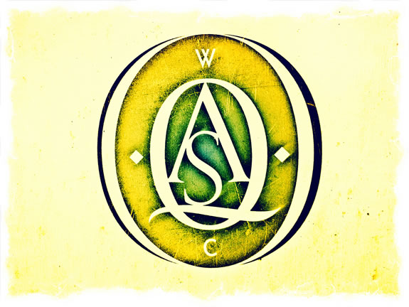
In a way, the intermixture of the letters and their intertwining forms an amalgam of meaning, interplaying the initial character of words as a holistic construct—which, by initials, becomes a point of reference as to their meaning.
I see the alphabet as a mysterious entity—
there is compressive power in anything that old.
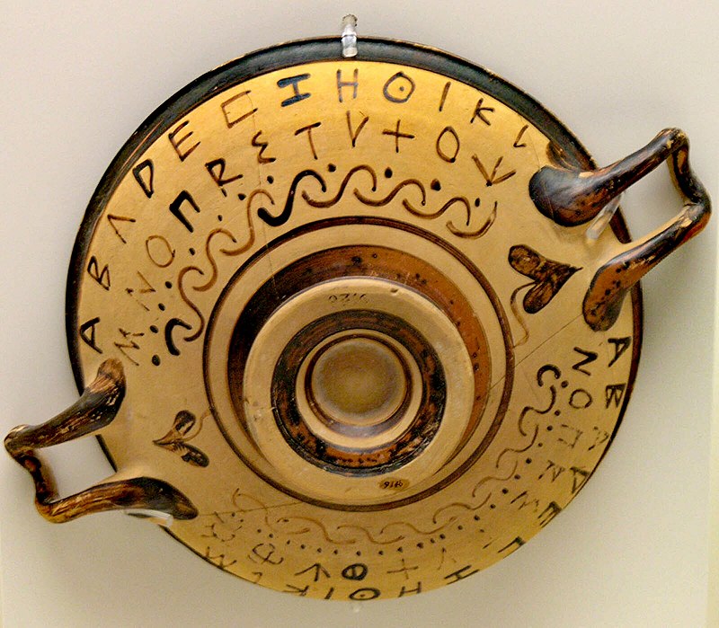
Black figure vessel with double alphabet inscription,
showing new letters ΥΧ[Φ]Ψ, and ΥΧΦΨΩ
And bearing in mind the origin of the Greek alphabet is seeded in the structure of the Phoenician letterform foundations, 9th-8th centuries, BCE. With the Hellenization of the Romans, there was a crossover of Greek characters to the Imperial civilization of Italy, coupled with their Etruscan originations. The Greeks regarded their alphabet as a mystical and occult entity, laden with hidden meanings—and as a divinatory device.
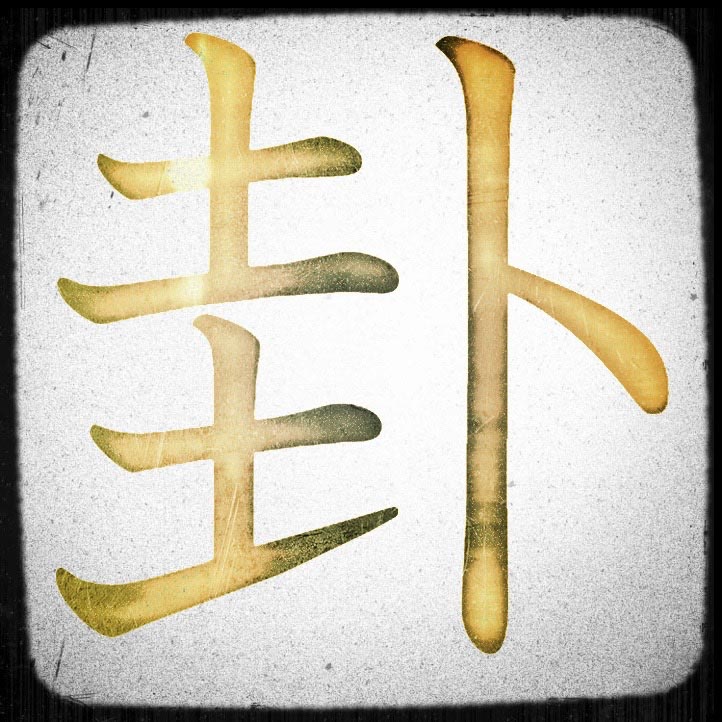
Japanese character magic, and
the Japanese kanji for “divination.”
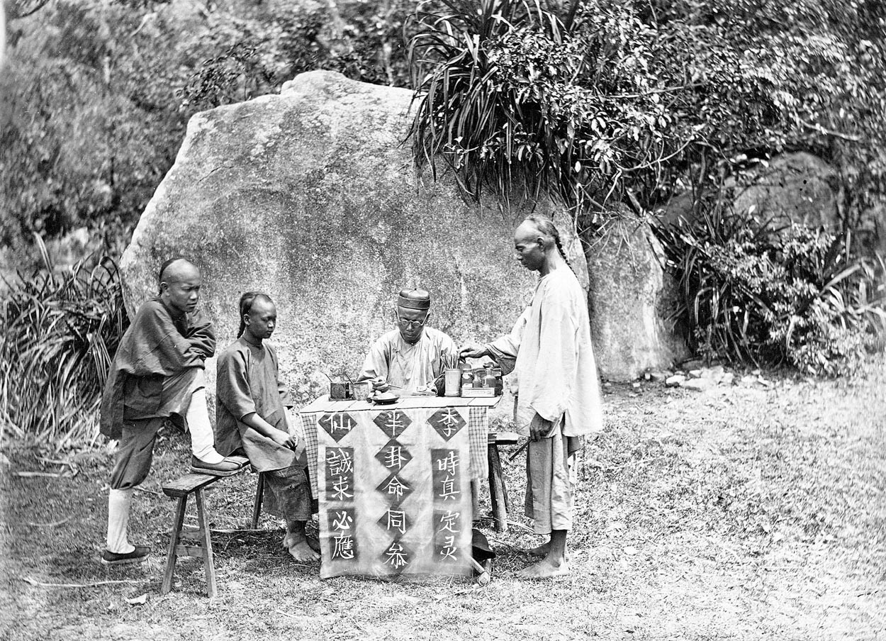
That would be the same with Chinese, [四柱八字.]
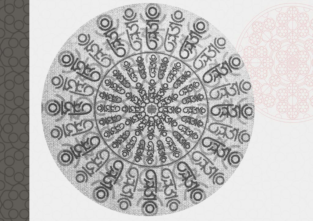
GIRVIN’s Sanskrit magical mantras for client HUM,
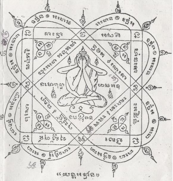
Thai,
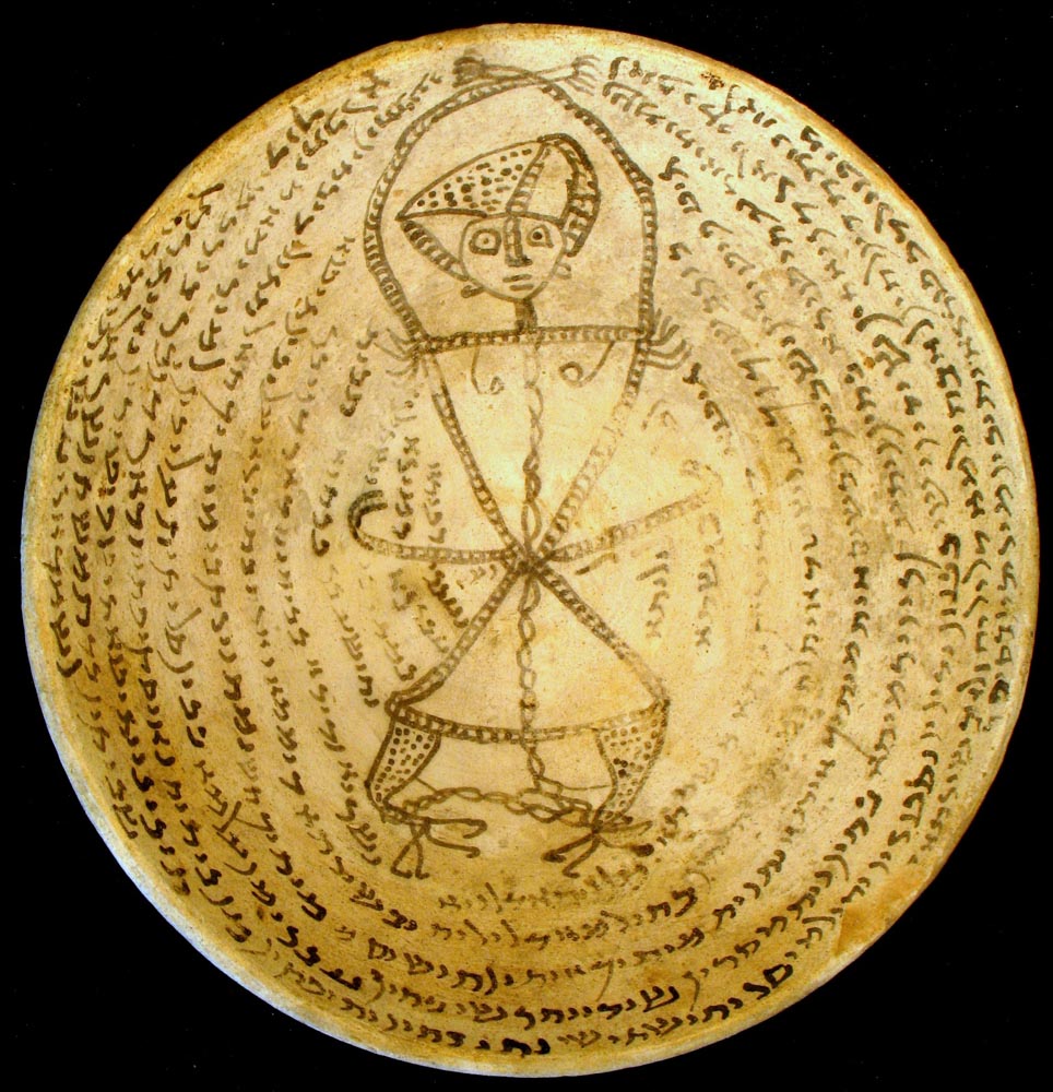
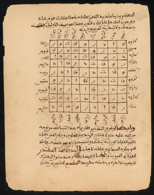
Aramaic alphabetic demon traps,
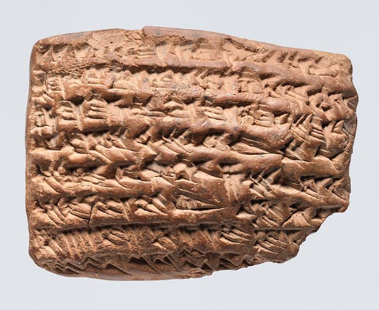
and Mesopotamian incantation texts.
Everyone knows that occult really means hidden. The simple examination suggests that, as designers, there is that which is on the surface, and there is that which lies beneath.
In that, one might surmise that any alphabetic and cultic [as in the aforementioned various writing-based divinationatory acts] interpretation of the occult would be nothing more than the quest for the hidden.
I probably live there,
in more ways than one.
In one manner, the journey of GIRVIN, and Girvin, has been about the quest for that farther, and as yet unexplored territory a realm of mystery, yet as much a realm of a place of newness, the land of curiosity—and the wowness of newly seen scene in spectacle. That is what we look for — journey, story, wowness.
And in the second, since I was a child, the nature of mystery and the mystical has sparked my mind — and to that, my team, the deeper mystery of the work that we all do is part of that journey of discovering.
Which is an uncovering—as in finding what’s hidden.
Brand work is inherently about finding the truth, authentes,
the heart of the brand, its narrative and the team that built it,
their visioning of their premise, posture and positioning.
Find the truth, bring forth that which is hidden.
And, as we all know, to discover is literally—to take the lid off, to remove the cover. In the quest for the soul of the brand, the reaching in—the deep—what will happen is an uncovering;
and what lies there is the truth.
Truth lives in the dark,
as well as the light.

In contemplating
the making of marks, the design of monograms and devices,
in that badge vibrates with
the psyche of a brand,
it becomes something more than just design thinking.
More difficult—as a challenge, it’s an emotional capture—
it’s a shining, a set of strokes
that come from mind and human hand,
that run deep in
the psychical place
of emotional context.

Feeling is movement —
e-motion isn’t constructed of
engineered stillness; it’s alive.
To align the humanness with
the ability to illustrate, which is — in itself,
a kind of light-bearing,
a shining,
a lustration.

As a designer, as a brand strategist,
that’s where you go—lean-in closely, looking deeper—
towards a better listening,
to contemplate,
and to study scenarios broadly.
You investigate, too ponder systemic meaning,
delve into brandcode® and brand genetics diversified in the
link from mind to hand.
And you draw it out.
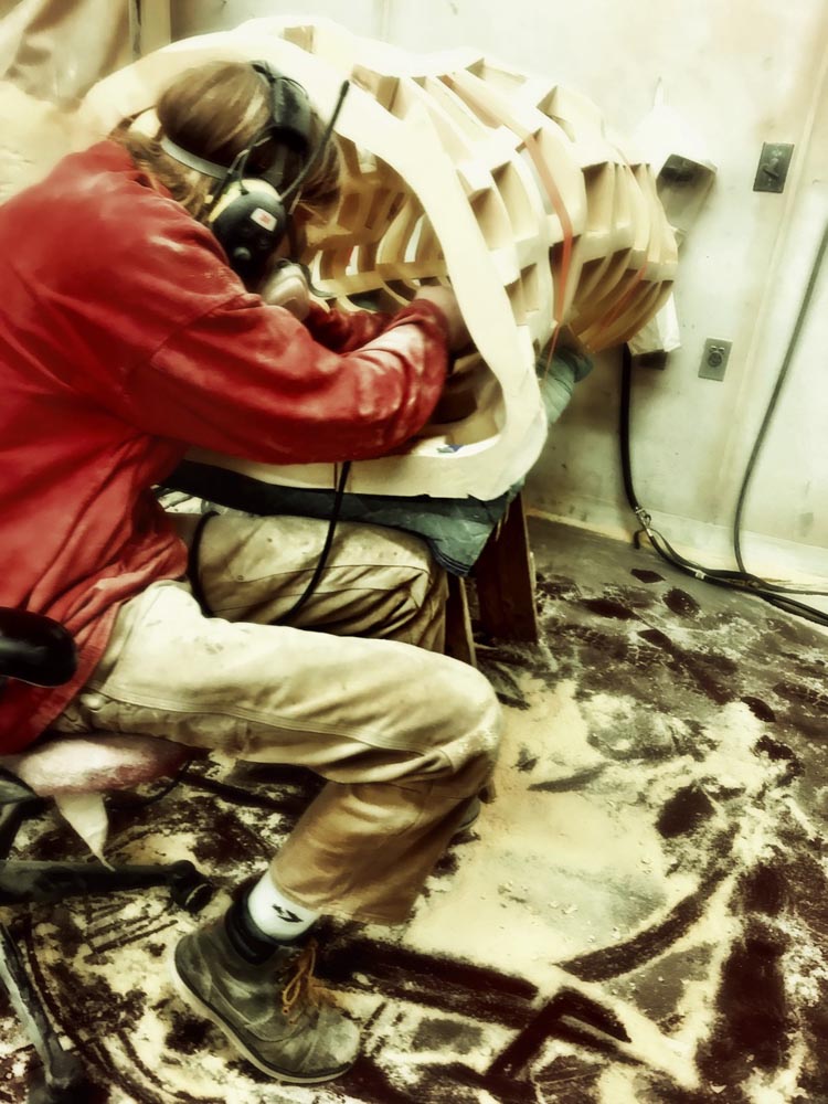
But what does that drawing mean? The art of drawing.
Literally, to draw it out — to capture that electricity of imagining.
That’s what you draw.
And that, in
the interpretation of others that have come and gone before, is:
M A G I C.
It’s portal making;
it’s transformational;
and it’s trans-sensate.
That is
the sign,
the sigil,
the signal,
the signature.
We’ve talked long about the meaning of this string of words.
Each makes one, but what do they know of it,
the language of the signature?
Your sign[ing], your own signature is your sigil, a marking with meaning—
rom the gripped ferrule on the sign-writer’s brush,
to the cut runic sorcerer’s icons
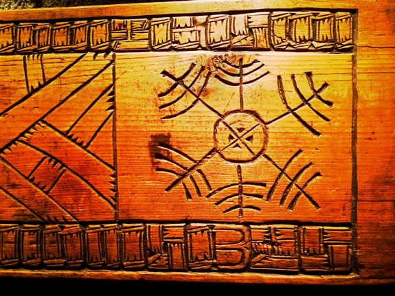
to the strategically empowered corporate identity,
thoughtfully-rendered, customer-pleasing packaging, compelling retail journeys
and unforgettable brand-related experiences;
it all comes back
to that one thing.
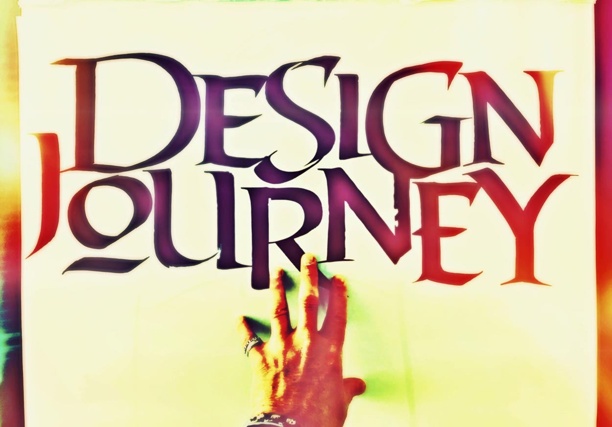
The mark,
the letter, the words arrayed, meaning is inherent,
constructed in the sign and those who sign it.
Who they are, what they stand for, what they are.
And in that transitioning state: what they shall be.
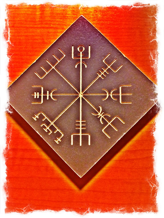
The Vegvisir,
Icelandic guidance sigil.
Tim | G I R V I N + Osean
The Strategy of Holism | Retail Experience Design
TouchPoints, Storytelling and Guest Engagement

