The Interspace: the new MySpace UI

Wide Open — Inner Space — Interface

It’s interesting to study the migrations of MySpace, in the challenges of their past failing and flailing attempts to maintain a respectable share of the social online communities. A new logo won’t do it, alone — though perhaps that’s a start, the compressed form of access — “people see, they read, they get.”
But there is a metaphor in creating a new, dramatically open field of expression, engagement and online storytelling. The new MySpace integrates deeply the characteristics of Twitter and Facebook.
In the beginning and in the end, the most potent capture is the immediacy of transition, “what people are listening to, doing and exploring.” And sharing.
MySpace’s new interface, designed by an Australian digital brand development agency, JosephMark of Brisbane, is surprisingly light, airy, open — cleanly elegant.
As the imagery below offers, along with the gratuitous imagery of Mr. Timberlake, the key backer to the new brand.

Perhaps the most compelling matter to the nature of the user experience and the holism of its touch points is simplification; these days, everything is bettered by simplification.
See spot go:
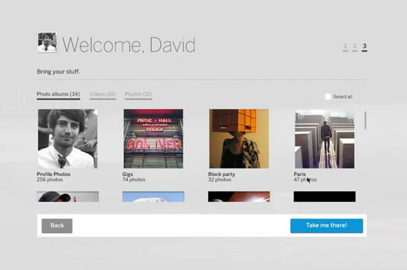
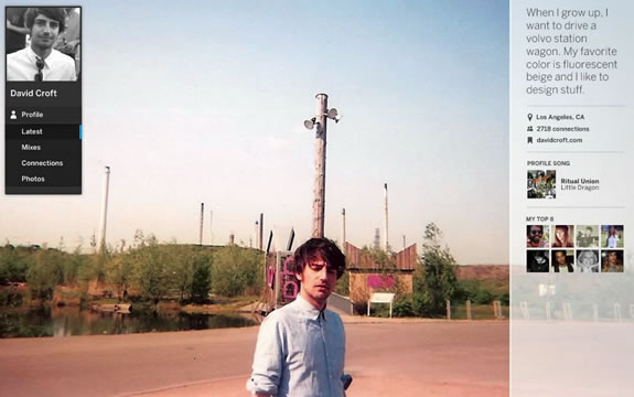
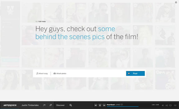
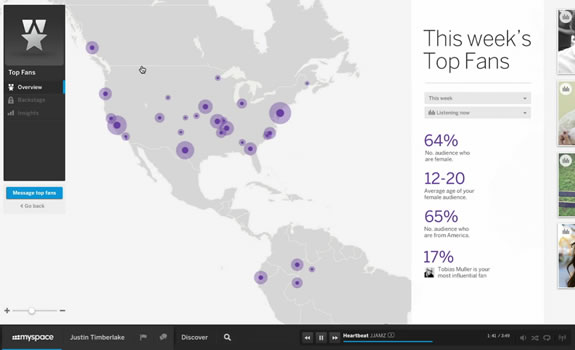
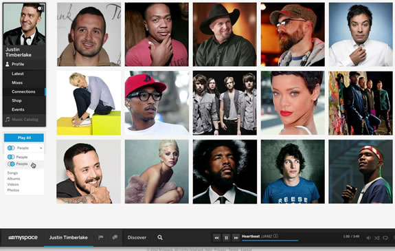
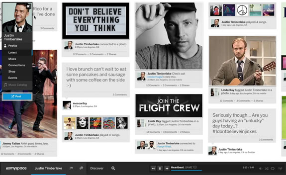
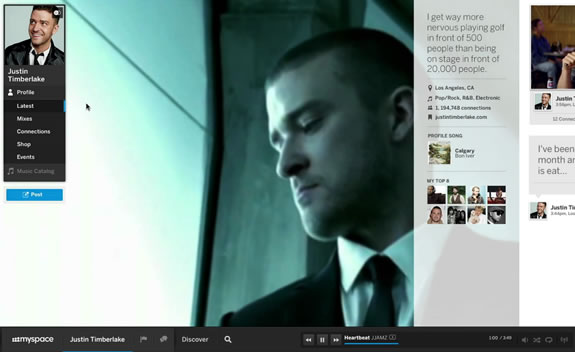
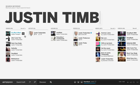
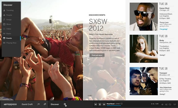
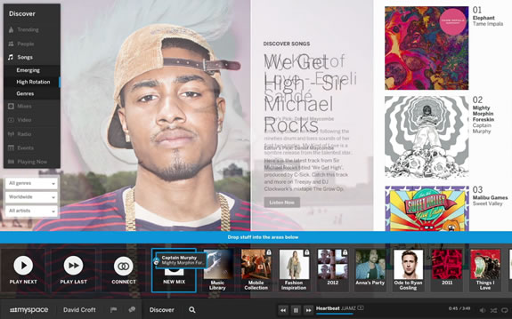
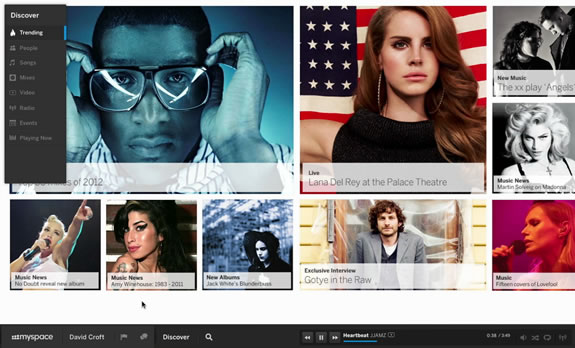
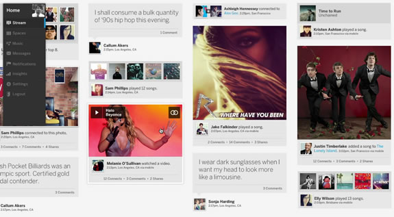

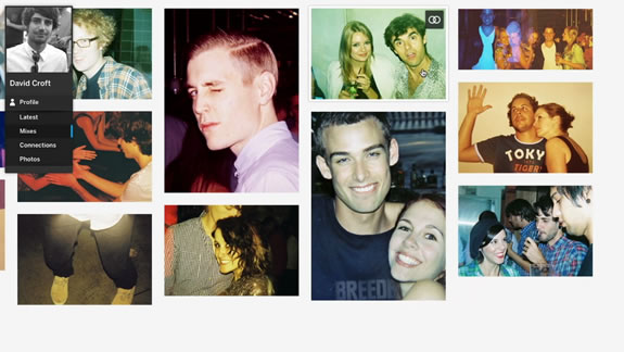
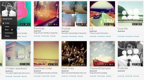
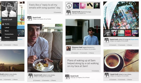
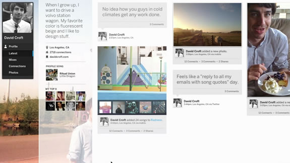
Interestingly, my first reach brought me here:

Back there:

The key, to my sense is openness and scale, a bigger more usable kind of scrapbook modeling.
I like the air of it — more inner space on my space.
Some AdAge collected pundits:
Wired’s Ian Steadman:
“Once-dominant now-withered social network MySpace has returned with new owners and a new design — and, in all honesty, it looks pretty cool.”
VentureBeat’s Sean Ludwig concurred, calling it
“absolutely stunning.”
Bloomberg Businessweek tech columnist Ben Kunz tweeted:
“If you haven’t seen the new Myspace redesign, you’re missing something. It makes FB look like MS-DOS.”
Might be good to go back,
explore more,
sign up here.
TSG | Girvin Decatur Island Studios
…..
G I R V I N | SOCIALITY + MEDIATION
DESIGNING BRAND STORYTELLING IN HYBRID MEDIA