The line between the story, the visualization, the brand.
Story — told. Story — visualized.
There’s a thread that runs between the original telling, and the next telling in story — and the next, and the next, and the next.
One person tells a story and so does (then) another — in hearing it. There is the front of the story, the beginning — the prologue — that is followed by the narrative of the main telling, there are admixtures of the story phrase, the personalities and windings of plot, there are substrate tellings, and there is the climactic, drawn snapping line; and finally, the story finishes, and another begins. The rise, the fall, the rebuilding.
In motion pictures, it’s always about this sequencing — the story on the story on the story. one form of telling that translates to another. And in telling tales, it is translational — from mind, from textuality, to visualizations. Such is the sensate capture of our experience — from one, to another. Tell me a story, and maybe I’ll embrace it. Perhaps I’ll listen — and perhaps I will want to pass that story along.
That is inherent in the character of brand (and brand, as I’ve said a thousand times, is a 3,000-plus-year-old word for fire) — which, metaphorically speaking, to my thinking, is the metaphor for story(telling) and the mystery of it. I’m convinced, and have seen that, brands work in the construct of translational experiences — one telling reveals another, and another is borne of the renewed level of experiential involvement. All ways — it is about layers — the story keeps moving.
An article, and surely one of many, that explores the brand development, story marketing, titling presentations of motion pictures, appeared in the NYTimes, post-Oscar®, examining the idea of the “uncredited” title. I might disagree with that — since the ’50s, titling designers have credited themselves — sometimes, like Saul Bass, they’ve credited themselves in as the titling rolls by. NORTH BY NORTHWEST, the classical sliding, skyscraper titling reveal (Picture Mill did that for PANIC ROOM, a Fincher film). The sequencing of the evidence — the opening of the story — interlays the concept of the credits, the opening reveal of who the players are, with the streetscape / cityscape telling.
As Emily Oberman and Bonnie Siegler note, “there’s an Oscar for pretty much every aspect of filmmaking, except one: the title sequences. Titles, though, have always played a significant part in motion pictures. They may have started out as simple black-and-white cards. But in the days before sound, they already did more than identify key players: they communicated dialogue and advanced plot. And as filmmaking evolved, so did title design. Titles have become wonderful bridges from reality into the cinematic world and back out again. At their very best, they are themselves innovative, emotional experiences, microcosms of their movies.”
Some of the references that manifest historical example:
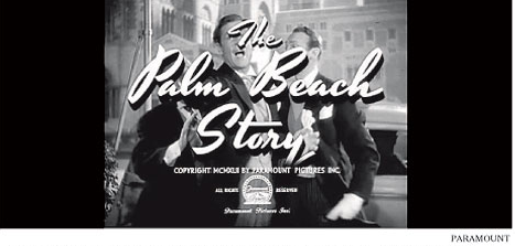
An unknown designer, 1942
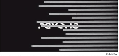
Sal Bass, 1960
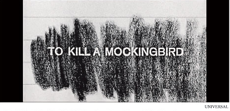
Stephen Frankfurt, 1962
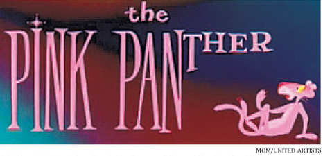
Friz Freleng and David DePatie, 1963
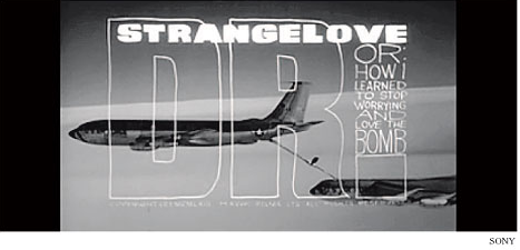
Pablo Ferro, 1964
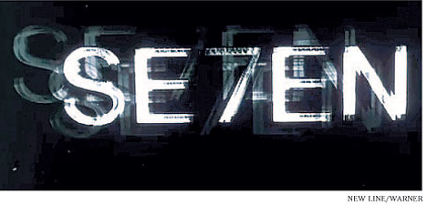
Kyle Cooper, 1995
Of this sequence of talents, I’ve only spent time with two. Saul Bass and Kyle Cooper. I met Stephen Frankfurt — but I didn’t advance the confirmation.
But, of Saul and Kyle, I’ve talked to them both about the idea of the story — and motion, and what that means in the context of emotion, captivation and attention. I see them as intertwined, but different in their sequencing: see something — the beginning of the visualization (of story), to be — perhaps — drawn in, and finally, to be attuned.
You are not merely captivated, emotionally connected, but you are paying attention. And it’s clear that titling lives in that space, in the character of miniature movies. Which are, of course, miniature stories.
Saul Bass
Saul I met in the ’90s; he and I were speakers at a design conference — and we stayed in touch for a bit, exploring some ideas, some time before the advent of his passing. Bass, as a designer, was incredibly voracious — he ranged from print to film and back again. And the signature of his work is bold graphics, bold color, hand-cut type and illustrations.
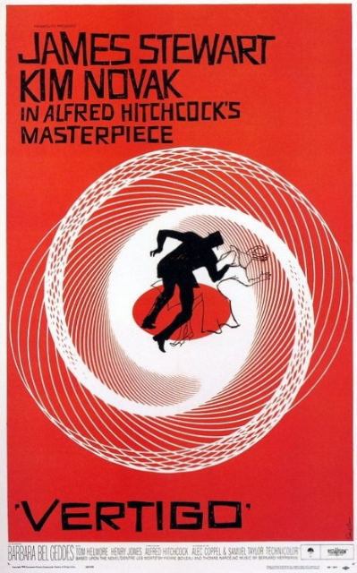
“My initial thoughts about what a title can do was to set mood and the prime underlying core of the film’s story, to express the story in some metaphorical way. I saw the title as a way of conditioning the audience, so that when the film actually began, viewers would already have an emotional resonance with it.” Saul Bass
During his 40-year career he worked for some of Hollywood’s greatest filmmakers, partnering with Alfred Hitchcock, Otto Preminger, Stanley Kubrick and Martin Scorsese.
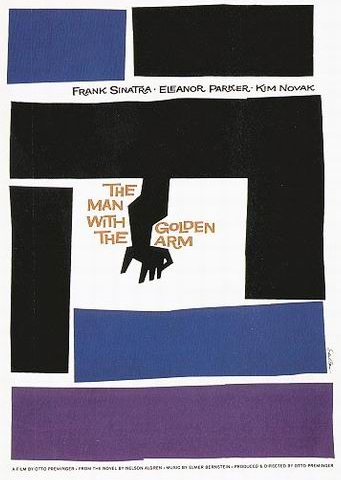
Perhaps the most recognized title sequences are works that, as well, represent his true explication of graphic styling — the animated paper cut-out of a heroin addict’s arm for Preminger’s THE MAN WITH THE GOLDEN ARM, the concept of text and imagery being juxtaposed: racing up and down what eventually becomes a high-angle, axonometric shot of the United Nations building in Alfred Hitchcock’s NORTH BY NORTHWEST, and the disjointed, slicing text that raced together and was pulled apart for PSYCHO.
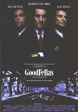
My literal connection to Saul is in the link to GOODFELLAS, while working as a designer on that project identity. I worked, as well, on his last film — CASINO. Not so much that we connected on the context of joint design, but rather that this occurred as an opening to conversation. Speaking to Saul, at the Grand Canyon Lodge, we talked about the ideas of typography, movement, the intermingling of visualizations — one thing leads to another. While we never had the chance to work together — by that time he was really retired — it was, nonetheless, a tipping point; a learning nexus. I learned then, that idea of message, image, text — integrates the dream of the story. Being collated as one coherency, it aligns the view with the telling, faster.
40 years of work, as a titling designer:
- CARMEN JONES (1954)
- THE MAN WITH THE GOLDEN ARM (1955)
- THE SEVEN YEAR ITCH (1955)
- AROUND THE WORLD IN EIGHTY DAYS (1956)
- BONJOUR TRISTESSE (1958)
- VERTIGO (1958)
- ANATOMY OF A MURDER (1958)
- THE BIG COUNTRY (1958)
- NORTH BY NORTHWEST (1959)
- PSYCHO (1960)
- SPARTACUS (1960)
- EXODUS (1960)
- ADVISE AND CONSENT (1960)
- OCEAN’S ELEVEN (1960)
- WEST SIDE STORY (1961)
- WALK ON THE WILD SIDE (1962)
- THE VICTORS (1963)
- NINE HOURS TO RAMA (1963)
- IT’S A MAD, MAD, MAD, MAD WORLD (1963)
- THE CARDINAL (1963)
- IN HARM’S WAY (1965)
- BUNNY LAKE IS MISSING (1965)
- GRAND PRIX (1966)
- SECONDS (1966)
- BROADCAST NEWS (1987)
- BIG (1988)
- THE WAR OF THE ROSES (1989)
- GOODFELLAS (1990)
- CAPE FEAR (1991)
- DOC HOLLYWOOD (1991)
- AGE OF INNOCENCE (1993)
- CASINO (1995)
Since the ’70s, I’ve continued to work as a designer on films (400 so far) — mostly skewed to identity, but in some capacities, working as an interpreter of script, storytelling, production design and how that translates to visualizations for theatrical advertising. That lends itself to posters and print campaigns, of course, as a primary communicator.
The other element of defining cinematic advertising is the bridge between print and trailers. The trailer — which came from the concept of showing promotions of other films as “trail-ers” — after the main “mov-ie” is finished. Like the serial, it’s a telling that leaps to the next step of the adventure. I believe that the concept of the trailer is the link to advancing the premise of titling design. It is part of the web of cinematic storytelling — and the marketing of that story.
“Design is thinking made visual.” Saul said that. I like that — a quality of creative intelligence. I’ve heard that phrase somewhere.
There’s another person to consider — on the one, a range of explorations in the opening innovations of titling; the other, the concept thinking, as Kyle Cooper puts it in the name of his recent company — titling as prologue. It is the word before — pro – logos.
Prologue Films is a motion-graphics design company specializing in film and broadcast work. It is led by Kyle and Kimberly Cooper, a married design couple — both of them really delightful people. Kyle, intensely focused and intellectually preoccupied (on every detail) — his mind perpetually working, it would appear. Kimberly, charming, warm — and managing the practice, as an operations director, to my take.
The firm, based in Venice, CA, has become a leader in the field of film-title design, an art form that Kyle Cooper has single-handedly revitalized over the past decade. They embolden the notion that the opening of a film is a crucial storytelling element that orients viewers toward what is to come. Prologue has raised the standard of title design through its work on a range of blockbuster and independent films, including SPIDER-MAN 2 and SPIDER-MAN 3, DAWN OF THE DEAD, ACROSS THE UNIVERSE and THE PAINTED VEIL.
And my connection with Kyle is about exploring the selfsame.
What’s the story? Who’s telling it? What does it look like?
And, in a way, the link between me, and Kyle, or Girvin and Prologue, has the same bridge. We think about the idea of storytelling, as designers, moving through the layering of imagery — to something: de-signed. A signature, a signing. We went here, with David Fincher’s direction — and the advertising team at Paramount Studios. We dig in, frame the link between the script, the production, the story — and the film, in creating brand / film master books for the studios.
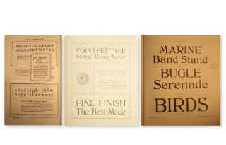
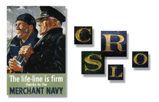
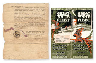
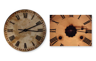
To get here:
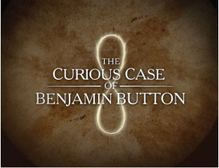

And that link, to exploring intention, Kyle and Kimberly were there, too. Two.
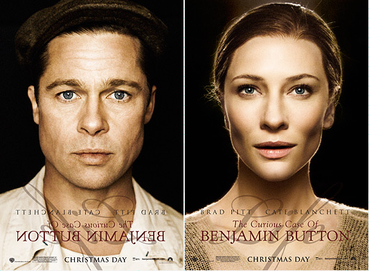
As a designer, to another designer, the talk was nearly the same in exploring potentials with Kyle. And a little, in connection, with Kimberly. And about type design, and movement — and visualizations. That’s one thing that’s remarkable about the layering of Prologue: there’s a fluency between the place of type — a wholly inextricable connection to the “naming” — and the live action movement of the other imagery, seamlessly moving.
Like the spectacular treatment of ROCKNROLLA, the link is tight, yet the pans and camera moves are liquid flowing. This visual legacy might be genetically attached to Guy Ritchie’s styling — especially LOCK, STOCK AND TWO SMOKIN’ BARRELS, where the opening interplay of type, titling moves, posterized photo-graphics and dimensional camera moves, verges from graphic novels to true comic book conceptions.
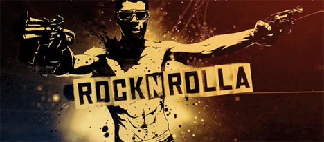
That’s what I find particularly compelling about the concept of titling — and the work of the Coopers: it’s graphic design that is dimensionally alive. All live.
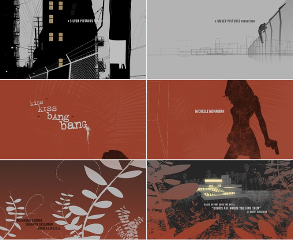
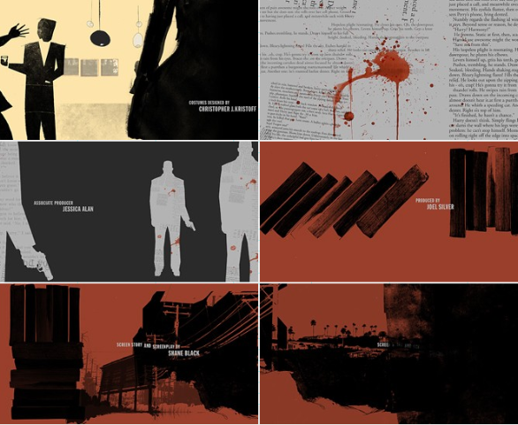
Their work on KISS, KISS, BANG, BANG for Silver Pictures:
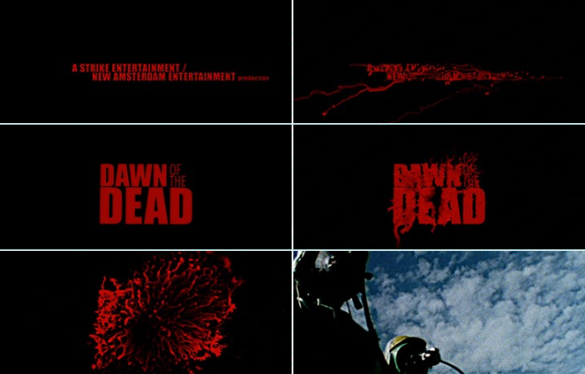
Zach Snyder’s DAWN OF THE DEAD titling, by the Coopers:
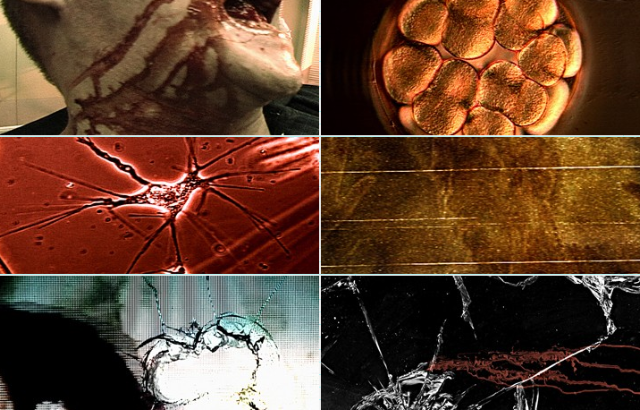
I was talking with some scientists the other day. And they said, “We don’t really know how to tell a story. We can (re)search. And we can search again — but we can’t tell a story.” Hearing that, reminded me of this:
Telling stories is an art; it can be a beautiful thing.
What’s your take?
Tim Girvin | L O N D O N