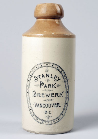
© 2008 Sam Carter & Patrick Gunn Collections 1896 Ginger Beer
Exploring restrained packaging design vocabularies in brand.
We’ve been working on packaging, up north in Canada. And in exploring the idea of messaging, in the context of container expression — shelf presence — sometimes the nature of that expression speaks to something complex in the layering of the intention; but sometimes, simple is beautiful.
In our work for Procter & Gamble, which ranges over dozens of assignments over the past decade and more, access and attention in the micro retail realm is a matter of epiphany. The reach of P&G into the mind of consumers is well known; it extends beyond the conventional testing models by moving, literally, into the home — and the minds of its relationships. And, according to the new CEO of Procter & Gamble’s global planning is to add to that measure of community and connection by 548,000 new relationships every day.
How to do that? Step by step — measure by measure, person to person. Among other things, building their world, and the vast sea of relationships — design strategy playing in, laying the story. What we offer is the reach from story to brand, packaged. Sometimes the layering of that story is a complex building of many tiers of messaging, market comprehension, individualized attunement between brand conception, innovation and the consumer.

That layering is psychic; it’s a deeper connectivity, between brand, story, person. It’s between the place of meaningfulness and relevance, and if possible, a sense of resonance in singing the right song. So, to reference, Sebastian Professional reaches to the heart of self image in beauty making. And personal worth, and self impression — being, in a word to demography: “beauty junkies.” So to the complexity of the layering of messaging, that starting statement is framed here.
Aspiration:
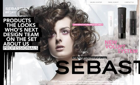
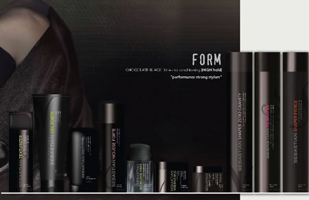
Execution: But what more, to the conceptions of simplicity in message.
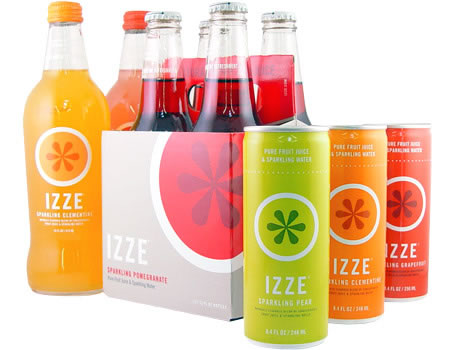
If it’s so simple, do consumers get it? According to the messaging of Izze, for example, growth has been “double-digit since their founding in 2002.”
To the references of others, that speak to the conception of simplicity in brand, visualization, integration of form — and typographic reach; here’s a sequence of ideas:
The top, to simplicity, brand, story:

Another classic, to discipline:
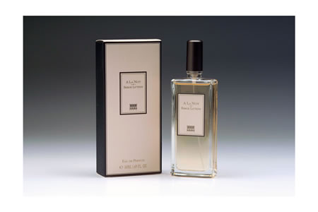
And another, to the spin of restraint:

A string, to message, quiet, calm:
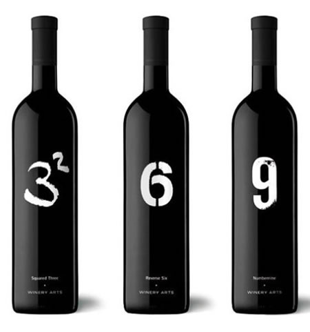
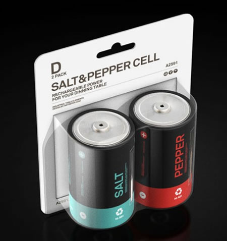
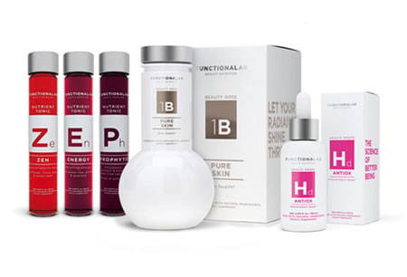
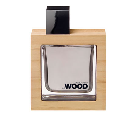

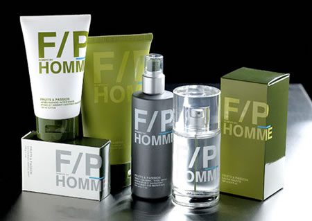
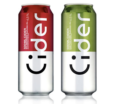
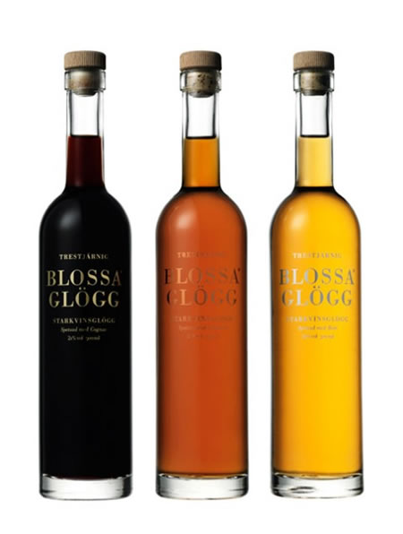
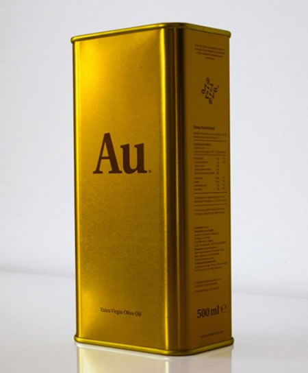
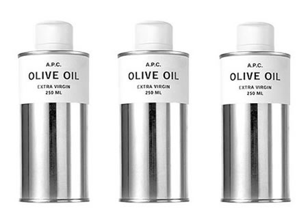

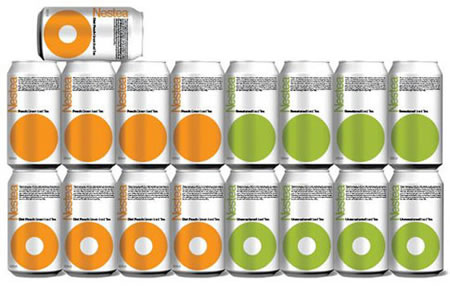
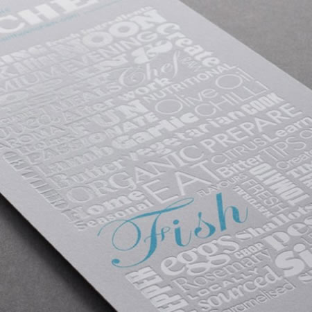
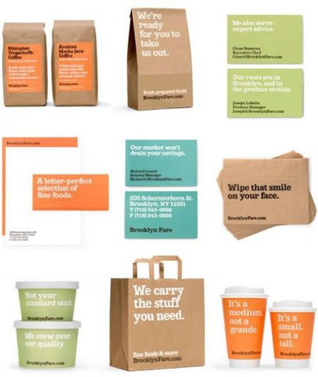

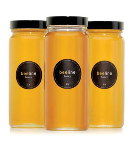
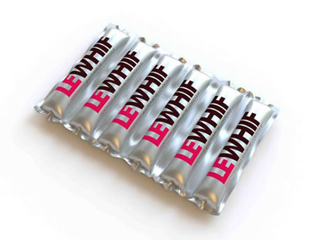
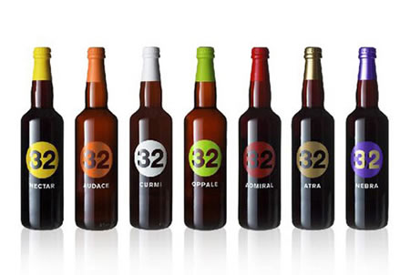
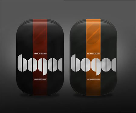
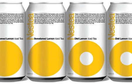

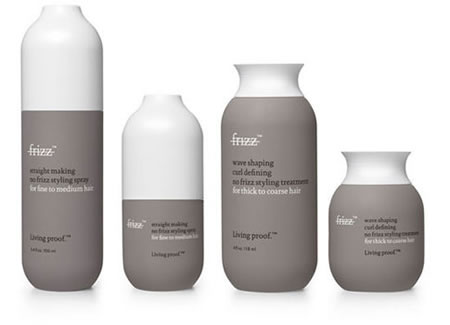
And closing with another classic:
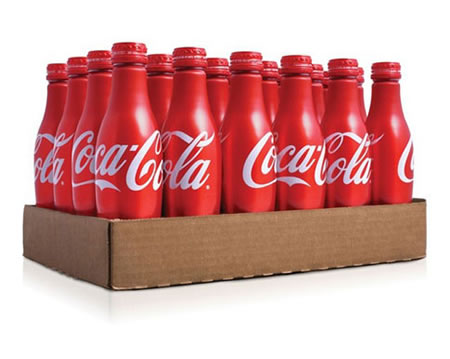
Sometimes, that idea of simple: straight to the message, the form, the alignment of character, it works beautifully.
tsg
….
the reels: http://www.youtube.com/user/GIRVIN888
girvin blogs:
http://blog.girvin.com/
https://tim.girvin.com/index.php
girvin profiles and communities:
TED: http://www.ted.com/index.php/profiles/view/id/825
Behance: http://www.behance.net/GIRVIN-Branding
Flickr: http://www.flickr.com/photos/tgirvin/
Google: http://www.google.com/profiles/timgirvin
LinkedIn: http://www.linkedin.com/in/timgirvin
Facebook: http://www.facebook.com/people/Tim-Girvin/644114347
Facebook Page: http://www.facebook.com/pages/Seattle-WA/GIRVIN/91069489624
Twitter: http://twitter.com/tgirvin