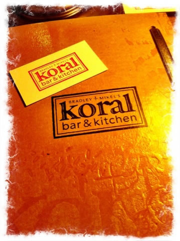
Menu design as a core element
of legend-making in
crafting food & beverage experiences
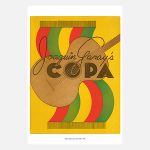
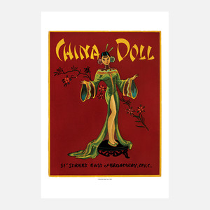
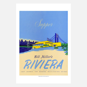
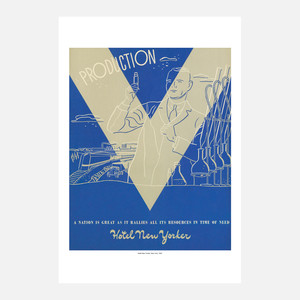
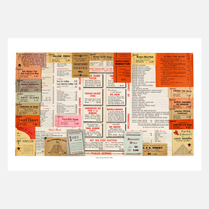
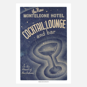
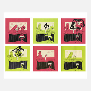
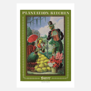
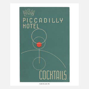
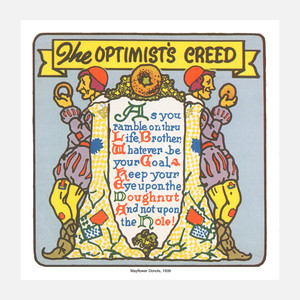
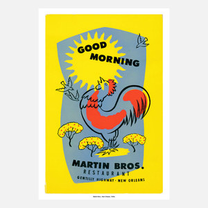
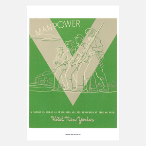
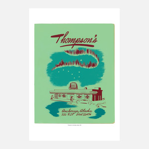
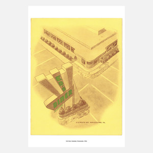
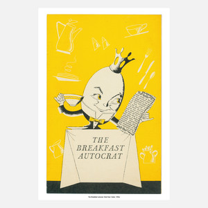
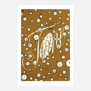
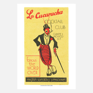
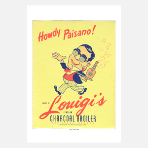
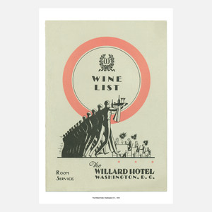
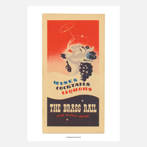
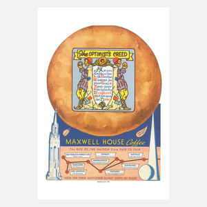
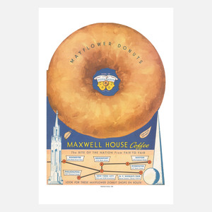
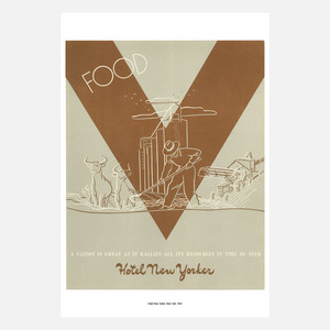
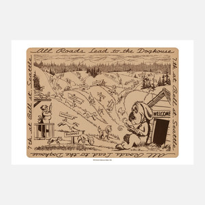
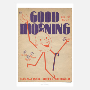
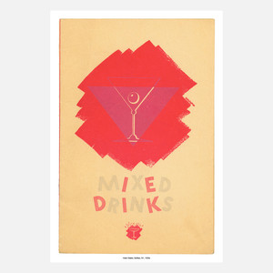
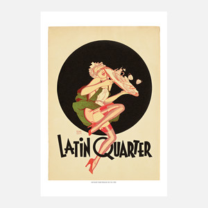
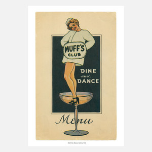
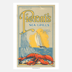
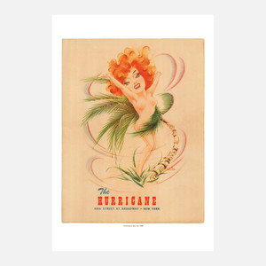
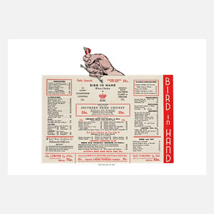
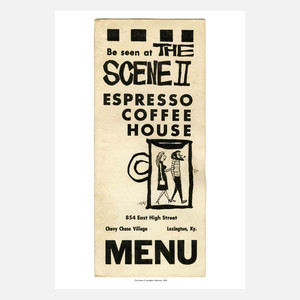
A friend sent these along to me, and I’m not sure where they came from, what collection. Apologetic for not defining their provenance.
But it reminded me of another missive, from another friend that I’ve seen, just last night.
“Contrary to popular mythology, it was with paint brushes in hand, not a guitar, that [Woody] Guthrie hit the road for California. He had hocked his guitar . . . and it was his artistic skills that he brokered for room and board.”
Nora Guthrie
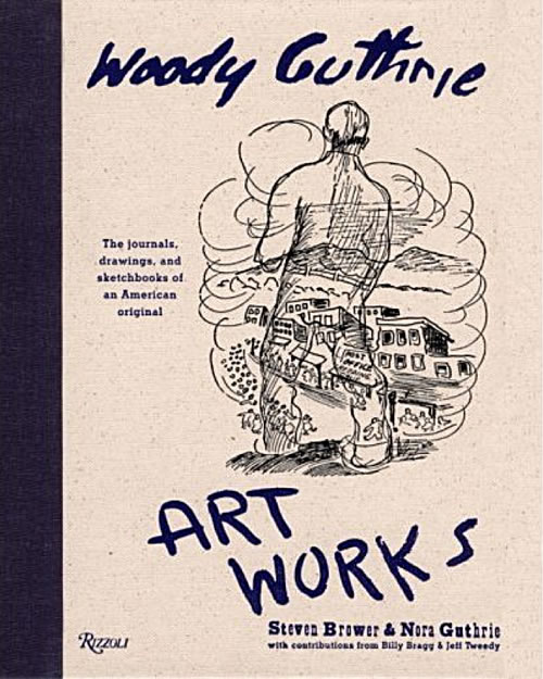
Rizzoli Books
“As I went walking I saw a sign there – And on the sign it said “No Trespassing.” – But on the other side it didn’t say nothing, – That side was made for you and me.” – Alternative verse from This Land is Your Land – Woodie Guthrie
It recalled another era, the art of the show card writer, “the snapper.” Earlier in my career, I was a show card writer, car, motorcycle and truck pinstriper and sign painter.
The right consistency of “One Shot Lettering Enamel,” the right stroking lettering brush, was core to the art, along with laying the pricked pounce patterning to lay out windows and panels on trucks and boats and cars.
Craft and care are inherent signatures.
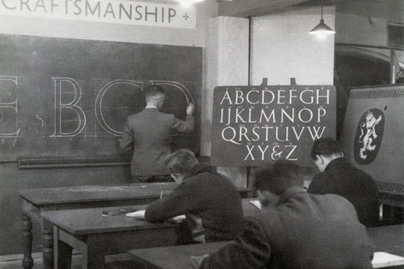
The classical art of drawing lettering, in a sign painting school
This art, as well, was often improvisational — a skilled signing show card writer was, in the context of earlier time frames [say: the 60s backwards] was a key commercial artist — and lettering, layouts and designs were done by hand — bringing forth the notion of the hand made, fingertip-built expressions of versatile and customized art.
The art of the “Snapper.”
Show cards might range from signing in stores and supermarkets, to merchandising display, in-store directional signing, shop fronts and sketches for larger scaled signing treatments and built environmental graphics.
Hand, eye, arm and fist all came into play.
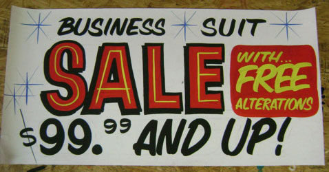
Image from Golden West Signs
In the 70s, I started a sideline business of building quick advertising comprehensives for agencies as a way to go into an agency, sit and draw as a freelancer, and walk out, end of day, with a pay-check.
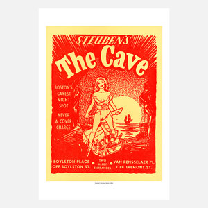
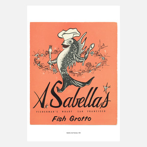
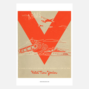
It all adds up, in the sequencing of micro assignments. That lead, too, to rendering completely hand-drawn menus — top to bottom, all art, made by hand — from logos to caricatures — showings of shop-fronts to cartooned storytelling of brand experience. These renderings showed forth as happier experiential tale tellings for what might be called earlier references to the notion of brand storytelling. Where the journey into, for example, a restaurant spoke of history of ownership, the types of food and the evocation of a happy procession — from entry, to selection, to service.
Seeing these studies and menu designs takes me back; still, the core is there:
“what is the story,
how is it told,
what does it look, sound and feel like, and
who’s it for?”
Better said,
“what’s the story
and who cares?”
The menu then becomes an access to understanding the calling card of holistic experience thinking.
Stories are told, read, shared and offer a possible deepening of experience —
and perhaps most importantly:
memory and
community sharing in impact.
Tim | Beverly Hills, CA
The Strategy of Holism | Restaurant Experience Design
TouchPoints, Storytelling and Guest Engagement
See the Restaurant Point Conference Keynote:
http://bit.ly/PWuvnE