
When you think about a place—
what aspects are the most memorable?
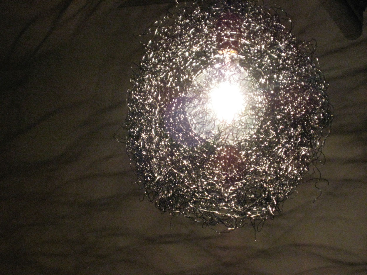
From my view: patterns, there are patterns that intertwine in the experience of a place that become distinctly memorable. That can speak to unique uses of materials—as in the gnarly grizzle of the wiring cluster above, which is a distinct memory of a place in Manhattan, a staircase in Gramercy. Close-in, above; fixture below. The intriguing interplay lies in the patterning of the construction of the light, or the patterning of the shadowed scrollery in the wall rendering below. Curiously, I have a distinct memory of this place, and that light in the hallway.
I’m interested in how patterning can play out, layer the branding of a story, inside the vocabulary of how someone experiences, and remembers a brand—for this is truly it: “what’s memorable?” Some GIRVIN patterning, to reference:
A patterning in a sports strategist and nutritionist’s brand vocabulary:
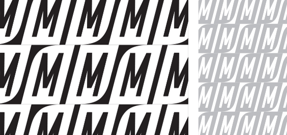
Which then becomes a substrate—almost like a watermarking—built into the brand:

Or as a contrastive brand language:

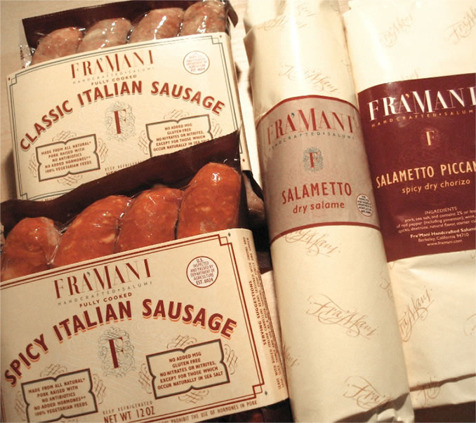
Another reference? Designing another brand language where there is a play on patterning in the context of a form of calligraphy that speaks to the spirit of an Italian, renaissance legacy. Invention and tradition, combined in a new interlacement.
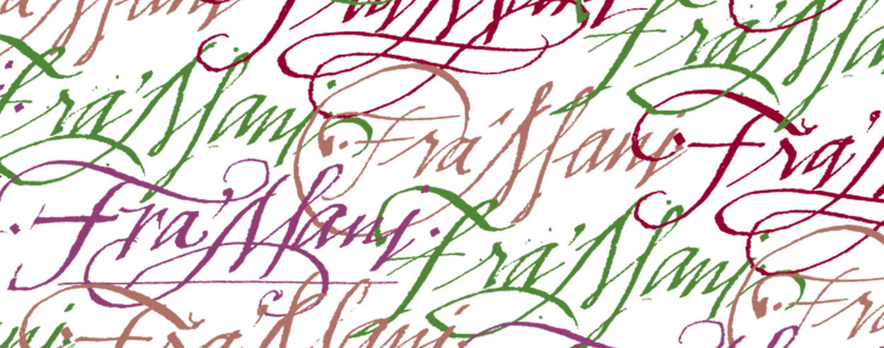
In a manner like this, there is an interplay to the layering of pattern as part of the brand’s lexicon of mnemonic touches.
We hear: “it’s the small details that count—as in ‘there’s one thing I remember about this brand, when I was there, it was this set of symbols—they were in the signs subtly, they were on the carpeting and in the books that I had in my room,’ presuming the larger thinking is organized as a disposition. That is, the brand has a story, and the story is a patterning, and the patterning finds its display in the graphical language of the brand. Could be substantial, small, subtle or stupendous. But its layering is there.
This walks back to some earlier references, which I was just thinking about: this form of design thinking is now finding itself increasingly expressed in architecture.
Working with Dawn A. Clark LEED AP, and designer Andy Thæmert, now Senior Creative Director, Global Store Design at Nike, was a fabulously expansive collaboration, and the patterning of a brand’s DNA, as well as a hidden metaphorical code that Dawn discovered
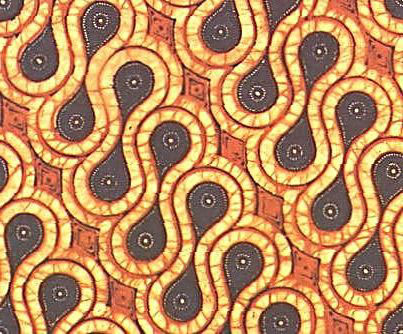
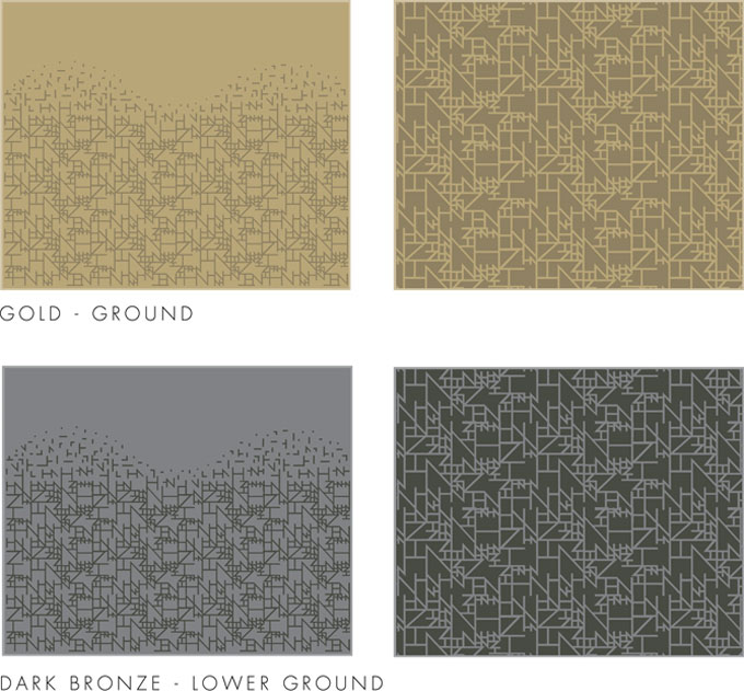
in the royal batik patterns of Jakarta, Indonesian cultural patterning—the parang [rusak, shown above], a specific decorative device symbolizing a ridge, slope or cliff—that was reserved for royal uses of batik patterning. It was an upscale use for a supremely luxurious store in Jakarta’s Plaza Indonesia. That became:
as below, a multi-storied perforated mesh cladding—with the parang in repetitive array.
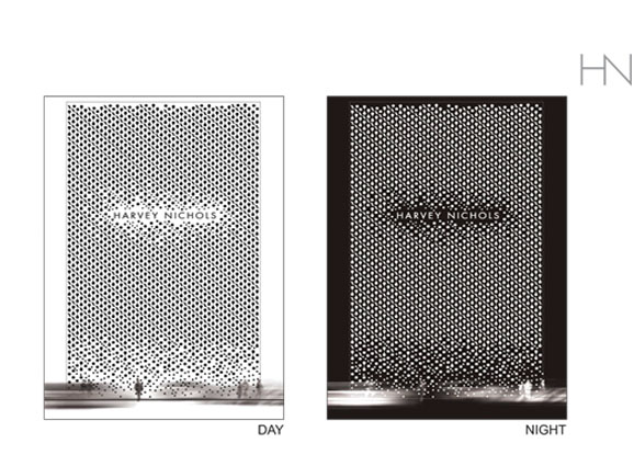
Floor patterning and devices:
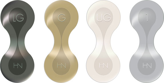
Signing with a substrate parang interplay.

Working with Andy and Dawn we sought to implement these strategies holistically—particularly in terms of signage and patterning visualizations.
As before, “there are the big picture items, the larger gestures in a place, ‘the big moves,’ and then there are the smaller details, the hidden symbolisms, the patterns inside a place’ that pop out as memorable.” Notes from a visitor.
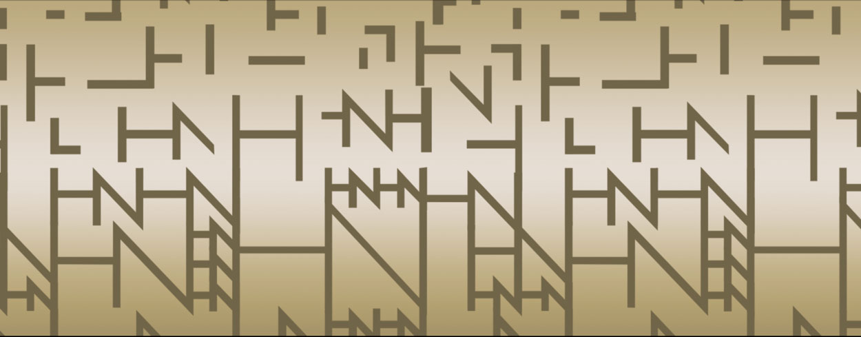
We also expanded upon that language studying options in a genetic disassembly of the Harvey Nichols logotype that became another tiering of mnemonic reflection—playing to different metallics—as a way-finding association.
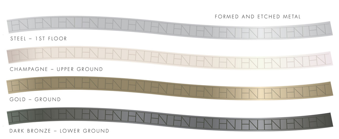
on different floors as part of that language.
One of my earlier references was to Herzog & De Meuron—masters of patterning in place-making.
Edwin Heathcote has responded to this overview—my earlier notations–in the Financial Times, as: “Ian Schrager’s new SoHo condominium development, 40 Bond, uses ornament as a kind of barrier but also as a hoarding. The New York building’s Swiss architects, Herzog and De Meuron, reflect on the heavily glazed iron and glass construction of the surrounding industrial buildings and lofts but the most striking thing about the structure is its extraordinary, squiggly cast metal fence.” I pulled up some studies, from my shoots at NOHO.
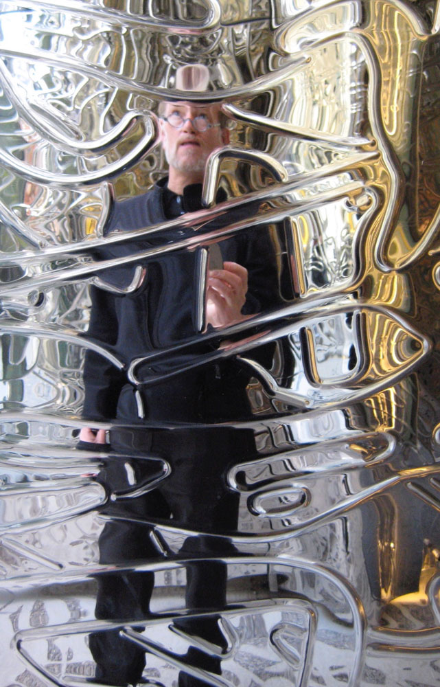
That patterning is graphical, and form-related—
it’s graffiti made formal: dimensionalized.
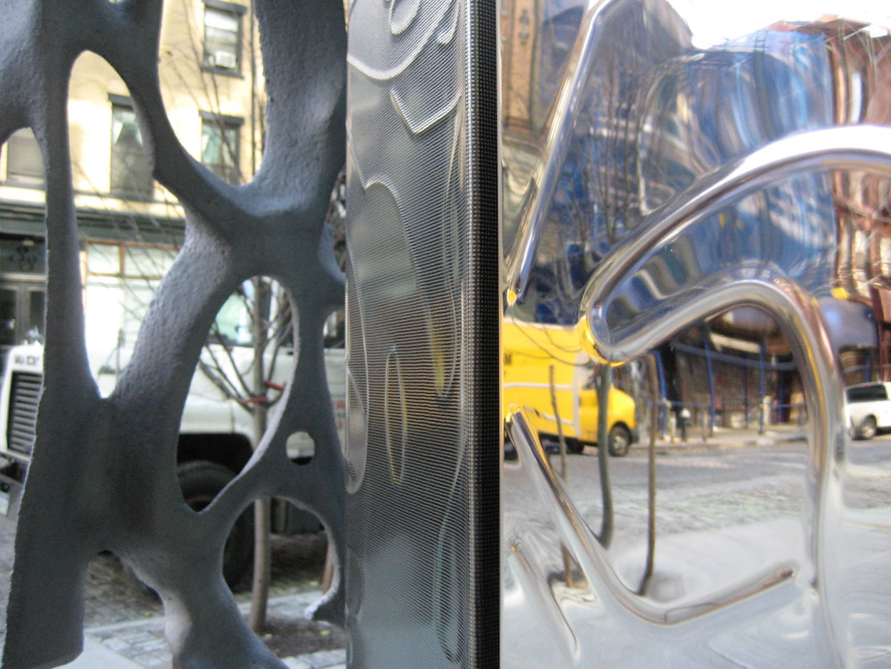
A truck reflected in the steel patterning.
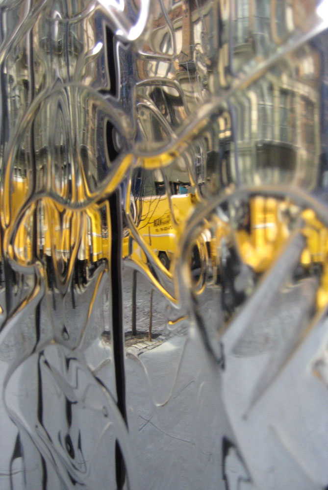
Thinking about brand patterning and place-making, there’s an intermingling of the place in which they are made, or built—as in this observation—from the architects themselves:
“It is based on New York graffiti and on tags and, as those are the signatures of the artists, this is the signature of the building.”
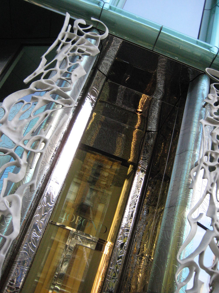
“In reinterpreting an almost forgotten architectural element, Herzog and De Meuron found a way of distinguishing the building, of involving it aesthetically in the public realm while also signifying separation from it.
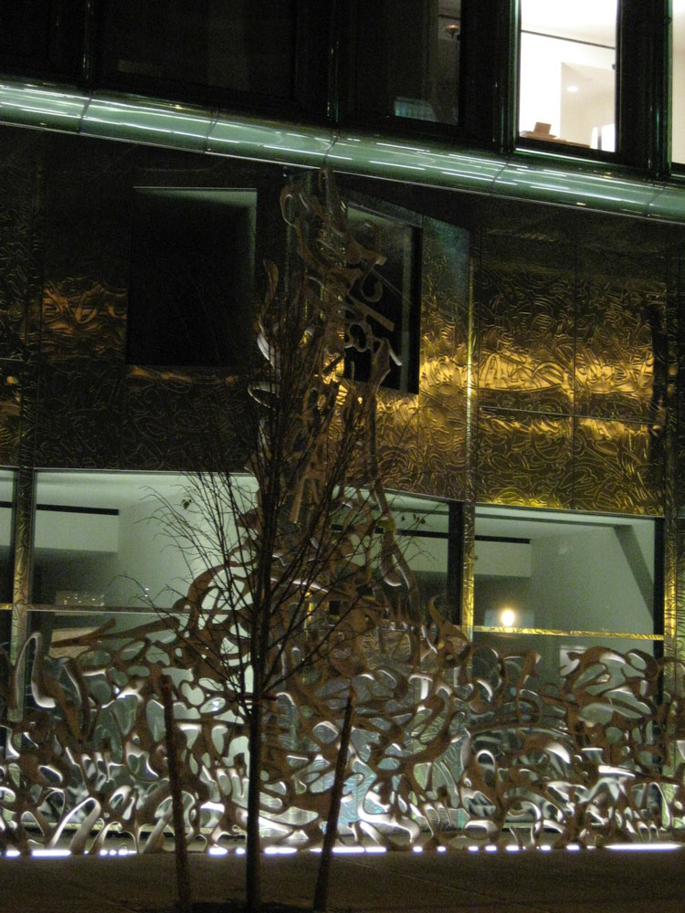
Just as the complex structure of their “Bird’s Nest” Olympic stadium in Beijing becomes the architecture, a web of convoluted, though internally consistent structural members, so what appears here as ornamentation serves a functional role.”
Edwin Heathcote
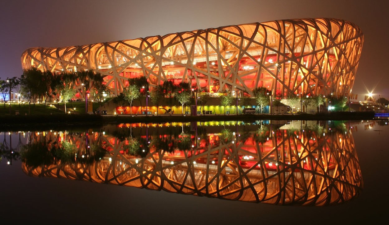
The logo for the Chinese National Stadium

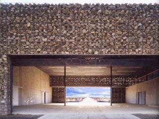
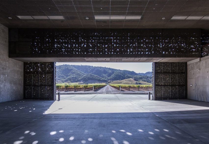
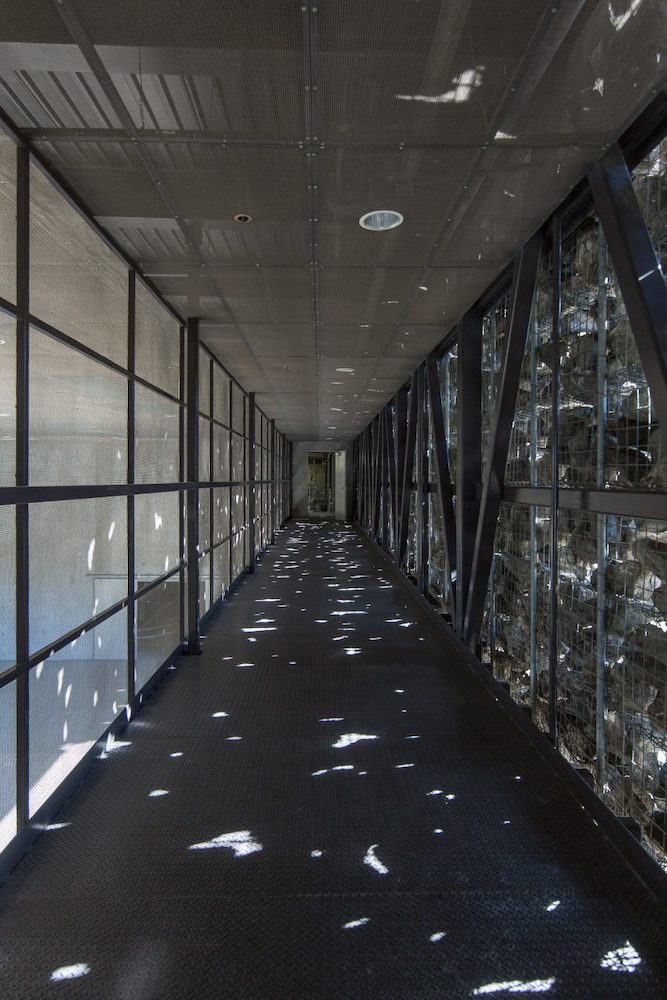
I’d referenced another project in considering the notion of patterning in brand place-making: the stone arrangements of the Dominus Winery
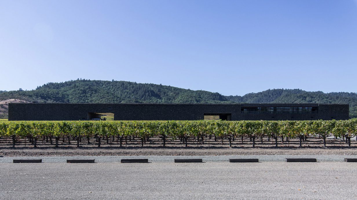
being yet another expression of the idea of patterned expression of context—the very stones of a rocky vineyard.
Edwin Heathcote, The Financial Times, London—opens his exploration of pattern—or decoration—in architecture with the quotation of Adolf Loos, architect and designer, who had spoken of his idea that decoration represented a kind of ascetic primitivism:
“In a highly productive nation, ornament is no longer a natural product of its culture and therefore represents a backwardness or even a degenerative tendency.” AL | 1908 | Ornament and Crime.
Ludwig Mies van der Rohe’s “Less is more”, a phrase that became the focus of minimalist design principles, defining modernism now well into its third century. These reflections, perhaps all a kind of reaction against the waning of an earlier profoundly decorative phase in the history of design—the arts and crafts movement of the Victorian era. For the latter part of the 1800s— expressed in the exemplar of John Ruskin, architect, draftsman, arts and crafts theorist—“I believe the right question to ask, respecting all ornament, is simply this; was it done with enjoyment, was the carver happy while he was about it?”
And William Morris, master craftsman, movement leader, a comrade in principle, offered “I love art, and I love history, but it is living art and living history that I love. It is in the interest of living art and living history that I oppose so-called restoration. What history can there be in a building bedaubed with ornament, which cannot at the best be anything but a hopeless and lifeless imitation of the hope and vigor of the earlier world?” And that, living in a world devoid of ornament or beauty, there was: “if you want a golden rule that will fit everything, this is it: Have nothing in your houses that you do not know
to be useful or believe to be beautiful.”
Of course, what’s beautiful?
What is a place bedaubed, as opposed to something newly designed, in replication of earlier principles of design—a kind of horror vacui of patterned context and scrolled overlay; it is, as Loos observed, a trend towards datable, fallible recognizability—“the style of the times.” And therefore, as he put it, it is without discipline since it’s chronologically definitive. “It’s from that period.” What is the theoretical bridge between functional, the decorative, the minimialist reserve?
But the Miesian disciplines of “those pure, white walls, those plate glass windows, that multiple schizophrenia between the white cube of the modern art gallery, the industrial chic of the loft and the modernist villa have stayed resolutely with us,” according to Heathcote’s analyses.
There have been those that retain the character of modernist collisions with the decorative field — Robert Venturi, for one: “When modern architects righteously abandoned ornament on buildings,” he wrote, “they unconsciously designed buildings that were ornament.”
In describing a sense of place, there has been expressions of the street that have moved from the outside to the inside—the beleaguering of graffiti-massed walls that now are becoming art hung in galleries. And isn’t this a form of decorative expression? The street, in—the decoration, without? I started, in the beginnings of my career, as a kind of tagger, drawing wildly-expressive calligraphy in wretched bathroom stalls, abandoned buildings, and alleyways.
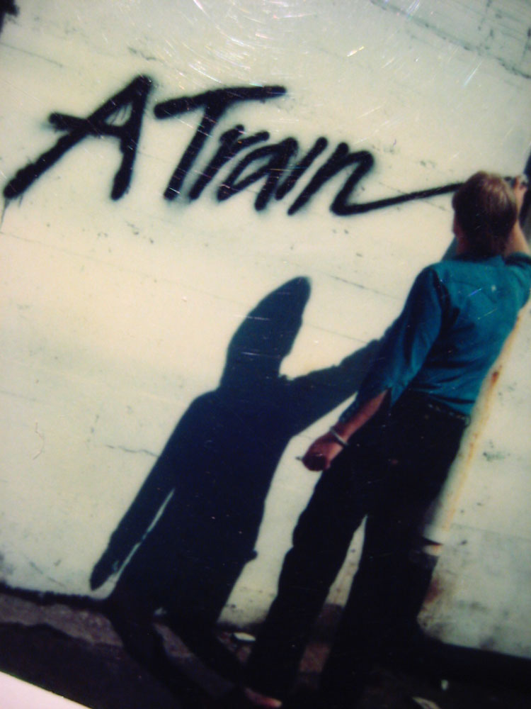
In this only photograph—actually, a polaroid, I was doing a alley side rendering for an album cover. Still, this work, marking things—it was my thinking that this was a kind of messaging improvement, as in: Krink
Is not the decorative street wise rendering, linked into architecture, a potential—even interactively, children drawing-on-drawing interplaying?
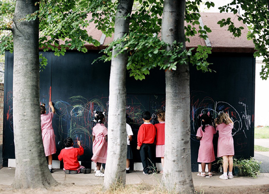
Simultaneously, developers and housebuilders remain committed to advancing a kind of humanism—design solutions that reflect the humanity of how people relate to patterning—in a “blend of suburban, sub-vernacular replete with mass-produced historical details from fanlights to coach-lamps with a stick-on early modernism for city-centre apartments.” But the notion of decoration in innovative context can be profoundly humanizing, if well done, thoughtfully orchestrated and meaningfully
expounded in place.
Others resist the movement to sterility—
London-based FAT (Fashion Architecture Taste) http://www.fashionarchitecturetaste.com/
grasp ornament as an inherent attribute of architecture.
FAT is a London design practice run by Sean Griffiths, Charles Holland and Sam Jacob. Established in 1995, Fat has developed a broad approach to architecture. Early work included a series of seminal interior projects and art projects. But it’s a distinctive solution pathway, that has been publicly observed, as in:
“True originals who are creating some of the most striking and different contemporary architecture…”
Financial Times
“Utterly unique…
There is no-one else in the world making buildings
that look like FAT’s’ Icon.”
Their work is distinctively decorative, and the 2004 Blue House, London remains an award winning addition to their premise:
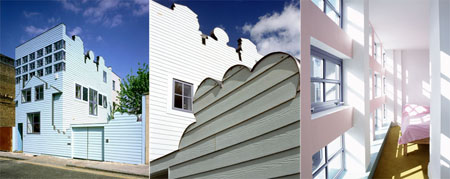
Heathcote, the architectural writer, loves this house – “partner Sean Griffith’s own house, an extra-ordinary, toy-like construction in pale blue in London’s deepest East End. It is the only building in the UK capital that makes me smile every single time I pass it. It stands somewhere between a child’s drawing, a bodged doll’s house and a dream image, a ship-lapped structure adorned with cut-out profiles of clouds and gables, with a faux façade pinned on its surreal two dimensional walls. It is as much of a picture as a building yet it is also resolutely a contemporary family home that asks questions about archetype, about symbols,
familiarity and townscape.”
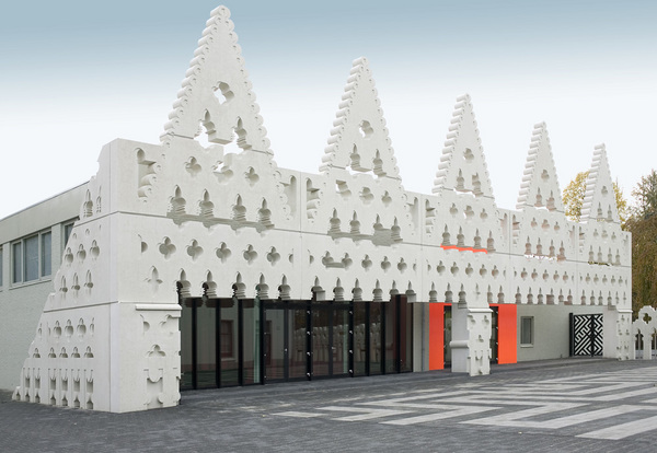
Other propositions, from FAT, are Sint Lucas:
Islington Square:

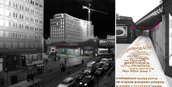
Waterloo Way, South Bank, London:
Partner Charles Holland: “The Loos argument is very interesting. As I understand it, he was saying that ornamentation was a waste of labour, effort and craft. With contemporary techniques and manufacturing it is possible to achieve a lot of complexity and intricacy with very little effort, so there’s a weird reversal of his argument.
“We [FAT] regard ornament less as a guilty pleasure and more as a communicative tool. There is traditionally a kind of puritanism in the UK, a rather macho approach in which engineering and high-tech appliqué is OK. It can all be justified in practical terms but I think we can look more critically now at a modernism in which the motifs of industry were applied to architecture to make it look modern, which in itself is a kind of ornamentation.”
AOC, http://www.theaoc.co.uk/, another architectural firm, is introducing pattern and decoration as a way of bridging theory and practice, architect and end-user. And, their reference focuses on their mission:
Work, to reference:
SpaSchool
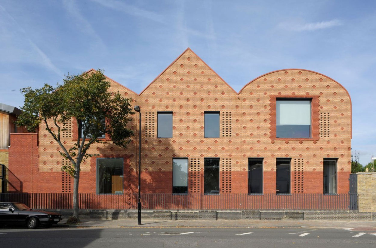
Half House: CarbonHouse
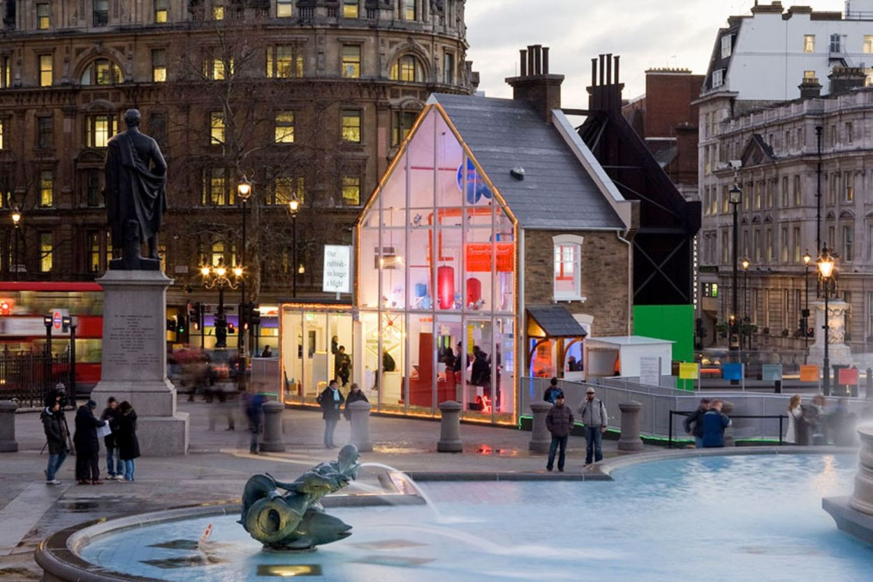
Lift | New Parliament
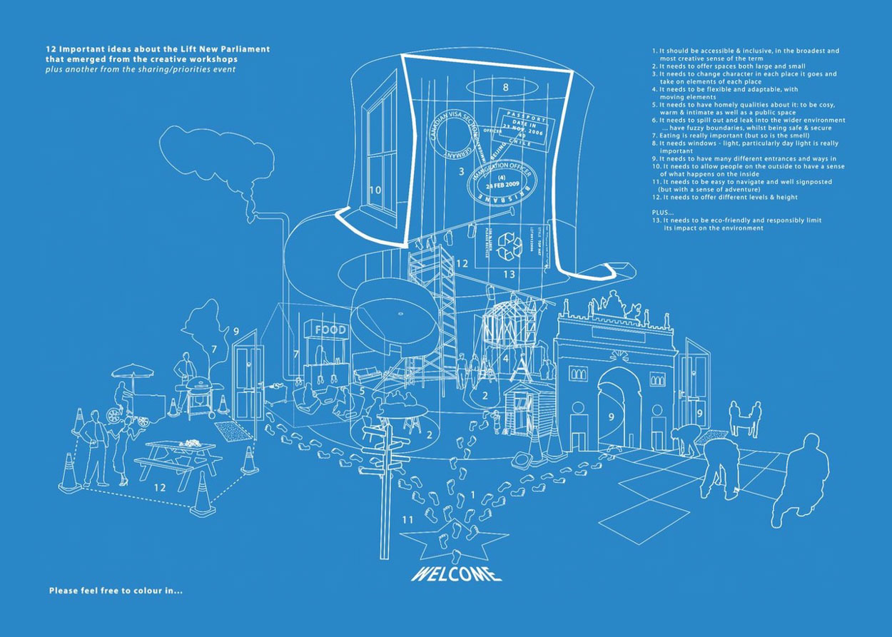
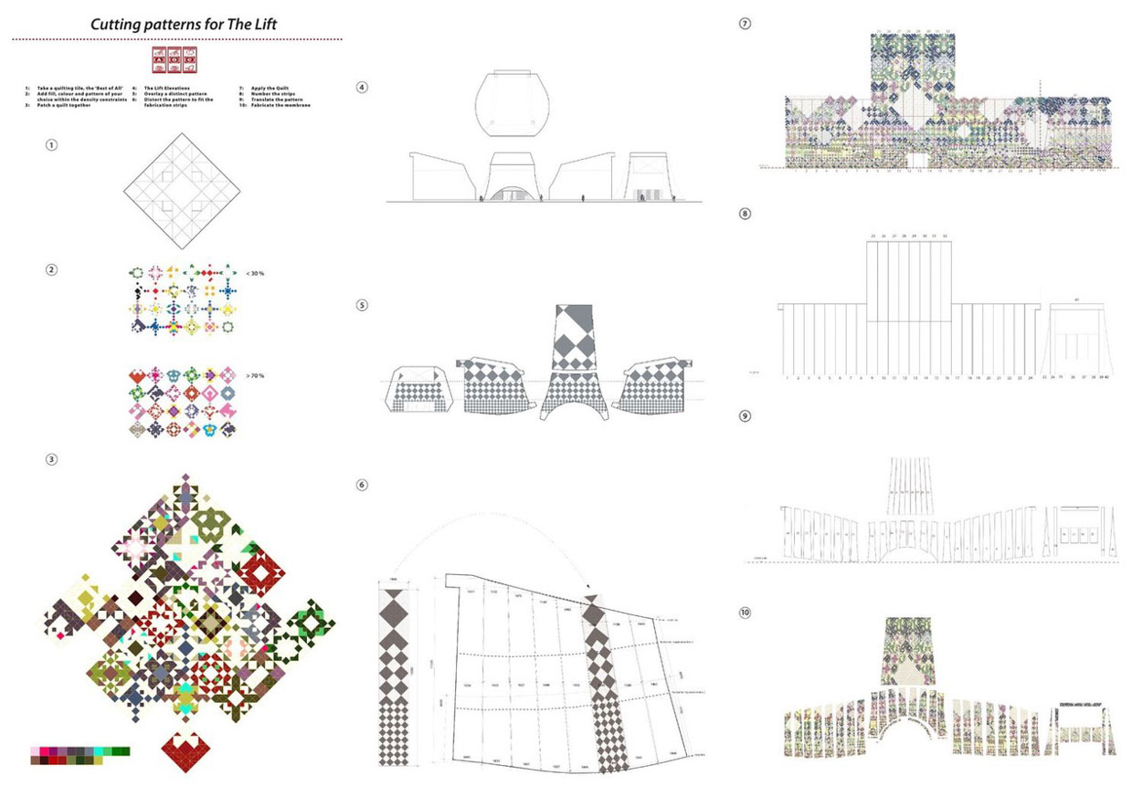
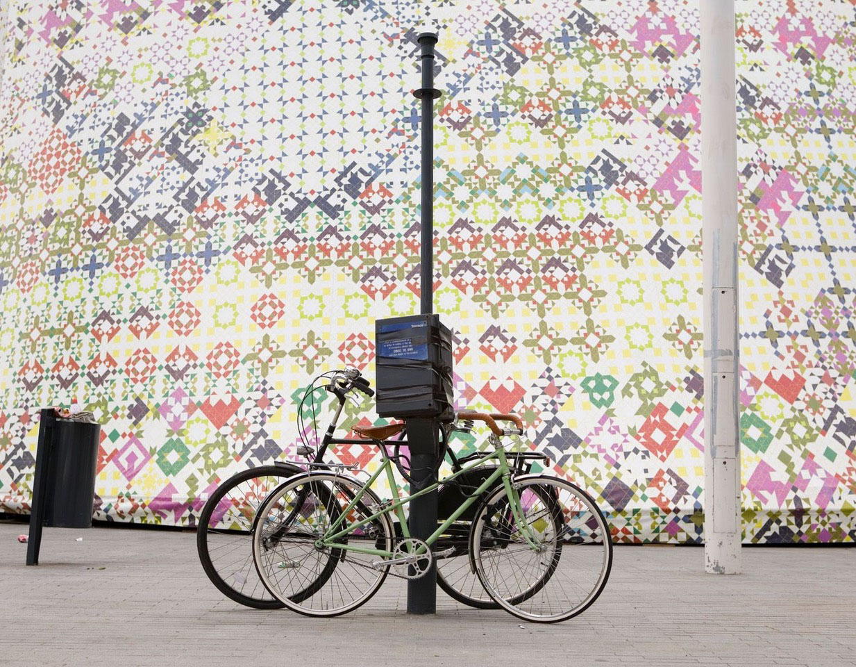
AOC’s Geoff Shearcroft says: “Ornamentation can suggest a way in for the users. It can provide a story, a coding. We were looking for a way of taking the flexibility and the DIY nature of a semi[-detached house] while allowing residents to adapt and decorate.”
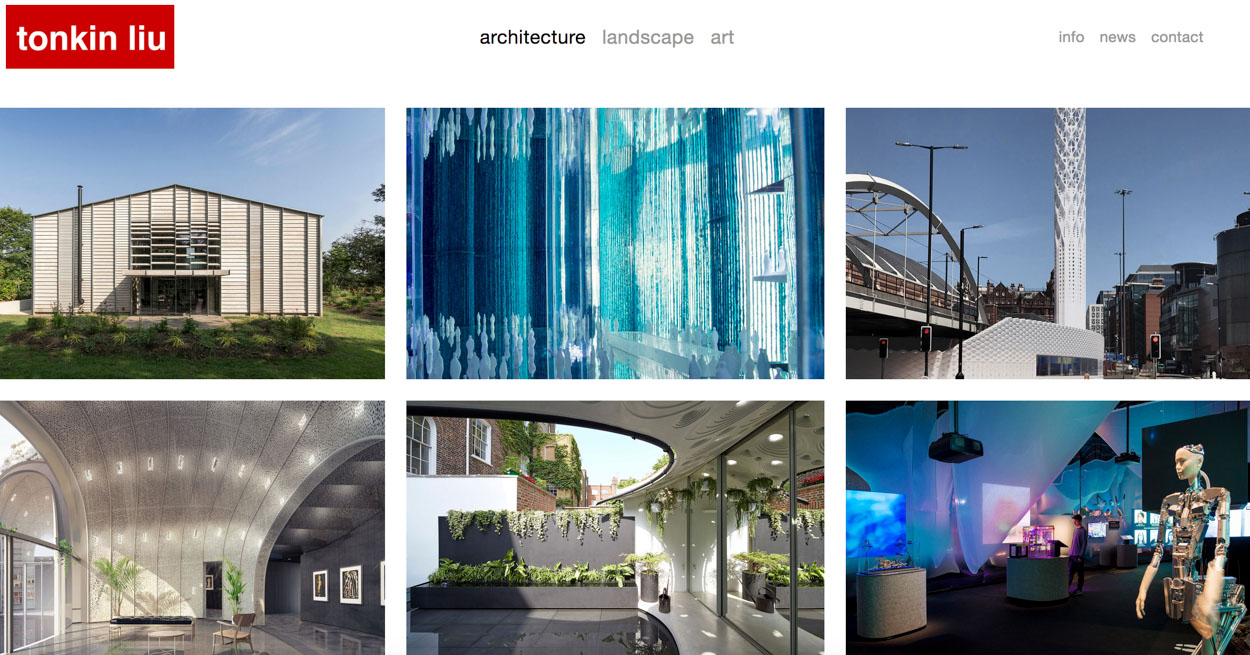
London architects Tonkin Liu investigate patterning languages that too, can be structural renderings, as well as points of distinction in collectively offering memorability:
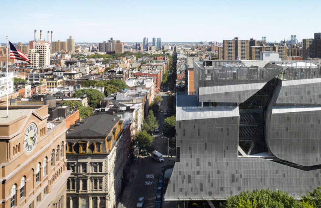
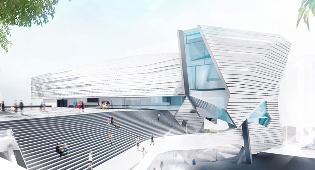
And another study of Thom Mayne and his team, Morphosis dramatic renderings of the interplay of structural character and distinctive patterning that can frame a building—up-close, as well as far away.
What I might point out to your review, is that Morphosis designs with an eye to massed drama—still with delicately detailed patternings and a/rhythmic gestures—that punctuate the theater of the array. That is: there’s a giant story. And there’s a tiny telling. The alchemical collaboration of these forces creates its own kind of memorability.
Emerson College

Cooper Union
Kolon One

Orange County
And abroad?
French architect Jean Nouvel | the Alcantara Mar:
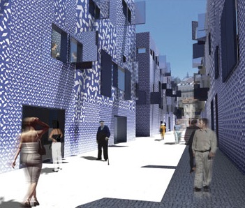
Actually, Nouvel’s site, in itself,
earlier was a kind of patterned language:
And there are a string of other projects that Nouvel has created that are rife with inventive, thoughtfully-designed patterns that deeply resonate inside the context of the structure and the meaning of the place, well made.
Patterning—has a greater value—when that has meaning to the layering of story, meaning and memory.
Louvre / Abu Dhabi
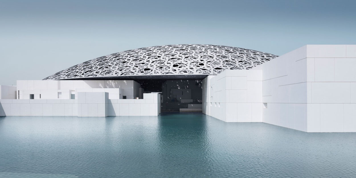
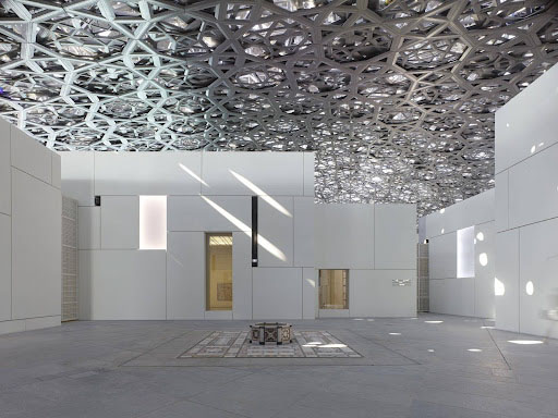
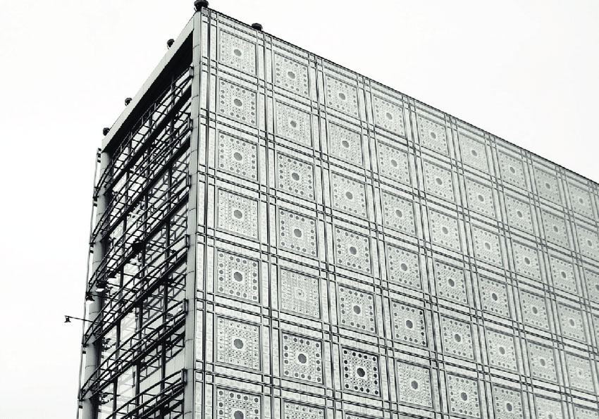
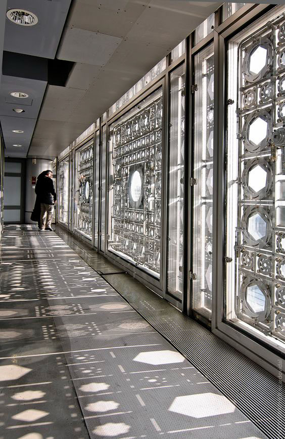
Or an earlier, live discovery for me, in Paris—when I saw it, of course, I grasped the context of islamic geometric
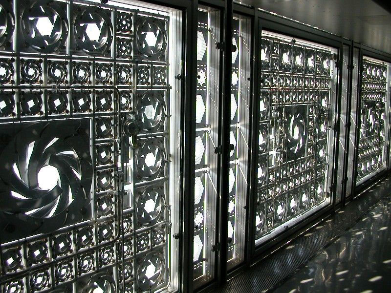
expressions—but the ocular nature of these
“lenses” is a mechanical wonderment.
Institut du Monde Arabe
And the lens for lighting adjustments, based on concentric angularities and contractive, expansive machinations.
Another patterning?
See the reference to these
Slovene architects Sadar+Vuga | Ljubljana:
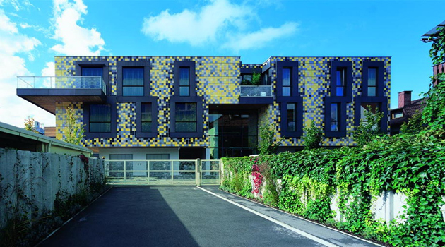
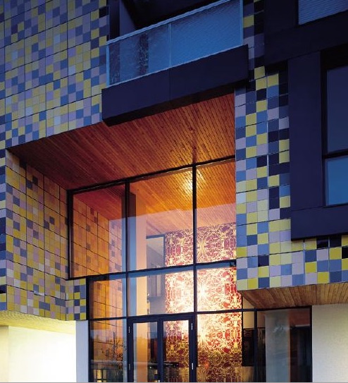
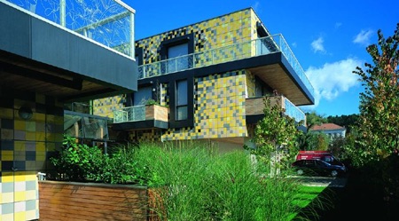
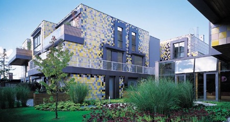
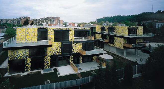
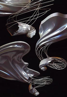
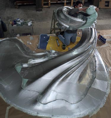
There are, of course, other details of patterning, in which the pattern becomes the form, a repetitive design language as in these forms created by Evan Douglis | NYC and his patterning in a place that offers discrete form mneomonics, which he articulates in the following meditation:
“The timeless search to bring inanimate matter to life has been a preoccupation for some of the most brilliant thinkers throughout history. The impulse can be traced as far back as Greek Mythology with the arrival of ‘Prometheus’, 16th c. Jewish folklore with the story of the ‘Golem’, Mary Shelley’s 19th c. legendary Gothic novel ‘Frankenstein’, and more recently with the timely debate surrounding Trans-humanism and AI. Underlying every epoch is a common fascination with discovering
the ineffable code that could create an autonomous life force
introducing into the natural world the first synthetic avatar.”
Again, he’s referring to that sense of the ineffable code—which is like our reference to brandcode®—a translatable, repetitious signal: a sequencing sigil that speaks to a raw story of the emotional engagement with food, dining experience and unforgettable drama.
You come here, you won’t forget the patterning and
the imprint it had left on the experiencer.
REptile | Haku Japanese Restaurant:
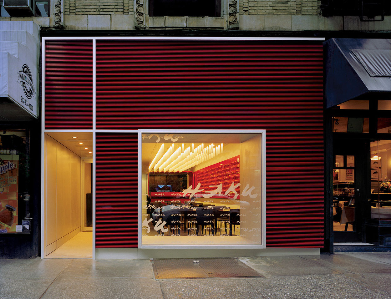
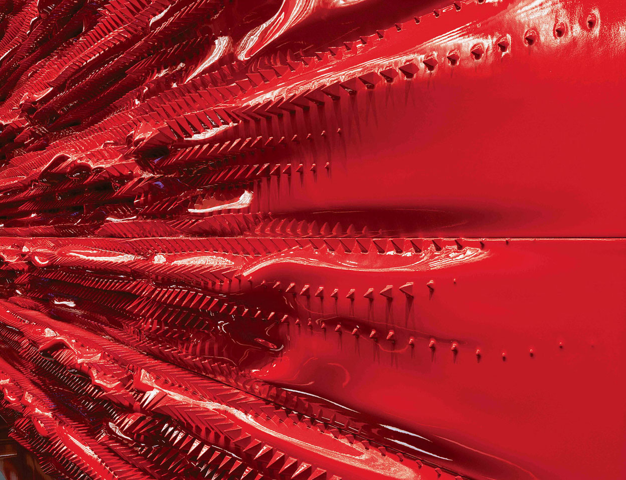
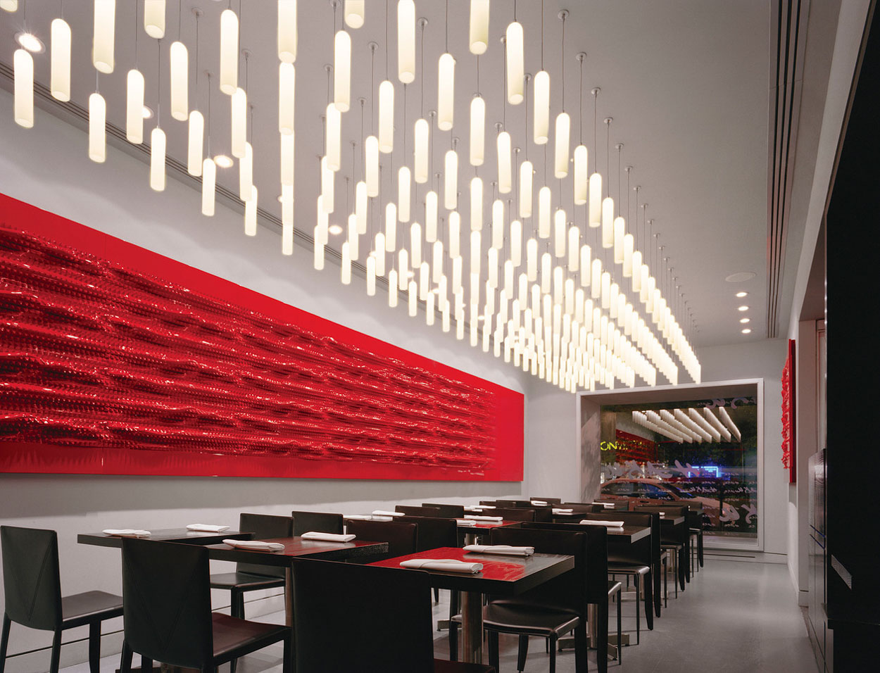
Evan’s exploration of CNC-produced, digitally-designed sculpture for interior applications examine the kinæsthetic linkage between form, sensation and the further holism of dining experientiality*:


The concluding point might be—what’s the next step? A return to the Ruskin and Morris-inspired principles of beauty in crafted application of pattern and decoration,
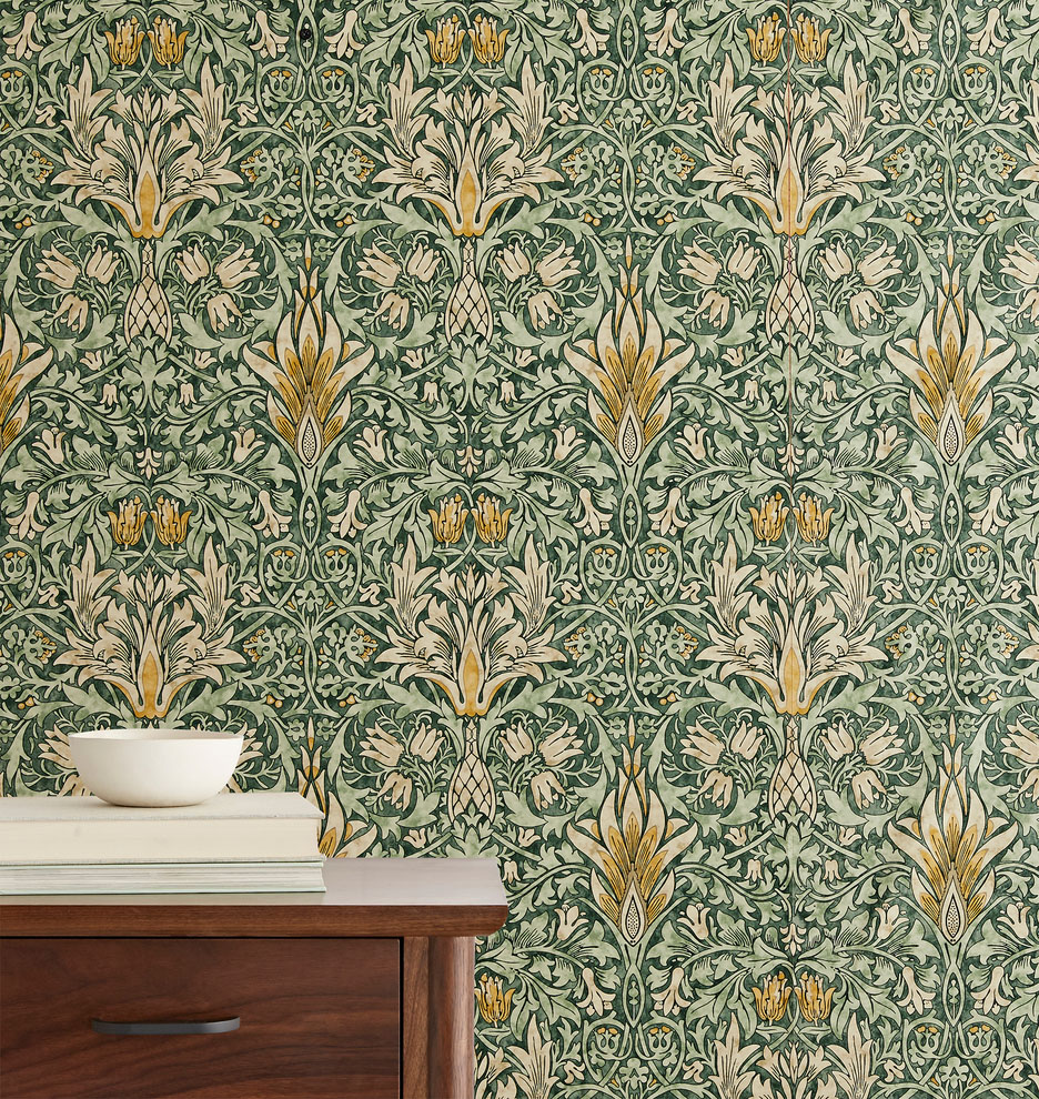
or sticking with the applied slick character
of modernist minimalism?
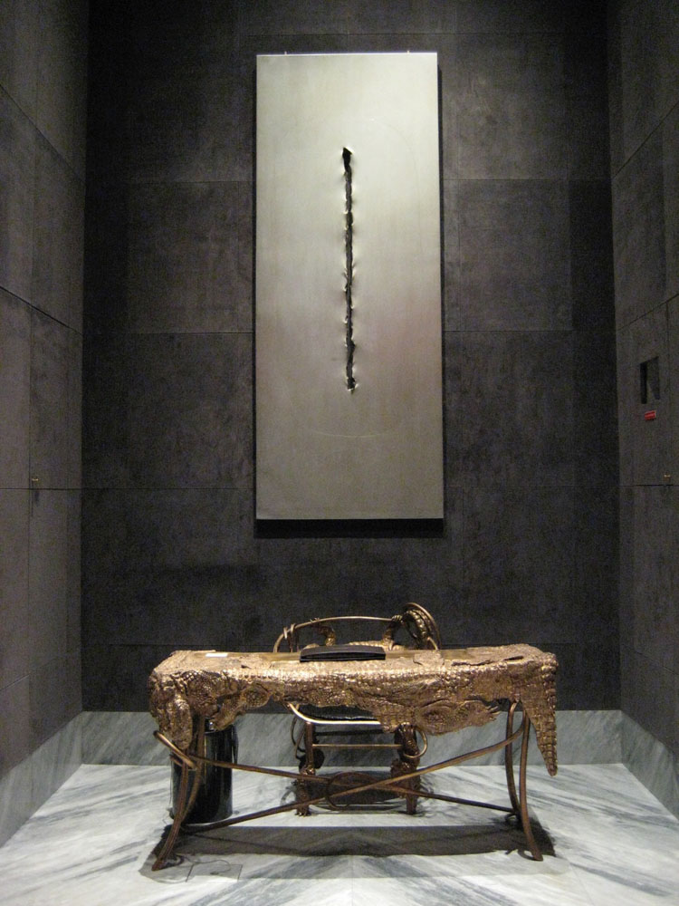
Or both, conjoined?
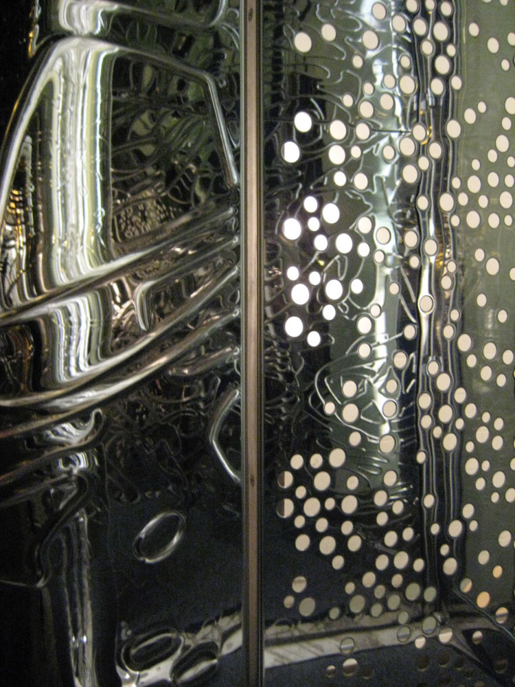
I’d offer the latter, that the sentiments of a cleanly-designed presence can have the art-fullness of human presence—in deed—like a way-finding, a story, a way in to a memorable place.
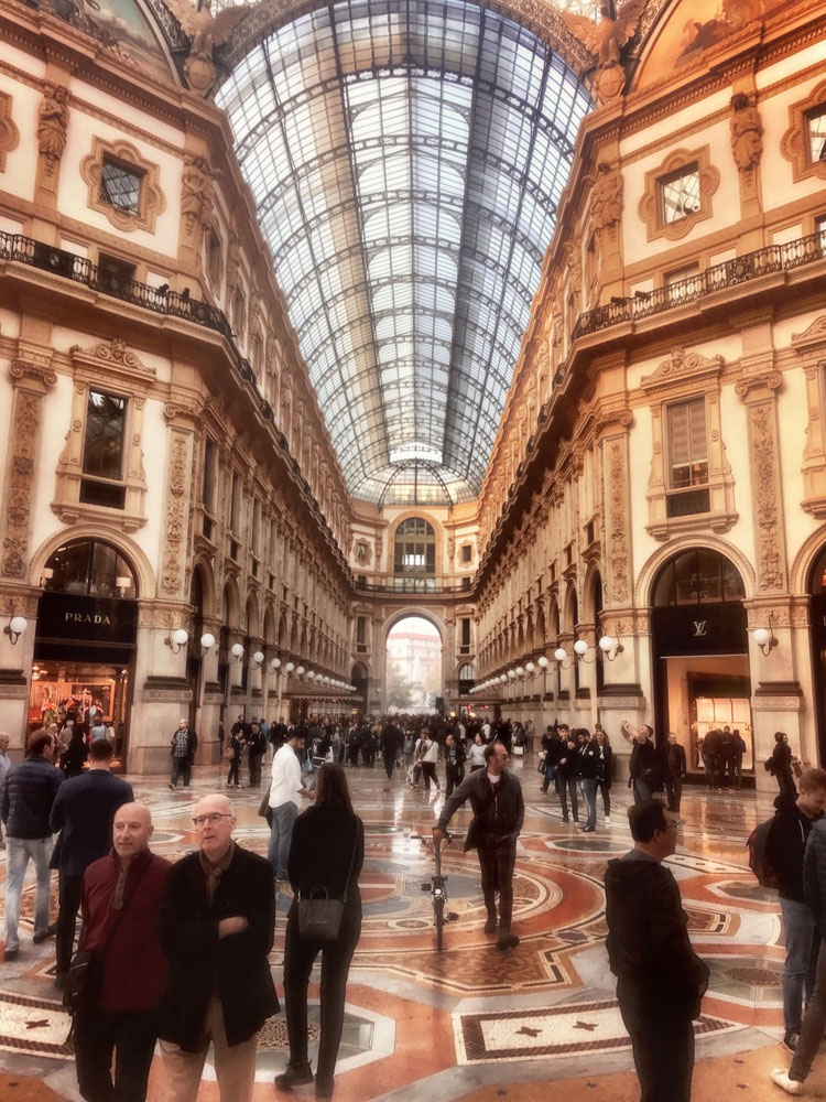
This place is one that can be entrancing, captivating, community-building—and ultimately, humanizing. As a contrast to the stern resolutions of Rem Koolhaas‘ treatment of the generic city,
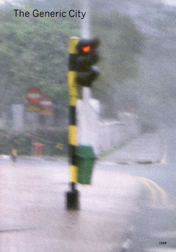
this contrastively speaks to the measure of disciplined and imaginative design that bridges to human connections in the fullness of a visual story told.
Edwin Heathcote: “Whether we are about to enter a new age of applied tat or of thoughtfully integrated, intellectually substantial ornament is yet to be seen but ornament, a century after Loos’s great polemic, seems well on its way to decriminalization.”
What about that—decoration, decorative matter and buildings—gone, or coming back?
What’s your view?
*experientiality: “design thinking founded on a multi-sensory strategy of experience development: an integrated holism.”
tim | osean | GIRVIN
Read deeper, mine further, get out farther