I spent time with the team at Johnson & Johnson — first, Skilling, out past Princeton; then at their original spaces on 26th, over by the river, in Chelsea, then in their new design labs. They’ve got the best section of the building, south facing, relatively high up — unless you were hoping to be out overlooking the river.
I’ve heard though, from others in the building that the breeze comes right in through the windows and it’s cold. Ausbert De Arce at Assouline mentioned this; he’s on another floor.
A long running friend — way back, Chris Hacker, art directed the design of the space — in his role as Creative Director for J&J, in part of their new modeling, which has been offered and explained to me, iteratively, several times. It, like anything, evolves — and has continuously shifted over time — the working methodology of Johnson & Johnson brand development and management. But in thinking this through — for example my experiences in working with P&G — their emerging modeling of approaching global design development, it’s the same thing, it keeps shifting, changing…And that’s a good thing. In working with other large global brands / brand groups, those who don’t resiliently shift: die. Or they culturally wither. Then they die.
I’ve worked, we’ve worked, with J&J in nearly every category of brand. And that means that you know a lot about teeth, femcare, pain, wound care, health and beauty. So I suppose I’m a kind of expert in pharmacy shopping management. I’m your aisle guide. Ask me where to go.
The space has been fundamentally blasted out, the floors varnished and buffed out, not dissimilarly to dozens of others in the building, which has become a kind of new crucible for hundreds of creatives — from the most erudite, to funky old framers and craftsmen; even people mostly storing their stuff. One of the hippest features is that you can drive up there, or rather, someone can drive up there; there’s a wheeling circular drive for trucks. Very cool. Love that building.
Brand. Space. Beauty. Light. Design.
And how they come in contact with eachother.
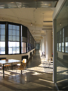
Here’s the view down, roughly east bound, light running the length of the building — or at least half of it.
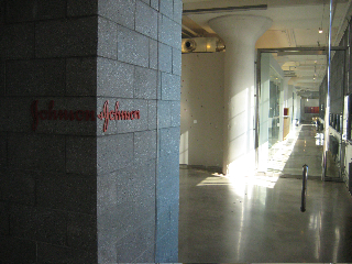
J&J, from the original corporate signing in New Jersey.
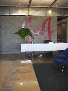
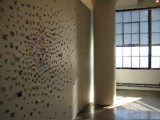
Wall mosaic of J&J products

Credo entry desktop treatment
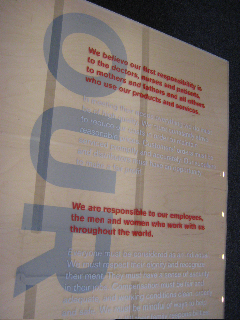
The long reach, light filled — to the working studios.
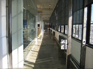
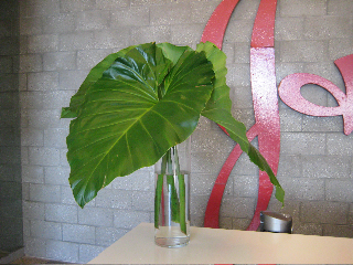
Lush life.
Mosaic, skinning the pillar.
Workspace, mac’d addy.
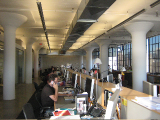
Looking back, to the front…
Chained scrims and sheet rock…
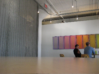
Divisor.

Conference and administrative.
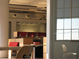
Lutron variable coloration illumination.
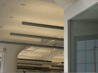
Simple, honest.

Steel scrims and shading systems.

Any process is about collaboration, outside in, inside out. And we do that, and others do that. We work in, we work out. J&J works in the way of that kind of creative osmosis — what’s coming in, what’s coming out, that’s the modeling of living things. The water, the oxygen, the carbon exchanges, like the model of the cellular walls, it flows.
It’s a good model. Like rippling. Like reflective vibration. Sound, water. Flow.
I like that.
tsg | nyc