
SIGNAGE, MESSAGING, SCALE AND BEAUTY.
I’m not saying that we’ve not designed massive signage. We have, we’ve created signing that can be seen for miles. Yes, Vegas.
And other places.
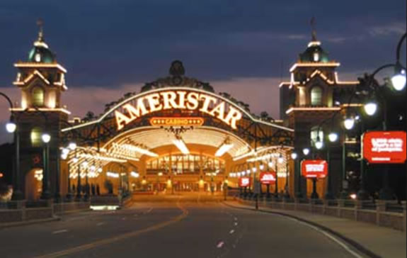
But what I admire are more elegantly restrained solutions.
What one might think are delicately disposed solutions imply a more quiet encounter — not loud, but soft.
Street-fitted — designed for intimacy.
In the journey of guests, experiencers, customers there is a perimeter of visibility — the point might be, how hard to push the story and what of the intimation of discovery.
Moments in momento.
Brand Patterning.
Touchpoints.
Sunlight shadowed.
Textured.
Some examples
from
Firenze.
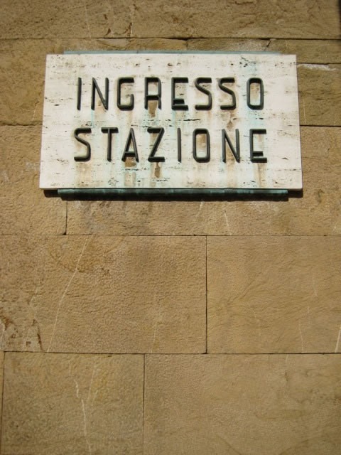

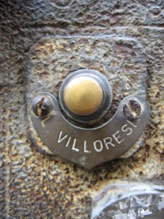
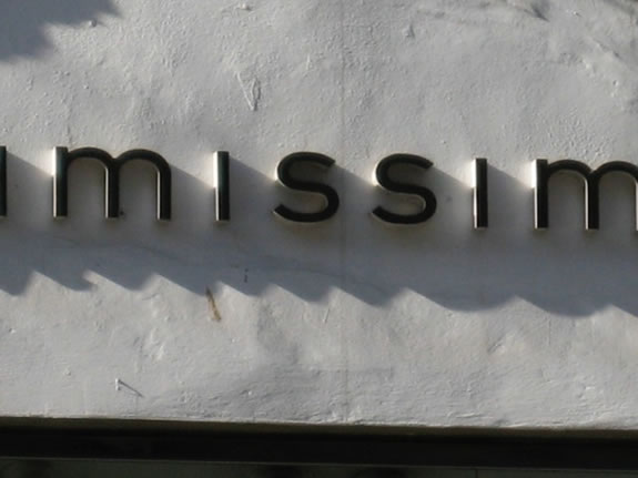
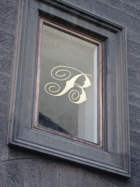
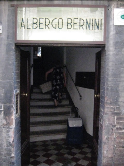
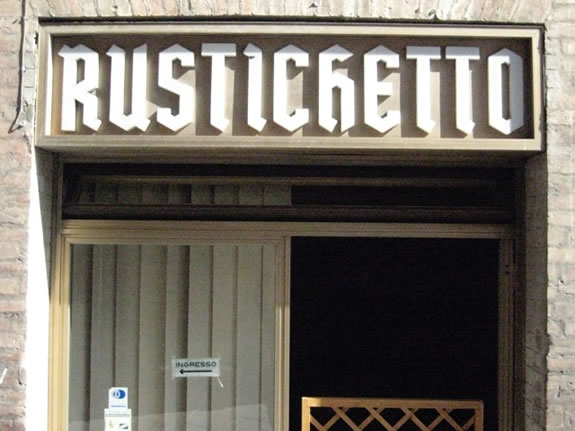
And larger,
yet restrained rendering.
Floated,
textural,
disciplined,
quieter.
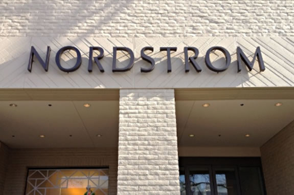
A luminous messaging
on a geological substrate.
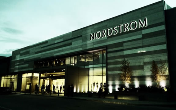
A sign is a sign, an assignation — and a signature.
A signature is the beginning of a journey.
How is that story told — loud?
Or a sensual whisper?
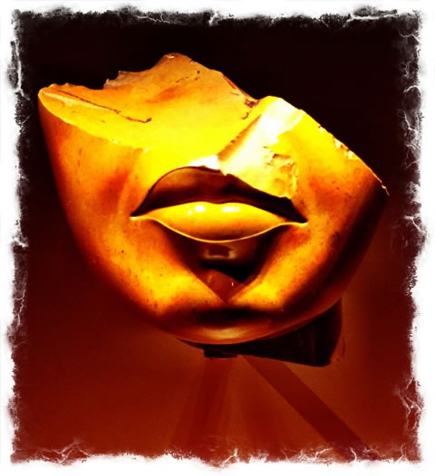
I like whispers.
Tim | GIRVIN > The Waterfront
The Strategy of Holism | Restaurant Experience Design
TouchPoints, Storytelling and Guest Engagement
See the Restaurant Point Conference Keynote:
http://bit.ly/1ndy9bv