GIRVIN: the early discovery of calligraphy and typographic design: stories, differentiation, craft and beauty.
I had an early experience, a blessing, as a designer, working in NYC for the grand luminaries of design. Late 70s. What that meant was courage, perhaps more than anything; and a spectacularly foolish sense of arrogance — “you went there to show your work?” I’d offer that this was more naivete than anything — I had an idea about the relevance and applicability of the work that I’d done, I simply needed to find out who would buy it.
I’d go there, tell my story, shuffle the sheets of work on handmade papers, show off my imagined alphabetical books (100 Alphabets by Tim Girvin+Alphabetica), hand-drawn calligraphic pages and try to present them as assets for utilization. Some got them — understood the hopeful use-fullness of the work — others didn’t.

But NYC, along with Chicago, a little Dallas, some LA, more San Francisco, and the least — Seattle — were dens of typographic “savoring”. Mostly there, people understood the idea of a customized rendering of a font — the design cultures, you might say, were fundamentally inventive enough that spending the time to draw, and create something, by hand, was an expected boon. You never just set a font, you did something to make it more special. My career, and the legacy of Girvin is built on that propositioning. It’s about that added detail, where project funding allows. And it’s not, all ways, allowed.

Then, as well, typographic and customized lettering design was a kind of commodity — a service rendered. Like — “draw this type for me” — “do the “finish” on it”. “Finish this logo”. I built on that, working as a finish artist for numberless art directors, designers and typographic wizards — but there was always an added touch — the idea that working with “us” involved a special “interpretation” — something eccentric to the Girvin touch. That was in the 70s. I’d take my folio around — which I was incessantly redesigning and rebuilding — to show off the latest Girvinisms — new fonts, new signs, watercolors, washed calligraphy, roughened and textured treatments, steel on handmade paper, posters and packaging that had the refreshed dispensation of a stylistic twist.

Back then, everyone had an impression of the lofty spirit of thoughtful typographic design — NY Magazine art director, Milton Glaser, and others amidst a well-spring of masters, like U&lc maestro, Herb Lubalin, his colleague, Alan Peckolick, Tony DeSpigna, Ed Benguiat, other influencers for me reach back further, like spectacularly sensitive book jacket designer — Paul Bacon like early American artist, poster makers, New Era designer and photographer Ben Shahn and book artist, illustrator and engraver, Leonard Baskin, even modernists — Roy Lichtenstein, Robert Rauschenberg, Saul Steinberg, Frank Stella, Jasper Johns and others that barely cross into the conception of commercialized art — though many, interestingly, did find fiscal survival in the context of “logos”. I met some of them at shows, gallery events, or on the squash court.
That idea of showing one’s work in a kind of assemblage — the illustration of design as a gathering of skills — is coming back. There are places for it — like Edward Belsky’s highly styled folio collection, Behance. I’d met Ed at TED, followed up and stayed in connection with him, his explorations, product development, over time.
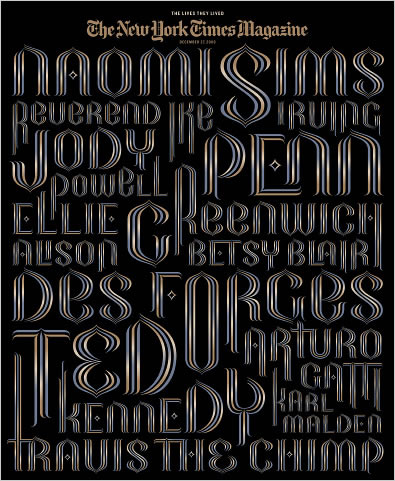
I’d always been curious about the work of the NYTimes magazine sections that utilized inventive treatments in typographic design. Of course, I’m always studying that. Here, to the expression of a gathering of fonts and ideas, is one of the exemplars of design for that publication — a woman — Nancy Harris Rouemy — Canadian-based, that offers:
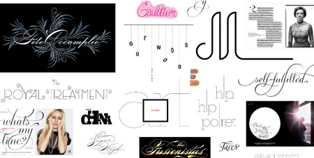
To the idea of a gathering, you can find that here — a folio explored. Just a letter, a word, a twinkle of a font — the portfolio of specialty.
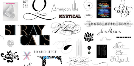
Sweet.
An application, from a year back:
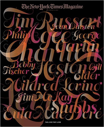
Invention. I savor that.
tsg
….
Exploring the typographic positioning in design:
https://www.girvin.com/blog/?s=typography
the reels: http://www.youtube.com/user/GIRVIN888
girvin blogs:
http://blog.girvin.com/
https://tim.girvin.com/index.php
girvin profiles and communities:
TED: http://www.ted.com/index.php/profiles/view/id/825
Behance: http://www.behance.net/GIRVIN-Branding
Flickr: http://www.flickr.com/photos/tgirvin/
Google: http://www.google.com/profiles/timgirvin
LinkedIn: http://www.linkedin.com/in/timgirvin
Facebook: http://www.facebook.com/people/Tim-Girvin/644114347
Twitter: http://twitter.com/tgirvin