Great person, an earlier GIRVIN | friend + colleague — Liz Muller
Storytelling, here. Some notes, here.
Liz Muller
STARBUCKS CONCEPT STORE : AMSTERDAM
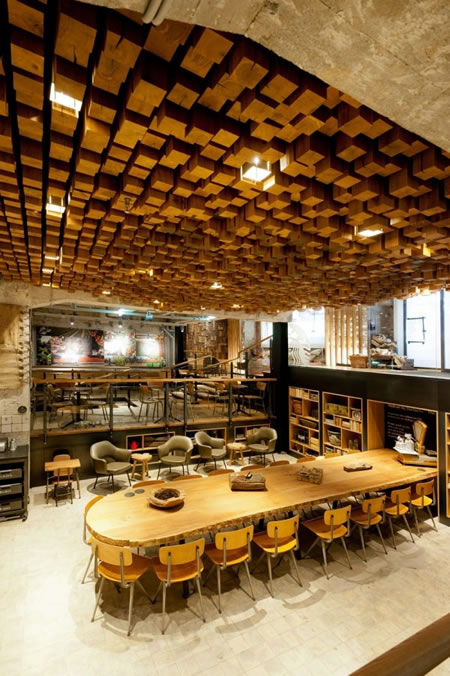
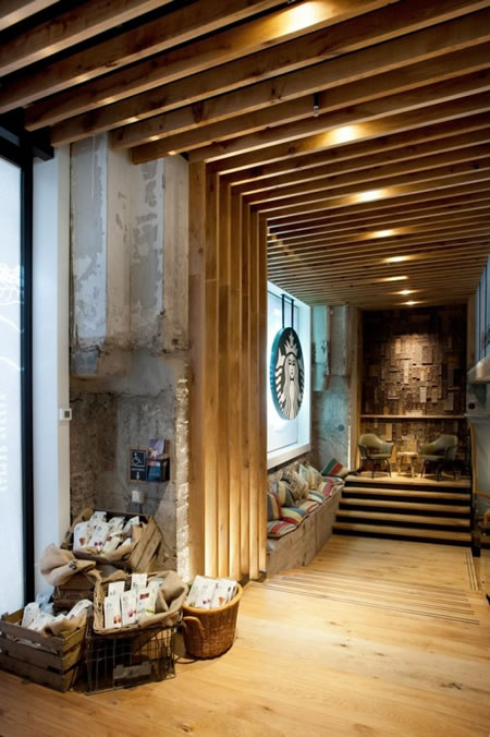
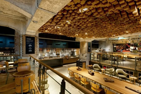
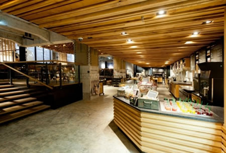
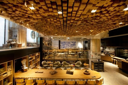
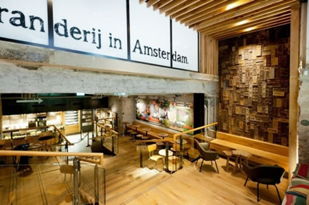
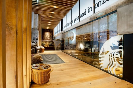
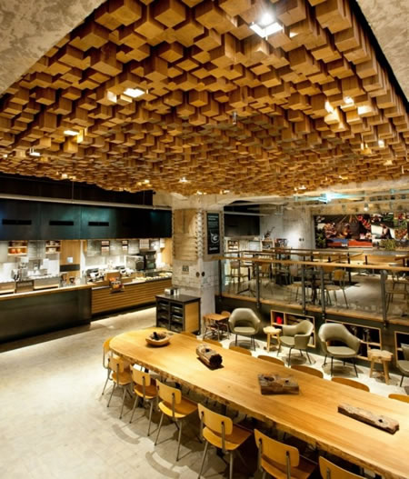
Last Thursday, March 08, 2012, marked the launch of Starbuck’s concept store, “The Bank”, on the Rembrandtplein in Amsterdam. Starbuck’s is really stepping up their game with this concept and design, as they are probably attempting to compete with the local coffee shops catering to the more alternative and creative demographic. Starbucks concept design director, Dutch-born Liz Muller, jumps on the sustainable wagon as she taps into the reclaimed trend – walls are lined with antique Delft tiles, bicycle inner tubes, and wooden gingerbread molds; re-purposed Dutch oak was used to make benches, tables, and the undulating ceiling relief consisting of 1,876 pieces of individually sawn blocks. The design of this 4,500-square-foot space is the result of more than 35 local artists and craftsmen.
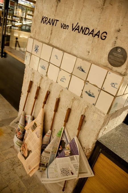
But the design is not the only departure for the corporate monster coffeehouse. They will also use social media to communicate relevant moments throughout the day–for example, by sending out a tweet when warm cookies roll out of its in-house bakery. The concepts that go over well in Amsterdam will find their way to other stores across Europe.
