Making a Statement of Identity in the Procession of Experience.
Sometimes, as a designer, one cuts to the chase and puts the story right there, out in front.
Big.
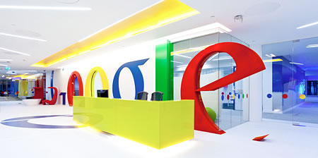
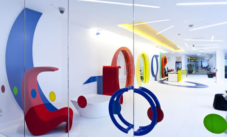
So too the dynamism of Scott Brownrigg’s designed installation of monster identity in the environmental graphics of Google’s globally recognized, “chisel-edged” logo in their new offices.

[Imagery from Brownrigg’s office.]
The point might be in the character of “what story does the Google logo tell?” Google has made long history in manipulating the storytelling of their logo — they’ve played with it, offering seasonal and daily renderings and abstractions of the letterforms. It’s treated as fun, celebrating the multiplicity of identities, emotions and experiences that search-ability brings.
Seek, and ye shall find — all that enter here, know clearly just where they are. Scott Brownrigg’s firm, with multiple offices in the UK, Croatia and Cyprus, seems to have struck a new, graphically powerful vein this work, which is distinct from some of their other projects.
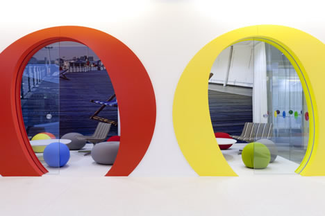
The logo, symbolically, acts as a doorway.

In the experience of progression, there’s a story to sequencing — some call it a journey, a customer voyage, a cycle of engagement — we might offer the combined notions of spectacle and enchantment. There’s something to the experiencer when the power of the story is magical — a word of perhaps increasing frequency in the strategy of Girvin’s work.
If there’s a story, who’s telling it, why is it important, who cares — and, finally, in all that, is is magical? It is transporting, transforming — does it change the experiencer?
More storytelling here.
And here.
And, more.
Explore as you will, massive messaging, colossal story, bigger enchantment. Magic.
TSG | GIRVIN | WEST QUEEN ANNE
ELEMENTARY SCHOOL STUDIOS
…..
G I R V I N | BRANDS BASED ON GENIUS
BUILDING STRATEGY AROUND PEOPLE