STRATEGIES OF CUSTOMER EXPERIENCE,
JOURNEY AND RETAIL PLACEMAKING.
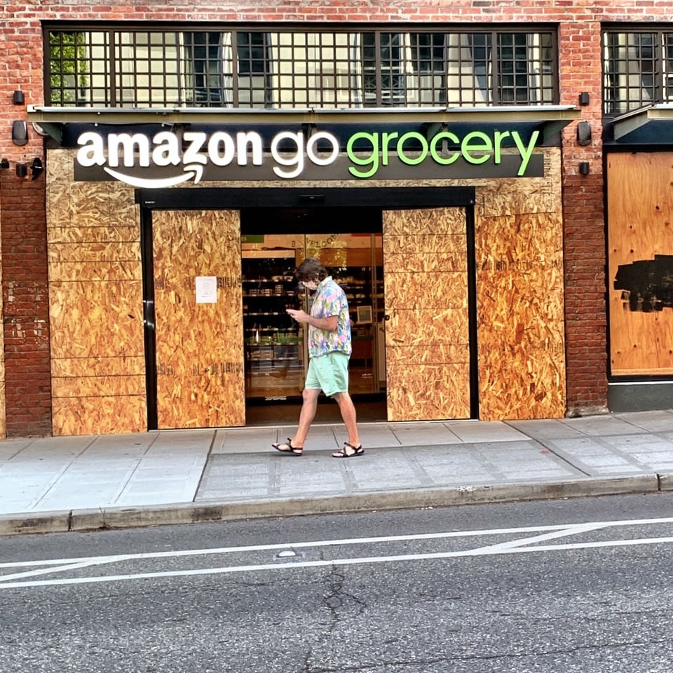
Everything’s boarded up, downtown Seattle and Capitol Hill. As Seattleites, we protest. We don’t like something, we will let it be known. Things do get out of hand—by some, not the others. There are, of course, tiers of statements. Some hold banners, march and cry out. Others loot as their statement. And others shoot.
I protest.
It’s in Seattle’s nature to be revolutionary at our core—as an early outpost, far from the maddening shores of, for example, San Francisco in the 1800s—we rebel to make things different, to make new things. I’m sure there are many earthlings that hold this sense of historical principle in their own cities—
each, to their own rebelliousness.
I was out for a drive, Sunday morning, studying what’s up,
Seattle shopfronts, retail and restaurants.
Of course, you can tell a lot about a city by the health of its streets—
what are these characteristics?
Clean? Bustling? Active?
Lit? Lots of feet? Trafficked?
Nope.
That’s a broader statement of the condition of things, around the world.
Step by step, people repopulate, get-out.
It’s in our nature: move.
And.
You.
Go.
In our experience, in my own history as a designer and brand person, I’ve worked around a lot of retail propositions for store and story design—and plenty of grocery stores. I’ve worked on tiny programs for small delicatessens, grocers and simple stores, as combinant sites. Like our insertions for USFoods—MetroDeli. I worked on Haggen, Top Food & Drug, Safeway, Costco and other brands, even retail groups and convenience stores in Korea.
I also studied shelf merchandising arrays—how customers shop, move through, for example, Nabisco [Mondelez]—is there a packaging and shelf presentation? Is there an arranging of visual priorities that customers see—the red bullseye of magnetic draws towards key product arrangements? Let alone eye-tracking, hot-spotting, aligned offer groupings and maximized facings?
But that’s what it’s all about—journey design, the *experientiality of sequence the movements from one place to another.
What about Amazon’s Grocery Go?
App in.
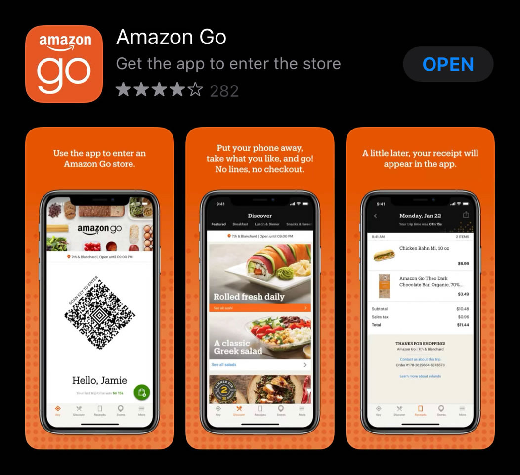
Pass the sensors
and enter the space to get what you need—
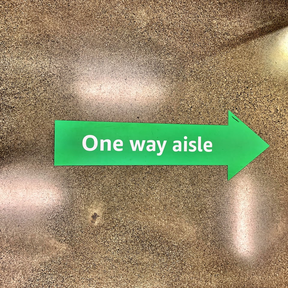
going one way—you go this way:
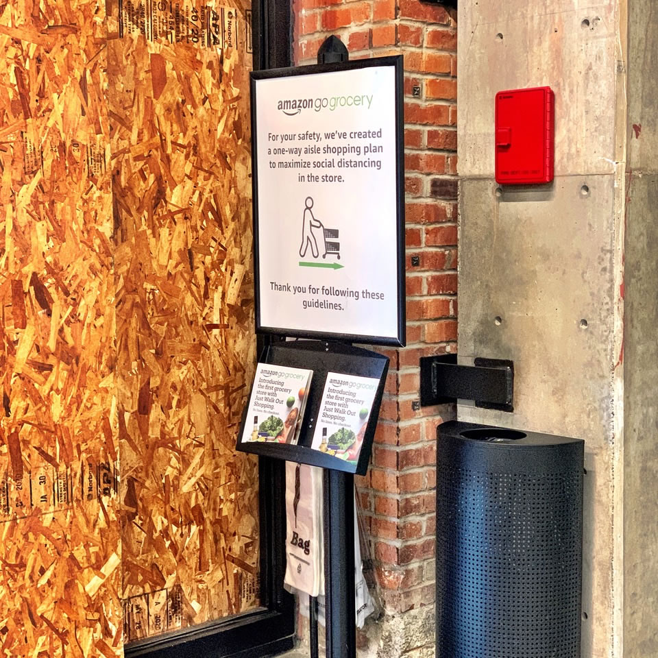
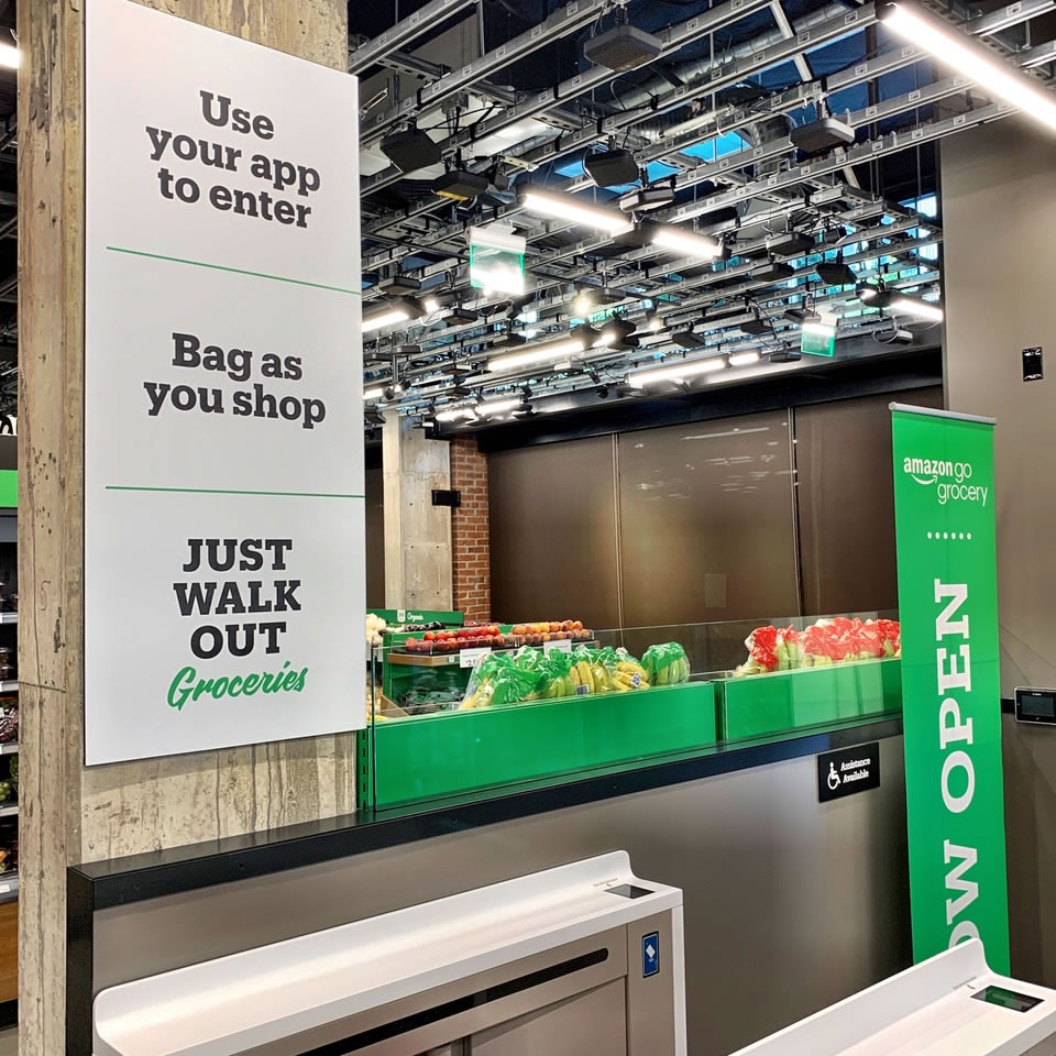
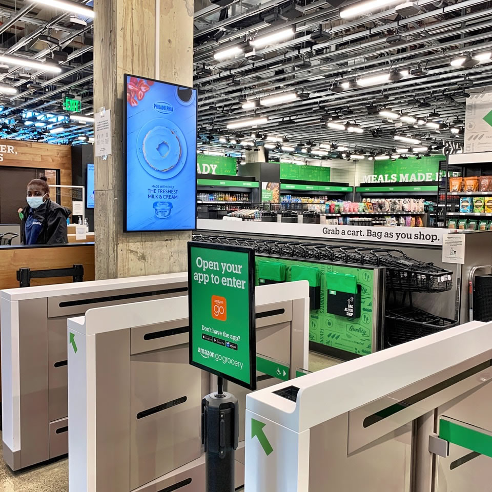
While you circulate, of course,
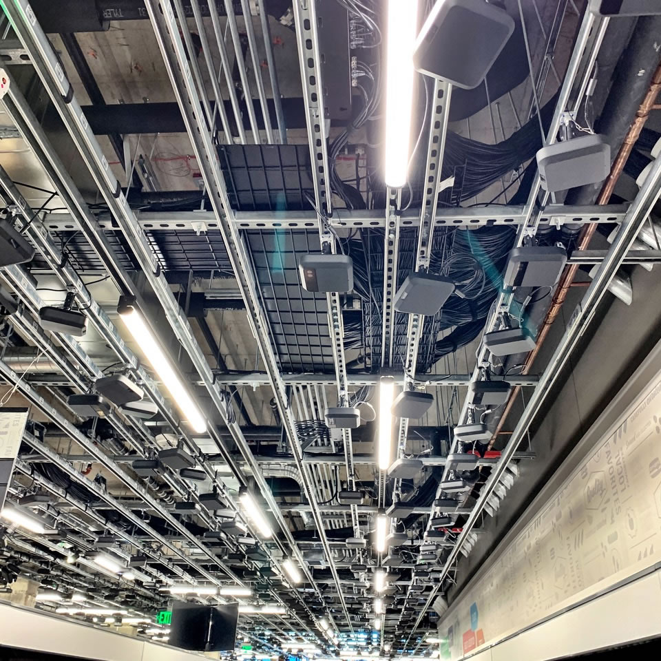
the ceiling is observing you.
There is a cartography of journey—a channeling.
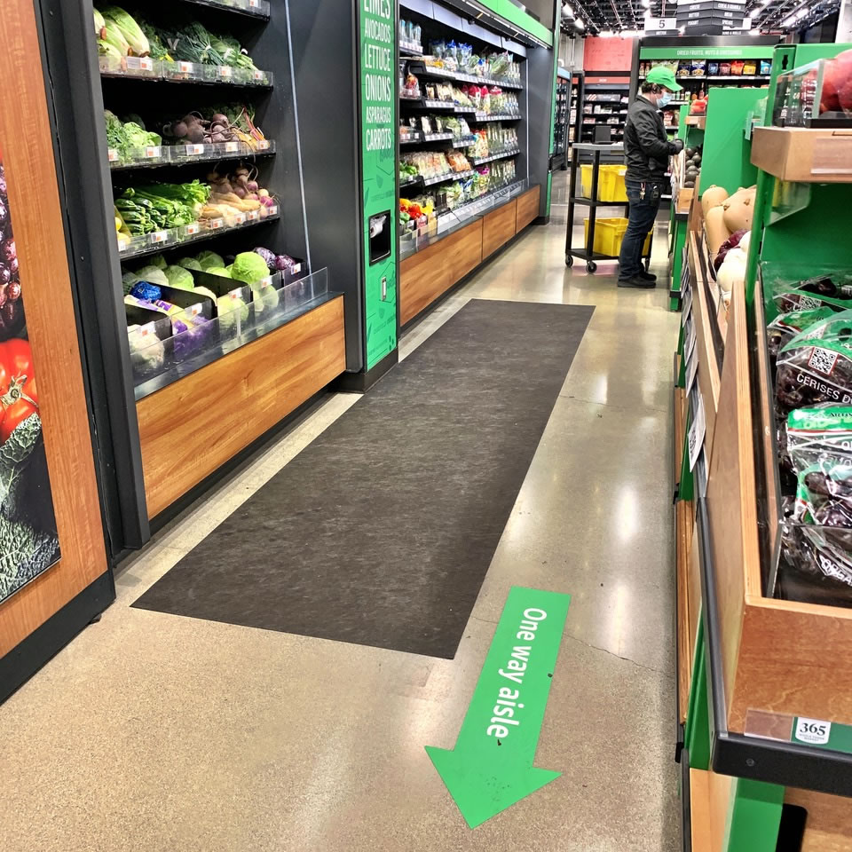
In earlier modeling of the grocery store, or any retail strategy, there is a postulation of pathway that is the most desirable, the reach to goods in a psychic processing of best purchases and sensate exposures in sequential tactics of revelation. In Go, that processing is clearly demarcated.
In my own journeys of retail design—and the exposures of place-making—I tend to disobey most expected retail mapped movements. In some, for example, I enter through the exit, which is a telling reversed journey-making; you come-in at the end.
I walk most stores going against the current to watch how people are shopping, by walking backwards—going against the current allows the observer to see how shopping works better than walking in the flow of commonality.
I even walked Go backwards—but of course,
in this instance, the entry is controlled.
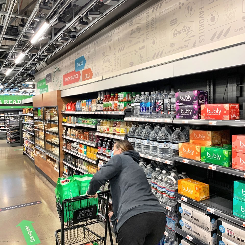
Fresh is front.
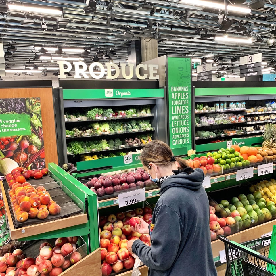
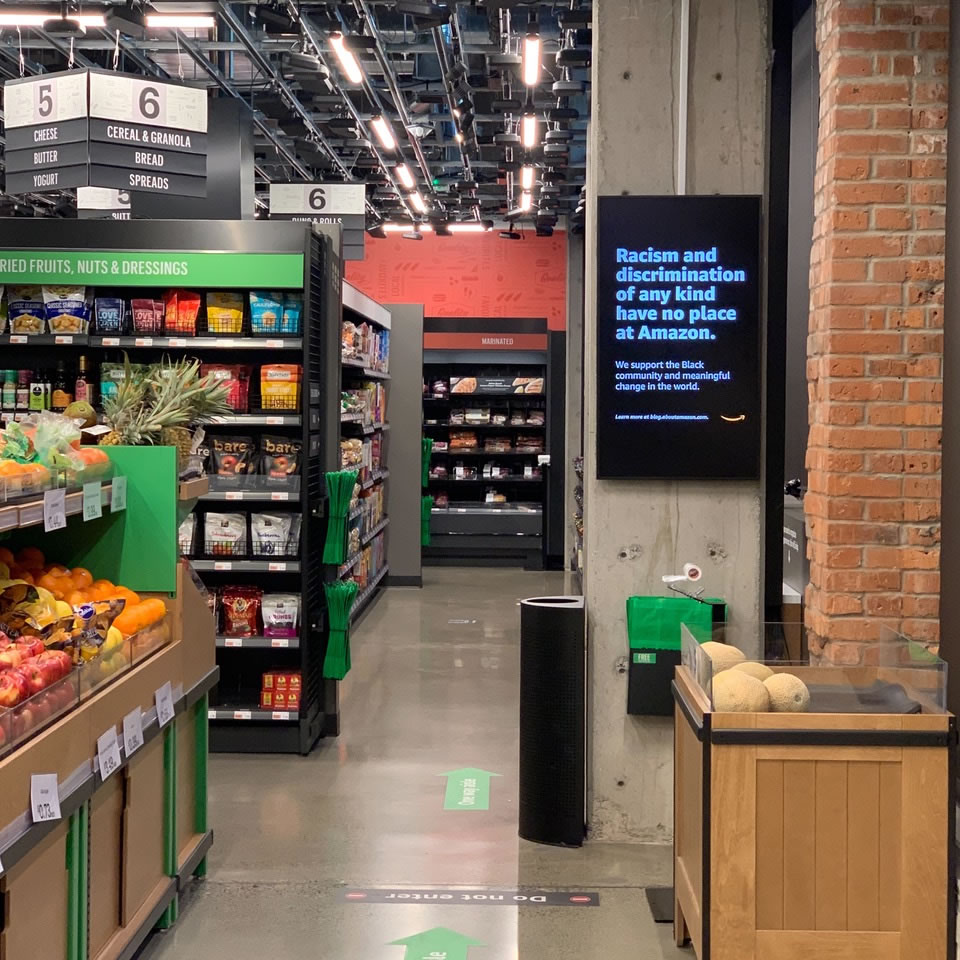
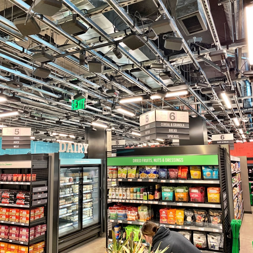
Rather than other Amazon retail holdings, like WholeFoods—this is a more broadly accessible product set—there’s Frito-Lay+Pepsi, CocaCola, more mass consumer goods—and less to rarefied organic, gluten-free and genetically unmodified food sources.
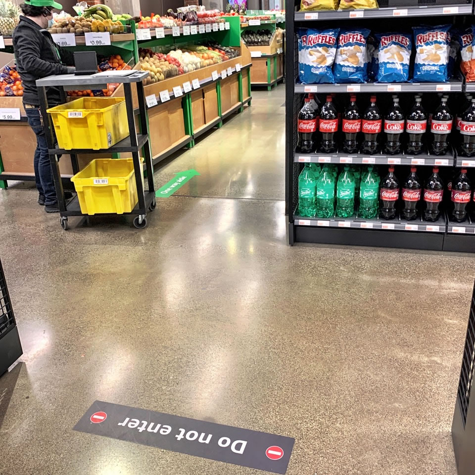
Graphical systems are minimal, restrained and mostly clinical in their impressions—there’s not much hand-work here—font systems are off the shelf, nothing special here; it’s all linked to the brand disciplines of Amazon graphical codes—which are less to personality and humanized touch, and more to fast communications and a highway-signage-type of environmental graphics.
See them from afar.
The walkout is where the concluding takeaways are—prepped food, for one, and alcohol, for another—and there’s a sentinel station, as it would appear. The employee count per store is minimal—stock layers and guidance counselors.
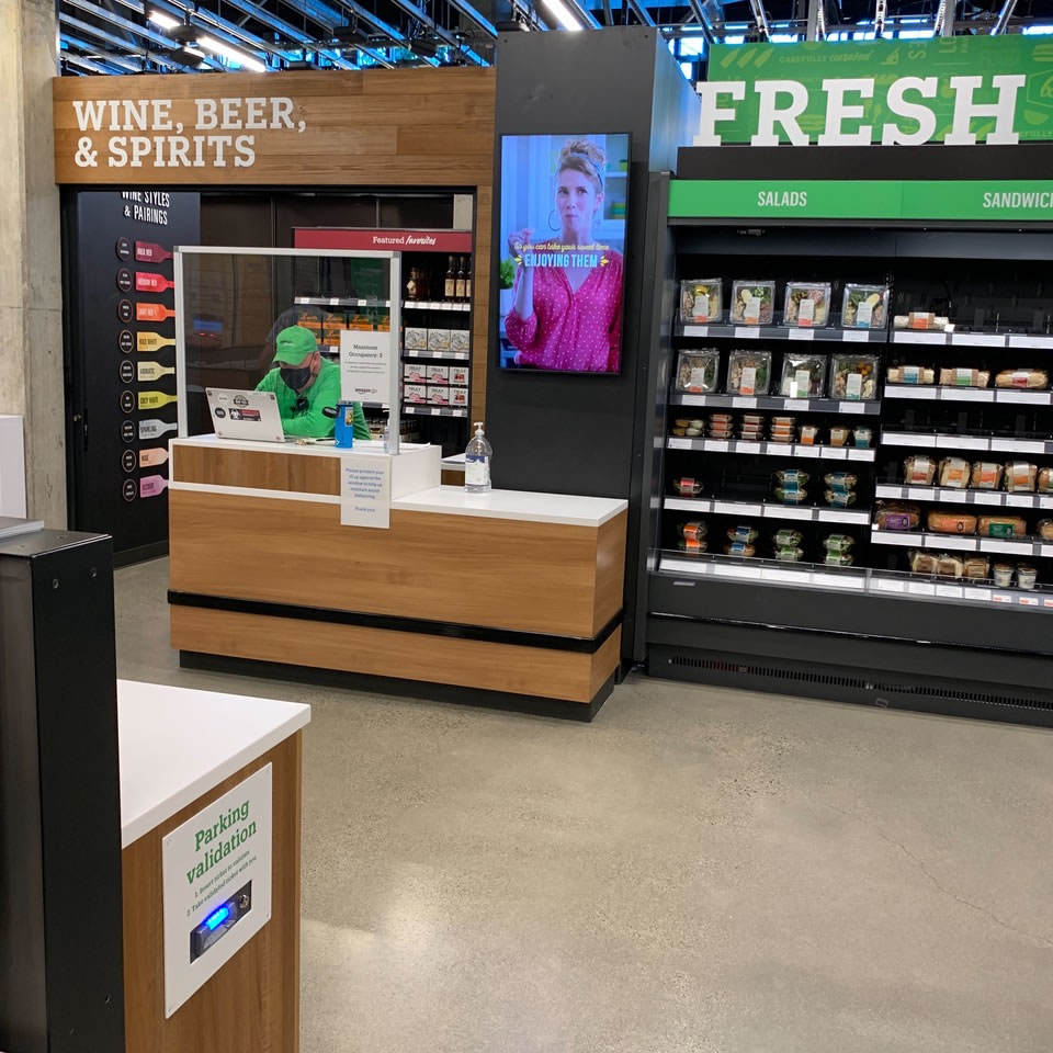
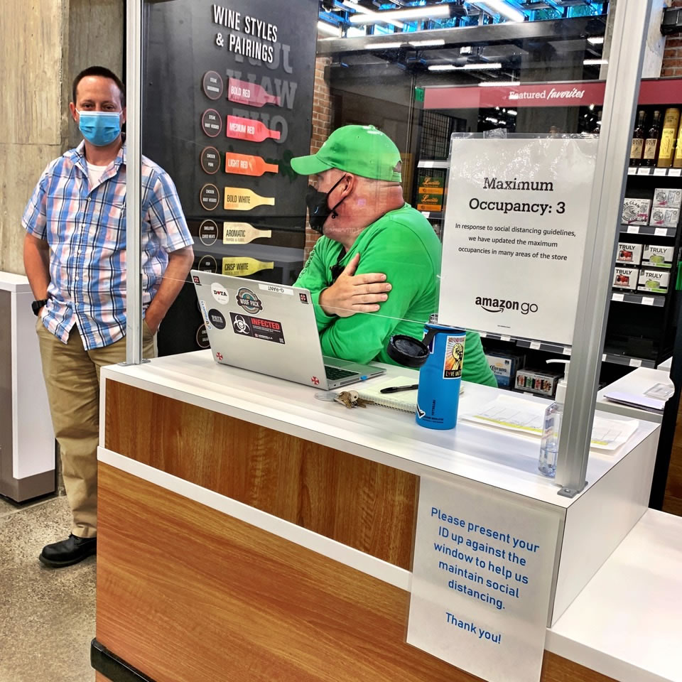
It’s an efficient blend.
Fast, silent, emotionless and technical.
Clinical efficiency comes to mind—and it’s worthwhile to posit the preliminary study of this brand-start-up is resilient and agile—it’s set up for quick change and lightning evolution.
I’d look for a more humanized character in the detailing of the environment: while the componentry is slick: it’s texture-less, touch-resistant and there could be more to retail allegory and storytelling, metaphorical design thinking.
Like, more fun? Happier, more artful—emotionally memorable and less transactionally focused?
There has been an earlier string of examinations of that front—
symbolic place-making.
And that lies in the idea of of holistic sensationalism, which speaks to our invented postulate from earlier in this overview: a retail brand could say—“however you approach me—you can touch me, feel me, believe in me.”
And you
want to
be
here.
*Experientiality — design thinking founded on a multi-sensory strategy of experience development: integrated holism.
TIM | OseanStudios
…..
G I R V I N | N E W FAST WOWNESS
INNOVATION WORKSHOPS
CREATING STRATEGIES, PRODUCTS,
IDEAS FOR CHANGE.
http://goo.gl/4fXQyE
RAPID INNOVATION: https://bit.ly/3dd1q3P