The context of designing places that are human, places that are not.
In the principles of fast casual food / beverage design, a mid-priced, faster service experience proposition, the notion of the holistic character of guest presence has to do with a layering of expectations. No restaurant will survive if their food isn’t any good. And intriguingly, restaurants that are supremely beautiful in their design doesn’t necessarily mean that they will survive either.
Hot design sells? Food and holistic presentation
Look over the list of some of the hottest restaurant design programs, from quick serve, fast casual and upscale — to luxury; and the key will be the appropriate alignment between the concept of food presentation (holistically: visually and tastefully great) to a form of presence. In fact, food wins — great design will support an opening gesture, but the actual character of the offering will be the returning quotient. To the notion of people coming back repeatedly (even for the note of celebration or “specialness” will likely not favor amazing design over crappy food presentation. When I’m referring to the idea of food, and presented preparation, as any chef would offer, it’s not only the taste, but how it looks — the admixture of scent, sight, taste, texturally “feeling” — the touch in mouth, as well as hearing; how does the food sound? Sloppy, crisp, crackling — and these, too, might relate to the spirit of umami. Umami might be called as the concept of presented perfection — the moment when things are just right; from the moistened peach just rightly ready to fall off the tree, to the salmon glazed and grilled to the moment of rightness.
Quick:
Savoriness, is one of the five basic tastes together with sweet, sour, bitter, and salty. Umami is the Japanese umami (うまみ ) meaning “pleasant savory taste”. This particular writing was chosen by Professor Kikunae Ikeda from umai (うまい) “delicious” and mi (味) “taste”. While normally written in hiragana, the Chinese characters 旨味 are used for a more general meaning, when a particular food is delicious.
Rightness, in place making: umami place
Rightness, that character, might be even applied to the nature of experience design in restaurant — the right taste, the right messaging, the right sense of place. There’s an intriguing alignment to the sensibility about “wow, this is cool, this place seems just right.” To “wow, this place is spectacular” — laden with spectacle. The key will be appropriateness.
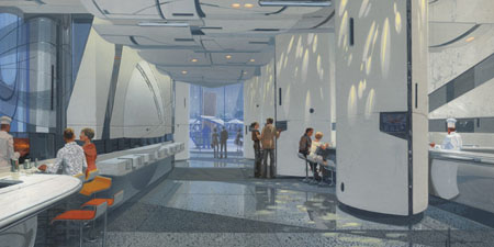
FoodParc conceptual renderings by Mead
I’ve been doing some writing on the futurist design of Syd Mead. I’ve not met him, but I’ve worked “around” his work. That is — looking at the character of his production design for motion pictures and how that might align to titling and motion picture marketing and identity. But Syd’s crossed his talents to restaurants, and I was curious about the strategy between the place, and the experience of the food. Reviews aren’t great, but the work is well-intentioned. And you have to count that. In our experience, it can be that — intentionality and sensual delivery; you can design a cool place, but the holistic sensations need to align. Food has to be amazing.
In an overview in Fast, the commentary is linked to this range of thinking — and the comment relates to FoodParc; a press release notes: “Syd Mead … conceived FoodParc’s imaginative, modern aesthetics, casting the walls and flooring in off-white stone, terrazzo and other modern materials, giving the space a visually serene ambiance in which, as Mead describes it, ‘food could be the star and the rest of the cast are the patrons.’ Dark faux ‘electronic’ strips throughout allude to Eventi’s elaborate electrical infrastructure, and metallic surfaces bring the outside light spectrum into the space.”
The site suggests that it does just that, “FoodParc is a modern playground for food lovers, a high-tech space where the cooking is down-to-earth and exceptional ingredients are celebrated.
We are a brand new 20,000 sq ft indoor/outdoor modern FoodParc—where you can find burgers, grilled cheese sandwiches and BLTs all available with out 4 artisanal bacons, as well as shakes and floats at 3Bs • dim sum, dumplings, Chinese BBQ and more at RedFarm Stand by Chef Joe Ng • salads, sandwiches and pastas all served on our brick oven flatbread at Fornetti • or La Colombe coffee drinks, tea, pastries and gelato at The Press!“
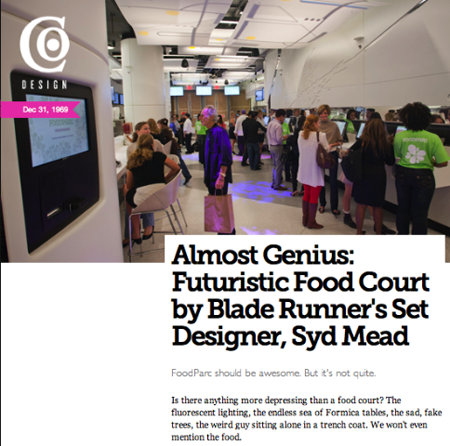
Fast is contrary, ” FoodParc should be awesome. But it’s not quite.
According to Suzanne Labarre, “Is there anything more depressing than a food court? The fluorescent lighting, the endless sea of Formica tables, the sad, fake trees, the weird guy sitting alone in a trench coat. We won’t even mention the food.
Well, someone’s finally trying to change things for the better: Celeb restaurateur Jeffrey Chodorow has attempted to turn 20,000 square feet of a chichi Manhattan hotel into a high-tech, modernist foodie mecca. He calls it FoodParc. And the designer behind it is none other than nerd god Syd Mead (set designer for Blade Runner!Aliens! Tron!), with help from New York-based Philip Koether Architects (whose principal is a longtime collector of Mead’s work).
The point might be — to umami, sense spirit and the marveling of food and people, how does technology relate? Is it a story telling, shifting place. Or is it a distraction from the main focus? A good question, and one that I’m contemplating right now — how does, for example, an iPad exemplify the spirit of coolness, but supporting the savoriness of experience development. People are trying to figure that out — dozens of iPads show up terminals at JFK. And people are sitting there, looking at them. Could this be the table-side jukebox radio, mini-play stations of 45s, or the telephone burger joints, the pull-up, drive in car side food service window tray clips? Some readers won’t even know what that was.
What’s food for: 4Food?
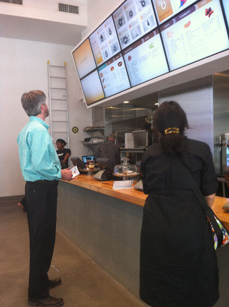
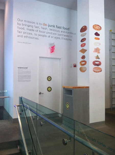
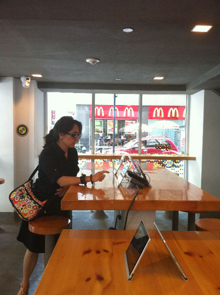
Another concept, midtown, Madison Avenue — another challenging positioning — a cool idea, great food, but was the stake too large for technology in place of humanness? Suzanne hammers the proposition, “All of which smacks of another attempt to bring digital dining to the fore. 4Food, also in Manhattan, got tons of buzz for its techie concept before opening earlier this month: Interactive ordering on iPads and Android devices; food promotion on Twitter and Facebook. It seemed like the perfect echo of the cultural moment. New York compared it, unqualified, to an Apple store. But it looks more like a studiously zany Internet startup circa 1999 crossed with a Dunkin’ Donuts — the sort of place where you’d go to grab food then get the hell out. You can’t even see the huge LED menus overhead, because they’re so long and at such a weird angle. (Also, the burgers are gross. Remind us why you’d want to cut out the middle of the burger — isn’t it the tastiest part?)
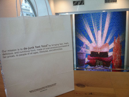
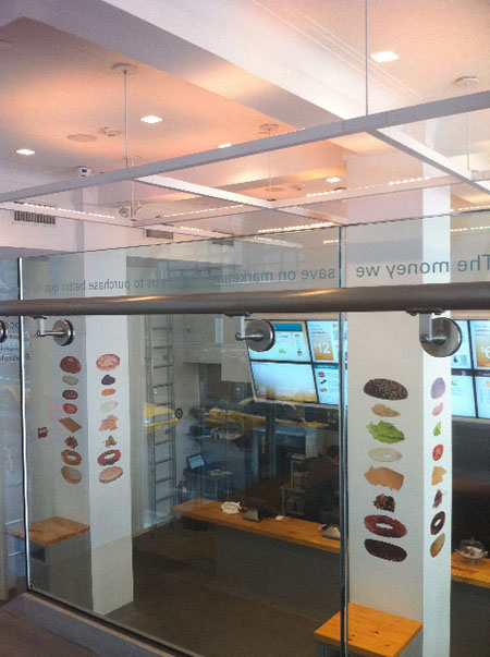
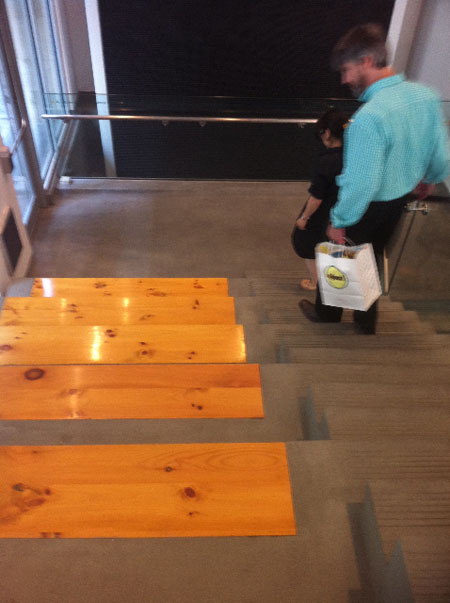
What I might offer is that it is just that — the sense of placement. It’s a concrete warehouse like environment, which would be fantastic if it wasn’t dropped into the mid-Madison Avenue sensibility. I’d rather that it was, realistically, a warehouse — in some other remote place, than dropped like a bomb here. Working there, urbanity — is this the place of respite? But is that really the notion: retreat, or sheer wowness? Imagery, from a lunchtime meeting with the GIRVIN | NYC team.
4Food Imagery:
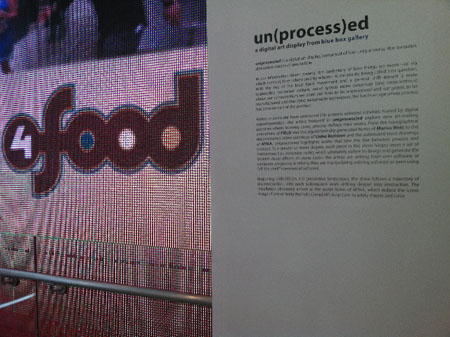
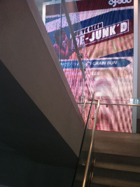
Dissolving and animating digital menus
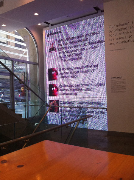
Tweets, Foursquare projected
Missionary positioning
Get it?
Wait, so — how’s it work?
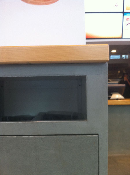
Skinned metal and floor-radiused garbage cans
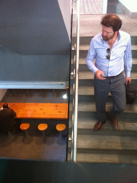
Basement seating
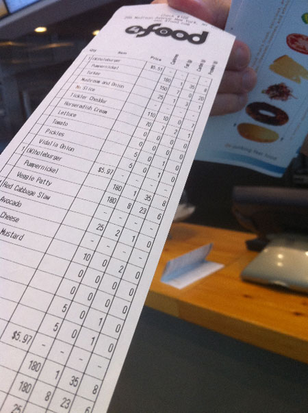
Food analysis, per receipt, per order
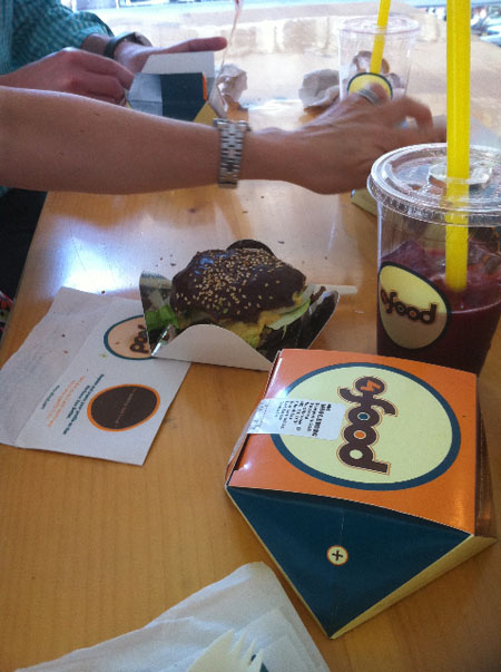
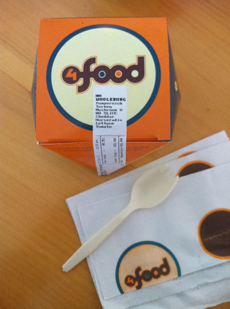
Food packs, monster straws
Perpetual animations, big screen size (and heavily pixelated)
Apple slick
Stadium seating and screening
iPads — along with mobility ordering
Food, attention, respite and retreat
So, the next move would be some balance, to this notion? While Starbucks has apps that allow for paying, so far they do not have a technology for ordering drinks or food in advance. It’s complicated — and one might ponder if it’s necessary. But the idea of mobility in ordering and food will be an increasing utility, no doubt about that. But there’s a crossover between the idea of food and beverage experience, the character of attention and the focus on “savoriness.” Attention, slowing down, leisure, respite and retreat — these might be one kind of experience and sensation, but would that always be expected? “I need fuel,” might be the other approach — “fast, and I don’t have time.” Style and type align — and design speaks volumes as well as the service and food.
Slow down: wabi sabi
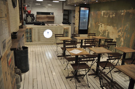
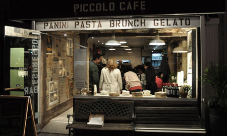
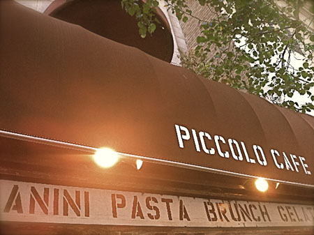
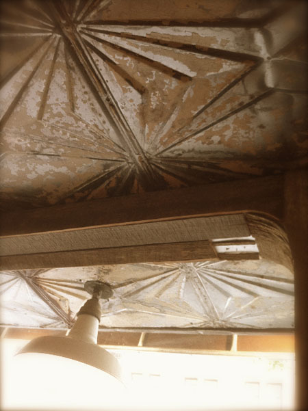
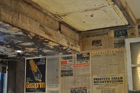
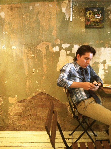
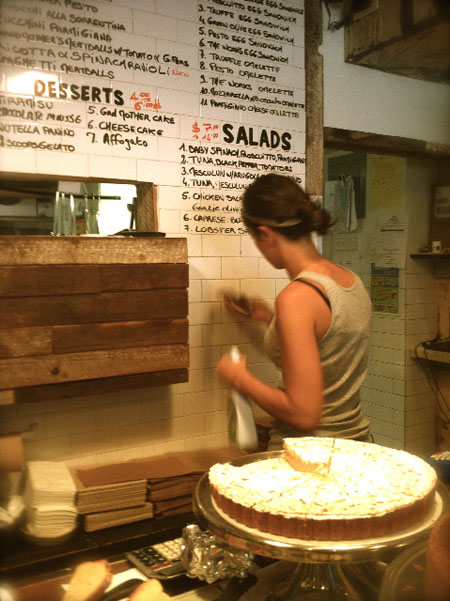
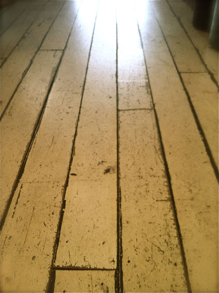
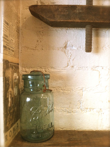
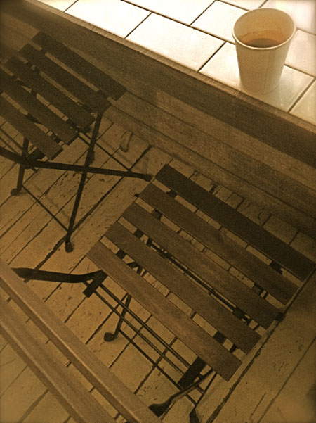
Walking down the street, I find another experience which resides in severe contrast. Piccolo Café has three locations in the city, and the spirit of their environments are carefully nurtured — and that design “nourishment” might be as much about finding places that will allow a sense of genuineness, coupled with the care of their food and ingredients.
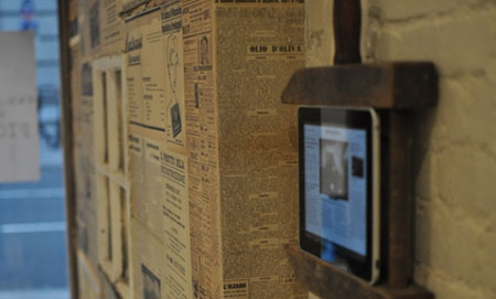
The ingredients of design are about the nature of a more distressed, lived-in and used maintenance. People come, stay, pick up, go — it’s very simple, handwritten, hand made. While it’s perceived as essentially low-tech, in fact, services are offered online for ordering and take out. A lively and fundamental way of increasing efficiency, but it’s functional and hidden.
That might be the key point. Subtlety, discretion, truth.
Details, in that story:
The course would be yours — where would you go?
From FoodParc at over 22,000 square feet — 4Food, I’d surmise at 3,500 feet squared; and 800+ square feet. From gymnasium, to multi-floored techno boom-room, to a gardened evocation.
To each, their own.
T I M | The Museum of Modern Art
–––––
HUMAN BRANDING | Strategies
https://www.girvin.com/subsites/humanbrands/
the reels:http://www.youtube.com/user/GIRVIN888
girvin blogs:
http://blog.girvin.com/
https://tim.girvin.com/index.php
girvin profiles and communities:
TED: http://www.ted.com/index.php/profiles/view/id/825
Behance: http://www.behance.net/GIRVIN-Branding
Flickr: http://www.flickr.com/photos/tgirvin/
Alltop network: http://my.alltop.com/TGirvin
Google: http://www.google.com/profiles/timgirvin
LinkedIn: http://www.linkedin.com/in/timgirvin
Facebook: http://www.facebook.com/tim.girvin
Facebook Page: http://www.facebook.com/girvindesign
