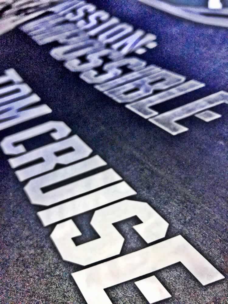
THE STRATEGY OF DESIGNING MOTION PICTURE BRANDING. THERE’S A PATTERN LANGUAGE, WHICH IS SENSUALLY INTERMINGLED. IT IS DESIGN, PLACE-MAKING, CHARACTERIZATIONS, CINEMATIC STYLE, SOUND DESIGN, MUSIC. ALL ARE PART OF THE TELLING.
To that telling: how is it that the pulsing Brandcode®—the decades-old motion picture score of Lalo Shifrin continues to electrify the character of a cinematic storytelling series?
Drive, I’d imagine. Unforgettable drive.
Persistence pays.
The Argentine pianist has been working assiduously for decades, IMDB recounts “Immensely talented, Argentinian born pianist, conductor and composer who has written over 100 scores for both television & the cinema including the memorable themes to Mission: Impossible (1966), Mannix (1967), Starsky and Hutch (1975), Cool Hand Luke (1967), and Bullitt (1968). Schifrin has regularly worked alongside Clint Eastwood (another jazz music aficionado) on numerous contributions including the theme’s to all the Dirty Harry films, plus Joe Kidd (1972) and Coogan’s Bluff (1968). During his illustrious career, Schifrin has received four Grammy Awards, and has received six Oscar nominations.”
And what else? “Schifrin received his classical music training in both Argentina and France, and is a highly respected jazz pianist. On moving back to Buenos Aires in the mid 1950s, Schifrin formed his own big band, and was noticed by jazz legend Dizzy Gillespie, who asked him to become his pianist and arranger. Schifrin moved to the United States in 1958 and his career really began to take off. In addition to his jazz and cinema compositions, he has conducted the London Philarmonic Orchestra, the Houston Symphony Orchestra, the Los Angelas Philarmonic, the Los Angelas Chamber Orchestra and many others.”
It’s a code. And that code could be, should be, unforgettable.
I come back. I was doing what I did that last time I wrote on this subject and that was watching Cruise’s newest interpretation of the Mission premise—this mission, “should you chose to accept it.”
Everything I’ve done as studies for somewhere near 400 different projects in decades of design work on tilting design for theatrical advertising, is drawn as customized, illustrative typographic design.
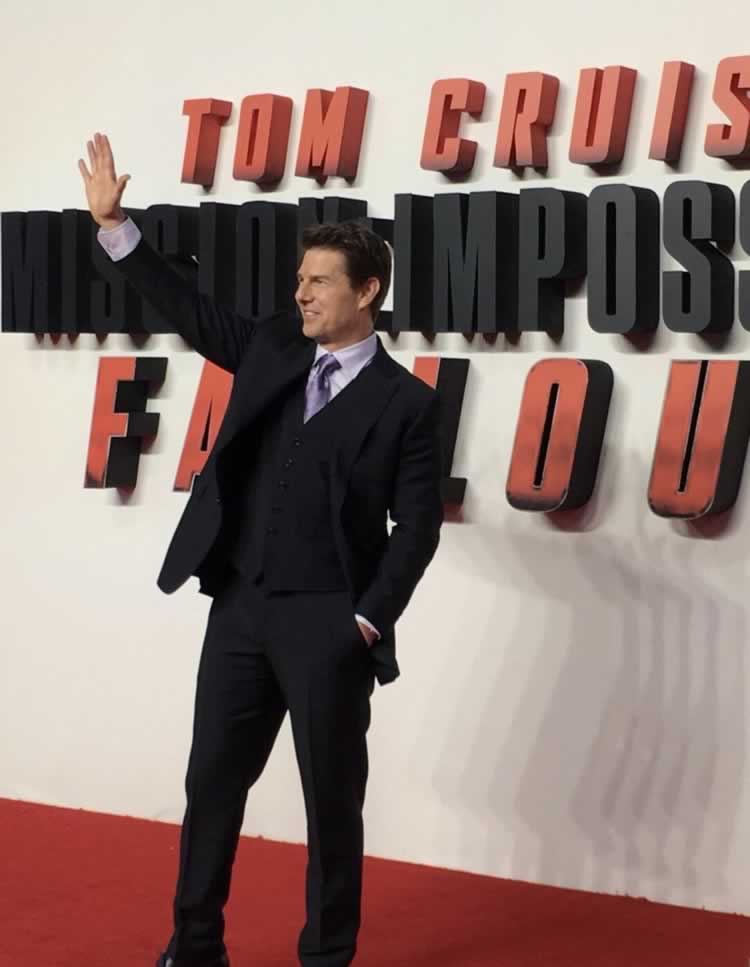
Paramount Studios | Tom Cruise, London Launch
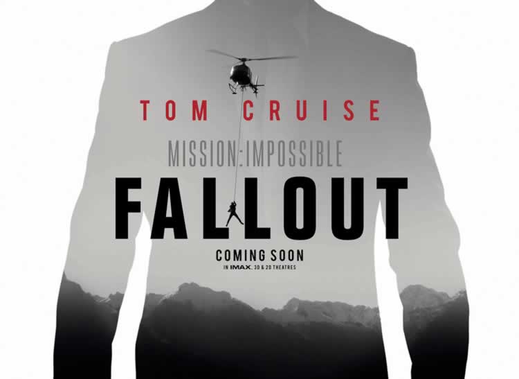
First off, to clarify, we didn’t work on Fallout, out this past week—but seeing the opening campaign, as well as the film launch in Paris and London (and working in each of these cities) reminded me of earlier efforts — creating at the start, to define brand style for Mission: Impossible.
That started for me, mid-90s.
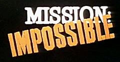
Over time, I worked on all of them, from the foundational Mission: Impossible—below and above—all the way up to M:I:III.
In the beginning, it was reaching into the soul of the legacy story—the TV series, and looking for new interpretations — working with the Paramount Studios marketing and theatrical advertising teams, in forging the opening approaches to a renewed strategic brand look and feel for Mission: Impossible.
Where I started, the 90s.
And that is:
condensed
modernist
fast
stencilled
mechanized
adrenalized:
There’s one part of the Girvin legacy that is spectacularly antiquated.
It’s about the hand.
And the work that comes from it.
And it goes right back to the roots of the founding of Girvin — and before that, Alphabetica (my letter-making firm when I was in college). That is an early and still held belief that logo typography needs to be entirely customized, built by hand, and taken digitally to computer applications. Every logo that we build starts with that proposition, that designing an identity is a closely-practiced study — linked entirely to the nature of the personality, the story and audience of the experiencer.
As has been pointed out in the past, that idea of illustration and interpretation in typography links to the nature of drawing soul — everything can be tuned and marked in the character of the core message of an identity treatment; type is how logos are read — it is, indeed, the “title” of the story. Even with thousands of interpretations of the alphabet’s design, still we start with the idea of creating foundational fonts that build these tactical attributes.
Working for decades in the motion picture business, as strategists, writers and designers, we’ve worked for mostly studios—Paramount and Warner Brothers in particular—some specialist advertising agencies in the motion picture marketing arena, and directors, producers, agents and theatrical stars.
Like Tom Cruise.
On the Lot at Paramount Studios.
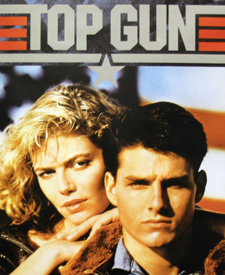
Our first connection with Tom, decades back, was Paramount Studios “Top Gun”—and this link was through Don Simpson and Jerry Bruckheimer—as producers; and that followed on to meeting with the producer-team, the directorial management and the creative lensing of Tony Scott, Ridley’s brother, now gone from us all.
We worked with them on their brand, we created the original double-lightning metaphor.
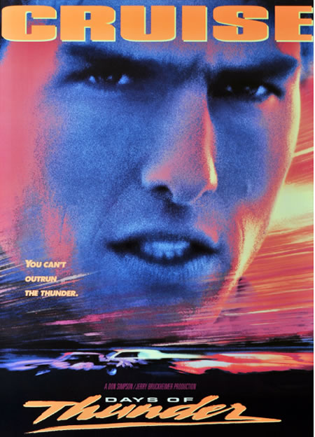
That connection later led to “Days of Thunder.” Also directed by Mr. Scott, and produced by Simpson Bruckheimer, there was another meet-up with Tom.
What impressed me then, as now, was his astonishing willingness to take risks to tell the story, personally—doing his own stunts.
Daytona included. With training wheels.
And we worked on a string of titles after that, out to consulting on Valkyrie—but it was the Mission series that involved a more close link between the design sentiments of a star or director and the visualization outcomes. That takes time — it’s not one conceptual or stylistic movement, but many — it’s not one idea, but a complex intermixing of many collaborations and explorations — then, finally, the gradated arrival at a solution set, then finally to the launch program.
Identity, in motion pictures, is one of the longest lasting sentiments of memory and experience; it is the title. To priority — then (and perhaps at the same time) the stars in tandem, then the overall visual strategy of the posters. Movie posters are thematic — and oftentimes, with the star arrays, the big heads, the bold colors, it can be hard to sort one to another — they can be similarly styled in character.
But in the Mission series, the idea was for our team to set the opening styling of the titling identity. That was the mid nineties—and, in our roles as designers and brand stylists—we built the opening accepted potential for the Mission: Impossible brand frame in identity. We come in—work in Los Angeles—and go. From there, implementation and continued evolution might happen.
In the beginnings, I worked on more complex titlings that involved more completely articulated title renderings — a logo with a subtitle.
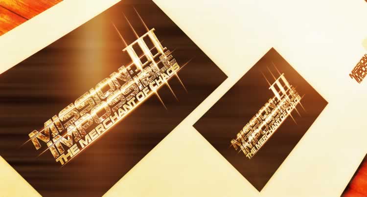
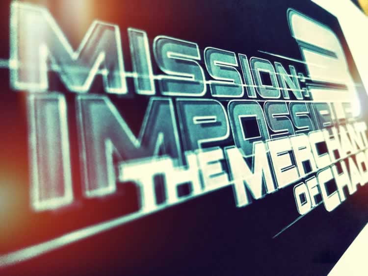
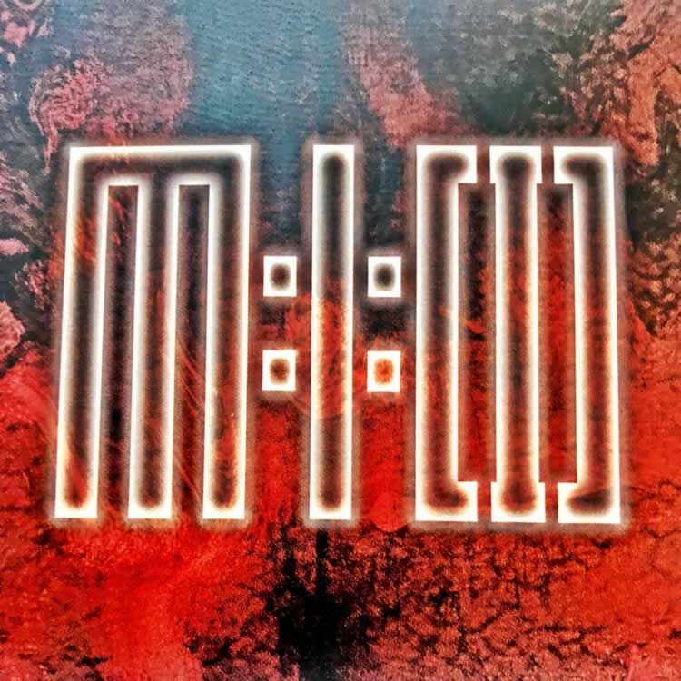
We built master identities, then supporting sub-titles, then monogrammatic letter | roman numeral sequences. That came from Tom, he was the once that sketched out that concept, passed along to me.
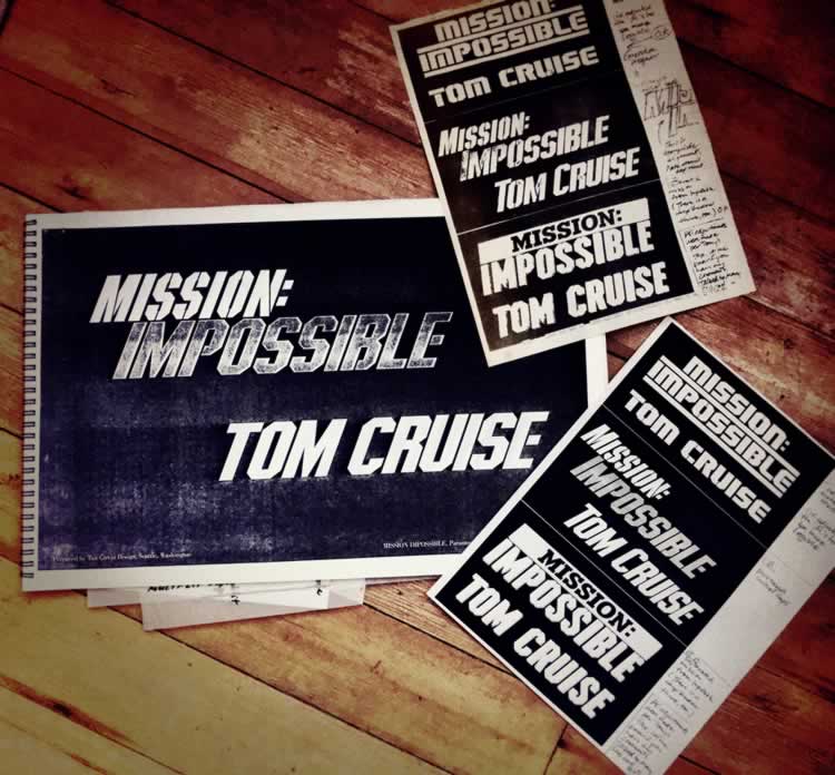
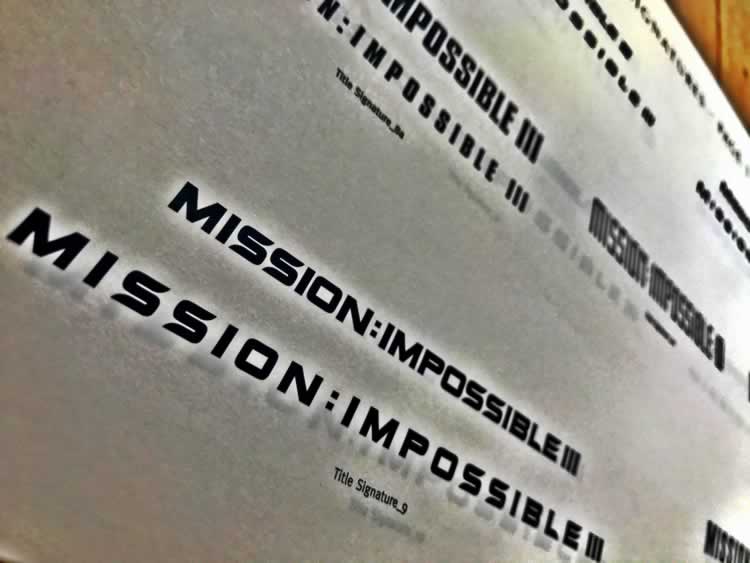
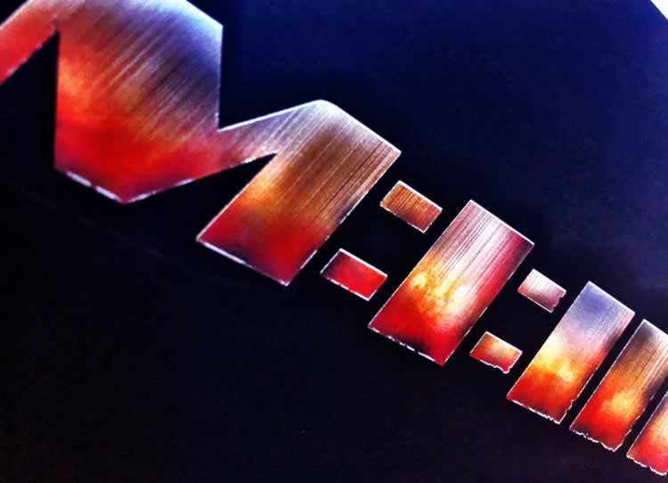
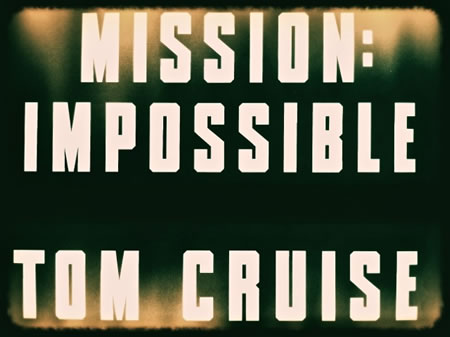
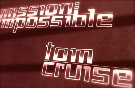
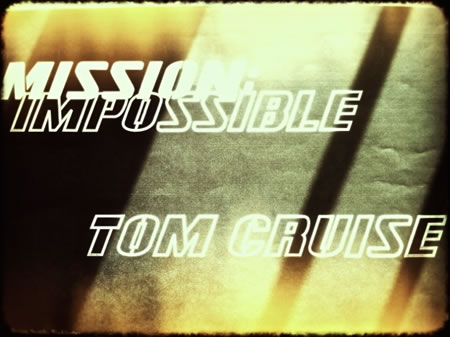
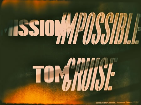
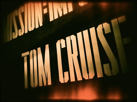
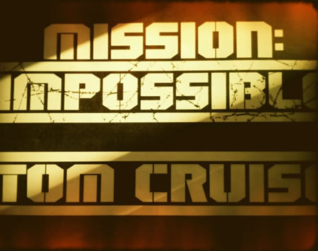
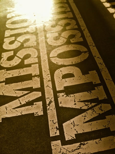
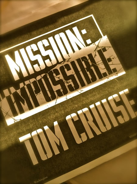
Some screen grabs, iPhone shots of our earlier defining efforts, to the styling of Mission: Impossible identity, the kick off to the new brand, 1995.
A gallery of early design foundations:
Mission: Impossible custom fonts and alphabetic clusters
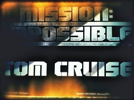
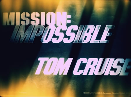
The finalized outcome — built at, and by, Paramount Studios:
condensed / stencilled / modernist / military
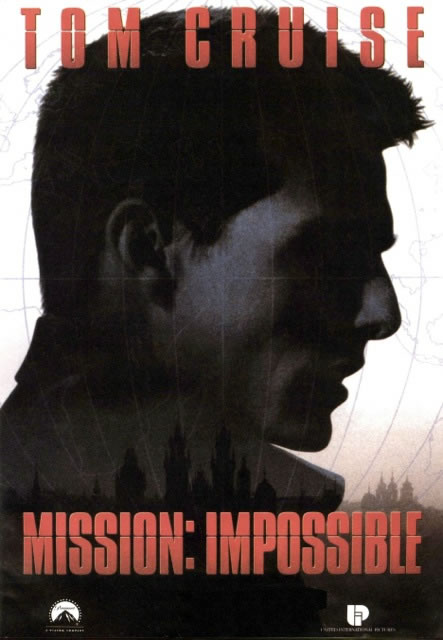
Several years later, the second conception of Mission: Impossible evolved, this time with the stylistic visioning of John Woo — laden with his characteristic explosive shooting style, the emergent fluttering of ghostly white doves, skull jarring hand to hand combat, ebullient chases and enthusiastic pyrotechnics. And during this effort, the idea of a coded monogram emerged — still our focus was founded in the nature of the typographic systems. The final more flattened treatment was orchestrated at Paramount Studios, their theatrical advertising department — still imbued with the sense of energy, speed and athletic power, spirited with thriller potency.
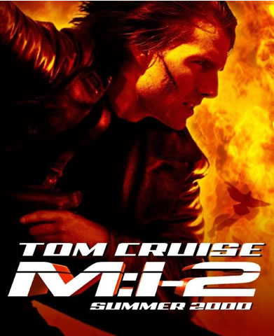
Round three of the impossible mission offers the next return to the monogrammatic coded device — and this time with specific directions and notations from Mr. Cruise, sent in faxed sketches.
Our process in creating these titling solutions runs in a series of books and digital presentations — like our opening overview for Mission: Impossible brand styling foundations.
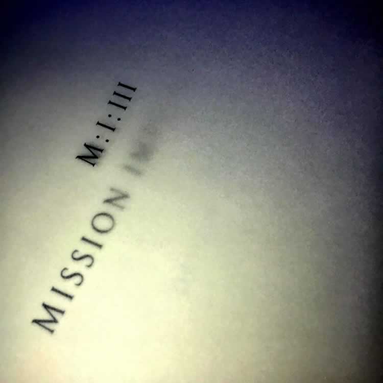
They look, from the cover, like this:
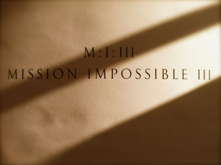
This styling bridges to the way we present everything — using customized Girvin classical fonts.
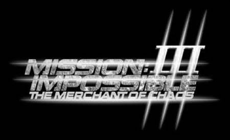
Interestingly, the opening strategy for the titling was a bridge between Mission: Impossible and a supporting title, Mission: Impossible III / The Merchant of Chaos.
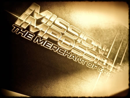
These were used in the beginning, as a way to code name the project — in fact much of our earlier work, reading the script in secrecy, on site
at Paramount Studios. Tom Cruise’s sketches followed this protocol — even, as he’d noted, something hand written.
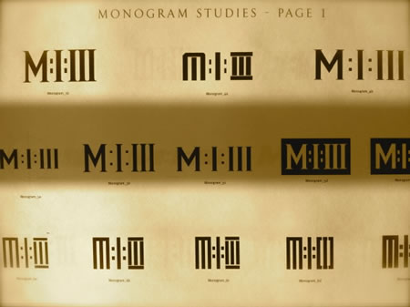
Sketched solutions, based on Tom Cruise’s notations:
Dimensional explorations.
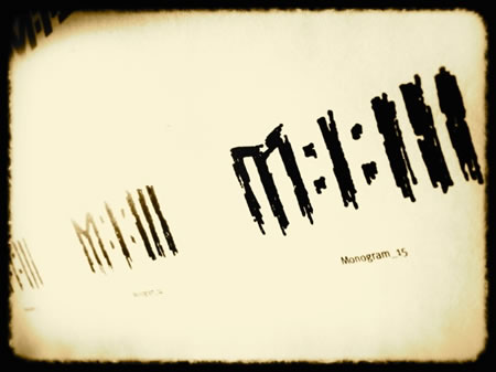
Dimensional explorations of the monogram — breaking the mold: Moving to other solution sets, based on commentary from J.J. Abrams, the director on the film (Girvin worked on Star Trek with him [animation here]).
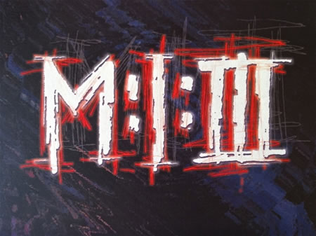
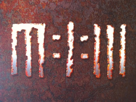
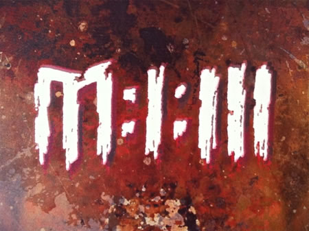
Strategies evolved and emerged to the move to typographical solutions, dimensional as a series of floating identity design movements.
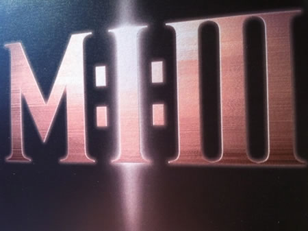
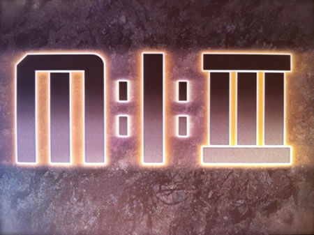
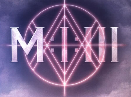
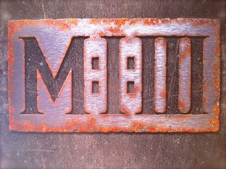
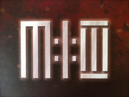
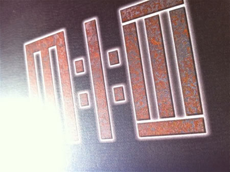
From dozens of studies — a channeling developed:
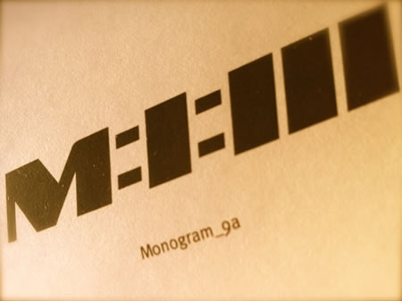
And evolution:
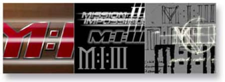
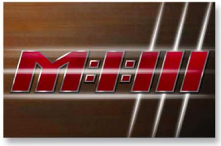
And the final interpretations by the team at Paramount:
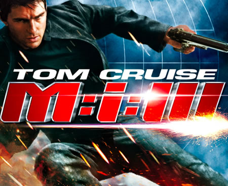
The most current rendering goes back to the beginning,
the original brandcoding:
Paramount Studios
Everything we do is about that selfsame nature of team-built solutions; it’s never about absolutely owning every story, there are many layers to the creation of the one final statement, the stake in the ground that tells all.
The creative juice is stellar — like a constellation, made of many “stars.”
Tim Girvin | OSEANSTUDIOS
—-
Cloud Crowd | Building team-workshops to find brand soul
GIRVIN Cloudmind | http://bit.ly/eToSYp
