ALPHABET DESIGN VISIONING AS THE VISUAL LANGUAGE OF BRAND IDENTITY
As a brand designer, you’re thinking—“where is this business going?”
“What’s the point, who cares, what’s it about—how’s it going to work?”
And then, after these opening queries—that project work comes to strategic clustering and designing the outcomes, direction, visualizing design systems.
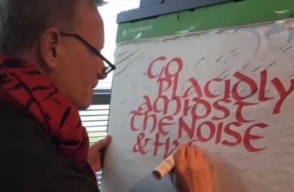
I was thinking about that idea of learning font design—letterform theory, the principles, it’s what I teach my calligraphy students @ GIRVIN, what we call “breathing time,” working back in time, studying the culture and writing of 3000 years of human history.
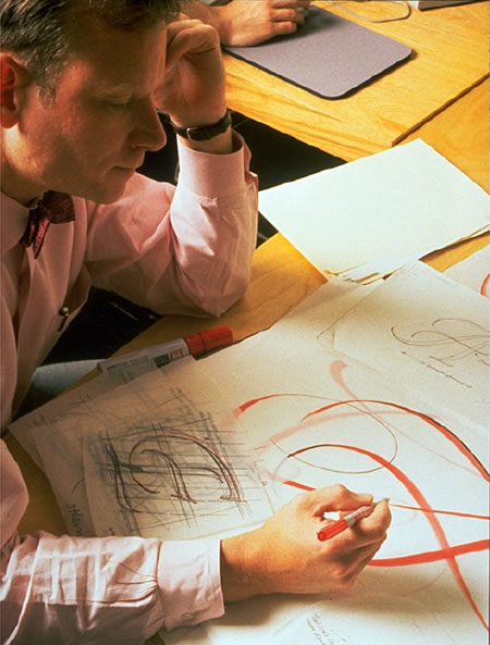
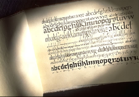
First up. You start with the foundations of a lettered system—a series of movements involving touch: a calligraphic run of forms, hand-influenced, speed tokened. There’s the core principle: “what is the design strategy of the O and the I—the curve and arc of the circled O and the character of a straight stroke, the finish of its structure, the detailing of its serif.
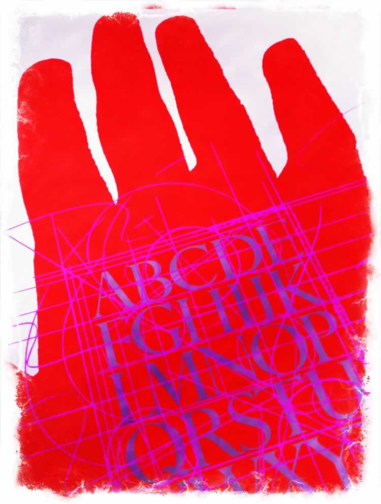
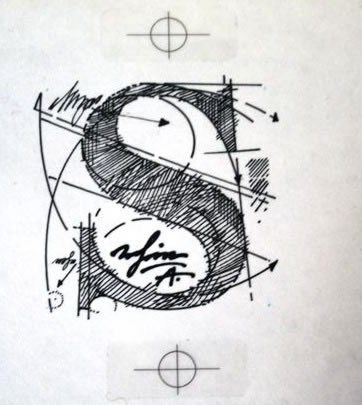
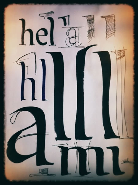
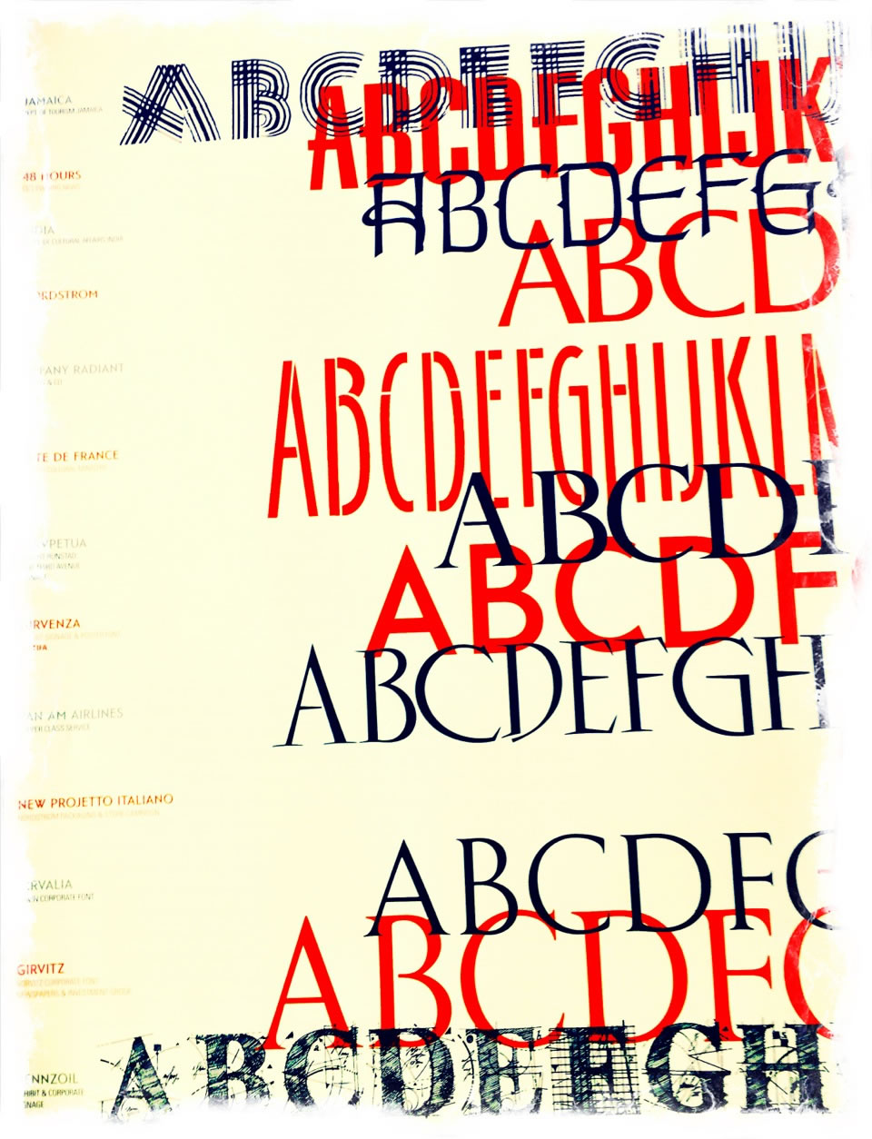
Poster from a GIRVIN TYPE DESIGN workshop.
Drafting the rhythm of the alphabet, and I wondered, how did it go—how did that happen—what caused the sequence of letterform design evolution? There are cultural influences, the art, the architecture
And this is history.
If you could design a brand strategy that created the a core brandcode® that included an ownable integrated typographic language, it’s likely to create a unforgettable impression.
We’ve done that.
For decades.
Design a brand, design a font [customized typographical voice,]
and integrate them.
For magazines, buildings, design firms, hair salons, department stores, high-tech industries, national television programs, campaigns.
For me, it’s the just right of identity, detailed, preciously precise, focused and hand-built: customized, that’s the just right—type out of a box simply never gets the heart of illustrating the soulful expression of a brand.
What’s next?
Bettering the craft, likely. Isn’t that so, the long and slow journey of making art of your labor? It’s about being better, more detailed, more care-full, thought-full. Meaning-full.
A
G A L L E R Y
AND SOME STORIES
––––––
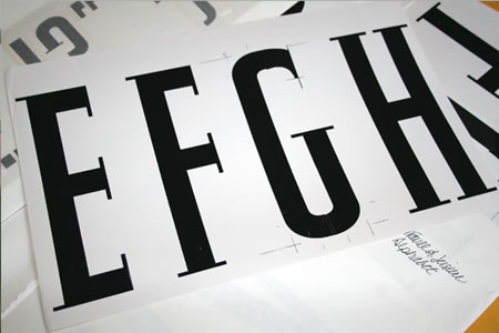
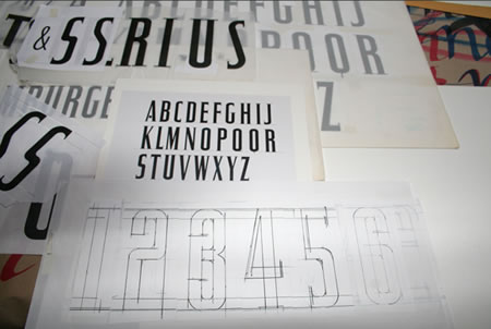
This is a font that was created for the identity for Travel & Leisure, an American Express publication, working with acclaimed art director Bob Ciano.
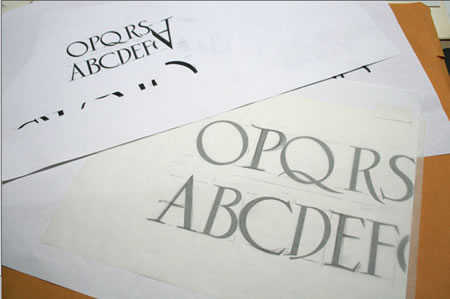
This is a typeface study for a salon, which included signing and collateral, and, to that end — an entire font was created
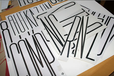
For the design of a special retro font for the PanAm airline “Clipper” — a re-visioning of classic flight experiences, back then.
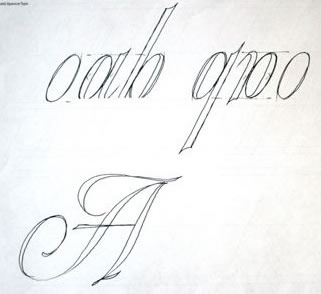
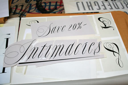
A scripted logofont created for a floor signing treatment at Bloomingdale’s, under the direction of John Jay.
A rough drawn calligraphic alphabet for Nordstrom
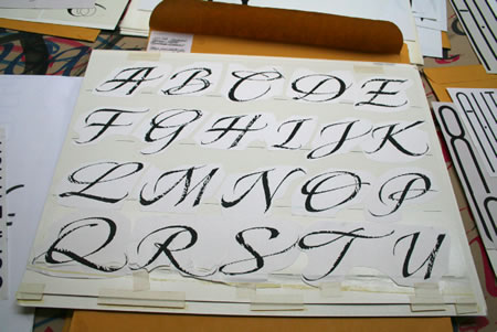
Disneyfont, designed for Disney Stores, for packaging,
signing and indoor merchandising:
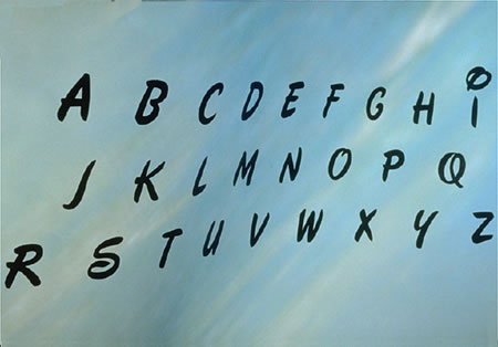
A trial font built for WallData, a software emulation group, based in Seattle, working worldwide (then)
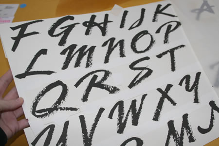
A script font for Nordstrom, based on an identity and packaging treatment for a national store-wide campaign
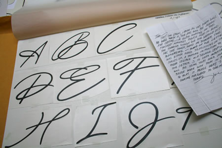
A steel-pen script font, designed with rubrics and color knock out, for initials.
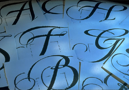
An alphabet for Douglas Trumbull, for the film Brainstorm.
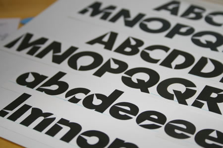
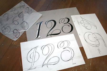
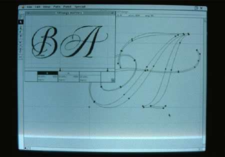
A series of font treatments for Tiffany & Co. — drawn first with a brushed tool, then redrawn, digitally built (the early days.)
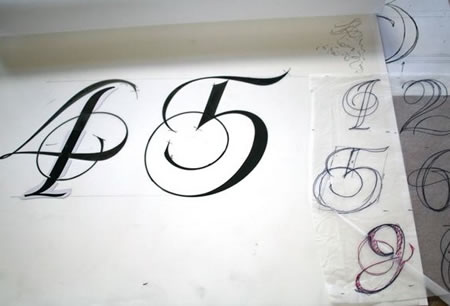
 g
g
A font created for Pennzoil, in an annual report application.
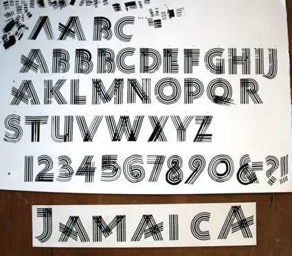
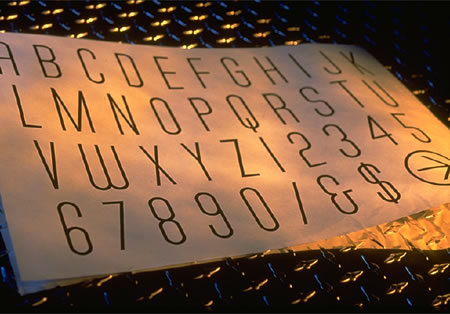
A font drawn with a steel pen, cut and ribbed—for a Bloomingdale’s campaign on Jamaica: logo, signing, initials, packaging.
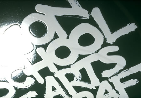
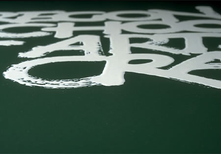
A font designed for the Oregon School of Arts & Crafts, drawn on japanese washi with a radiator brush, then baked in porcelain enamel and applied to installed building signing (for each of the schools) and business materials.
The signing was ultimately all stolen.
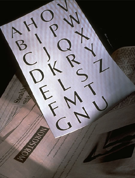
A customized font, drawn for the Nordstrom family, for print and packaging, as well as for signing and identity applications.
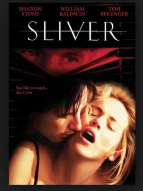
An alphabet originally designed for Sharon Stone, for her company, Chaos; and applied to her film: Sliver.
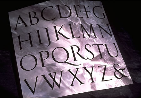
A font drawn for the Horvitz family a series of trusts and foundations, in the name of the Horvitz estate.
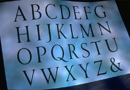
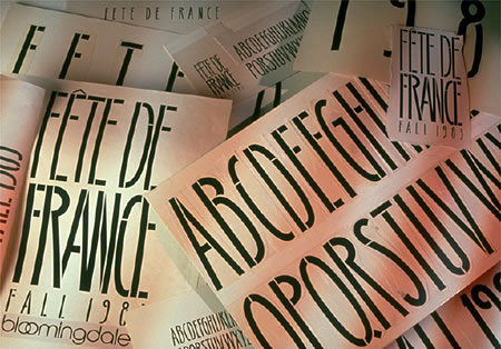
A font designed for Bloomingdale’s, for the celebration,
Fête De France, a fortnight event originated by Marvin Traub, former CEO of the store group.
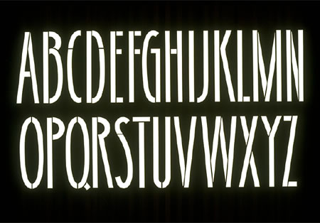
A typeface designed for Massimo Vignelli and Michael Bierut, for a building property in NYC
There are more, many more.
Collaborations for, and with, clients around the world:
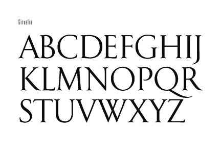
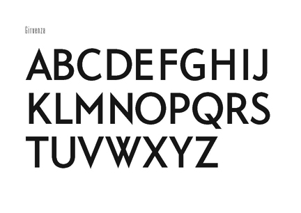
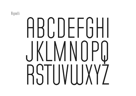
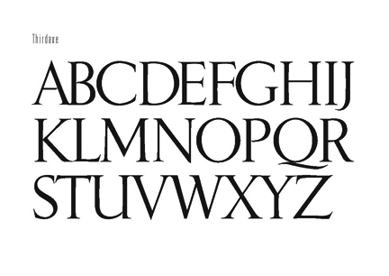
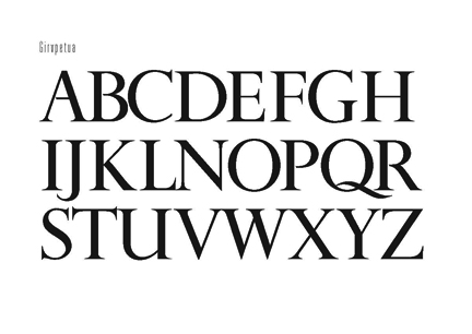
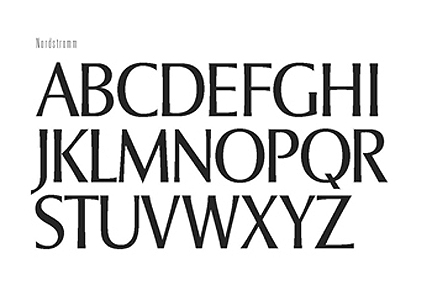
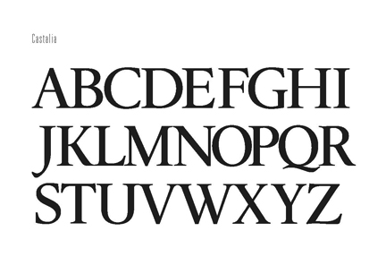
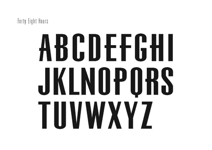
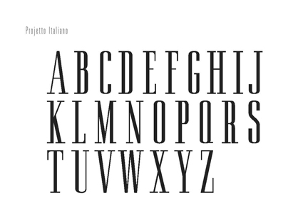
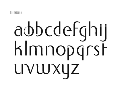
Most of these fonts are pre-digital, though some — like Tiffany & Co., there were early experiments in carrying it across the line from analog stroke to pixelated visualization.
The character of the alphabet, the strokes and geometry of the language of the mind — now touched in the stroking of the finger tip, then to the other visuals: the weft and heft of form which builds out that curving and linear language of design.
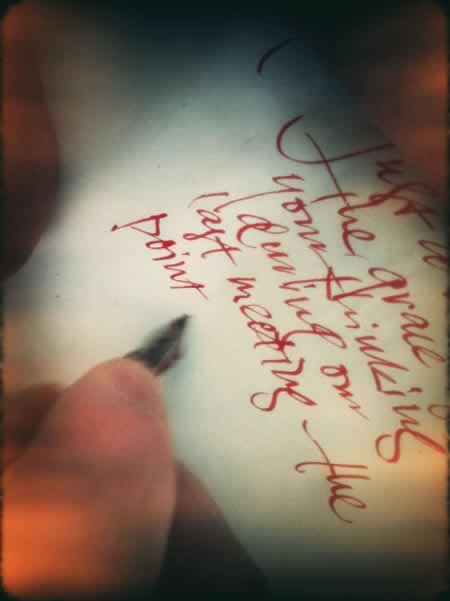
Stroke on stroke, there’s still nothing to the power of a handwritten note in the warmth of the palm, the fingertips, the turning wrist.
Beauty emerges in touch — drawn with the digital pen, or drafted with an ebony stick of ink.
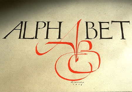
It starts in the beginning with hand-drawn work, the practice, small, at scale—draw it out, draw yourself out, go back, get back to the beginning and see what you can open up.
I start here.
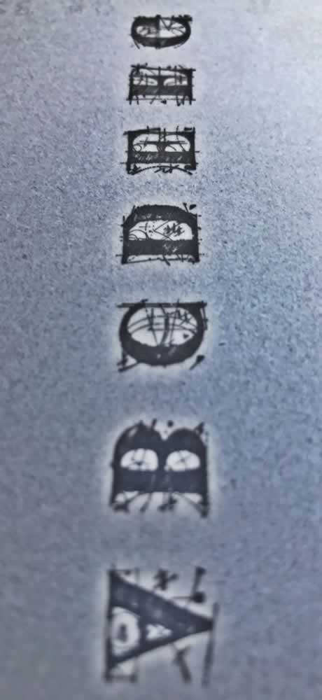
The tiny studies, millimeters high.
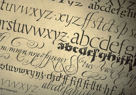
Go there.
Tim | GIRVINWATERFRONT
F i r e s t a r t e r & A c c e l e r a n t
B R A N D M Y S T I C I S M | Deep Journeys to Team & Enterprise
D i s c o v e r y: http://goo.gl/DNfwS9
HUMANS, BRANDING + H E A R T
GIRVIN BrandJourneys®
http://goo.gl/iyQIzK