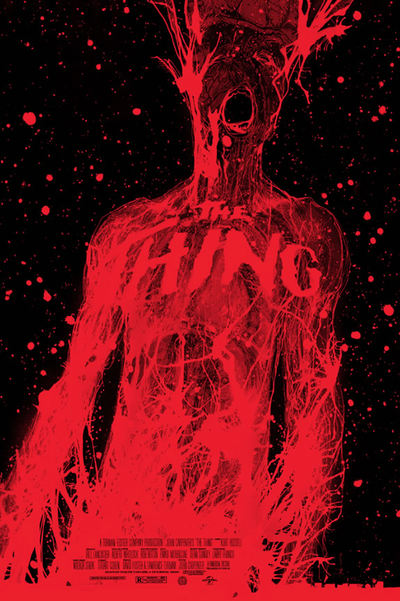
Design studies for “The Thing.”
This isn’t my work [it was pointed out by friend Stuart Balcomb and the poster above was designed by Jock] —
but worthy of mention and exploration.
It’s interesting, as a perpetual student of design [and theatrical advertising] to study what wins, and what doesn’t.
While the study of a sci-fi monster movie poster might be seen as an odd way to study design, in fact, movies of this genre can break traditional models since their storytelling is frequently outlandish and fantastical;
the story breaks the mold and
the audience is more adventuresome [thrill seeking.]
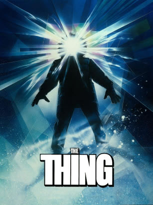
The final poster, designed by Drew Struzan;
and
the imagery of the non-winners, further below:
A Q U E S T I O N
F O R D E S I G N E R S
If you’re a designer, have you ever been in a situation where you’re asked to retrieve a project that’s gone awry [done by another firm] and you look at the work and say “smart, good solutions — what’s the problem?”
What I find is that the answer lies in the following;
and likely you have more thoughts:
• Didn’t ask the right questions — sometimes, as designers, we tend to look out to the solution without clarifying the dynamics of decision-making.
• Failing to comprehend our clients’ cultures — oftentimes there are cultural dynamics in making decisions; if you don’t spend the time to understand that — you can do great work that can fail. Not because of the work, but failing to see.
• Not truly understanding need — sometimes, it might be that we don’t listen appreciatively,
binding ourselves into the real-time needs and expectations of our clients. The more you are in,
the more you know that [their] world.
• Not accepting failure — generally, failure is a movement to another, the next, tier; it’s an answer to a question. But the work of design is entirely emotional and it’s easily to react emotionally to failure as a shut down. The door is closed.
• Knowing the audience. A criteria for any solution is not necessarily your world, but another. To tell a story, you have to speak in the language of the listener. Know that language, those needs, and a better resonation might evolve.
• Watching your client listen and speak — in meeting with client relationships, talking to them, presenting to them, I note there is often telling in how they react.
Test your ideas, see how they float.
Watch what people do.
To winning and losing, as a designing creative, one of the headiest and bloodiest battle grounds is Hollywood. Competition is savagely fierce. Firms come and go, and are remade in what seems like half year installments
and burn-outs.
As a designer’s war ground, it’s Iwo Jima.
Intense, tough, sharply critical and perpetually 11th hour — everything up to the trip-wire of the last moment deadline.
Working in the motion picture arena, for 25 years and more, I have visited sets, met with production designers,
worked with movie stars, cinematographers, producers and directors, script writers and
executive presidents of theatrical advertising;
I’ve made, and worked on
100s of campaigns, location design devices and art direction, photo shoots, logos, copywriting, art and logos.
It’s a training field, a battle for the win.
Friend Stuart Balcomb has built
a power blog
that captures the writing of my explorations.



In the work of examining movie productions, campaign strategies, you see a lot of work that never
sees the light of audience viewership.
One campaign that I never worked on was “The Thing.”
The Thing, amusingly enough was a film that my Dad inadvertently switched on [channels] for my 12-year-old daughter [back then].
To this day, now 30, she remembers it all distinctly. And not too happily.
Motion picture posters, one sheets, are creative exercises around the distinctly contractural. Typographic point sizes, the scale of actor’s imagery, their credits, the proverbial credit block, these are all controlled by actors, film-makers, studios and the legal deal-making in every detail. Mostly, this leads to expected formulae, but adventuresome marketers push the edge.
A series of headshots, some action imagery, a marketing signature line, a striking branding color and a broad integrated marketing campaign, intermedia infection and the crossing bridge to a vast sales engine energizes.
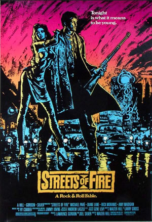
Sometimes, to my thinking, it’s the holistic styling that makes theatrical advertising fascinating — the run from idea, to logo, to the poster illustration, an interwoven character of context and construction — like this treatment designed in collaboration with David Reneric.
Interesting solutions,
gathered by The Shortlist,
that
didn’t make it:
The Thing:
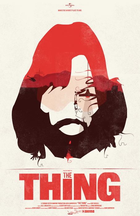
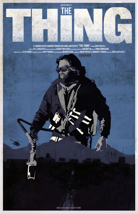
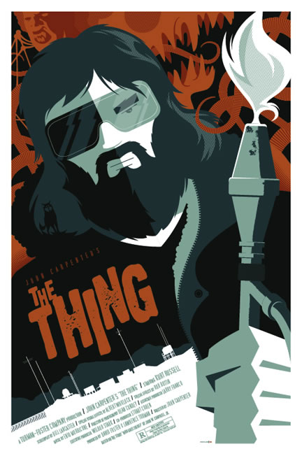
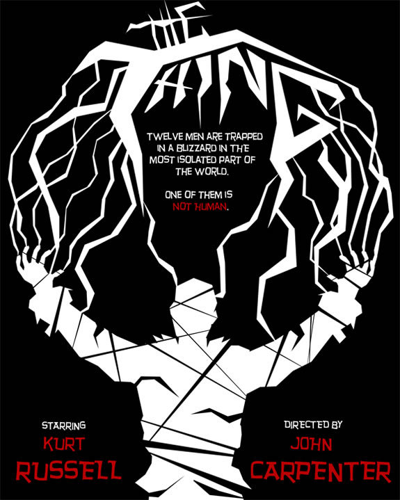
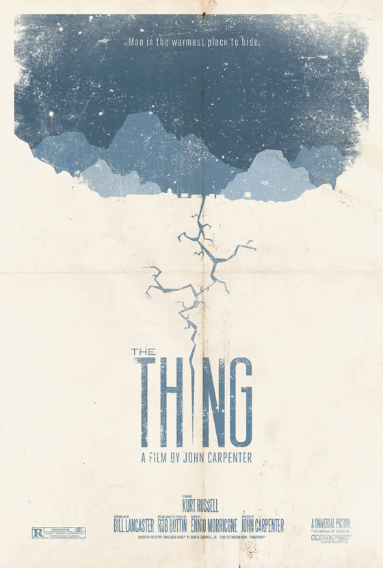
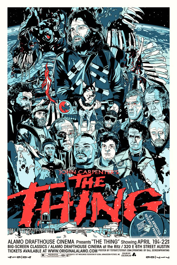
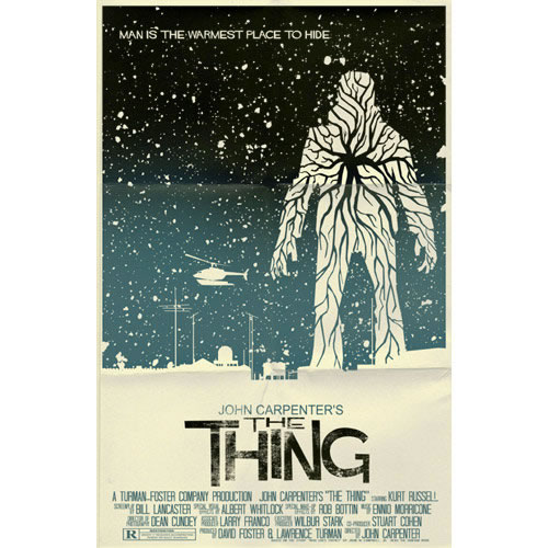
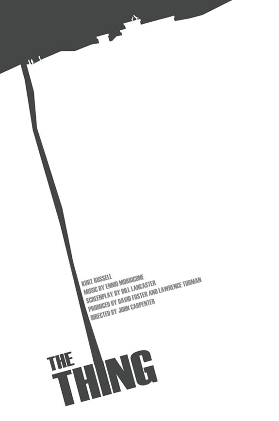
Seeing these submissions makes me think:
what happened? Interesting solutions, fantastic combinations
of context and arrangement. Some of these aren’t even studio design pitches, but posters for theatre performances, art houses and promotional events.
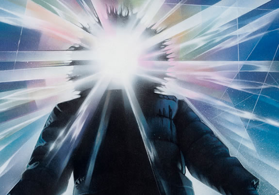
It might be obvious why Drew Struzan’s
imagery was so compelling.
A striking juxtaposition, spectacle in combination,
an icy entanglement.
Sometimes you win, sometimes you lose.
Personally, I dig deep to learn why I didn’t make it.
TIM
…..
G I R V I N | DESIGNING MOVIES
THEATRICAL BRANDING + ENTERTAINMENT
IMAGINATION: AND THE TOOLS TO MAKE IT HAPPEN
http://bit.ly/1afeVIQ