Notes on making typography by hand, for perfectly tailored applications — a Girvin legacy.

For decades, Girvin has been making typefaces by hand, completely customized to our client project applications. It’s a story that is surely understood internally within our organization and team designers, but is less understood on the outside. Why?
Because of the computer.
Most design groups tend to use a typographic vocabulary that is based on the 8,000 fonts that are currently in play. Our model is to create solutions that are not so much derived solely from a conventional application of merely pulling fonts from a digital index, but instead start with the hand — and the imagination.
How can that be? The answer is that there are literally three-thousand years of alphabetic legacy in relevant proximity to the alphabet that we use today. That is, past the Proto-Sinaitic or Proto-Canaanite early consonantal alphabets [read: www.ancientscripts.com/protosinaitic.html] and the crossing rendering of early Graeco-Roman scripts, there is a profoundly rich lexicon of paleographic reference that can create an unparalleled opportunity to understand the nuances of form that will create the ideal font for a branding story application.
As a designer, there’s three millennia, at least, for inspired study and interpretation.
To understand timing in context to history, check this chart out from AncientScripts.com –>
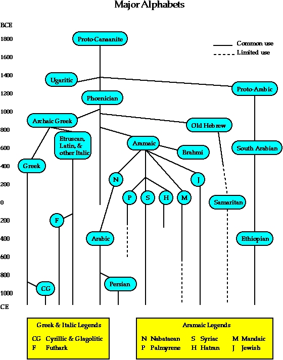
And, of course, that’s not even the beginning — this is merely the opening shift from earlier forms of writing, like the 3000 years before that — the opening cuneiform scripts of the Mesopotamian cultures of ancient Iraq and Iran, to the hieroglyphic three scripts of the ancient Egyptians.
The point is, there is a great deal to explore and learn, to understand how an alphabet works, and how it might be applied to suiting the customized needs of a client expectation in expression.
According to my mentor Lloyd Reynolds, Professor of Design and Culture at Reed College, Portland OR, and his mentor Alfred Fairbanks, a mid 20th-century Arts and Crafts theorist, calligrapher and designer from London: “Handwriting is a system of movements involving touch, and in a sense, touch gives grace.”
The legacy of the alphabet and its growth and extraordinary permutations from the last several thousand years, is all about this — a series of movements, kinesthetically aligned, involving touch, interpretation and perception. The hand moves in a certain way — and it evolves over time in the history of the expression of the alphabet. Each generation begets another, in terms of treatments of the alphabet — the wrist, the fingers, the political and cultural implications all creating a new and interpretative rendering of the time and the hand.
But for us, for Girvin, the alphabet is always about the hand. Michaelangelo is said to have offered that very link — “by hand, with mind and meditation“.
So in working on any brand identity program, we start with the mind, the meditation, the inspiration and the hand in the design of the font for applications —
which might be titling for a movie:
https://www.girvin.com/project/custom-letter-forms/:
a new web-based information company:
https://www.girvin.com/documents/tableau.pdf
a line of products:
http://www.sebastianprofessional.com/en_US/
a newly created resort:
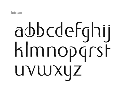
https://www.girvin.com/documents/bardessono.pdf
a specialty retailing group:
http://shop.nordstrom.com/?origin=tab-logo
or a popular television program:
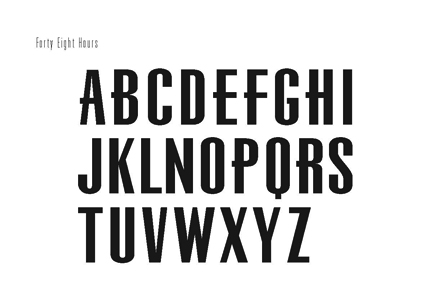
http://www.cbsnews.com/sections/48hours/main3410.shtml
The work that we do begins with listening. Working with our clients to get at the heart of the brand, the character of strategy, the unfolding of visualizations.
Chie Sharp Masuyama, Creative Director of Girvin | Seattle, is a specialist in typographic design and identity. And we’ve worked together as a team for more than a decade on projects here as well as in Asia. Her overview on project and practice can be summarized in her words:
“We develop custom fonts using our comprehensive understanding of type history, typographic design principles and structure, as well as our creativity and imagination to produce the best solution for each client.
After sketching ideas and digitizing them, we use FontLab to make them keystroke enabled, so that they could be easily implemented by our client’s teams. This program, as well, helps us to define kerning, which is one of the critical details to making keystroke fonts function well.”
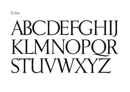
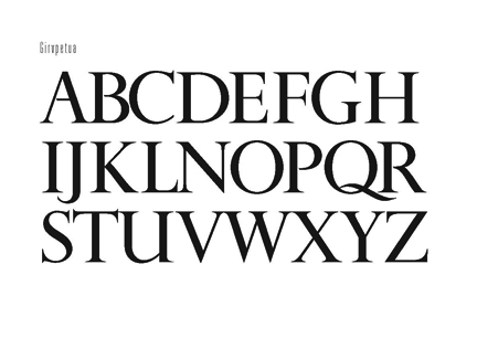
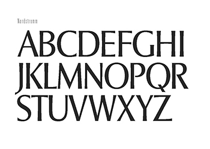
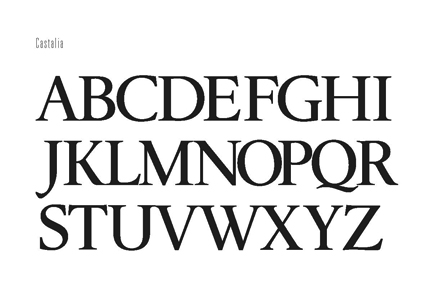
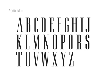
Here are some examples of our collaborations for clients around the world:
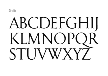
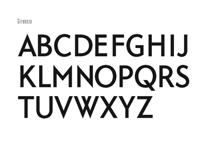
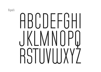
Some added elements for exploration:
http://www.nytimes.com/
http://typophile.com/node/44954
http://www.typophile.com/node/6777
http://www.typecon.com/program.html
http://www.graphic-design.com/DTG/macnab/type_with_character.html
http://findarticles.com/p/articles/mi_qa5326/is_200305/ai_n21329618
http://sfpl.lib.ca.us/librarylocations/main/bookarts/prestianni.htm
What’s your take?
tsg | nyc