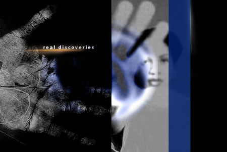
Exploring identity and television brand design development.
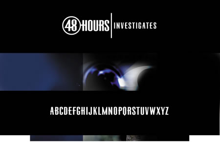
In the past, others have promulgated remarkable use of key-strokable, customized fonts, in the development of motion picture graphics. Friend Kyle Cooper, for one.
The nature of type design can gather up the potential to set a sensibility in motion that can start with the designed corporate identity — the spirit of a story reaches into the visualization of the form and movement — and there is a bridge between idea, the telling, and the “reading” of content.
Simpler? A great logo can be built into a titling system.

But the idea is the process — the way of getting from idea and inspiration in brand storytelling and the link to the audience. Doing that, really, is about the person — the human brand — that might be at the center of the story. In this one recollection, Susan Zirinsky.
Susan is the director of CBS News. She’s the executive producer of special projects for CBS both news and entertainment. According to Huffington, “Zirinsky was one of the executive producers of In God’s Name, a CBS primetime special produced in association with the acclaimed French filmmakers Jules and Gedeon Naudet, which explored the complex questions of our time through the intimate thoughts and beliefs of 12 of the world’s most influential spiritual leaders. Additionally, Zirinsky was executive producer of the critically acclaimed documentary Flashpoint in May 2007. It told the story of one bomb, three journalists and the Army’s 4th Infantry Division in Iraq. In addition, Zirinsky was the executive producer of “Celebrating Cronkite at 90, That’s The Way It Is, a CBS special celebrating the life of Walter Cronkite. There’s more on her background, here.

And I was reading about her, recently — and reconnecting — with CBS|News.
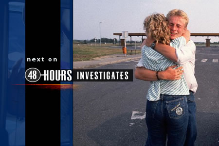
The recollection — is really about people, and the sudden reconnection with the Naudet brothers, noted above. The string of connection rings back to the heart of a story in linking to Susan Zirinsky, early on — ten years ago, in a new branding of her program CBS|48 Hours. But the point of the development, in reaching into the start of the project was reaching to the soul of Zirinsky, a legendary figure of television production. But besides that, she’s an amazing, intelligent, articulate visionary who continuously dreams big stories, finds them, and builds branded properties around them, all in the nature of her extended commitment to CBS.

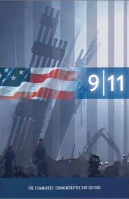
That link with her lead to working with Susan’s team, and the Naudet brothers, and their extraordinarily powerful — and tragic footage of the holocaust of 9/11. The spirit of these expressions and explorations are inherently linked in the conceptions of brand, story and positioning. With brand — in everything about activation, person and story story come first. As with any effort in brand development — our role starts with strategy, then reaching into the heart of the person, leadership, then moving from there to the messaging and visualization. All that, with Susan — who really was, and is, our prime client — the human brand at the center of the visioning of change in direction. This connection with Susan lead to her development of the programming of the Naudet brother’s remarkable capture of the experience of a group of firefighters, Ladder 1 / Duane Street, NYC, entering the towers, just after the airborne assault of two jets that claimed the lives of thousands.

Seeing the brother’s names again, as well as the link to Susan, reminded me of these propositions — and the story of the link between them all. For us, in the evocation of imagery for all of them, it’s about that — the “reading” of content. The type does that — it’s the bridge to the story that supports the visuals. For Girvin, the idea of bridging strategy, story, message, identity — and typography are foundational. It’s where we began — the stems and curved strokes that make up the alphabet and link to the telling of the tale in a manner that most immediately identifies subject matter.

People read, first. The very nature of the brand is about the holistic sensibility of experience — all of the layers of how people sense their environment and what those sentiments of content can be. Still, the simplicity of “reading” — whether text, or visuals, or touch, or sound, or taste — is the layering of access to ideas.
tsg
….
the reels: http://www.youtube.com/user/GIRVIN888
girvin blogs:
http://blog.girvin.com/
https://tim.girvin.com/index.php
girvin profiles and communities:
TED: http://www.ted.com/index.php/profiles/view/id/825
Behance: http://www.behance.net/GIRVIN-Branding
Flickr: http://www.flickr.com/photos/tgirvin/
Google: http://www.google.com/profiles/timgirvin
LinkedIn: http://www.linkedin.com/in/timgirvin
Facebook: http://www.facebook.com/people/Tim-Girvin/644114347
Facebook Page: http://www.facebook.com/pages/Seattle-WA/GIRVIN/91069489624
Twitter: http://twitter.com/tgirvin