Designing brands for consumer profiles in only one geography.
Most brand shops have experience in developing brands that are global in nature, they start in one area—likely the geographic origination of the brand creation, then they expand to other regions in the world.
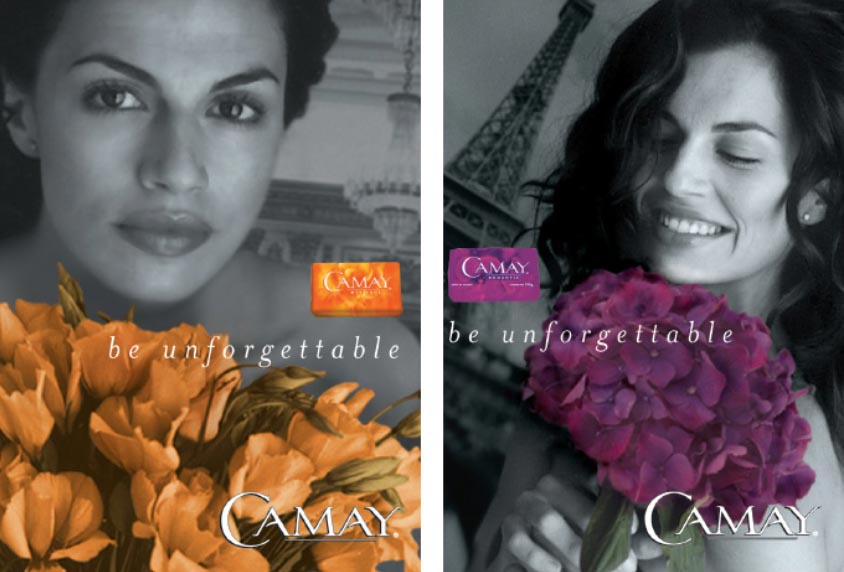
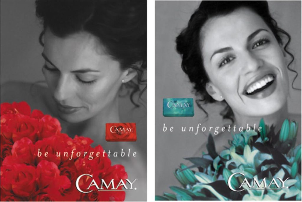
We’ve been there, particularly to Camay—which started as a localized assignment in Cincinnati, then—progressively, we listened in, as a team—to global customers, with the P&G brand team, to effectively arrive at a solution pathway for how to particularly position that brand in each of the major geographic planes in the world, still under a unified proposition strategy. There was one way to tell the story of product premise in Russia and Eastern Europe—the women there had a particular point of view; there was another profile in Latin America—precisely tuned to that demographic and anthropological profile, then still others for Southeast Asia and finally, the Middle East and Africa.
To each their own, a reflection of memorability—the unforgettableness of a woman’s presence.
But what if you’re designing in a culture, inside a culture,
only for that geographic demography.
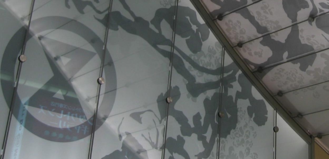
It’s one thing to design a place in, for example, Japan—like our work on the experience integration for the skin of Osaka’s Sogo Depato.
Working on beauty is particularly distinguished from, for example, Western beauty principles—simply, for example, color and whiteness. For example, in the west, suntanning might be seen as a sign of health and outdoor activity, while in the East, the premise would be the restraint of limited sun exposure and a whiter skin character.
There are two pathways to be conscious of—in geocentric brand work. This comes down to how you pay attention—know your environment in terms of “brand listening” and “customer listening.” To work in another culture—for that culture—you must know the brand first.
Geographic brand work knowledge:
Who runs this brand, what’s their history, what do they believe in—their aesthetic?
How does this brand speak to its community?
Their presence in-store, looks like what—how do they manage their retail placemaking?
The brand might have a history—what is it?
Does the legacy speak to innovation, science, trendiness, insightful responsiveness?
What is the heritage of product positioning—over time, are there genetic threads that speak to particular attributes? Is there, for example, an approach to product nomenclature, form design, packaging treatments?
What about language?
Obviously, if you’re working in a country for a period of time—a sequence of geospecific brands—then it would be appropriately relevant to the brand relationships—to that, I learned both Japanese
and French in support of knowing more.
Particularly, to Japanese, the structure of the language is distinctly built on tiers of formality, which changes the structure of how one communicates with a superior, a colleague, a support relationship—and, as well, whether you are a man or a woman speaking to either one or the other.
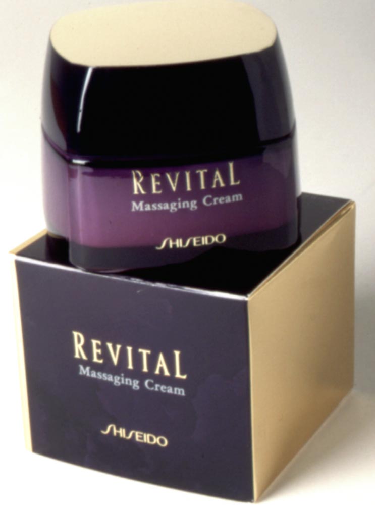
In the beauty space, I’d reached out to Shiseido first in NYC at their offices there—a pathway through their CEO who I knew from another life. I started with Revital, which coincidentally isn’t a wholly Japanese-focused brand—it’s for sale, rarely and in limited doors, in various parts of the US. Still, my work on the brand was in NYC, then I moved to Japan.
That brand started small, as above, then expanded the SKUs.
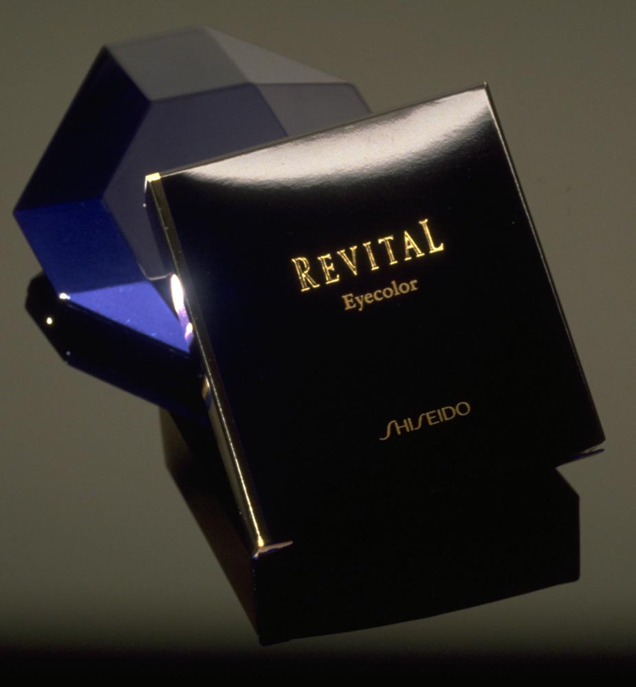
Our opening palette was built on a deep purple sheen overlaid on a metallic substrate
for a dichroic-like effect of luminosity.
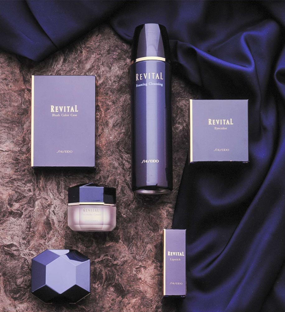
That core principle evolved.
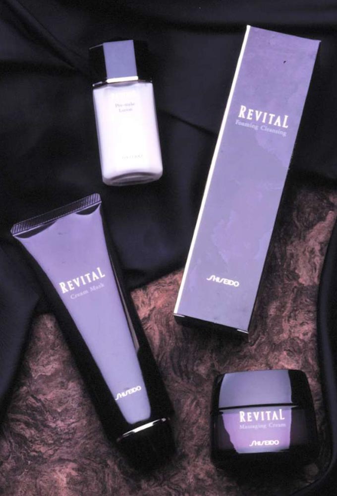
With line variations, we shifted to pastel renderings and the line was further expanded.
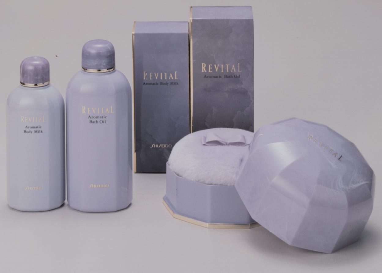
Style, the brandcode® of the proposition has a particular, even evolving
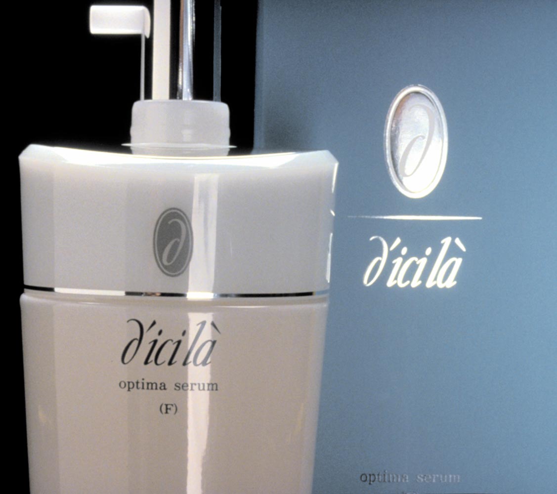
What I learned in the opening—from working in midtown Manhattan to the Ginza, Tokyo, was about detailing. When you look at these retail packaging concepts, you’ll notice that, to their chromosomal characteristics, there is a particular curvature or softness in the detailing of the industrial design of the products—and, contrastively, the typographic design speaks to, in each instance, a precisely detailed awareness of Japanese typographic design linguistics—carefully-tuned letter structure, integrated symbology, then simplistically elegant disposition of the art in signage, product labeling and packaging. Some of our concept work, for example, D’ici lá was exemplified in shop-in-shop micro retail environments for customer interception, brand storytelling and consulting. We designed those too.
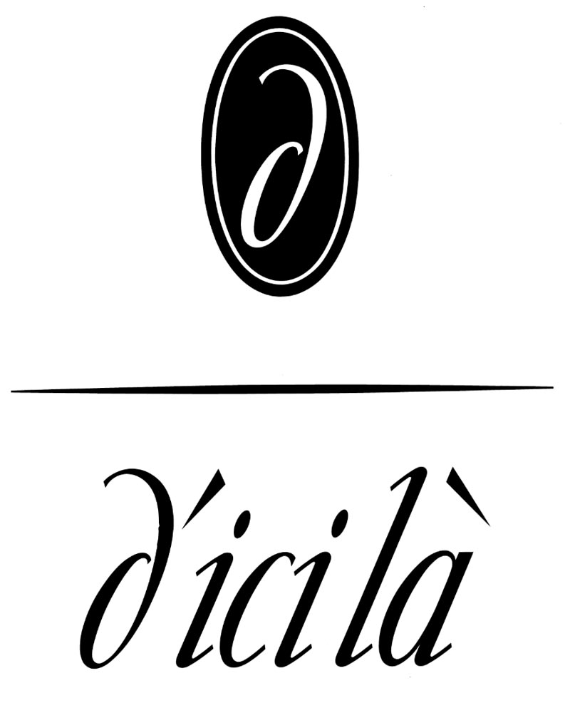
Studying these, you’d think, “wow, I don’t know that I’ve seen
products like these,” since you won’t—they’re only for sale in Japan.
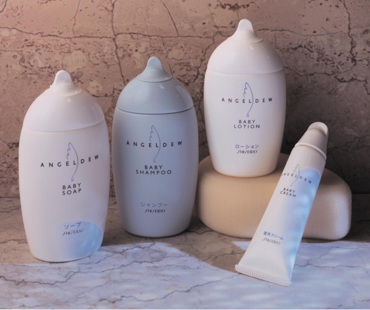
Considering the notion of a form-related brandcode®—

softer curls and highly customized container design, this Shiseido product for baby care integrates all of the brand-related evidences of the notations above, bespoke to Japan.
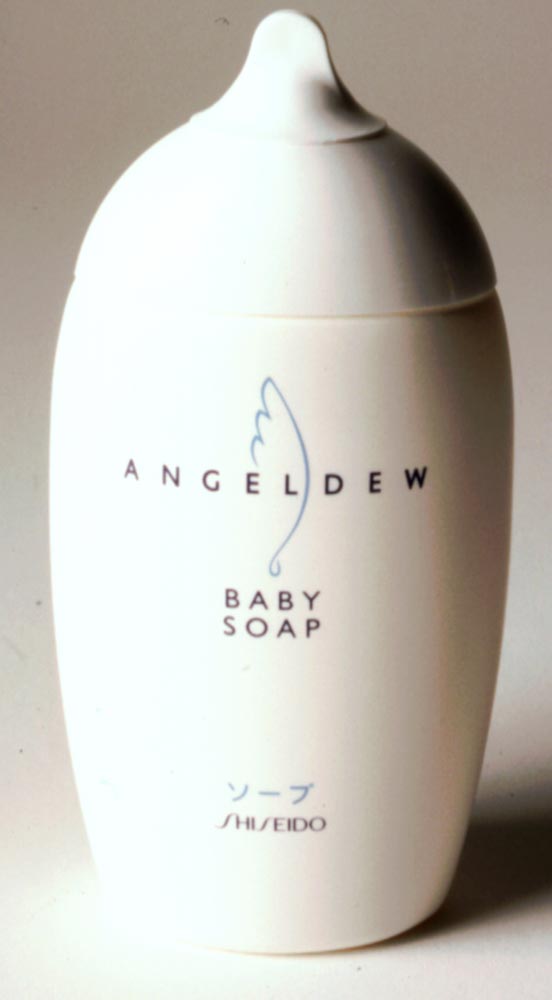
The restraint of the brand system finds an expansion in this grouping, which—at shelf, is typically Shiseido—understated and remarkably elegant for a baby product.
One might ask—
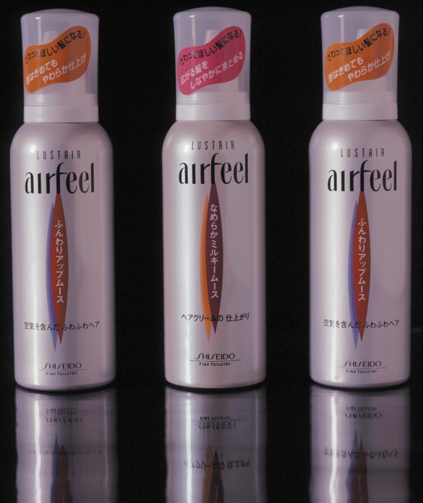
“these packaging propositions are so elegant,
how does that approach work for younger SKUs?”
As a design partner, we took the notion of brand-related sophistication and skewed it differently—still elegant, but differentiated towards these stock aluminum container types—all complexly detailed and interplayed with promotional elements that worked for in-store signage, at shelf promotions.
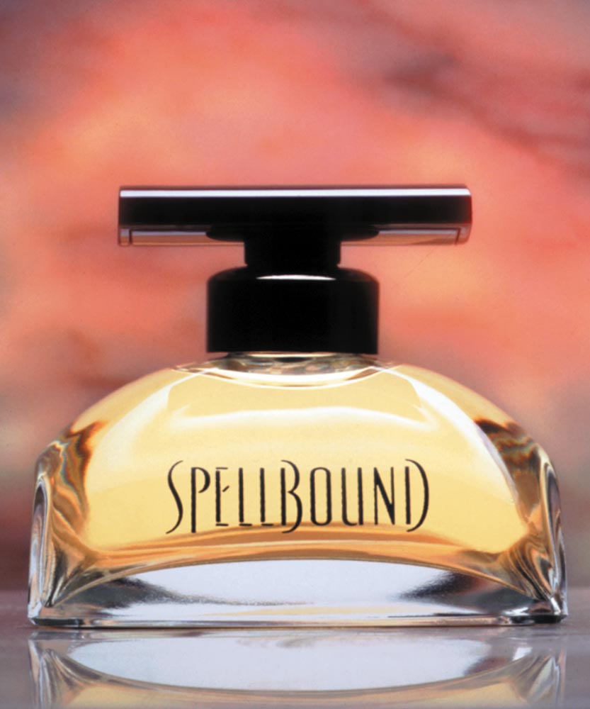
It’s a matter of considering the linguistics of brand design—reflecting, as a contrastive measure for legacy stateside work, for example—the GIRVIN brand strategy and design for Estée Lauder.
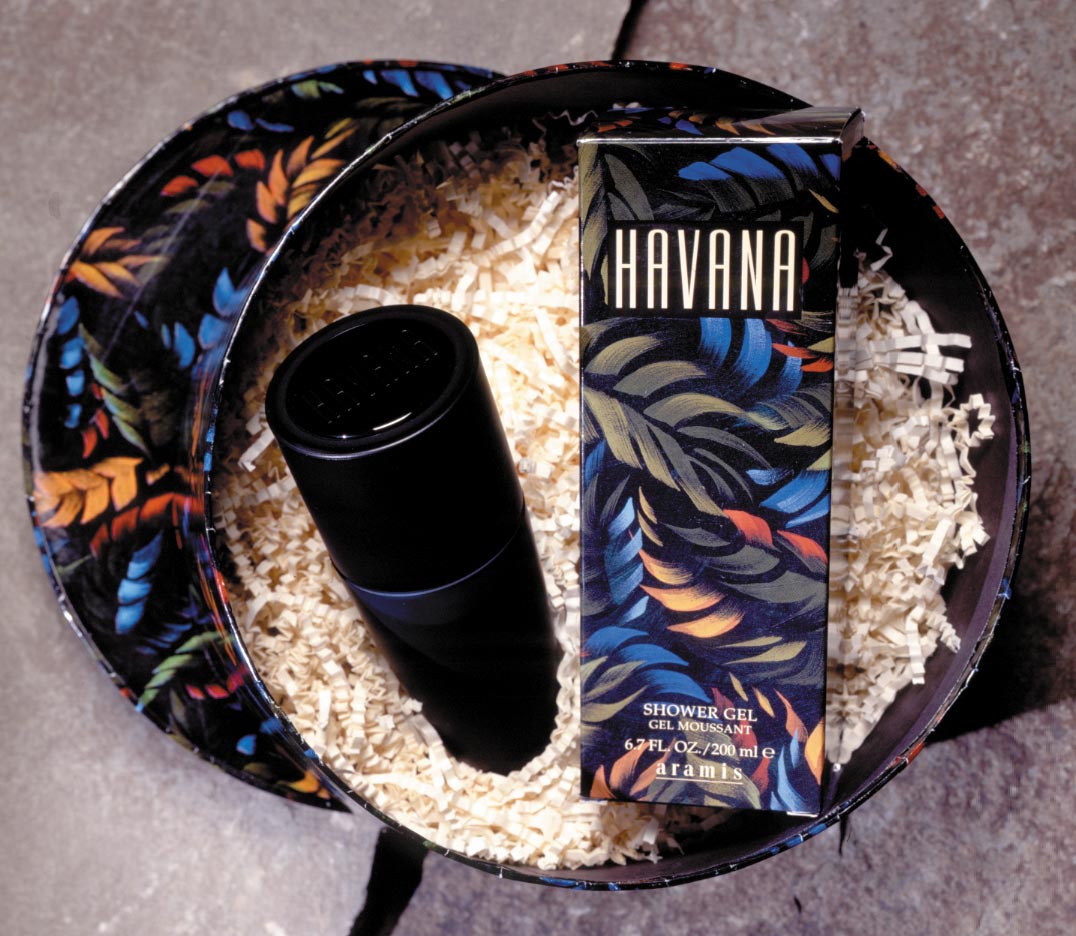
Three case studies—each, long-running brands, each speaking to beauty-related brand components—in this instance, perfume as the foundational brand offering—thence expanded into aligned products.
Note the form-linguistics—
this market, and above, the Asian market.
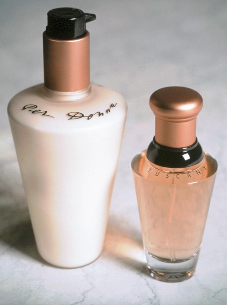
There’s a difference, here.
Or there.
We help.
Tim | GIRVIN | Strategic Brands
digital | built environments by Osean | theatrical branding
waves | art | Talismanika™ | Technology Brands | Destination Brands
We build projects in strategy | story | naming | messaging | print
identity | built environments | packaging
social media | websites | interactive