Exploring integrative identity and developmental work on the House of Orange, Valentino, Bardessono and Harvey Nichols | Jakarta — logo story in brandplace and other case studies.
There’s an implication in the current realm of testing behavorial study, that people understand through their feelings, first and foremost — they look at something, and they gather an impression, and they react, psychically and emotionally.
What that means is that a person responds to something in an intuitive and sensually reactive way that might be imbued in memory, captivated in happy experience, or downtrodden in some unhappy recollection. Sensory gatherings are based on experiential recollection and reminding of other expressions that a person has encountered.
Surprise is a good thing — to sequences of positive recall; and inversely, it can be a bad thing, in the state of branding. On the one hand, people like mnemonic sequences that are consistent (“this is just like the last time I had an experience with this brand, and I feel good about it — I can rely on it”, acceptable reoccurrence is the positive frequent outcome notation in testing ) — and on the other hand, people like to be surprised in a happy and delighting way. In this manner, it’s the “I love this brand because…”. That’s where stories come in, of course. When people say that “I love this brand”, then there’s a story coming. And that story spreads…
Enough said.
But there are a number of other ways in which brand experience can be told in story. And one of them, simply enough, is reading.
In our experience as brand strategists, storytellers and designers, we find ourselves frequently looking for the right way to organize information so that it makes sense to the right person — the audience that is engaged.
For easy frame of reference — writing and organizing something simplistically makes sense in communicating with an audience that is, in fact, interested in only simplified content. Simple, fast, easy to read, fast to grasp — and getting to the heart quickly. Some audiences, tested personality profiles, or precisely identified archetypes, “genetically” don’t like to read excessive or complex content.
Gesturally, you might proffer that the profile of a person that smokes Marlboro cigarettes is struck by simple statements, bold realizations of imaginary scenarios, striking juxtapositions of strong color and a deep psychic relationship to the notion of smoking, masculinity and the mythic legendary characters of the American West. Working on understanding that audience profile — the artisan — we built an entire global communications program for another broad grouping of consistent brand / persona relationships, that same profile, for a different application — Fluke electronic testing equipment. 70 countries, millions of users, and most of them tested out similarly in the framing of their psychic profiling. We designed everything, in strategy and story, just for them.
And this goes further than writing, of course — it’s about stylistically arranging content in a way that lustrates, or polishes — it brightens, the idea(l).
It is about the writing, but it is, as well, about how that writing looks. And how that writing tells a story. In this manner, I believe that part of the layering mimetic character of the soulful engagement — that entrancement, is about the layering of textual messaging that is also, inherently allied with the design vocabulary. That, of course, might be obvious to some, but it’s about trying to create a resonance between the layers of meaning, the content of the presentation, the language that is used, and finally, what is the visible lexicon that creates that sentiment.
Write well, so that people will understand well; design well, so that people will experience that story told well.
The House of Orange http://www.friesian.com/ross/orange.htm
For an example of a visitation to concept and content, this new 2008 architectural 5 Euro http://infosthetics.com/archives/2008/11/dutch_architecture_5_euro_coin_design.html coin for the Netherlands, celebrates the design talent of the Dutch in a typographical compositing of Koningin Beatrix, her beloved Queen. While the typography speaks to the identity of the star design populace selected for the coin, it simultaneously illustrates the visage of the Queen Matriarch of the House of Orange. The obverse shines with modernist skyline expansions of the patterning “building / designers”, creating, as well, a map and bird geographic renderings to placement on the country. The point, to the opening story is that the very identity of a presence — an enterprise — might be celebrated in a uniquely arranged array of messaging that speaks to the character, the content, the storytelling…Type, message, story — speak.

On that spiraliform rendering, there might be this expansion, to the concept of identity in application. I’ve written in the past about Valentino — the human brand — and a talent that recently retired from the scene of fashion design, after decades of exposure, critical success and fabulous couture. The fundamental typography is pretty close to just that: classical, hand-drawn, a little eccentric (note the clipped, semi-slab serif treatments).
Valentino merchandising and identity (NYC)

In exploring the merchandising installations of his story, and store, on Madison Avenue, NYC, the visual installers considered repetitively circling the range of the mark – or an interpretation of the mark, in a labyrinthine winding — that draws the viewer in the web of the story. A giant V slats the mark of the type in the applications to the interior, cross-stroking the pillar dominating the space.
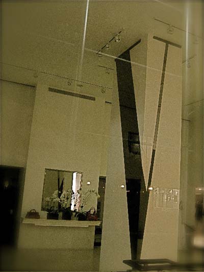
Here, it’s not so much that the identity is being lead into the context of merchandising, but rather, that it’s expressed — people read, they are drawn in; there’s no questioning what brand this is — what place, is made:
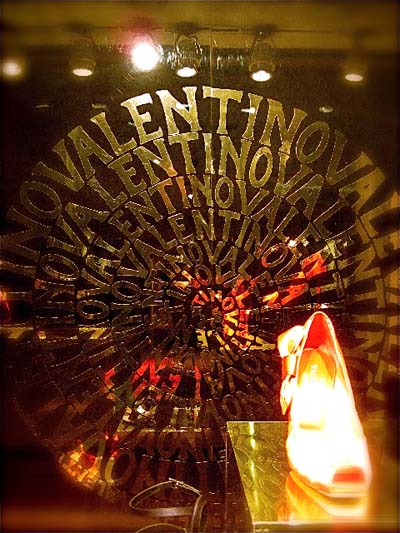
This sprawling and incised illuminated treatment spins, amidst the reflected ruffling of the V tangoiste styling of the couturier legacy:
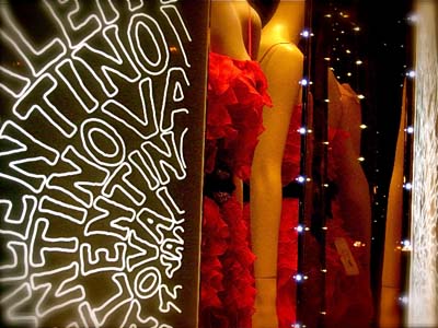
In these two treatments of the identity applied in storytelling layering speak to mere type, in message, in visual play.
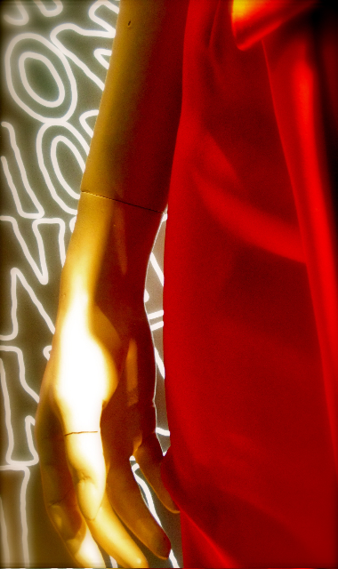
But what of the idea that the identity the element that consistently bridges layering of experience in branding.

Standing on the brand principles — understanding, perhaps — there is a potential to link in, connect, be involved.
Any work that Girvin does is about collaborations — building ideas as a team, and examining potential avenues of brand expression. That can begin, and does begin, with nearly poetic explorations — gathering imagery that relates to emotional content and experience.
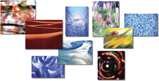
And in the resultant outcomes, how can that opening language impact experience presentation?
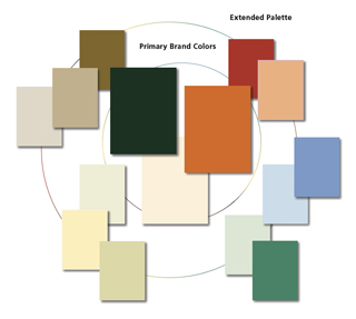
Working with long term luxury hospitality and island community conclave developer Phil Sherburne, we explored the early stages of brand development for The Bardessono, Yountville, California — along with hotel experience management team MTM Luxury Hotels, Jim Treadway, James Simkins and Marc Pujalet. WATG’s Ron Mitchell (now, ThinkGDC) lead the design effort, with ongoing site management from the WATG team leader, Susan Frieson.
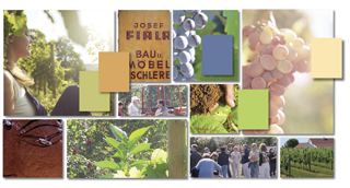
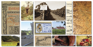
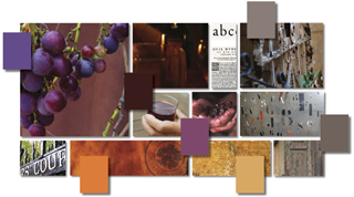
Our role, early on in the development’s brand framing, was to look for the heart of the team’s visioning — and Phil’s personal inspirations, find and tell the story, visualize the treatments for identity. That telling took us to a structuring of the brand explication of story in a series of solutions that created environmentally-based, built solutions noted below.

(WATG)
The presence is small — it’s a limited, highly engineered, luxury property with a very small footprint, ascribing to the goal of a Platinum LEED built green rating.
 (WATG)
Their plans are to open in the spring of 2009, adding a carefully orchestrated ethos to the character of the Napa Valley hospitality and wine-making communities. The fundamental character of the property relates to a proposition of cor-ten steel, rammed earth wall, and energy gathering and saving design solutions throughout the four hospitality compound areas.
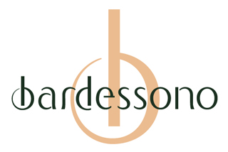
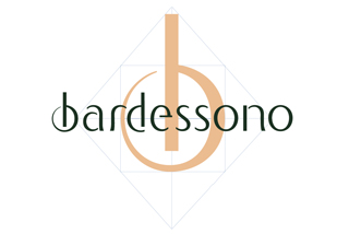
Our solution was to look for paths to integrate the storytelling of the brand — the mark itself, and the character of that design — suggesting in the b of the design, a quality or conception of enclosure; Phil’s visioning being that the guest will have a managed, entirely customized experience in the aligned outcome of the property.

We’d created an alphabet, to expand on that language, throughout the property’s applications and signing treatments. These conceptions of application were based on a grouping of workshops, early on in the project, exploring personality and flavor, that supported the architectural visioning, as well as Phil’s intentions, and finally, MTM’s insights into the process of hotel branding. The balanced device and the structuring of brand components, including the notion of using the b as a tool for signing the compounds of the property.
Possible patterning languages for the sites:
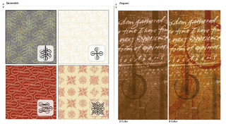
Variations on the site treatments for the b.
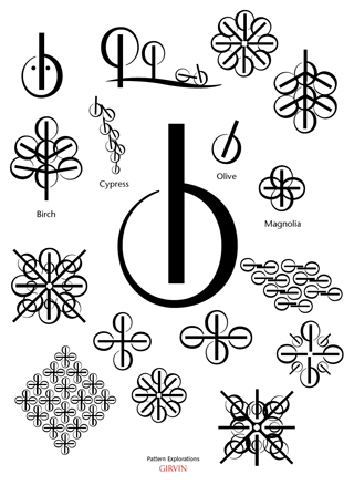
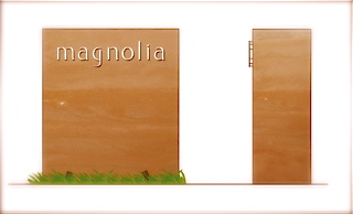
The driver of these ideas framed the potential in examining experience relationships between the concept of the brand, the story of the property and the use of the mark as an overarching collective identity. The circled b — with the standing vertical band suggests the person contained, in harmony, in the Bardessono experience design. That, in turn, could suggest the quality of the environmental graphics installations, reflecting the brand, in situ.

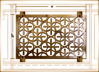
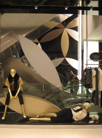
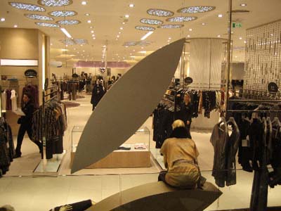
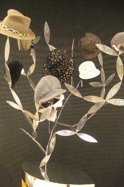
The branding lexical character, here in Harvey Nichols | Istanbul — at Kanyon, some distance out side of the city — the conception relates to the repetitive sequencing of a leaf-like organic form.
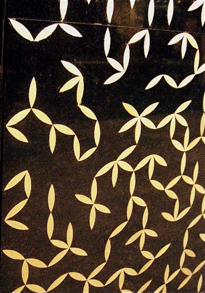
that’s used either geometrically, as a framing brand device, or as a patterning language for experience; it’s an increment of expression — a touchpoint.
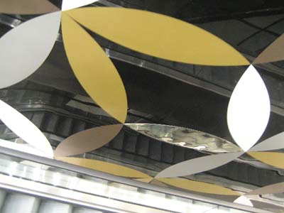
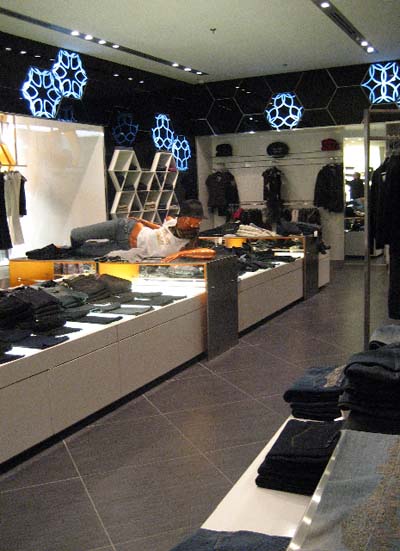
In studying the imagery, the evidence of this evincement is every where, the diversity of application is shown in multiplicity of engagement.
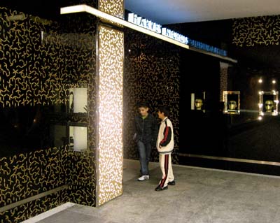
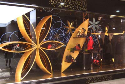
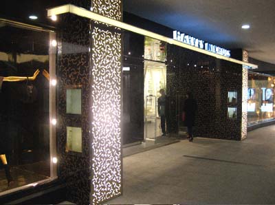
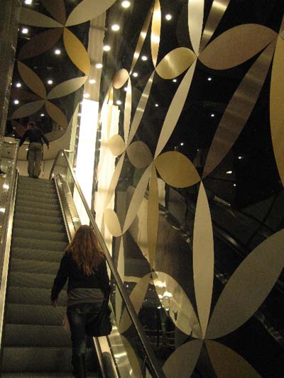
Harvey Nichols | Jakarta
The legacy of Harvey Nichols http://en.wikipedia.org/wiki/Harvey_Nichols, a brand that originated in the early 1800s, founded in London, then Leeds, fits well into the study of the concept of what we’ve called —True Brands, authentically imagined and evolved branded enterprises, http://blog.girvin.com/?p=1947, that Girvin has been exploring over the past number of years. Our opening development, was the study of Harvey Nichols | Istanbul, licensed by Unitim, Turkey. And it was here, traveling with Design Director, Dawn Clark, AIA LEED AP, that we began to examine the interpretation of design language.
Our goal, however, and the character of the identity applications of this overview – was to look at the central message of brandmark — for Harvey Nichols — and build from there, diversely applying the language throughout.
The mnemonic patterning for brand experience is not only the mark — Harvey Nichols — but Dawn Clark’s inspiration in exploring, for HN | Jakarta — the concept of the Indonesian wave symbol, the parang, the formal name of a form of malay or indonesian blade, as well as meaning, “rugged rock pattern, broken blade, or knife pattern,” a device of royal lineage http://www.expat.or.id/info/batik.html

Working with the design team, Andy Thaemert and Doug Shaw, as well as the leadership PT. Mitra Adiperkasa Tbk (MAP), a leading Jakarta based retail group, Director Alan Thomson our role was about the interpretation of the brand, into experience, from identity, and placemaking design touchpoints. MAP has signed an exclusive licence agreement for the development of a Harvey Nichols Store at the Grand Indonesia Shopping Town development in Jakarta.
Chris Eden, Callison documentarian, offers this visualization overview, seen here. To the opening, the access of the integration of the parang blade patterning, and the mark, there is the conceptual development, and the finalizations, as noted above:
The parang procession opening, the multi-story shopfront:
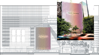
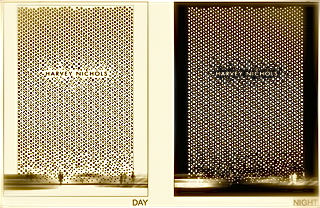
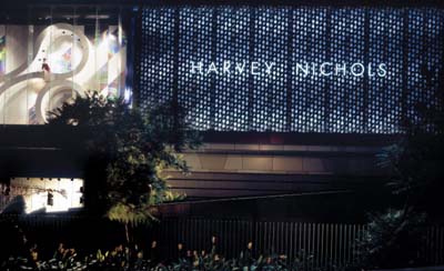
(Chris Eden | © Callison)
Projected interior applications, parang:
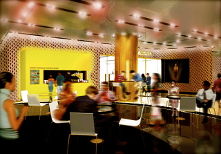
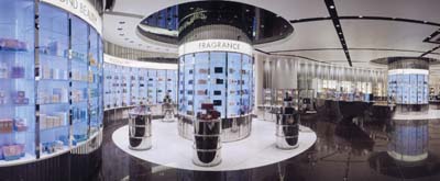
The interior applications, speaking to the Harvey Nichols identity and brand language, began to evolve in the structuring of ideas, in place-making.
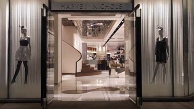
(Chris Eden © Callison)
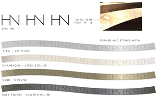
Designing a grouping of interior applications — based on the HN monogram and the typographic styling of the look and feel of Harvey Nichols.
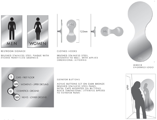
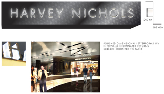
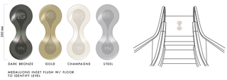
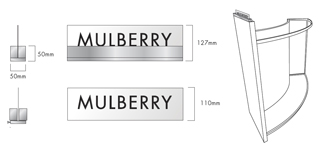
Signing system applicaions
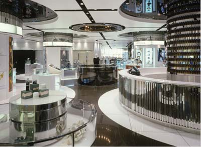
(Chris Eden © Callison)
The overview identity — the forms of language and experience — that we are considering in the materials, is about capturing the concept of “speaking” to an audience, connecting with them, gathering up the roots of the brand language and bringing that into play — as sequencing touchpoints — subtle, or loud, they add to experience.
Bring beauty. Forth. Tell me a story that I can touch, and walk into. Sense.
We all long for that.
tsg | paris / france