Could a brand be so beautiful that it should be made into jewelry?
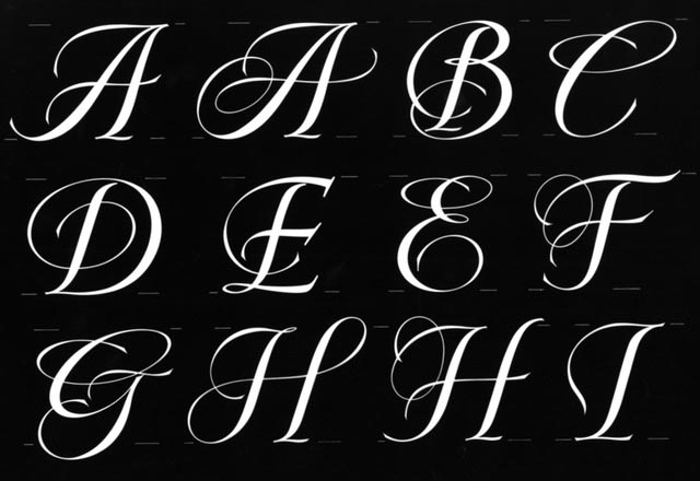
“Sure,” says Susy Korb, an earlier Creative Director at Tiffany&Co., she asked, “Could we create a font that could be used in our print, as well as for actual fabrication into precious metals?” In our experience with laser and water-jet-related incisions in metals we found a way to design upscale letters that could be made into monograms or single characters to wear in gold or silver.
We’ve always thought about letterforms as dimensional tales—they exist in the foundational narrative tool in any storytelling.
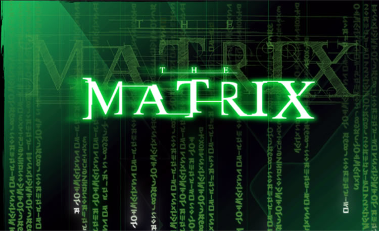
In our work with the Wachowski siblings on The Matrix, the history of our work there, in that collaborative effort, was designing treatments that exist as objects.
The logo, and logos, that we designed floats in space as a dimensional and luminous expression—it’s weaving ideas, information and the code of “the matrix,” that which is here, there,
and the programmed layers twixt them all. Of course, this was a widely merchandised proposition—
so, in the end, it was dimensionalized as an object for sale.
But what if the opening challenge was to design a brand whose ultimate expression would be as a made object?
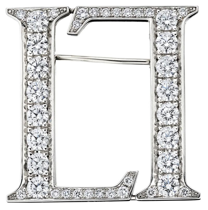
In our creation of the patterning language of Leviev,
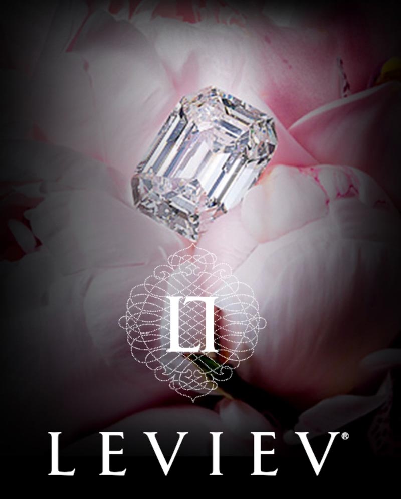
a superlatively luxurious brand specializing in distinctly large scale diamonds, mined in operations
owned by the Lev Leviev in Africa and Russia—and perhaps the only significant competitor to DeBeers—
we created a double L monogram and a micro-gemological filigree patterning that wraps this identity device.
This was crafted into a piece
of jewelry, a 1.68 CT pin.
Over time, in the legacy of developing identity treatments and
hand-crafted, customized logos, this type of design programming has
come into play in signage, shopfronts, and built environments with frequency—let me know if you’d like to look at this book,
drop a note at girvin@girvin.com and I’ll get you the code.
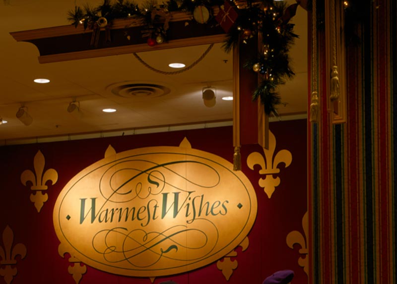
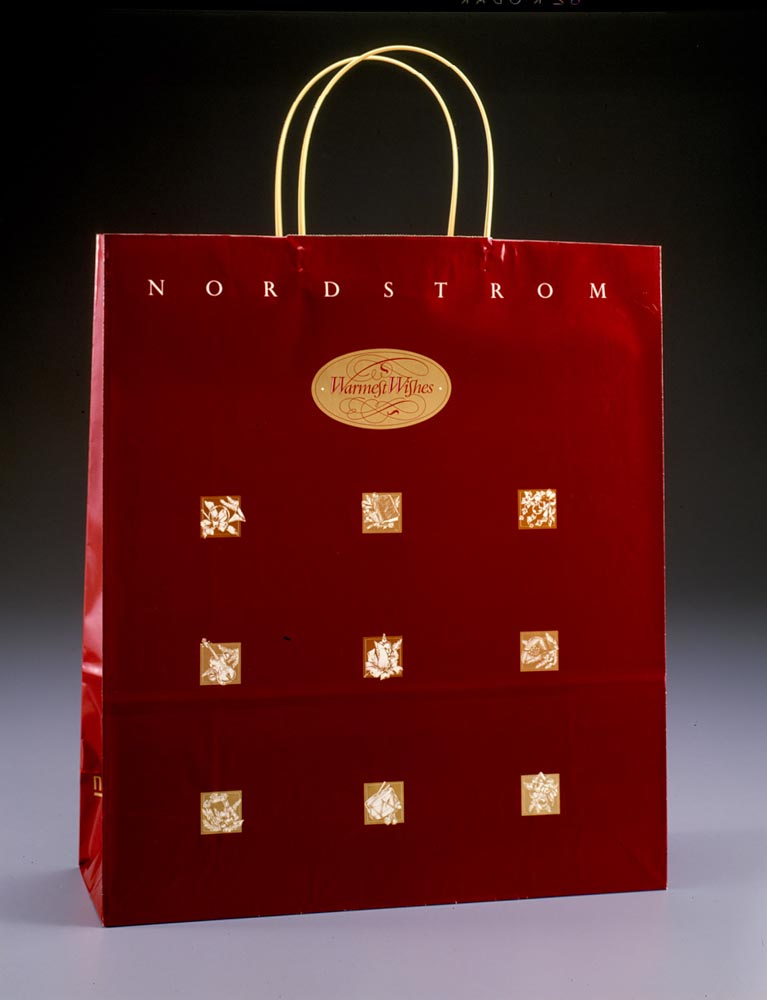
I do recall another effort, working on a campaign design program for a department store—a Christmas campaign. I did this type of design programming in two locations—one East coast, one West coast.
The first one, East Coast, involved a multiple language rendering that was designed
as a kind of substrate patterning, in conjunction with photography.
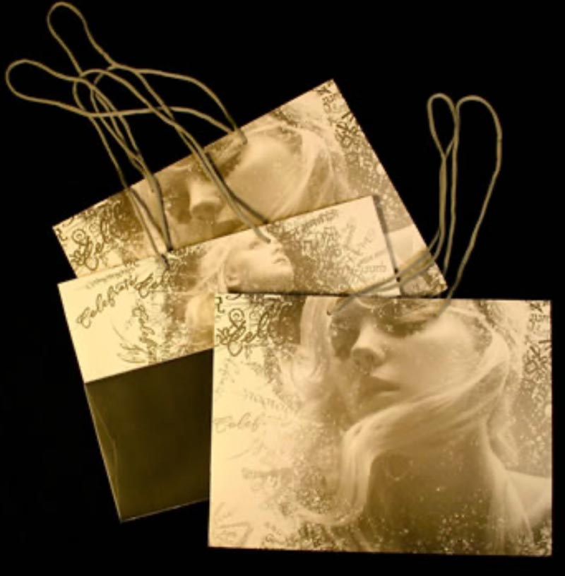
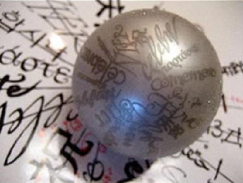
That campaign rendering was expressed as a asterisk-like sun burst of words in Russian, Greek, Spanish, Hebrew and a string of other languages, built, literally, as a design language that found its way into everything seasonal. But then it became dimensional.
Ornaments and giftable items found their expression.
Also, cut metal objects.
Spheres.
Flat metal molds.
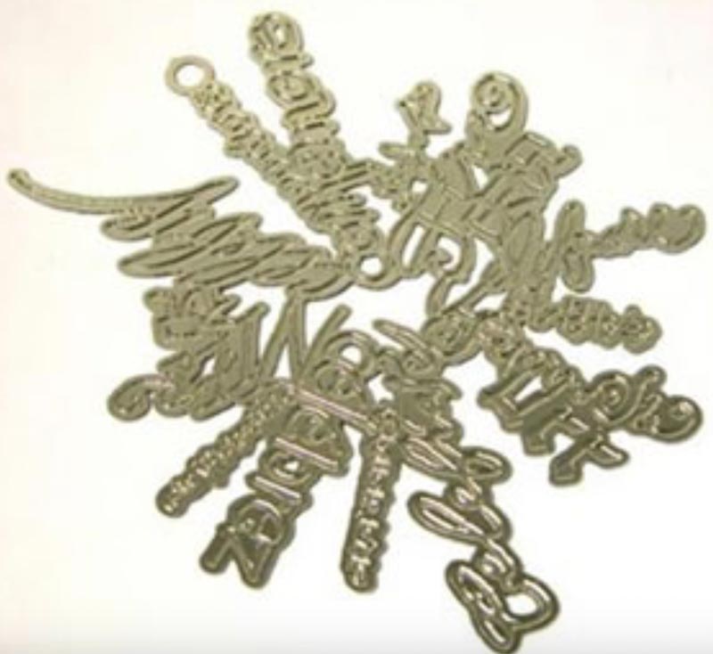
Incised metal and
intertwined ornaments.
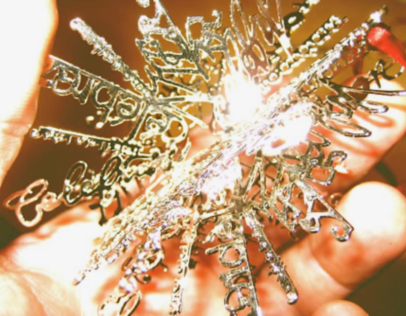
Interestingly, hanging in the light,
the patterning is “words of light” on the walls.
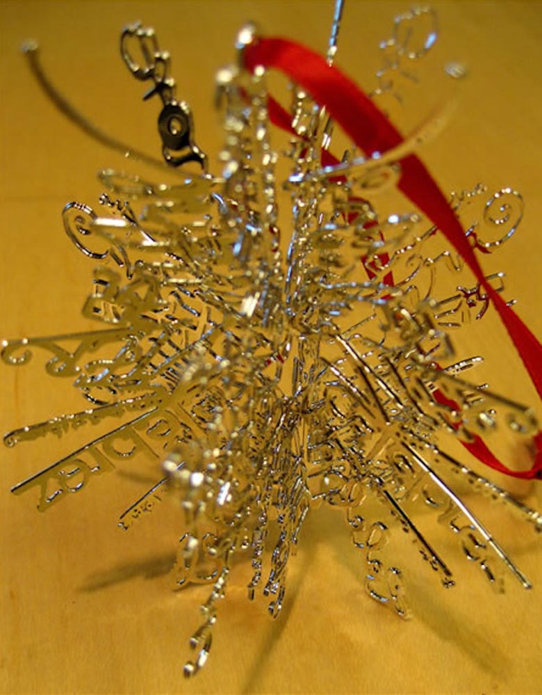
That premise found its way into another jewelry item, and brand integration, from one campaign rendering to jewelry expressions.
Molded and incised metals—giftable.
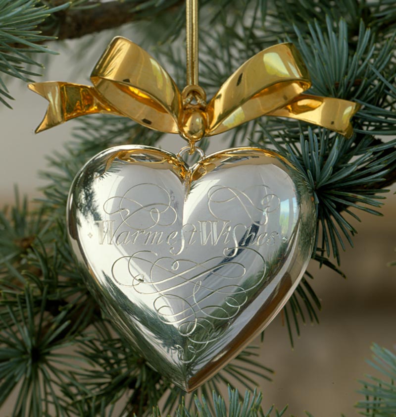
Sure, this is somewhat of a divergence from, precisely, jewelry branding, but for us, it’s the principle of extensible integrations, GIRVIN’s premise of experientiality.
GIRVIN has created small, median and national, and mega-luxury jewelry brands—from local to global.
Let me know what you think.
Tim | GIRVIN | Strategic Brands
Digital | Built environments by Osean
We build projects in strategy | story | naming | messaging | print
identity | built environments | packaging
social media | websites | interactive
S I N C E 1 9 7 3
Discover more from Girvin | Strategic Branding & Design
Subscribe to get the latest posts sent to your email.