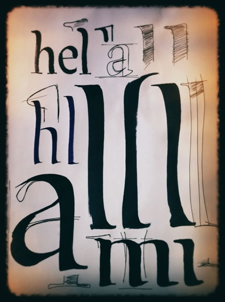
The Legacy of Type Studies | Reaching Back
“It’s been said that the first stroke of any alphabet is the vertical, drawn with the finger — from heaven, to earth. In the mysteries of the origin of writing, it is the first stroke that cracks the light in the beginning of being — spirit, mind, body: the alif, the aleph, the alpha — the Arabic spear is the lightning struck stroke that is the start and the finish, in one movement. The other origin stroke of the alphabet is the circling guard — the ring of everything. So in the start, the foundation of the alphabet is the start and the end of everything.“
–––––
In the beginning of my career as a type designer, calligrapher — the 70s, it was my belief that everything should be crafted by hand. Rather than set whole galleys of typography, I drafted it all by hand. That legacy was hardly new. In the beginning of the 20th century, showcard writers and advertising designers drew much of the typography of their promotional placements using hand rendered type. Oswald Cooper, Edward Catich, Ray DaBoll, James Hayes — and others. With the exception of Mr. Cooper, I’d reached to, and connected with, them all.
My early education was based on wandering. I’d find a resource that I was interested in, write to them, travel there and meet. Stay a while. Learn, explore more. Talk. Watch. What I was interested in was the idea of something entirely and completely customized, made by, and in the spirit of, the hand. Early work was skewed to those that looked for representations of their enterprises that were specially “made.” This then was a rarefied clientele, but I found them; and that was the beginnings. These inspirations came from study — and travel — I sought out the inspirations; and studied, traveling to find the right renewal of possibility — the next mesa, the new vista. That idea of things being crafted led me to resources like rare book libraries, special typographic collections, poster collections, booksellers of rare books, university collections, from Harvard’s Houghton to the U.W’s Suzzallo, from the Bodleian to Musée du Louvre, the New York Public Library, from Dawson’s LA, CA, to Philip Pirages, McMinnville, OR.
Special people emerged, in the studies — two, to balance: W.A. Dwiggns and Oldrich Menhart. There are other legends and talents that circulate around these people. Not only was there the classical tradition, but the mix between a classic distinction and personalized modernism. These two come to mind and figure in my formative years. It’s not only about the notion of design and drawing by hand, but speaking to slightly personalized distinctions that lend themselves to uniquely disposed attitudes.
The stem — the single vertical stroke — is telling (and the O) defines the alphabet. To the idea of the architecture of the alphabet, it’s the combination between the die cast of these characters that form the hidden geometry of structure; speak one, call forth the other, and you have the genetics of an alphabetic system. Stories emerge.
Font Bureau notes, to the legacy of Dwiggins this overview:
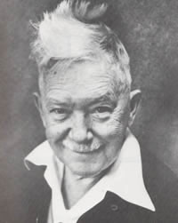
William Addison Dwiggins
June 19, 1880–Dec. 25, 1956
W.A. Dwiggins was known for many things: his illustration, calligraphy, advertising, book design and his puppet theater, as well as the typefaces that we know him by. Chauncey Griffith, Director of Typographic Development at the Mergenthaler Linotype Company, kept the design of telephone directory, newspaper and non-roman faces for himself, but employed Dwiggins (and later Rudolf Ruzicka, who provided Fairfield and Primer) for the company’s commercial text efforts: Before the war WAD, as he called himself, designed Metro, Electra, and Caledonia for Mergenthaler.
During the war all but essential brass was taken for munitions, blocking production of new Linotype faces. Griffith kept Dwiggins busy on experimental designs: Eldorado (released 1951) and Falcon (released 1962), were manufactured after the war. Drawings for most of the published faces are to be found in the Dwiggins Collection at the Boston Public Library. His drawings for Stuyvesant, Winchester, Arcadia, Tippecanoe, Hingham and a number of experimentals survive with the rest of Dwiggins papers in the Griffith Archives at the University of Kentucky.
Looking at his fonts, there’s a hand drawn character that I savor — below, Eldorado and Caledonia, to reference. Study the details and you can notice the little twists and touches that impart the distinctive qualities of Dwiggin’s fist.
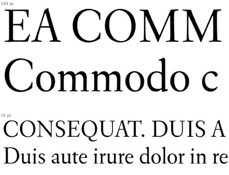
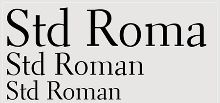
An exquisite reference to the link between the hand, the drawn, the personality and the font can be found in this classic bit of masterly advice, a series of notes from W.A. Dwiggins and Rudolf Ruzicka, a Czechoslovakian-American wood engraver, etcher, illustrator, type and book designer. WAD created these pages, in a booklet to a friend — and these belie the distinctive character between them – both being designers. But it’s WAD’s spirit that balances the classic with something more personable — warm and human. Explore more.
Some renderings from the journal.
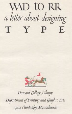
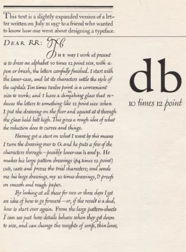
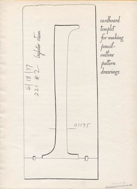
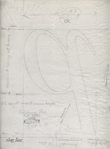
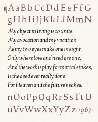
A page, Ruzicka’s “Studies in Type Design“
Presently, many fonts are built on a digital substrate — characters are aligned on screened grids and micro millimeter, pixeled measurement. 20th century, the hand way, back then — scribed on tracing paper and inverted for casting. A series of movements involving touch and sight, defining the rhythm of the fonts on the nature of the pencil, the fingers, the wrist, the arm, the eye and mindfulness therein. Everything about the human will integrate the personal touch.
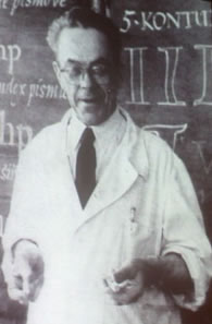
Another, to inspiration in the early studies, and still, too, graced with personality and character, Oldrich Menhart, a man that dedicated his life to type, calligraphy, the book arts and teaching. His efforts represented a kind of expansion on the sequence of Czechoslovakian designers, whose alphabets feature a series of complex diacritical marks to any alphabet drawing. In a way, it was Vojtech Preissig that set the opening standard with his Preissig Roman, which set the foundation for aligning diacritics with font typology.

There was a kind of evolution, as well, in the works of Karel Dyrynk, who was — according to a fine overview by Johanna Bil’ak –“the director of the printing house and a great promoter of Czech typographic work, took the advantage of the improved technology and designed five new typefaces, all rather decorative, keeping strong links with several well-known historical models, while at the same time retaining a particular charm as can be seen in: Malostranská Antikva (1927), Dyrynk’s Roman (1928), or Gregr’s Roman (1930).” Charming, indeed.

Karel Dyrynk’s Latein und Kursiv, 1928-1930
That’s the point, distinctions based on humanized interpretations of the one stroke, the circled geometry. The idea — the bridge between humanity and the mystery of the first stroke — the stem, the circle — between them, the magical origination of all gestures, alpha-beta.
Menhart, in a way, concreted the efforts of many designers, a legacy of Czech distinctively
admirable (and eccentrically attractive and intriguing gestures. These have been redrawn, in admiring emulation.
Figural

Manuskript Antiqua

Monument

An American designer, Alexander White, built upon these legacies, in a series of digitally rebuilt fonts, based on the Manuskript characteristics — his settings, shown below.
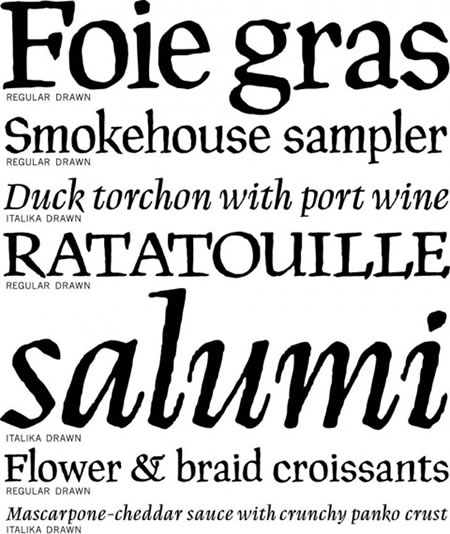
Menhart used a form of scripted regiment that was founded on earlier calligraphic forms — one might presume based on quill work that aligned with weight and pressure. 15th century medieval manuscripts used a goose quill, baked in heat and split, and perpetually recut as they wore down.
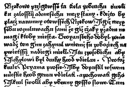
Czechoslovakian Littera Bastarda — a late Gothic lettered compression [Johanna Bil’ak]
But the quality of the quill creates a kind of pressure sensitive fat/slim perspective that belies the right angled spirit of a broad-edged tools — the thick and thin split from the drawn weighting of the stroke.
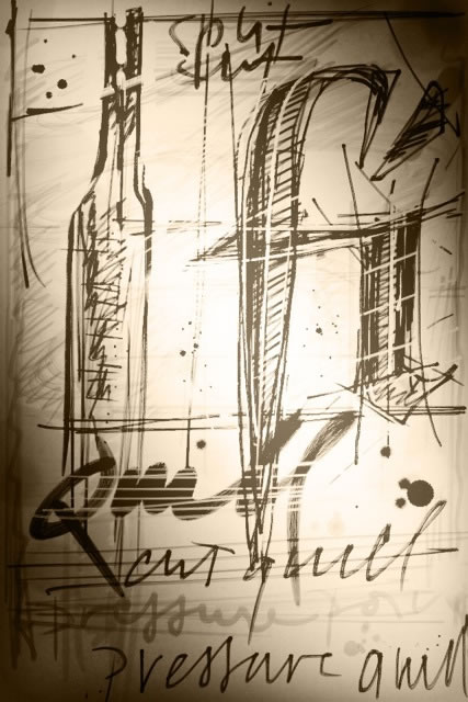
The split quill, the pressured stroke
One line then becomes a wedged parallelogram. A circle drawn then holds a white counter ellipse within — distinctions are created. The work of the Czechoslovakian designers speaks to the quill made, hand drawn and pressure laid strokes. Slavoboj Tusar, Karel Dyrynk, Oldrich Menhart, Frantisek Muzika, Oldrich Hlavsa and Josef Tyfa and others. Circles ring each other, stories and styles intertwine.
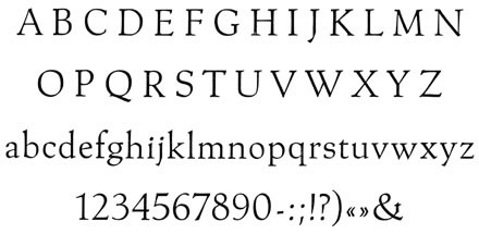
Menhart’s Roman
That is my search, our search to brand, that language, that sense of style imbued — the human touch, the distinctive
character of personality and trained, progressively maturing instincts. Whether the genetic plays of W.A.Dwiggins, Rudolf Ruzicka, Thomas Maitland Cleland, or the Czech eccentric character, to each their own — personalities are revealed. Many other intertwinements in design show themselves. This is but one meditation.
Touch, human; draw, human; illustrate, human.
For the work, it’s all human. A point never to be forgotten.
Tim | NYC
….
GIRVIN | Brands / stories / humans / intertwinements
CROWD MIND | EXPERIENCE DESIGN | MEMORY STRATEGY
http://bit.ly/ev7AYx